Attributes
| Design-time functionality is available to controls in one of two ways: programmatically or declaratively. Checking the DesignMode property is an example of the programmatic approach. One side effect of using a programmatic approach is that your implementation takes on some of the design-time responsibility, resulting in a blend of design-time and run-time code within the component implementation. On the other hand, the declarative approach relies on attributes to request design-time functionality provided by the designer host. Changing the Toolbox IconFor example, consider the default Toolbox icon for AlarmClockControl, shown in Figure 11.5 residing in the AlarmClockControlLibrary's Toolbox tab. Recall from Chapter 9 that this tab is automatically created for you after a project build and is filled with all the public components in your solution. Figure 11.5. Default Toolbox Icon Typically, a custom component prefers a more appropriate icon. To substitute your own icon, you start by adding a 16 x 16, 16-color icon or bitmap to your project. Next, you set its Build Action to Embedded Resource (embedded resources are discussed in Chapter 13: Resources).[3] Finally, you add the ToolboxBitmap attribute to associate the icon with your component:
// AlarmClockControl.cs [ToolboxBitmap( typeof(AlarmClockControl), "AlarmClockControl.ico")] partial class AlarmClockControl : ScrollableControl {...} Whenever you add or change the ToolboxBitmap attribute, the icon for your component is automatically updated in both the Toolbox and the nonvisual design surface after a project rebuild, resulting in something like Figure 11.6. Figure 11.6. New and Improved Toolbox Icon You can achieve the same result without using the ToolboxBitmap attribute: Simply place a 16 x 16, 16-color bitmap in the same project folder as the component, give it the same name as the component, select the file in Solution Explorer, and set its Build Action to Embedded Resource from the Properties window. This is a special shortcut for the ToolboxBitmap attribute only; don't expect to find similar shortcuts for other design-time attributes. It is possible that not all of the public component implementations in your assembly specifically target the design time. In these cases, you probably don't want them to be available from the Toolbox at all. To hide them, you adorn them with the DesignTimeVisible attribute, passing false to its constructor:[4]
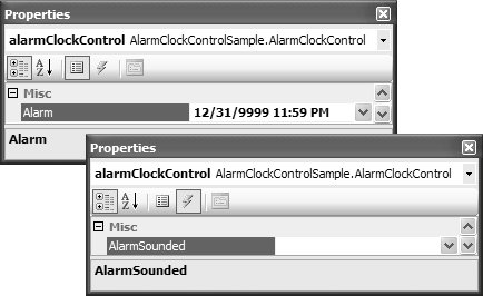
// IDontWantToAppearInTheToolboxComponent.cs [ToolboxBitmap(false)] partial class DontAppearInTheToolboxComponent : Component {...} Passing true to the constructor is the same as not using the DesignTimeVisible attribute at all. Properties Window IntegrationJust as we use an attribute to influence which icon the design time displays in the Toolbox, we can use attributes to influence how properties and events appear. This is worth considering because the defaults can be quite uninformative, as shown in Figure 11.7. Figure 11.7. Default Appearance of Public Properties and Events in the Properties Window For a more informative experience, you can use special design-time attributes to enhance the look and feel of your component in the Properties window, describing and categorizing your properties and events. The System.ComponentModel namespace provides a comprehensive set of attributes, as shown in Table 11.1, that you can use to influence your custom component's behavior within the Properties window as well as its interactions with other design-time features like the Toolbox and the Windows Forms Designer.
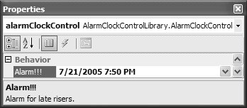
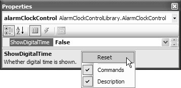
By default, public read-only and read-write propertiessuch as the Alarm property highlighted in Figure 11.7are displayed in the Properties window under the Misc category. If a property is intended for run time only, as Alarm is, you can prevent it from appearing in the Properties window by adorning the property with the Browsable attribute: [Category("Behavior")] public DateTime Alarm { get {...} set {...} }You can use the Description attribute to provide a description for the Properties window to display, thereby improving the situation: [Category("Behavior")] [Description("Alarm for late risers")] public DateTime Alarm { get {...} set {...} }If you really want to, you can even change the property label text in the Properties window; the value of the property label text is the name of the underlying component's property implementation. You can do this by using the DisplayName attribute, which also allows you to use spaces and punctuation characters: [Category("Behavior")] [Description("Alarm for late risers.")] [DisplayName("Alarm!!!")] public DateTime Alarm { get {...} set {...} }After you add these attributes and rebuild, the Alarm property is categorized appropriately and described nicely in the Properties window, as shown in Figure 11.8. Figure 11.8. Alarm Property Augmented with Category, Description, and DisplayName Attributes Note that you can use the Category attribute to create new categories, but you should do so only if the existing categories don't suitably describe a property's purpose. Otherwise, you'll confuse developers who look for your properties in the most intuitive category. In Figure 11.8, some property values are shown in boldface and others are not. Boldface values are those that differ from the property's default value. For example, if we had a property, ShowDigitalTime that allowed us to hide or show the digital time value on the clock face, and if the default value was true, we could use the DefaultValue attribute to specify that it be bolded when false: bool showDigitalTime = true; ... [Category("Appearance")] [Description("Whether digital time is shown")] [DefaultValue(true)] public bool ShowDigitalTime { get {...} set {...} }Using the DefaultValue attribute also allows you to reset a property to its default value using the Properties window, which is available from the property's context menu, as shown in Figure 11.9. Figure 11.9. Resetting a Property to Its Default Value This option is disabled if the current property is already the default value. Default values represent the most common value for a property. Some properties, such as Alarm or Text, simply don't have a default that's possible to define, whereas others, such as Enabled and ControlBox, do. Just like properties, a class can have defaults. You can specify a default event by adorning a class with the DefaultEvent attribute: // AlarmClockControl.cs [DefaultEvent("AlarmSounded")] partial class AlarmClockControl : ScrollableControl {...} Double-clicking the component causes the Windows Forms Designer to automatically hook up the default event; it does this by serializing code to register with the specified event in InitializeComponent and providing a handler for it: // AlarmClockControlHostForm.cs partial class AlarmClockControlHostForm : Form { ... void alarmClockControl_AlarmSounded( object sender, AlarmClockControlLibrary.AlarmSoundedEventArgs e) {...} ... } // AlarmClockControlHostForm.Designer.cs partial class AlarmClockControlHostForm { ... void InitializeComponent() { ... this.alarmClockControl.AlarmSounded += this.alarmClockControl_AlarmSounded; ... } } You can also adorn your component with the DefaultProperty attribute: // AlarmClockControl.cs [DefaultProperty("ShowDigitalTime")] partial class AlarmClockControl : ScrollableControl {...} This attribute causes the Windows Forms Designer to highlight the default property when the component's property is first edited. Default properties aren't terribly useful, but properly setting the correct default event can save a developer's time when using your component. |
EAN: 2147483647
Pages: 216


