USING THE PARAGRAPH PALETTE
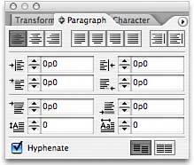
| The Paragraph palette (choose Type, Paragraph to display it) also gives you options for adjusting the appearance of your text, but on a paragraph basis as opposed to individual characters (see Figure 27.6). Figure 27.6. The Paragraph palette.
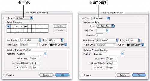
The first set of buttons across the top of the Paragraph palette enables you to choose from left-aligned, centered, or right-aligned text; justified text with the last line left-aligned, centered, or right-aligned; force-justified text, in which all lines are justified regardless of length; and align toward spine or away from spine. The next set of fields deals with indents. Enter specific values to indent your type to the left or right, and left-indent the first line or right-indent the last line. If you want a specific amount of space before or after each paragraph, enter that measurement in the next set of fields. Create a drop cap (an initial letter that drops above or below the baseline a set number of lines) by entering the number of lines you want the first letter of the paragraph to drop or rise. If you prefer, specify the number of characters you want the drop cap to drop above or below the baseline in the last field. Click the Hyphenate check box to hyphenate text automatically based on dictionary settings. Use the buttons in the lower-right portion of the palette to choose to align or not align your text to the baseline grid automatically. In the palette menu, select a composition method. Adobe Paragraph Composer looks at an entire paragraph to help avoid unattractive breaks in text. Adobe Single-Line Composer takes only single lines of type into consideration for appearance and breaks. Based on how you want your text to appear, select Only Align First Line to Grid (ignores grid alignment for subsequent lines of type) or Balance Ragged Lines (when Adobe Paragraph Composer is selected, this balances ragged headlines or pulled quotes when you click in the paragraph you want to balance) from the palette menu. The Justification selection enables you to choose the word spacing, letter spacing, and glyph scaling (the size of individual characters in the font) for justified text. Changing these percentages can help improve the appearance of justified text and minimize the white river effect you sometimes see. Note, however, that adjusting these settings with too-large swings between the maximum and minimum settings can result in characters that are noticeably wider or thinner. The Keep Options entry in the palette menu enables you to set specific lines of type that should stay with the lines that follow or precede themfor example, the last item in a list that you do not want to flow to another page or column. You can set how many lines to keep together, or whether to keep an entire paragraph together, either all of the lines, or a certain number of lines at the beginning and end of the paragraph. You can also choose where to start the paragraph when it does break. The Hyphenation option in the Paragraph palette menu contains specific settings for how words should be hyphenated, and enables you to choose a degree of hyphenation between fewer breaks and better spacing. Paragraph styles, which you explore later in this chapter, can normally be applied only to a specific paragraph, not to individual words or characters. The Drop Caps and Nested Styles selection gives you the ability to set up nested styles, which are applied to only certain characters within the paragraph. For example, if you are creating a directory and want the name to appear in a certain style but all the following information to appear in another style, you can create a nested style for the person's name and set the style to end after the colon that separates the name from the information that follows. Paragraph rules are lines you can specify to always follow or precede a paragraph. Turn them on or off from the Paragraph palette menu. In the Bullets and Numbering dialog (choose Bullets and Numbering from the Paragraph palette menu to display the dialog), choose to create bullets or numbers from the pop-up menu at the top of the dialog. For bullets, select the available glyphs for your font. For numbering, select the numbering style, the separator, and the starting number for a specific font. Both options give you the chance to select your desired position for the bullet or number. You can also select a different font and font size for the bullet or number without changing the font and size of your text (see Figure 27.7). Figure 27.7. Choose the appearance and style of bullets and numbering in the Bullets and Numbering dialog. If you later change your mind about bullets and numbering, you can select Convert Bullets and Numbering to Text from the Paragraph palette menu to change it back to normal text. |
EAN: 2147483647
Pages: 426
- Chapter IV How Consumers Think About Interactive Aspects of Web Advertising
- Chapter VII Objective and Perceived Complexity and Their Impacts on Internet Communication
- Chapter IX Extrinsic Plus Intrinsic Human Factors Influencing the Web Usage
- Chapter XI User Satisfaction with Web Portals: An Empirical Study
- Chapter XII Web Design and E-Commerce
