Building Idioms
When graphical user interfaces were first invented they were so clearly superior that many observers credited the success to the interfaces' graphical nature. This was a natural, but incorrect, assumption. The first GUIs, such as the original Mac, were better primarily because the graphical nature of their interfaces required a restriction of the range of vocabulary by which the user interacted with the system. In particular, the input they could accept from the user went from an unrestricted command line to a tightly restricted set of mouse-based actions. In a command line interface, the user can enter any combination of characters in the language — a virtually infinite number. In order for the user's entry to be correct, he needs to know exactly what the program expects. He must remember the letters and symbols with exacting precision. The sequence can be important, and sometimes even capitalization matters.
In modern GUIs, the user can point to images or words on the screen with the mouse cursor. Most of these choices migrated from the user's head to the screen, eliminating any need to memorize them. Using the buttons on the mouse, the user can click, double-click, or click-and-drag. The keyboard is used for data entry, but not typically for command entry or navigation. The number of atomic elements in the user's input vocabulary has dropped from dozens (if not hundreds) to just three, even though the range of tasks that can be performed by GUI programs isn't any more restricted than that of command-line systems.
The more atomic elements there are in an interaction vocabulary, the more time-consuming and difficult the learning process is. A vocabulary like that of the English language takes at least ten years to learn thoroughly, and its complexity requires constant use to maintain fluency, but it can be extraordinarily expressive for a skilled user. Restricting the number of elements in our interaction vocabulary reduces its expressiveness at the atomic level. However, more complex interactions can be easily built from the atomic ones, much the way that letters combine to form words, and words to form sentences.
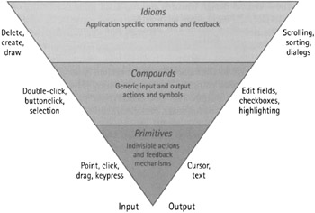
A properly formed interaction vocabulary can be represented by an inverted pyramid. All easy-to-learn communications systems obey the pattern shown in Figure 20-3. The bottom layer contains primitives, the atomic elements of which everything in the language is comprised. In modern GUIs, these primitives consist of pointing, clicking, and dragging.

Figure 20-3: One of the primary reasons that GUIs are easy to use is that they enforce a restricted interaction vocabulary that builds complex idioms from a very small set of primitives: pointing, clicking, and dragging. These primitives can build a larger set of simple compounds, which in turn can be assembled into a wide variety of complex, domain-specific idioms, all of which are based on the same small set of easily learned actions.
The middle layer contains compounds. These are more complex constructs created by combining one or more of the primitives. These include simple visual objects that are acted upon and which reveal state, actions such as double-clicking, click-and-dragging, and manipulable objects like pushbuttons, check boxes, hyperlinks, and direct manipulation handles.
The uppermost layer contains idioms. Idioms combine and structure compounds using domain knowledge of the problem under consideration: information related to the user's work patterns and goals, and not specifically to the computerized solution. The set of idioms opens the vocabulary to information about the particular problem the program is trying to address. In a GUI, it includes things like labeled buttons and fields, navigation bars, list boxes, icons, and even groups of fields and controls, or entire panes and dialogs.
Any language that does not follow this form will be very hard to learn. Many effective communications systems outside of the computer world follow similar vocabularies. Street signs in the United States follow a simple pattern of shapes and colors: Yellow triangles are cautionary, red octagons are imperatives, and green rectangles are informative.
|
|
EAN: N/A
Pages: 263