| Throughout this chapter we've used HTML tables to align form prompts and input fields. Creating table markup by hand is tedious and error prone, so let's see how we can alleviate some of that tediousness with h:panelGrid, which generates an HTML table element. You can specify the number of columns in the table with the columns attribute, like this:
<h:panelGrid columns="3"> ... </h:panelGrid>
The columns attribute is not mandatory if you don't specify it, the number of columns defaults to 1. h:panelGrid places components in columns from left to right and top to bottom. For example, if you have a panel grid with three columns and nine components, you'll wind up with three rows, each containing three columns. If you specify three columns and ten components, you'll have four rows and in the last row only the first column will contain a component the tenth component. Table 4-24 lists h:panelGrid attributes. Table 4-24. Attributes for h:panelGridAttributes | Description |
|---|
bgcolor | Background color for the table | border | Width of the table's border | cellpadding | Padding around table cells | cellspacing | Spacing between table cells | columnClasses | Comma-separated list of CSS classes for columns | columns | Number of columns in the table | footerClass | CSS class for the table footer | frame | Specification for sides of the frame surrounding the table that are to be drawn; valid values: none, above, below, hsides, vsides, lhs, rhs, box, border | headerClass | CSS class for the table header | rowClasses | Comma-separated list of CSS classes for columns | rules | Specification for lines drawn between cells; valid values: groups, rows, columns, all | summary | Summary of the table's purpose and structure used for non-visual feedback such as speech | binding, id, rendered, styleClass, value | Basic attributes[a] | dir, lang, style, title, width | HTML 4.0[b] | onclick, ondblclick, onkeydown, onkeypress, onkeyup, onmousedown, onmousemove, onmouseout, onmouseover, onmouseup | DHTML events[c] |
[a] See Table 4-3 on page 90 for information about basic attributes.
[b] See Table 4-4 on page 93 for information about HTML 4.0 attributes.
[c] See Table 4-5 on page 95 for information about DHTML event attributes.
You can specify CSS classes for different parts of the table: header, footer, rows, and columns. The columnClasses and rowClasses specify lists of CSS classes that are applied to columns and rows, respectively. If those lists contain fewer class names than rows or columns, the CSS classes are reused. That makes it possible to specify classes like this: rowClasses="evenRows, oddRows" and columnClasses="evenColumns, oddColumns". The cellpadding, cellspacing, frame, rules, and summary attributes are HTML pass-through attributes that apply only to tables. See the HTML 4.0 specification for more information. h:panelGrid is often used in conjunction with h:panelGroup, which groups two or more components so they are treated as one. For example, you might group an input field and it's error message, like this:
<h:panelGrid columns="2"> ... <h:panelGroup> <h:inputText value="#{user.name}"> <h:message for="name"/> </h:panelGroup> ... </h:panelGrid>
Grouping the text field and error message puts them in the same table cell. Without that grouping, the error message component would occupy its own cell. In the absence of an error message, the error message component produces no output, but still takes up a cell, so you wind up with an empty cell. h:panelGroup is a simple tag with only a handful of attributes. Those attributes are listed in Table 4-25. Table 4-25. Attributes for h:panelGroupAttributes | Description |
|---|
binding, id, rendered, styleClass | binding, id, rendered, styleClass, value | Style | HTML 4.0[a] |
[a] See Table 4-4 on page 93 for information about HTML 4.0 attributes.
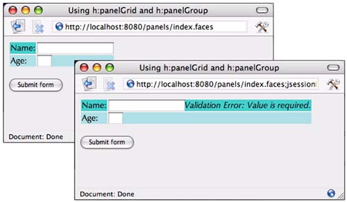
Figure 4-11 shows a simple example that uses h:panelGrid and h:panelGroup. The application contains a form that asks for the user's name and age. We've added a required validator with h:inputText's required attribute to the name field and used an h:message tag to display the corresponding error when that constraint is violated. We've placed no restrictions on the Age text field. Notice that those constraints require three columns in the first row one each for the name prompt, text field, and error message but only two in the second: the age prompt and text field. Since h:panelGrid allows only one value for its columns attribute, we can resolve this column quandary by placing the name text field and error message in a panel group, and because those two components will be treated as one, we actually have only two columns in each row. Figure 4-11. Using h:panelGrid and h:panelGroup 
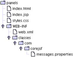
The directory structure for the application shown in Figure 4-11 is shown in Figure 4-12. Listings 4-19 through 4-21 contain the code of the JSF page and related files. Listing 4-19. panels/index.jsp 1. <html> 2. <%@ taglib uri="http://java.sun.com/jsf/core" prefix="f" %> 3. <%@ taglib uri="http://java.sun.com/jsf/html" prefix="h" %> 4. <f:view> 5. <f:loadBundle basename="com.corejsf.messages" var="msgs"/> 6. <head> 7. <link href="styles.css" rel="stylesheet" type="text/css"/> 8. <title> 9. <h:outputText value="#{msgs.windowTitle}"/> 10. </title> 11. </head> 12. 13. <body> 14. <h:form> 15. <h:panelGrid columns="2" rowClasses="oddRows,evenRows"> 16. <h:outputText value="#{msgs.namePrompt}"/> 17. <h:panelGroup> 18. <h:inputText required="true"/> 19. <h:message for="name" error/> 20. </h:panelGroup> 21. <h:outputText value="#{msgs.agePrompt}"/> 22. <h:inputText size="3"/> 23. </h:panelGrid> 24. <br/> 25. <h:commandButton value="#{msgs.submitPrompt}"/> 26. </h:form> 27. </body> 28. </f:view> 29. </html>
Listing 4-20. panels/WEB-INF/classes/com/corejsf/messages.properties 1. windowTitle=Using h:panelGrid and h:panelGroup 2. namePrompt=Name: 3. agePrompt=Age: 4. submitPrompt=Submit form
Listing 4-21. panels/styles.css 1. body { 2. background: #eee; 3. } 4. .errors { 5. font-style: italic; 6. } 7. .evenRows { 8. background: PowderBlue; 9. } 10. .oddRows { 11. background: MediumTurquoise; 12.}
Figure 4-12. Directory Structure for the Panels Example 
|