Understanding and Using Brushes
In the .NET Framework library, brush-related functionality is defined in two namespaces: System.Drawing and System.Drawing.Drawing2D. The System.Drawing namespace defines general brush-related classes and functionality, and the System.Drawing.Drawing2D namespace defines advanced 2D brush-related functionality. For example, the Brush, SolidBrush, TextureBrush, and Brushes classes are defined in the System.Drawing namespace; and the HatchBrush and GradientBrush classes are defined in the System.Drawing.Drawing2D namespace.
Before using brushes, obviously you must include the corresponding namespace to your application. Alternatively, you can use the namespace as a prefix to the class; for example, System.Drawing.Brush represents the Brush class if you do not wish to include the System.Drawing namespace in your application.
The code snippet in Listing 4.1 creates a red SolidBrush object and uses it to draw a rectangle. This code is written on a form's paint event handler. The first line gets the Graphics object of the form, and the second line creates a brush using the SolidBrush class, which later is used to fill a rectangle. The last line disposes of the SolidBrush object.
Listing 4.1 Creating a solid brush
Graphics g = e.Graphics;
SolidBrush redBrush = new SolidBrush(Color.Red);
Rectangle rect = new Rectangle(150, 80, 200, 140);
g.FillRectangle(redBrush, rect);
redBrush.Dispose();
4.1.1 The Brush Class
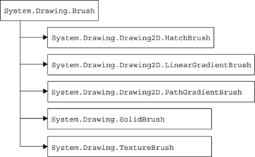
In the .NET Framework library, the Brush class is an abstract base class, which means you cannot create an instance of it without using its derived classes. All usable classes are inherited from the abstract Brush class. Figure 4.1 shows all the Brush-derived classes that can be used in your GDI+ applications.
Figure 4.1. Classes inherited from the Brush class
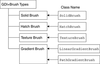
Applications generally call fill methods of the appropriate Graphics class, which in turn use brushes to fill GDI+ objects (such as an ellipse, an arc, or a polygon) with a certain kind of brush. GDI+ provides four different kinds of brushes: solid, hatch, texture, and gradient. Figure 4.2 shows the brush types and their classes.
Figure 4.2. Brush types and their classes
4.1.2 The Brushes Class
The Brushes class is a sealed class (it cannot be inherited). Brushes provides more than 140 static members (properties), and each of these members represents a brush with a particular color (including all the standard colors). For instance, the Brushes.Pink, Brushes.Red, and Brushes.Green members represent Brush objects with the colors pink, red, and green, respectively.
4.1.3 Solid Brushes
A solid brush is a brush that fills an area with a single solid color. We create a SolidBrush object by calling its constructor and passing a Color structure as the only parameter. The Color structure represents a color. It has a static property for every possible color. For example, Color.Red represents the color red. The code snippet in Listing 4.2 creates three SolidBrush objects with three different colors: red, green, and blue.
Listing 4.2 Creating a SolidBrush object
SolidBrush redBrush = new SolidBrush(Color.Red);
SolidBrush greenBrush = new SolidBrush(Color.Green);
SolidBrush blueBrush = new SolidBrush(Color.Blue);
SolidBrush has only one property of interest: Color, which represents the color of the brush.
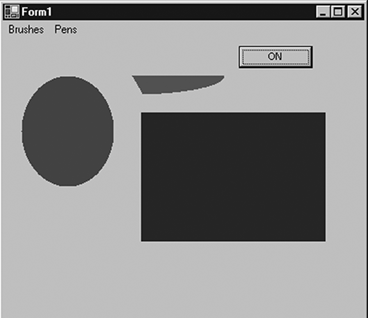
Listing 4.3 uses red, green, and blue solid brushes and fills an ellipse, a pie, and a rectangle using the FillEllipse, FillPie, and FillRectangle methods of the Graphics class, respectively.
Listing 4.3 Using the SolidBrush class
private void Form1_Paint(object sender,
System.Windows.Forms.PaintEventArgs e)
{

 Graphics g = e.Graphics;
 // Create three SolidBrush objects
 // using the colors red, green, and blue
 SolidBrush redBrush = new SolidBrush(Color.Red);
 SolidBrush greenBrush = new SolidBrush(Color.Green);
 SolidBrush blueBrush = new SolidBrush(Color.Blue);
 // Fill ellipse using red brush
 g.FillEllipse(redBrush, 20, 40, 100, 120);
 // Fill rectangle using blue brush
 Rectangle rect = new Rectangle(150, 80, 200, 140);
 g.FillRectangle(blueBrush, rect);
 // Fill pie using green brush
 g.FillPie(greenBrush,
 40, 20, 200, 40, 0.0f, 60.0f );
 // Dispose of objects
 redBrush.Dispose();
 greenBrush.Dispose();
 blueBrush.Dispose();
}
The output of Listing 4.3 draws an ellipse, a rectangle, and a pie, as Figure 4.3 shows.
Figure 4.3. Graphics objects filled by SolidBrush
4.1.4 Hatch Brushes
Hatch brushes are brushes with a hatch style, a foreground color, and a background color. Hatches are a combination of rectangle lines and the area between the lines. The foreground color defines the color of lines; the background color defines the color between lines.
The HatchBrush class constructor takes HatchStyle as its first parameter and Color as the second parameter. Second and third Color parameters represent the foreground and background colors. The following code snippet shows the constructor signatures:
Note
The HatchBrush class is defined in the System.Drawing.Drawing2D namespace. An application needs to provide a reference to System.Drawing.Drawing2D before using this class. Alternatively, an application can refer to the HatchBrush class as System.Drawing.Drawing2D.HatchBrush.
public HatchBrush(HatchStyle, Color);
public HatchBrush(HatchStyle, Color, Color);
The following code creates a hatch brush with a dashed-vertical hatch style, blue background, and red foreground:
HatchBrush hBrush1 = new HatchBrush
(HatchStyle.DashedVertical, Color.Blue, Color.Red);
We can use this hatch brush to fill graphics objects such as rectangles or ellipses. For example, the following code line fills an ellipse using hBrush1:
g.FillEllipse(hBrush1, 20, 40, 100, 120);
HatchBrush has three properties: BackgroundColor, Foreground-Color, and HatchStyle. BackgroundColor returns the color of spaces between the hatch lines, and ForegroundColor represents the color of the hatch lines.
HatchStyle returns the hatch brush style of type HatchStyle enumeration, whose members are described in Table 4.1.
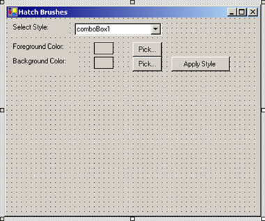
Let's create a Windows application that looks like Figure 4.4. The combo box will list some of the available hatch styles. The Pick... buttons let you select background and foreground colors of the hatch brush, and the Apply Style button creates a hatch brush based on the selection and uses it to draw a rectangle.
Figure 4.4. A sample hatch brush application
First we add one HatchStyle-type and two Color-type class-level variables that represent the current selected hatch style, foreground, and background color of a hatch brush, respectively. These variables are defined as follows:
|
Member |
Description |
|---|---|
|
BackwardDiagonal |
A pattern of lines on a diagonal from upper right to lower left. |
|
Cross |
Horizontal and vertical lines that cross. |
|
DarkDownwardDiagonal |
Diagonal lines that slant to the right from top points to bottom points, are spaced 50 percent closer together than in ForwardDiagonal, and are twice the width of ForwardDiagonal lines. |
|
DarkHorizontal |
Horizontal lines that are spaced 50 percent closer together than in Horizontal and are twice the width of Horizontal lines. |
|
DarkUpwardDiagonal |
Diagonal lines that slant to the left from top points to bottom points, are spaced 50 percent closer together than BackwardDiagonal, and are twice the width of BackwardDiagonal lines. |
|
DarkVertical |
Vertical lines that are spaced 50 percent closer together than Vertical and are twice the width of Vertical lines. |
|
DashedDownwardDiagonal |
Dashed diagonal lines that slant to the right from top points to bottom points. |
|
DashedHorizontal |
Dashed horizontal lines. |
|
DashedUpwardDiagonal |
Dashed diagonal lines that slant to the left from top points to bottom points. |
|
DashedVertical |
Dashed vertical lines. |
|
DiagonalBrick |
A hatch with the appearance of layered bricks that slant to the left from top points to bottom points. |
|
DiagonalCross |
Forward diagonal and backward diagonal lines that cross. |
|
Divot |
A hatch with the appearance of divots. |
|
DottedDiamond |
Forward diagonal and backward diagonal lines, each of which is composed of dots that cross. |
|
DottedGrid |
Horizontal and vertical lines, each of which is composed of dots that cross. |
|
ForwardDiagonal |
A pattern of lines on a diagonal from upper left to lower right. |
|
Horizontal |
A pattern of horizontal lines. |
|
HorizontalBrick |
A hatch with the appearance of horizontally layered bricks. |
|
LargeCheckerBoard |
A hatch with the appearance of a checker-board with squares that are twice the size of SmallCheckerBoard. |
|
LargeConfetti |
A hatch with the appearance of confetti that is composed of larger pieces than SmallConfetti. |
|
LargeGrid |
Horizontal and vertical lines that cross and are spaced 50 percent farther apart than in Cross. |
|
LightDownwardDiagonal |
Diagonal lines that slant to the right from top points to bottom points. |
|
LightHorizontal |
Horizontal lines that are spaced 50 percent closer together than Horizontal lines. |
|
LightUpwardDiagonal |
Diagonal lines that slant to the left from top points to bottom points and are spaced 50 percent closer together than BackwardDiagonal lines. |
|
LightVertical |
Vertical lines that are spaced 50 percent closer together than Vertical lines. |
|
Max |
Hatch style SolidDiamond. |
|
Min |
Hatch style Horizontal. |
|
NarrowHorizontal |
Horizontal lines that are spaced 75 percent closer together than Horizontal lines (or 25 percent closer together than LightHorizontal lines). |
|
NarrowVertical |
Vertical lines that are spaced 75 percent closer together than Vertical lines (or 25 percent closer together than LightVertical lines). |
|
OutlinedDiamond |
Forward diagonal and backward diagonal lines that cross. |
|
PercentXX |
Percent hatch. The "XX" number after "Percent" represents the ratio of foreground color to background color as XX:100. The values of XX are 05, 10, 20, 25, 30, 40, 50, 60, 70, 75, 80, and 90. |
|
Plaid |
A hatch with the appearance of a plaid material. |
|
Shingle |
A hatch with the appearance of diagonally layered shingles that slant to the right from top points to bottom points. |
|
SmallCheckerBoard |
A hatch with the appearance of a checkerboard. |
|
SmallConfetti |
A hatch with the appearance of confetti. |
|
SmallGrid |
Horizontal and vertical lines that cross and are spaced 50 percent closer together than Cross lines. |
|
SolidDiamond |
A hatch with the appearance of a checkerboard placed diagonally. |
|
Sphere |
A hatch with the appearance of spheres laid adjacent to one another. |
|
Trellis |
A hatch with the appearance of a trellis. |
|
Vertical |
A pattern of vertical lines. |
|
Wave |
Horizontal lines that are composed of tildes. |
|
Weave |
A hatch with the appearance of a woven material. |
|
WideDownwardDiagonal |
Diagonal lines that slant to the right from top points to bottom points, have the same spacing as in ForwardDiagonal, and are triple the width of ForwardDiagonal lines. |
|
WideUpwardDiagonal |
Diagonal lines that slant to the left from top points to bottom points, have the same spacing as in BackwardDiagonal, and are triple the width of BackwardDiagonal lines. |
|
ZigZag |
Horizontal lines that are composed of zigzags. |
private HatchStyle style = new HatchStyle();
private Color forClr = Color.Blue;
private Color backClr = Color.Red;
On the form's load event handler (see Listing 4.4), we fill the combo box with different hatch styles and set the background color properties of our two text boxes to the current colors.
Listing 4.4 The form's load event handler
private void Form1_Load(object sender,
 System.EventArgs e)
 {
 // Fill combo box with hatch styles
 FillHatchStyles();
 // Set foreground and background colors
 // of text boxes
 textBox1.BackColor = forClr;
 textBox2.BackColor = backClr;
}
The FillHatchStyles method adds different styles to the combo box (see Listing 4.5). We have added only a few styles; many more are available (see Table 4.1).
Listing 4.5 The FillHatchStyles method
private void FillHatchStyles()
{
 // Add hatch styles
 comboBox1.Items.Add(
 HatchStyle.BackwardDiagonal.ToString());
 comboBox1.Items.Add(
 HatchStyle.Cross.ToString());
 comboBox1.Items.Add(
 HatchStyle.DashedVertical.ToString());
 comboBox1.Items.Add(
 HatchStyle.DiagonalCross.ToString());
 comboBox1.Items.Add(
 HatchStyle.HorizontalBrick.ToString());
 comboBox1.Items.Add(
 HatchStyle.LightDownwardDiagonal.ToString());
 comboBox1.Items.Add(
 HatchStyle.LightUpwardDiagonal.ToString());
 comboBox1.Text =
 HatchStyle.BackwardDiagonal.ToString();
}
The Pick... buttons in our combo box (see Figure 4.4) call the ColorDialog method and save the selected foreground and background colors, respectively. These methods also set the background color of the respective text boxes, as Listing 4.6 shows.
Listing 4.6 The Pick... button click event handler
private void ForeColorBtn_Click(object sender,
 System.EventArgs e)
{
 // Use ColorDialog to select a color
 ColorDialog clrDlg = new ColorDialog();
 if (clrDlg.ShowDialog() == DialogResult.OK)
 {
 // Save color as foreground color,
 // and fill text box with this color
 forClr = clrDlg.Color;
 textBox1.BackColor = forClr;
 }
}
private void BackColorBtn_Click(object sender,
 System.EventArgs e)
{
 // Use ColorDialog to select a color
 ColorDialog clrDlg = new ColorDialog();
 if (clrDlg.ShowDialog() == DialogResult.OK)
 {
 // Save color as background color,
 // and fill text box with this color
 backClr = clrDlg.Color;
 textBox2.BackColor = backClr;
 }
}
The last step is to apply the selected styles and colors, create a hatch brush, and use this brush to draw a rectangle. This is all done on the Apply Style button click event handler, which is shown in Listing 4.7. As you can see from this listing, first we create a HatchStyle object based on the user selection in the combo box. Then we create a HatchBrush object using the hatch style, background, and foreground colors. After that we simply fill a rectangle with the hatch brush.
Listing 4.7 The Apply Style button click event handler
private void ApplyBtn_Click(object sender,
 System.EventArgs e)
{
 // Create a Graphics object
 Graphics g = this.CreateGraphics();
 g.Clear(this.BackColor);
 // Read current style from combo box
 string str = comboBox1.Text;
 // Find out the style and set it as the
 // current style
 switch(str)
 {
 case "BackwardDiagonal":
 style = HatchStyle.BackwardDiagonal;
 break;
 case "DashedVertical":
 style = HatchStyle.DashedVertical;
 break;
 case "Cross":
 style = HatchStyle.Cross;
 break;
 case "DiagonalCross":
 style = HatchStyle.DiagonalCross;
 break;
 case "HorizontalBrick":
 style = HatchStyle.HorizontalBrick;
 break;
 case "LightDownwardDiagonal":
 style = HatchStyle.LightDownwardDiagonal;
 break;
 case "LightUpwardDiagonal":
 style = HatchStyle.LightUpwardDiagonal;
 break;
 default:
 break;
 }
 // Create a hatch brush with selected
 // hatch style and colors
 HatchBrush brush =
 new HatchBrush(style, forClr, backClr);
 // Fill rectangle
 g.FillRectangle(brush, 50, 100, 200, 200);
 // Dispose of objects
 brush.Dispose();
 g.Dispose();
}
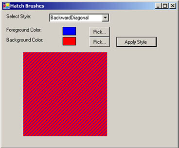
If you compile and run the application and then click the Apply Style button, the default rectangle looks like Figure 4.5.
Figure 4.5. The default hatch style rectangle
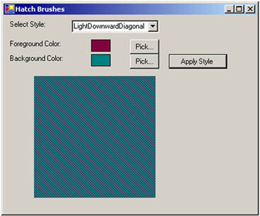
Let's select LightDownwardDiagonal for the hatch style, change the foreground and background colors, and click the Apply Style button. Now the output looks like Figure 4.6.
Figure 4.6. The LightDownwardDiagonal style with different colors
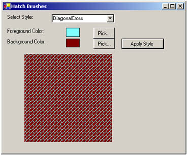
Let's change the hatch style and colors one more time. This time we pick DiagonalCross as our hatch style. Now the output looks like Figure 4.7.
Figure 4.7. The DiagonalCross style
4.1.5 Texture Brushes
Texture brushes allow us to use an image as a brush and fill GDI+ objects with the brush. Texture brushes are useful when you need to fill a graphics object with images in a pattern such as tile. In this section we will discuss how to create and use texture brushes in GDI+.
In the .NET Framework library, the TextureBrush class represents a texture brush. Table 4.2 describes the properties of the TextureBrush class.
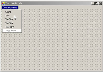
Let's create an application using texture brushes. We create a Windows application. We also add a context menu to the form, along with five context menu items. The final form looks like Figure 4.8.
Figure 4.8. The texture brush application
|
Property |
Description |
|---|---|
|
Image |
Returns the Image object associated with a TextureBrush object. |
|
Transform |
Represents a Matrix object that defines a local geometric transformation for the image. |
|
WrapMode |
Represents a WrapMode enumeration that indicates the wrap mode for a texture brush. |
Note
The WrapMode enumeration represents the wrap mode for a texture brush. It has five members: Clamp, Tile, TileFlipX, TileFlipY, and TileFlipXY. These members are described later, in Table 4.7.
Now we add a class-level variable of TextureBrush type to the application:
private TextureBrush txtrBrush = null;
The next step is to create a texture brush from an image and fill a rectangle with that brush. We create an Image object on the form's load event handler from the file smallRoses.gif, which is used to create a TextureBrush object. On the form's paint event handler, we call the FillRectangle method to fill the rectangle with the texture. Listing 4.8 shows the form's load and paint event handler. Note that our rectangle is the ClientRectangle of the form.
Listing 4.8 Creating a texture brush and filling a rectangle
private void Form1_Load(object sender,
 System.EventArgs e)
{
 // Create an image from a file
 Image img = new Bitmap("smallRoses.gif");
 // Create a texture brush from an image
 txtrBrush = new TextureBrush(img);
 img.Dispose();
}

private void Form1_Paint(object sender,
 System.Windows.Forms.PaintEventArgs e)
{
 Graphics g = e.Graphics;
 // Fill a rectangle with a texture brush
 g.FillRectangle(txtrBrush, ClientRectangle);
}
Note
See Chapter 7 for details on the Image class.
Now we can add event handlers for the context menu items as shown in Listing 4.9. As you can see from this code, we simply set the WrapMode property of the texture brush.
Listing 4.9 TextureBrush's context menu event handlers
private void Clamp_Click(object sender,
 System.EventArgs e)
{
 txtrBrush.WrapMode = WrapMode.Clamp;
 this.Invalidate();
 }

 private void Tile_Click(object sender,
 System.EventArgs e)
 {
 txtrBrush.WrapMode = WrapMode.Tile;
 this.Invalidate();
 }

 private void TileFlipX_Click(object sender,
 System.EventArgs e)
 {
 txtrBrush.WrapMode = WrapMode.TileFlipX;
 this.Invalidate();
 }

 private void TileFlipY_Click(object sender,
 System.EventArgs e)
 {
 txtrBrush.WrapMode = WrapMode.TileFlipY;
 this.Invalidate();
 }

 private void TileFlipXY_Click(object sender,
 System.EventArgs e)
 {
 txtrBrush.WrapMode = WrapMode.TileFlipXY;
 this.Invalidate();
 }
Finally, we need to load the context menu on the right mouse click event handler. As Listing 4.10 shows, we simply set the ContextMenu property of the form.
Listing 4.10 The right mouse button click event handler
 private void Form1_MouseDown(object sender,
 System.Windows.Forms.MouseEventArgs e)
 {
 if(e.Button == MouseButtons.Right)
 {
 this.ContextMenu = contextMenu1;
 }
}
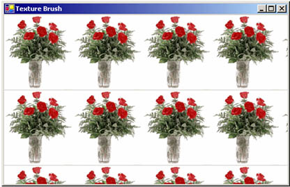
Now let's run the application. Figure 4.9 shows default (tiled) output from the program. The entire client rectangle is filled with the texture.
Figure 4.9. Using texture brushes
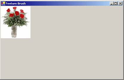
If we right-click on the form and select the Clamp menu item, we get Figure 4.10.
Figure 4.10. Clamping a texture
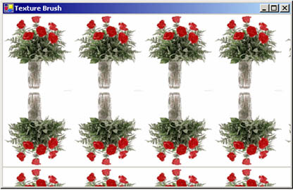
Now let's select the TileFlipY option, which generates Figure 4.11. You can try other options on your own!
Figure 4.11. The TileFlipY texture option
4.1.6 Gradient Brushes
Linear gradient brushes allow you to blend two colors together, generating an indefinite range of shades. The Blend class defines a custom falloff for the gradient.
Note
Chapter 9 discusses the Blend class and alpha blending in more detail.
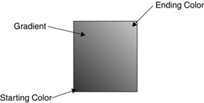
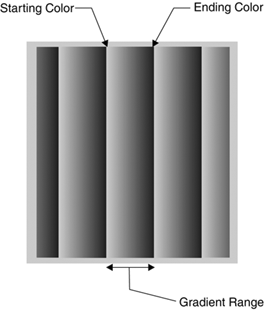
In a gradient, we begin with a starting color and shift to an ending color, with gradual blending in the space between them. In addition to the starting and ending colors, we can specify the direction of the gradient. For example, Figure 4.12 starts with green in the left bottom corner and ends with red in the top right corner. (You may not notice these colors exactly in a black-and-white image.)
Figure 4.12. A color gradient
You can also specify a range for pattern repetition. For example, you can specify that the gradient will occur from point (0, 0) to point (20, 20) and after that will repeat the same pattern, as in Figure 4.13.
Figure 4.13. A gradient pattern with pattern repetition
4.1.6.1 Linear Gradient Brushes
The LinearGradientBrush class has eight forms of overloaded constructors. Each constructor takes a starting point, an ending point, and two gradient colors. The orientation and linear gradient mode are optional.
The following code snippet creates a linear gradient brush using the colors red and green:
Rectangle rect1 = new Rectangle(20, 20, 50, 50);
LinearGradientBrush lgBrush = new LinearGradientBrush
 (rect1, Color.Red, Color.Green, LinearGradientMode.Horizontal);
Here the mode parameter is represented by the LinearGradientMode enumeration, which specifies the direction of a linear gradient. The members of the LinearGradientMode enumeration are described in Table 4.3.
Now let's look at the properties and methods of the LinearGradient-Brush class, which are defined in Tables 4.4 and 4.5, respectively.
Note
Chapters 9 and 10 discuss blending and transformation, respectively, in more detail.
4.1.6.2 Linear Gradient Brushes Example
Now let's create an application that uses linear gradient brushes. We create a Windows application, add three label controls, a combo box, two text boxes, four buttons, and two check boxes. We also change the Text property and other properties of these controls. The final form looks like Figure 4.14.
Figure 4.14. Our linear gradient brush application
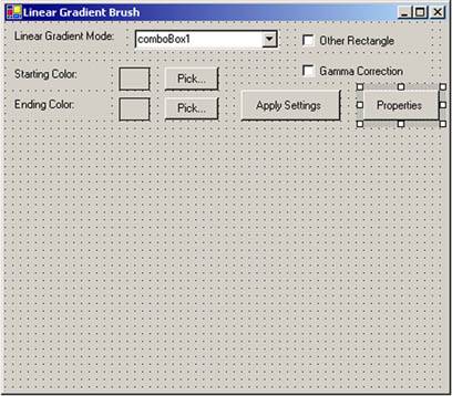
The combo box will list the linear gradient modes. The Pick... buttons allow the user to pick starting and ending colors for the gradient process. The Other Rectangle check box uses a rectangle to specify the range of the gradient. We will discuss the Gamma Correction and Properties options later in this section.
|
Member |
Description |
|---|---|
|
BackwardDiagonal |
Specifies a gradient from upper right to lower left. |
|
ForwardDiagonal |
Specifies a gradient from upper left to lower right. |
|
Horizontal |
Specifies a gradient from left to right. |
|
Vertical |
Specifies a gradient from top to bottom. |
|
Property |
Description |
|---|---|
|
Blend |
Represents the Blend object that specifies gradient position and factors. |
|
GammaCorrection |
Represents gamma correction. If it is enabled, the value is true; if not, it is false. |
|
InterpolationColors |
Represents a ColorBlend object that defines a multicolor gradient. |
|
LinearColors |
Represents the starting and ending colors of a gradient. |
|
Rectangle |
Returns a rectangle that defines the starting and ending points of a gradient. |
|
Transform |
Represents a Matrix object that defines the transformation. |
|
WrapMode |
Represents a WrapMode enumeration that indicates the wrap mode. |
|
Method |
Description |
|---|---|
|
MultiplyTransform |
Multiplies a Matrix object that represents the transformation. |
|
ResetTransform |
Resets the Transform property to identity. |
|
RotateTransform |
Rotates the transformation. |
|
ScaleTransform |
Scales the transformation. |
|
SetSigmaBellShape |
Creates a gradient falloff based on a bell-shaped curve. |
|
TranslateTransform |
Translates the transformation by the specified dimensions. |
Next we add some class-level variables as follows:
private LinearGradientBrush lgBrush = null;
private LinearGradientMode mode =
 new LinearGradientMode();
private Color startColor = Color.Red;
private Color endColor = Color.Green;
After defining the variables, we add the code from Listing 4.11 on the form's load event handler. As the code shows, we add all gradient modes on the AddGradientMode method. We also set the default background color of text boxes.
Listing 4.11 Adding available linear gradient modes
private void Form1_Load(object sender,
System.EventArgs e)
{
 AddGradientMode();
 textBox1.BackColor = startColor;
 textBox2.BackColor = endColor;
}
private void AddGradientMode()
{
 // Adds linear gradient mode styles to the
 // combo box
 comboBox1.Items.Add(
 LinearGradientMode.BackwardDiagonal);
 comboBox1.Items.Add(
 LinearGradientMode.ForwardDiagonal);
 comboBox1.Items.Add(LinearGradientMode.Horizontal);
 comboBox1.Items.Add(LinearGradientMode.Vertical);
 comboBox1.Text =
 LinearGradientMode.BackwardDiagonal.ToString();
}
Next we add code for the Pick... buttons, which allow the user to provide color selections for the starting and ending colors. We also set the color of relative text boxes, as shown in Listing 4.12.
Listing 4.12 The Pick... button click event handler
private void StartClrBtn_Click(object sender,
 System.EventArgs e)
{
 // Use ColorDialog to select a color
 ColorDialog clrDlg = new ColorDialog();
 if (clrDlg.ShowDialog() == DialogResult.OK)
 {
 // Save color as foreground color,
 // and fill text box with this color
 startColor = clrDlg.Color;
 textBox1.BackColor = startColor;
 }
 }

 private void EndClrBtn_Click(object sender,
 System.EventArgs e)
 {
 // Use ColorDialog to select a color
 ColorDialog clrDlg = new ColorDialog();
 if (clrDlg.ShowDialog() == DialogResult.OK)
 {
 // Save color as background color,
 // and fill text box with this color
 endColor = clrDlg.Color;
 textBox2.BackColor = endColor;
 }
}
The last step is to write code for the Apply Settings button. This button reads various settings, including the selected gradient mode in the combo box, the starting and ending colors, another rectangle, and gamma correction. As Listing 4.13 shows, the code creates a linear gradient brush using a rectangle, two colors, and the gradient mode selection. After creating the brush, it calls the FillRectangle method.
Listing 4.13 The Apply Settings button click event handler
private void ApplyBtn_Click(object sender,
 System.EventArgs e)
{
 Graphics g = this.CreateGraphics();
 g.Clear(this.BackColor);
 // Read current style from combo box
 string str = comboBox1.Text;
 // Find out the mode and set it as the
 // current mode
 switch(str)
 {
 case "BackwardDiagonal":
 mode = LinearGradientMode.BackwardDiagonal;
 break;
 case "ForwardDiagonal":
 mode = LinearGradientMode.ForwardDiagonal;
 break;
 case "Horizontal":
 mode = LinearGradientMode.Horizontal;
 break;
 case "Vertical":
 mode = LinearGradientMode.Vertical;
 break;
 default:
 break;
 }
 // Create rectangle
 Rectangle rect = new Rectangle(50, 140, 200, 220);

 // Create linear gradient brush and set mode
 if(checkBox1.Checked)
 {
 Rectangle rect1 = new Rectangle(20, 20, 50, 50);
 lgBrush = new LinearGradientBrush
 (rect1, startColor, endColor, mode);
 }
 else
 {
 lgBrush = new LinearGradientBrush
 (rect, startColor, endColor, mode);
 }
 // Gamma correction check box is checked
 if(checkBox1.Checked)
 {
 lgBrush.GammaCorrection = true;
 }

 // Fill rectangle
 g.FillRectangle(lgBrush, rect);
 // Dispose of objects
 if(lgBrush != null)
 lgBrush.Dispose();
 g.Dispose();
}
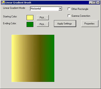
When you run the application, the result looks like Figure 4.15.
Figure 4.15. The default linear gradient brush output
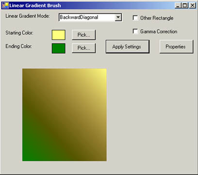
To generate a different output, let's change the linear gradient mode to Vertical. We'll also change the colors, with the results shown in Figure 4.16.
Figure 4.16. The Vertical linear gradient mode
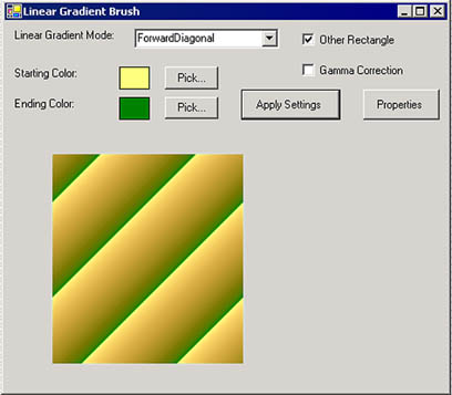
Let's change the colors and gradient mode again, this time selecting the Other Rectangle check box. This option sets a range of the gradient. If the output is out of range, the gradient repeats itself. The new output looks like Figure 4.17.
Figure 4.17. Using a rectangle in a linear gradient brush
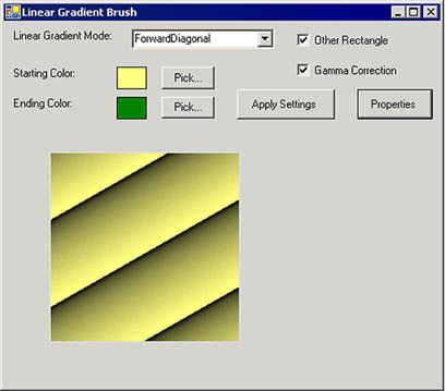
You can also use the LinearGradientBrush class properties and methods to change brush properties programmatically. Listing 4.14 creates a linear gradient brush from two points (starting point and ending point), and sets the LinearColors and GammaCorrection properties. The correction provides more uniform intensity in the gradient. We write this code on the Properties button click event handler.
Listing 4.14 Using the LinearColors and GammaCorrection properties of LinearGradientBrush
private void button1_Click(object sender,
 System.EventArgs e)
{
 Graphics g = this.CreateGraphics();
 // Create points
 Point pt1 = new Point(40, 30);
 Point pt2 = new Point(80, 100);
 Color [] lnColors = {Color.Black, Color.Red};
 // Create a linear gradient brush
 LinearGradientBrush lgBrush = new LinearGradientBrush
 (pt1, pt2, Color.Red, Color.Green);
 // Set linear colors and gamma correction
 lgBrush.LinearColors = lnColors;
 lgBrush.GammaCorrection = true;
 // Draw rectangle
 g.FillRectangle(lgBrush, 50, 140, 200, 200);
 // Dispose of objects
 lgBrush.Dispose();
 g.Dispose();
}
Figure 4.18 shows the output from the Properties button click.
Figure 4.18. Using LinearGradientBrush properties
4.1.6.3 Path Gradient Brushes
A graphics path is a collection of lines and curves. In GDI+, the PathGradientBrush object fills a graphics paths with a gradient. Like LinearGradientBrush, PathGradientBrush is a combination of two colors, but instead of starting with one color and ending with another, PathGradientBrush starts from the center of a graphics path and ends at the outside boundary of the path. In between, you can apply blend factors, positions, and style effects using the PathGradientBrush class members.
Table 4.6 describes the properties of the PathGradientBrush class.
Table 4.7 describes the members of the WrapMode enumeration.
Like LinearGradientBrush, PathGradientBrush has five transformation methods: MultiplyTransform, ResetTransform, RotateTransform, ScaleTransform, and TranslateTransform.
This class also has the methods SetBlendTriangularShape and SetSigmaBellShape. SetBlendTriangularShape creates a gradient with a center color and a linear falloff to one surrounding color. SetSigmaBellShape creates a gradient falloff between the center color and the first surrounding color according to a bell-shaped curve.
We will discuss PathGradientBrush, its properties, and its methods in more detail in Chapter 9 (Section 9.5).
|
Property |
Description |
|---|---|
|
Blend |
A Blend object specifies the positions and factors that define a custom falloff point for a gradient. The Blend property takes a Blend object. |
|
CenterColor |
The center color of the path gradient. |
|
CenterPoint |
The center point of the path gradient. |
|
FocusScales |
The focus point for the gradient falloff. |
|
InterpolationColors |
A ColorBlend object defines a multicolor linear gradient, and this property can be used to set a ColorBlend object for the brush. |
|
Rectangle |
Represents a bounding rectangle for the brush. Outside of this boundary, the brush pattern repeats itself. |
|
SurroundColors |
Defines an array of colors for an array of points in the path. |
|
Transform |
Specifies a transformation matrix. |
|
WrapMode |
Defines how a texture or gradient is tiled when it is larger than the area being filled, using a WrapMode enumeration. |
|
Member |
Description |
|---|---|
|
Clamp |
Clamps the texture or gradient to the object boundary. |
|
Tile |
Tiles the gradient or texture. |
|
TileFlipX |
Reverses the texture or gradient horizontally and then tiles it. |
|
TileFlipXY |
Reverses the texture or gradient horizontally and vertically and then tiles it. |
|
TileFlipY |
Reverses the texture or gradient vertically and then tiles it. |
GDI+: The Next-Generation Graphics Interface
- GDI+: The Next-Generation Graphics Interface
- Understanding GDI+
- Exploring GDI+ Functionality
- GDI+ from a GDI Perspective
- GDI+ Namespaces and Classes in .NET
- Summary
Your First GDI+ Application
- Your First GDI+ Application
- Drawing Surfaces
- The Coordinate System
- Tutorial: Your First GDI+ Application
- Some Basic GDI+ Objects
The Graphics Class
- The Graphics Class
- Graphics Class Properties
- Graphics Class Methods
- The GDI+Painter Application
- Drawing a Pie Chart
Working with Brushes and Pens
- Working with Brushes and Pens
- Understanding and Using Brushes
- Using Pens in GDI+
- Transformation with Pens
- Transformation with Brushes
- System Pens and System Brushes
- A Real-World Example: Adding Colors, Pens, and Brushes to the GDI+Painter Application
Colors, Fonts, and Text
- Colors, Fonts, and Text
- Accessing the Graphics Object
- Working with Colors
- Working with Fonts
- Working with Text and Strings
- Rendering Text with Quality and Performance
- Advanced Typography
- A Simple Text Editor
- Transforming Text
Rectangles and Regions
- Rectangles and Regions
- The Rectangle Structure
- The Region Class
- Regions and Clipping
- Clipping Regions Example
- Regions, Nonrectangular Forms, and Controls
Working with Images
- Working with Images
- Raster and Vector Images
- Working with Images
- Manipulating Images
- Playing Animations in GDI+
- Working with Bitmaps
- Working with Icons
- Skewing Images
- Drawing Transparent Graphics Objects
- Viewing Multiple Images
- Using a Picture Box to View Images
- Saving Images with Different Sizes
Advanced Imaging
- Advanced Imaging
- Rendering Partial Bitmaps
- Working with Metafiles
- Color Mapping Using Color Objects
- Image Attributes and the ImageAttributes Class
- Encoder Parameters and Image Formats
Advanced 2D Graphics
- Advanced 2D Graphics
- Line Caps and Line Styles
- Understanding and Using Graphics Paths
- Graphics Containers
- Reading Metadata of Images
- Blending Explained
- Alpha Blending
- Miscellaneous Advanced 2D Topics
Transformation
- Transformation
- Coordinate Systems
- Transformation Types
- The Matrix Class and Transformation
- The Graphics Class and Transformation
- Global, Local, and Composite Transformations
- Image Transformation
- Color Transformation and the Color Matrix
- Matrix Operations in Image Processing
- Text Transformation
- The Significance of Transformation Order
Printing
- Printing
- A Brief History of Printing with Microsoft Windows
- Overview of the Printing Process
- Your First Printing Application
- Printer Settings
- The PrintDocument and Print Events
- Printing Text
- Printing Graphics
- Print Dialogs
- Customizing Page Settings
- Printing Multiple Pages
- Marginal Printing: A Caution
- Getting into the Details: Custom Controlling and the Print Controller
Developing GDI+ Web Applications
- Developing GDI+ Web Applications
- Creating Your First ASP.NET Web Application
- Your First Graphics Web Application
- Drawing Simple Graphics
- Drawing Images on the Web
- Drawing a Line Chart
- Drawing a Pie Chart
GDI+ Best Practices and Performance Techniques
- GDI+ Best Practices and Performance Techniques
- Understanding the Rendering Process
- Double Buffering and Flicker-Free Drawing
- Understanding the SetStyle Method
- The Quality and Performance of Drawing
GDI Interoperability
Miscellaneous GDI+ Examples
- Miscellaneous GDI+ Examples
- Designing Interactive GUI Applications
- Drawing Shaped Forms and Windows Controls
- Adding Copyright Information to a Drawn Image
- Reading and Writing Images to and from a Stream or Database
- Creating Owner-Drawn List Controls
Appendix A. Exception Handling in .NET
- Chapter V Consumer Complaint Behavior in the Online Environment
- Chapter VII Objective and Perceived Complexity and Their Impacts on Internet Communication
- Chapter X Converting Browsers to Buyers: Key Considerations in Designing Business-to-Consumer Web Sites
- Chapter XI User Satisfaction with Web Portals: An Empirical Study
- Chapter XVIII Web Systems Design, Litigation, and Online Consumer Behavior
