11.2 The JScrollPane Class
| The JScrollPane class offers a more flexible version of the ScrollPane class found in the AWT package. Beyond the automatic scrollbars, you can put in horizontal and vertical headers as well as active components in the corners of your pane. (Figure 11-6 shows the exact areas available in a JScrollPane, which is managed by the ScrollPaneLayout class.) Many Swing components use JScrollPane to handle their scrolling. The JList component, for example, does not handle scrolling on its own. Instead, it concentrates on presenting the list and making selection easy, assuming you'll put it inside a JScrollPane if you need scrolling. Figure 11-3 shows a simple JScrollPane in action with a JList object. Figure 11-3. JScrollPane showing two portions of a list that is too long for one screen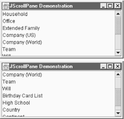 This particular example does not take advantage of the row or column headers. The scrollpane adds the scrollbars automatically, but only "as needed." If we were to resize the window to make it much larger, the scrollbars would become inactive. Here's the code that builds this pane: // ScrollList.java // A simple JScrollPane // import javax.swing.*; import java.awt.*; public class ScrollList extends JFrame { JScrollPane scrollpane; public ScrollList( ) { super("JScrollPane Demonstration"); setSize(300, 200); setDefaultCloseOperation(EXIT_ON_CLOSE); String categories[] = { "Household", "Office", "Extended Family", "Company (US)", "Company (World)", "Team", "Will", "Birthday Card List", "High School", "Country", "Continent", "Planet" }; JList list = new JList(categories); scrollpane = new JScrollPane(list); getContentPane( ).add(scrollpane, BorderLayout.CENTER); } public static void main(String args[]) { ScrollList sl = new ScrollList( ); sl.setVisible(true); } } A similar technique can be used with many of the Swing components, including JPanel, JTree, JTable, and JTextArea. Chapter 15 discusses the JTable class and its particular use of JScrollPane. While you will certainly use JScrollPane with many of the Swing components, you can also build your own components and drop them into a scrollable area. You may bundle up a piece of your user interface into one panel and make that panel scrollable. Here's a short example that takes the items from our previous list and turns them into a basic census form. As you can see in Figure 11-4, the form itself is a panel with a size of 600 x 400 pixels. We display it inside a JScrollPane and make the application 300 x 200. Figure 11-4. A JScrollPane with a component larger than the application window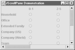 The only change from our first program is that we now have to build the census panel from scratch. We build a JPanel containing various labels and radio buttons, and slap it into a JScrollPane. The only logic involved is figuring out whether we're adding a label or a button, and getting the buttons into appropriate ButtonGroups (one group per row). // ScrollDemo.java // A simple JScrollPane demonstration // import javax.swing.*; import java.awt.*; import java.awt.event.*; public class ScrollDemo extends JFrame { JScrollPane scrollpane; public ScrollDemo( ) { super("JScrollPane Demonstration"); setSize(300, 200); setDefaultCloseOperation(EXIT_ON_CLOSE); init( ); setVisible(true); } public void init( ) { JRadioButton form[][] = new JRadioButton[12][5]; String counts[] = { "", "0-1", "2-5", "6-10", "11-100", "101+" }; String categories[] = { "Household", "Office", "Extended Family", "Company (US)", "Company (World)", "Team", "Will", "Birthday Card List", "High School", "Country", "Continent", "Planet" }; JPanel p = new JPanel( ); p.setSize(600, 400); p.setLayout(new GridLayout(13, 6, 10, 0)); for (int row = 0; row < 13; row++) { ButtonGroup bg = new ButtonGroup( ); for (int col = 0; col < 6; col++) { if (row == 0) { p.add(new JLabel(counts[col])); } else { if (col == 0) { p.add(new JLabel(categories[row - 1])); } else { form[row - 1][col - 1] = new JRadioButton( ); bg.add(form[row -1][col - 1]); p.add(form[row -1][col - 1]); } } } } scrollpane = new JScrollPane(p); getContentPane( ).add(scrollpane, BorderLayout.CENTER); } public static void main(String args[]) { new ScrollDemo( ); } } 11.2.1 PropertiesTable 11-3 shows how the JScrollPane properties grant you access to the five main components (not the corners) and the scrollbar policies. The valid values for horizontalScrollBarPolicy and verticalScrollBarPolicy are defined in the ScrollPaneConstants interface (see Table 11-8). The validateRoot property is always true to ensure that revalidation calls to any of the pane's descendants cause the scrollpane and all of its descendants to be validated, and that revalidation doesn't go any further than the JScrollPane, which would be redundant. The wheelScrollingEnabled property, added in SDK 1.4, allows you to enable or disable support for mice with a middle-wheel button.
Given that you already have a viewport set up for the row and column headers, or the main viewport itself, you can use the columnHeaderView , rowHeaderView, and viewportView properties to modify the contents of these viewports. Note that the set accessors for these properties don't create new viewport objects; they simply set the view to display the given component. 11.2.2 Constructors
11.2.3 Pane Component Methods
11.2.4 Headers and CornersNeither of the previous examples took advantage of the additional features provided by JScrollPane over the AWT ScrollPane class. You can add headers to your scrolling panes and even put active components in the corners. Figure 11-5 shows an expanded example of our census program with headers and an "Information" button in the upper-left corner. Figure 11-5. A JScrollPane with a button in the upper-left corner that opens a pop up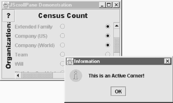 The code to add to the init( ) method for our demo is straightforward: // Add in some JViewports for the column and row headers. JViewport jv1 = new JViewport( ); jv1.setView(new JLabel(new ImageIcon("columnlabel.gif"))); scrollpane.setColumnHeader(jv1); JViewport jv2 = new JViewport( ); jv2.setView(new JLabel(new ImageIcon("rowlabel.gif"))); scrollpane.setRowHeader(jv2); // And throw in an information button JButton jb1 = new JButton(new ImageIcon("question.gif")); jb1.addActionListener(new ActionListener( ) { public void actionPerformed(ActionEvent ae) { JOptionPane.showMessageDialog(null, "This is an Active Corner!", "Information", JOptionPane.INFORMATION_MESSAGE); } } ); scrollpane.setCorner(ScrollPaneConstants.UPPER_LEFT_CORNER, jb1); We use a JLabel inside a JViewport for each header. The viewport in the headers allows the JScrollPane to synchronize header scrolling with the main viewport. We'll look at the JViewport class in more detail later in this chapter. When you set up corner components, remember that if your scrollbars are on an as-needed basis, your corners could disappear. In our example, if we moved the information button to the upper-right corner and then made the window tall enough to contain the entire census form, the vertical scrollbar would disappear, and so would the Information button. You can alleviate this problem by setting the appropriate scrollbar policy to "always." That way, your corners stick around even when the scrollbars are not active. 11.2.5 The Scrollable InterfaceYou may have noticed that several Swing components rely on JScrollPane to do the scrolling work for them. Most of those components, like JList, seem to use the scrollpane intelligently. That's not by accident. These components implement the Scrollable interface. This interface defines five methods that a component can implement to get a natural effect out of the scrollpane. By "natural" we mean that things like the line and page increments behave the way you would expect. A component does not need to implement Scrollable to be scrollable. Anything you add to a JScrollPane scrolls properly. The Scrollable interface merely provides some intelligence to make scrolling more convenient. 11.2.5.1 Increment methods
11.2.5.2 Viewport dimension methodsThe other methods of the interface dictate the relation between the visible area of the scrollable component and the viewport it is displayed in:
11.2.5.3 The JScrollPane.ScrollBar class
11.2.6 The ScrollPaneLayout ClassThe JScrollPane class is actually just a panel with a hard-working layout manager and some convenient access methods for the manager. While you probably will not use this class on its own, the ScrollPaneLayout class is the manager that provides layout control for the nine areas of a JScrollPane object:
These nine components are laid out as shown in Figure 11-6. Figure 11-6. The layout areas managed by ScrollPaneLayout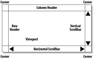 The column headers and scrollbars behave like the four compass positions (North, South, East, and West) of a BorderLayout-managed panel. The vertical components are as wide as they need to be and as tall as the viewport. The horizontal components are as tall as they need to be and as wide as the viewport. The difference from the BorderLayout-managed panels is that the ScrollPaneLayout panels have four corners. Each corner can be a regular component (or blank). The corners appear based on the visibility of the headers and scrollbars. For example, if both of the scrollbars are visible, the lower-right corner component would be available. The valid values for these positions are defined in the ScrollPaneConstants interface (see Table 11-4).
The ScrollPaneLayout class also contains several methods for manipulating the scrollbars associated with the viewport (via JScrollPane's properties; see Table 11-1). Both the horizontal and vertical scrollbars have policies that determine when (and if) they show up. You can set and retrieve the scrollbar policies using these methods with constants defined in the ScrollPaneConstants interface listed in Table 11-5.
11.2.6.1 PropertiesThis layout manager treats the various components as properties, with the usual property access methods. However, since ScrollPaneLayout is really just a layout manager, you don't set the components, you add them to the JScrollPane. Table 11-6 shows the components managed by a ScrollPaneLayout.
The columnHeader , rowHeader, and viewport components are all of type JViewport. (We will look at that class in the next section, but basically, it provides easy access for placing a viewable rectangle over a component.) If the entire component fits in the rectangle, you can see all of the component. If not, the parts outside the rectangle are cropped. The corner property is indexed using constant values from Table 11-4. As with other layout managers, you rarely add or remove components directly through the manager; that task is handled by the container. As you saw earlier, the JScrollPane class contains the methods necessary to add or replace any of these nine components. It also contains methods to retrieve these components, but the retrieval methods are provided through the layout manager, too, for convenience.
11.2.7 JViewportYou use the JViewport class to create a view of a potentially large component in a potentially small place. We say "potentially" because the view can encompass the entire component or just a piece of it. In the JScrollPane class, a viewport is used to show a piece of the main component, and the scrollbars provide the user with control over which piece they see. JViewport accomplishes this using the normal clipping techniques, but it guarantees that an appropriately sized view of the component is displayed. The JScrollPane class also uses JViewport objects for the row and column headers. Most of the time, you'll leave JViewport alone and use one of the other panes, like JScrollPane, to display your components. However, nothing prevents you from using JViewport objects, and you can certainly subclass this to create some interesting tools, such as an image magnifier pane. In such a pane, you'd still have to write the magnifying code JViewport would just make it easy to see pieces of a magnified image. (The discussion of the new SpringLayout manager later in this chapter does show an example of using a JViewport on its own.) 11.2.7.1 PropertiesThe JViewport class has the properties shown in Table 11-7. The useful properties of JViewport deal with the view component. The view property lets you get or set the component this viewport is viewing. viewSize and viewPosition control the size and position of the area that's displayed. viewSize is normally equal to the size of the viewport, unless the component is smaller than the viewport. In that case, viewSize equals the component's size, and all of it is displayed. viewPosition is relative to the top-left corner of the component being displayed. If the backingStoreEnabled property is true, this JViewport object double-buffers the display of its contents. The isOptimizedDraw-ingEnabled( ) call always returns false to force the viewport's paint( ) method to be called, rather than allowing repaint calls to notify the viewport's children individually.
The scrollMode property can also affect repaint performance. The constants for valid scrolling modes are shown in Table 11-8.
11.2.7.2 EventsThe JViewport class fires a ChangeEvent whenever the view size, view position, or extent size changes.
11.2.7.3 Constructor
11.2.7.4 Useful methods
11.2.8 The ViewportLayout ClassAs with the ScrollPaneLayout class, this class is meant to be used with a JViewport object, not for general use. That is to say, rather than attach this layout manager to your container, you should simply use a JViewport for your container. (Recall that you can place any component such as a JPanel within the viewport area.) ViewportLayout is a straightforward implementation of the AWT LayoutManager interface and keeps the view in a useful position during resizing. |
EAN: 2147483647
Pages: 289