Recipe 3.2. Creating a Color Scheme
ProblemYou need to select colors for your site's background, text, links, and other elements. SolutionChoosing a color scheme for a site might be the most subjective task confronting a web designer. Of the nearly infinite number of color combinations at your disposal, there are certainly more than a few right ones for your site, as well as many wrong ones. Choosing the right colors can have a big impact on how your site is received by visitors, while the wrong combination can just as easily repel them. But differentiating right from wrong has less to do with opting for, say, a shade of light purple over a shade of light green, than it has to do with choosing a palette of colors that supports your design and the goals of your site. With that in mind, follow this checklist when developing a color scheme for your site:
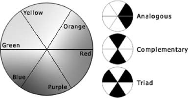
DiscussionCreating a color scheme requires some familiarity with how colors relate to one another, practice, and a bit of experimentation. By learning a few tricks, you'll be able to whip up beautiful, professional color schemes at a moment's notice. Don't rely on small swatches to make your color decisions, though. Mock up some text on a sample web page and take your color choices for a test drive. First, use a color wheel or color picker, such as the one in Photoshop, to experiment. A color wheel displays the red-to-violet rainbow of colors wrapped back on itself in a circle. Points on the circle identify colors that harmonize with each other (see Figure 3-3). Analogous colors, like blue and teal, lie next to each other on the wheel and can work together in a low-contrast, understated scheme. Complementary colors at opposite sides of the wheelsuch as purple and greencombine in more dramatic schemes. Even richer color combinations can be found by combining color triads from three points of a equilateral triangle on the wheel. If you don't know where to start on the color wheel, take a favorite image (or the site's logo), optimize it as a JPEG or GIF, and zoom in on it until you can see individual pixels. Adjacent pixels are usually complementary colors. Figure 3-3. Points on a color wheel identify color combinations that go together When you've exercised on the color wheel long enough, step away from your computer and pay attention to your surroundings. Mother Nature is the supreme color expert. A walk in the outdoors can reveal surprisingly obvious color combinations that work well on a web site, too. Everyday objects also can be a source of inspiration. Keep a clipping file of color schemes you find attractive, whether it's a cereal box or conversion van artwork. Take note of how the notable color schemes you collect complement their subject and affect your emotions. See AlsoOther design considerations are covered in Recipes 3.1 and 4.3. There are several addictive point-and-click online tools for mixing and matching colors from a color wheel, including the Webmaster's Color Laboratory (http://www.visibone.com/colorlab/), ColorWhore (http://www.colorwhore.com/), and the Color schemes generator 2 (http://wellstyled.com/tools/colorscheme2/index-en.html). |
EAN: 2147483647
Pages: 144