Image Composition
| |
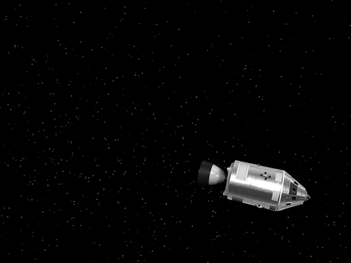
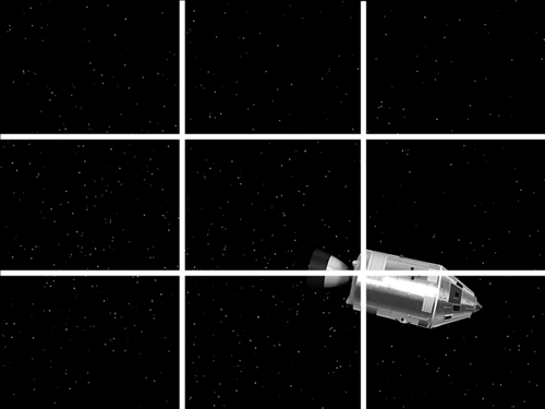
| A key part of framing your shots is image composition ”the placement of the subject and its surroundings within the image's rectangular frame. Another element of composition is how you use color and contrast to direct the viewer's eye. Areas of similar colors, or similar brightness, with low contrast are de- emphasized in relation to other areas of the composition. Brightness and ContrastIn general, you want your images to run the gamut from very white to very black, but you might choose a washed-out (the darkest dark is medium gray) or underexposed (the brightest bright is medium gray) look. However, usually you want to have some areas of your image remain quite dark and others more fully illuminated so that the image doesn't look dull or washed out. Contrast can be used to focus the viewer's attention. Low-contrast areas of a composition (for example, a large unadorned beige wall that dominates one part of the frame) are often more bland and uninteresting than high-contrast areas (such as a shiny red car with black tires). However, in general you should avoid making your entire composition high contrast and busy; it can detract from the composition's focus and look harsh . With 3D, the usual danger is a washed-out appearance (see Figure 1.4). To avoid this, take care not to overlight your scenes, and be sparing about ambient light (a type of light in Maya that shines on all surfaces at all times). Work up from darkness , adding many local lights of low strength to bring out the areas of interest. You should almost always apply some amount of falloff ( decreasing the light's intensity) to any point lights, the type that shine in all directions. Otherwise, each light is like a sun, in which the intensity seems not to diminish at any distance. Figure 1.4. Brightness and contrast: The leftmost image has areas of nearly maximum and minimum brightness, the middle image is overlit, and the right image is underlit. Lighting in 3D is completely different from lighting in the physical world. The tiniest lightbulb creates trillions of photons that scatter throughout the environment, reflecting color and light in all directions. Any simulation of natural light would be too intensive for current computers. Instead, simple mathematical simulations of light sources that do not scatter are used. In the real world, the sunlight shining through a window lights a darkened room and reflects from the floor. In 3D, the light would affect only the floor, and the room would remain dark! note Some third-party renderers, such as Mental Ray for Maya, do support simulations of reflected light, but this usually comes with greatly increased computational burden during rendering. Negative SpaceNegative space is the term for less complicated and eye-catching areas of the image. In other words, it's the space that fills the image where the subject does not appear. Usually it means a neutral look ”flat walls, empty sky, and so forth. However, negative space is as important as the subject. An image swirling with complex images everywhere creates a visual effect akin to 100 radios on different stations all playing at once. Use negative space to accentuate and focus on the important parts of your composition, as shown in Figure 1.5. Figure 1.5. Negative space adds emphasis to the busier, high-contrast areas. Sometimes a scene is detailed and complicated, so how do you create negative space then? Combining techniques of photography and post-processing (the digital equivalent of the darkroom), you can find new ways to create the emphasis you want. You can use depth of field to blur foreground and background areas so that the subject is in focus against a blurry field. You can desaturate areas that should be negative space by using post-processing techniques. With this approach, the surrounding environment's color is muted and appears somewhat pastel (halfway to a grayscale look) while the subject is fully saturated . Instead of black-and-white grayscale, you could use a monochrome theme, such as shades of blue, blended in the background to make it less interesting. With Maya, you can fully control your 3D world and the resulting 2D images for maximum artistic impact. Dividing the CanvasPutting the subject right in the center of your frame like an amateur photographer is not always the best approach. If you take a tour of an art museum and look at the way painters position an image's focal point, you'll find some interesting patterns. Observing paintings and film will give you helpful ideas on how to say something about your subject by the way you frame the image or action. A common principle of composition is dividing the canvas into thirds and putting key parts of the image into these vertical or horizontal areas (see Figure 1.6). This division helps avoid a boring symmetrical look and forces the artist to think about putting the subject in the appropriate portion of the image. Is the character alone in a big world? Then he might be in the bottom third of the frame. Is the image a closeup of a strong character? Then it might take up the vertical two- thirds of the frame. You can find many examples and explanations in a good art history or cinema history book to give you a palette of ideas for how you'll divide your own canvas. Figure 1.6. The canvas divided into vertical and horizontal thirds. |
EAN: 2147483647
Pages: 201


