Elevate the User Experience
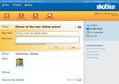
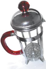
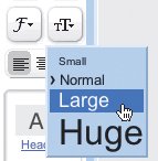
| The company I worked with spent a week trying to come up with an innovative way to let a user know when the Next button was going to take her to a screen she hadn't yet seen. But any solution that required an innovative, new interface gadget wouldn't really solve the problem, but rather complicate itand our codeeven more. Innovations can be cool, and are often just what is needed to solve a problem. But innovations are expensive. They typically take a substantial amount of time to implement, require loads of trial-and-error experimentation, and are just as likely to fail as they are to succeed. Besides that, most people are simply incapable of coming up with brilliant, innovative ideas all the time. Big ideas are few and far between. Most of the time, ideas are small. Small enough to work. Most of the time, companies and applications don't need big ideas. They need little ones that make small improvements right now. The kaizen approach is about making frequent, incremental changes that improve things steadily and constantly. These advances make for ongoing, positive changes that can be planned, designed, implemented, and tested very easily and quickly. They're also cost-effective, because it hardly takes any time at all to make small changes (at least, in comparison to expensive innovations), and the result often has such a high return that the investments are extremely easy to justify. Elevation is about being more politeOne simple way to incrementally improve an application is to make it more polite. If your application is any less polite than a really attentive and caring store clerk, iterate over the design until it becomes that polite. Your application may be the best source of customer service your company can provide. Make sure it does its job well. What makes a polite application? Generally speaking, the absence of rudeness is all it takes. The applications that demonstrate the traits outlined in this book are more polite by default. Here are some other ways to be polite: Don't interrupt the user's workflow. Javascript alerts, errors that could have been prevented, confirmation messages, unnecessarily complicated interactions, and confusing task flows are all things that show off an application's rude nature. Get rid of the errors. Write meaningful error messages when they are needed. Make it easy for the user to get her job done. Pages with elements strewn all over the place without any sense of uniformity are rude because users have a harder time determining the flow of the interaction. Screens that lack visual structure are rude because users are forced to guess what's important and what isn't. Help users get up to speed quickly. Don't force the user to understand anything that's not relevant to the job she's doing. Applications that require understanding of the underlying system to be productive are rude because they force users to bend to the whims of developers instead of relying on their own mental models. Hide the system, so that users can rely on their mental models to work with an application and be productive without heaving to learn too much. Following these rules is a giant step towards a more polite solution. Elevation means giving your software a better personalityOne of the most difficult character traits to design in an application is its personality, but a "winning" personality can be one of the best ways to elevate the user experience. Being polite is essential to creating a good user experience, but beyond this are more subjective factors, like the tone of an application, that enable users to connect with our applications in a more positive way. People connect emotionally to the things they use. If a coffeemaker is difficult to use, the user's primary connection to it is one of frustration and resentment. But if the appliance makes it easy to brew great coffee, looks nice, maintains well, and does its job consistently, users feel at ease while using it. The coffeemaker doesn't even have to match other appliances. Usually, in fact, quirky and fun designs make items more appealing. They appeal to the user's personality, not just the user's goal for the product. For example, Skobee (www.skobee.com)designed to enable groups of friends to coordinate plans together around events users createis filled with bright colors, upbeat icons, and text written in a friendly, conversational tone that tells users it's okay to have fun. The overall vibe of the application is such that it invites users to poke around and explore. Check things out. Goof off. Skobee uses a lively and fun design style to add personality to the act of making plans.  Personality is determined largely by how things look in an application, but copy is also important. Stuffy phrases like "Update your profile to include a photograph, scheduled events, and a contact list" won't fly at Skobee. Instead, statements like "Your profile is lookin' a little shabby" and "Add a picture so everyone can see your smiling face" are shown on the Profile screen. Using the same language they would use to talk to their own friends, Skobee developers added personality to the application that not only helps contribute to the overall product experience, but is also helpful in getting users up to speed. No one ever said the Web had to be boring. Let's liven it up a little. Elevation means creating "On-Demand Interfaces"It's important to look not only at the details of an application, but also what character traits the controls represent. We need to understand not only how a drag-and-drop interaction works, but also why it's effective in the first place. In Google Page Creator, for example, we can drag an image around within its container box, or drag it from one box to another. We can resize it by selecting it and choosing a size option from a small, image-specific toolbar that appears. We can format text by selecting it and choosing formatting options from the main toolbar. We can do all these things in many desktop applications, but they're not typical of Web applications. Text can be formatted in Page Creator without leaving the main interface. So what is it about these interactions that make Page Creator so easy to learn and use? Part of it is the implementation, because the design of an interaction is vital to helping users understand how it works, but it's also the character trait it represents. Page Creator is responsive. It offers what I like to call an On-Demand Interface (ODI), and this results in an application that is easy to understand, reacts and adapts to user input in a smooth and appealing way, and generally "just works." An ODI offers users the features they needwhere they need them and when they need them. Page Creator offers the image toolbar the moment after a user selects an image. It allows us to move an image any time we want, without taking a round-trip to an editing screen. It lets us format text without pogo-sticking in and out of popup windows designed for text formatting. We can do it all right there in the main interface, without ever leaving the page. This is how an On-Demand Interface works. ODIs reduce both the number of steps involved in a task and the complexity of each one. Functionality is provided when and where the user needs it, exposing features in an on-demand fashion. ODIs allow users to interact with an application in a way that facilitates productivity. They appear to adapt to the user. As a result, the user experience is improved dramatically, and user satisfaction is taken to much higher levels. These character traitsresponsiveness, speed, a streamlined mental model, and so onare what make the application great. The implementation of the design is a huge part of its effectiveness, but only because it means the implementation effectively supports the underlying principle. In other words, when we Know What Makes It Great and Know The Best Ways To Implement It, we can design applications that not only live up to a user's expectations, but also stand out from the crowd by providing an elevated user experience. |
EAN: 2147483647
Pages: 81
- Chapter XI User Satisfaction with Web Portals: An Empirical Study
- Chapter XIII Shopping Agent Web Sites: A Comparative Shopping Environment
- Chapter XIV Product Catalog and Shopping Cart Effective Design
- Chapter XV Customer Trust in Online Commerce
- Chapter XVI Turning Web Surfers into Loyal Customers: Cognitive Lock-In Through Interface Design and Web Site Usability

