Using Form Actions
When actions are added to a form, they appear in the Form Action bar at the top of a form. The Action bar remains fixed as the user scrolls through the form, so the buttons are always available no matter where the user is in the form. Buttons can also be added directly on the form wherever they are needed.
Actions can be single-use for a specific form, or they can be shared actions used across multiple forms. You can program an action using simple actions, the Formula language, LotusScript, or JavaScript. Shared actions are stored in the Resources, Other section of the Design list and are covered in Chapter 7.
NOTE
Unlike pushbuttons or actions otherwise embedded in a specific location on a form, action buttons do not print with the rest of the document. Pushbuttons print unless the Hide-When Printed property has been selected for the paragraph in which the pushbutton resides.
Shared actions can be created in the Shared Code area of the Design list. When you are in the Shared Action design area, you can choose Create, Shared Action from the menu. Shared actions are programmed in exactly the same way that an action is programmed. Shared actions can be inserted into a form by choosing Create, Action, Insert Shared Action. You can use a shared action in either a view or a form, and as long as the context for the action is appropriate, it will work equally well. For example, you might want to create an Edit shared action. True, there is a default Edit Document system action, but it doesn't work for Web clients . You can create a shared action and use @Command([EditDocument]) , which will work for both Web and Notes clients. This shared action will work both in views and in documents.
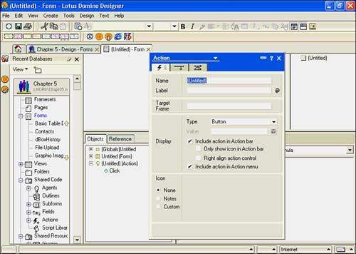
When a form is in design, actions can be viewed in the Action pane. To open the Action pane, click View Show/Hide Action Pane, or choose View, Action Pane from the menu. New actions can be added by choosing Create, Action from the menu. The Action properties box is displayed, and the new action is listed as (Untitled). If the Action pane isn't open , creating a new action opens it for you. Figure 5.19 shows a new action added to a form. In the Design pane, the Run drop-down list has choices for Formula, Simple Action(s), LotusScript, and JavaScript.
Figure 5.19. A new action displays the properties box opened to the Action Info tab.
Actions can be deleted by highlighting the action in the Action pane and either pressing the Delete key or choosing Edit, Clear from the menu.
Working with System Actions
In earlier versions of Notes and Domino, default system actions were automatically added to a form. You could not delete them, but you could cause them not to display. In Designer 6, system actions must be explicitly added to forms; if added, they can be deleted by selecting the action(s) and pressing the Delete key. To add system actions, choose Create, Actions, Insert System Actions.
The six system actions are listed in Table 5.6. By default, these actions do not appear in the Form Action bar, but can be set to do so from the Action properties box Basics tab.
Table 5.6. System Actions
| Action | Usage |
|---|---|
| Categorize | If the form has a field called Categories, allows the user to modify the value in single or multiple documents. Designers can then sort and categorize the documents in views. |
| Edit Document | Opens the document in edit mode. |
| Send Document |
Sends the document to a user or mail-in database. A SendTo field must be present for this to work. |
| Forward | Forwards the document or documents to users or mail-in databases in a mail message. |
| Move to Folder | Moves the documents to a folder. Users can create new folders on the fly. |
| Remove from Folder | Removes the document from a folder. Note that this does not delete the document. |
Understanding Simple Actions
Simple actions are available for forms, agents , and views, so some aren't very useful for forms. For example, marking a document as Read doesn't make much sense because the Action bar doesn't appear unless the document is being read. Figure 5.20 shows the Add Action dialog box. The following are the simple actions:
- Copy to Database
- Copy to Folder
- Delete from Database
- Mark Document Read
- Mark Document Unread
- Modify Field
- Modify Fields by Form
- Move to Folder
- Remove from Folder
- Reply to Sender
- Run Agent
- Send Document
- Send Mail Message
- Send Newsletter Summary
- @Function Formula
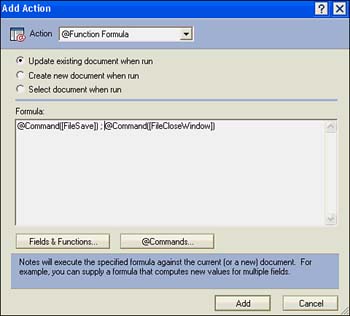
Figure 5.20. You add simple actions with the Add Action dialog box.
CAUTION
Like system actions, simple actions do not function on the Web. You'll have to substitute @Commands, @Functions, or JavaScript if Web clients will use the database.
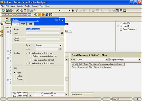
You can string together several simple actions in the same action. For example, you can modify a couple of fields and then send the document. The form in Figure 5.21 has three actions strung together. The first sets the value of the SendTo field to a legitimate email address using the Modify Field simple action. The second uses the Send Document simple action to mail the document to the address in the SendTo field. The final is an @Function formula that combines @Command([FileSave]) and @Command([FileCloseWindow]) .
Figure 5.21. Several simple actions are combined in this form action; this technique also works for agents and view actions.
Programming Actions
Despite the ease and power of the simple actions, most often you will use one of the scripting languages (the Formula language, LotusScript, Common JavaScript, or JavaScript) to program an action. Only one event is available for programming with the Formula language, the Click event. This event is also available for LotusScript; the equivalent event in JavaScript is the onClick event. The majority of the time, you will use the Click or onClick events to script an action button. When you pick any language other than the Formula language, additional events can be programmed.
Choosing which language to use will depend largely on what you're trying to accomplish. In general, anything programmed with the Formula language executes faster but is less powerful because the Formula language is somewhat limited, especially when it comes to looping and logic. You also need to consider which client will be using the application. If a Web client will be using it, you can't program the action with LotusScript because Web clients can't execute LotusScript. In fact, if you select Web in the Run field, the only choices you have are JavaScript and Common JavaScript. To a certain extent, you can work around this limitation by creating an agent and then calling the agent from the action. On the other hand, JavaScript works for both Web and Notes clients, so it makes sense to use JavaScript instead.
NOTE
Common JavaScript isn't a new version of JavaScript. It is simply a way for a developer to program events with JavaScript for both Web and Notes clients.
Naming Actions
When you've created an action, you'll want to name it. It is a good idea to keep the names short and to the point, especially if there are multiple actions on the form. You can create actions with subactions by choosing Create, Action, Action with Subaction, and you can group similar actions under one action button. When you do so, a top-level action appears in the Action pane, along with a subaction indented underneath. At runtime, when the top-level action button is clicked, a drop-down menu appears. To create additional subactions, position the cursor in the Action pane under the last subaction and create a new action. The Reply button in the Inbox view of the mail database is a good example of this. It combines the following four shared actions:
Reply
Reply with History
Reply Without Attachment(s)
Reply with Internet-Style History
Of course, you can immediately see the power behind actions with subactions: You can stack more actions on the Action bar than ever before. Actions with subactions are also referred to as cascaded actions. Because actions are available to both Notes and Web clients, cascaded actions can help replace the menu available to Notes clients but not to Web clients.
CAUTION
In R5, you created cascading actions by placing a backslash after the common name for the action ”for example, DocumentEdit . Designer 6 does not permit the slash character in the name of the action.
TIP
You can easily move an action by clicking it with the mouse pointer and dragging it to a new location.
Whenever you create a cascaded action, you can also include a graphic image that shows in the Action button. To do so, add the image to the first cascaded action. Naming an action is done in the Name section on the Action Info tab of the Action properties box.
Working with Action Properties
Like most other objects in Notes and Domino, a properties box is available for actions. Three tabs are available: Action Info, Action Hide-When, and Advanced. To quickly display the Action properties box, open the Action pane and double-click the action.
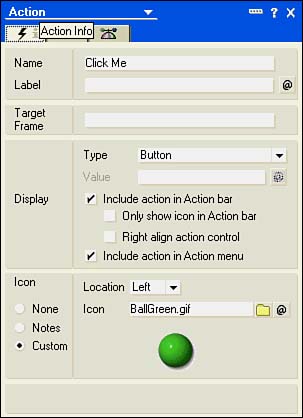
The Action Info Tab
The Action Info tab is shown in Figure 5.22. On this tab, you specify the name of the action, specify a target frame, determine the display properties of the action, and choose an icon.
Figure 5.22. The image chosen on the Action Info tab is from the image resources for this database.
In the top section, you can name and label the action. Labels are new to Designer 6 and appear in place of the name. If there is no label, actions use the name. If you use a label, you must programmatically determine the label using the Formula language. The formula must evaluate to a text string for the label.
The Target Frame field is used for actions in framesets. Specify the name of the frame that will contain the results of the action. For example, if your action opens a page, enter the name of the frame in which the page should display.
Four check boxes in the Display section control whether the action appears in the Action bar, in the Action menu, or in both. If you check Include Action in Action Bar (the default for a new action), you can also check Only Show Icon in Action Bar and Right Align Action Control. The first causes only the icon to appear, even if a name has been specified for the action. When you right-align an action button, it appears on the right side of the Action bar. You can mix right- and left-aligned actions in the same form. The last check box, Include Action in Action Menu, is also checked by default. In general, it is a good idea to leave it checked so that Notes users who prefer using the keyboard over the mouse also have access to the action.
The order in which the actions appear is the same in the menu and the Action bar, and is derived from the order in Designer 6. When deciding on the position of each action, consider adopting a standard placement for frequently used actions. For example, in a view, you might place the New Document button first, followed by the Edit and Delete buttons. Similarly, in a form, you might place the Edit button first, followed by a Close button. Placing design elements in the same location makes your applications easier to use because users know where to find the actions.
The Type and Value fields in the Display section are new to Designer 6. You have three choices in the Type field: Button (the default), Check Box, and Menu Separator. Button is the standard action discussed in this chapter so far. If you select Check Box, the Value field is enabled for entry of a formula that controls the contents of the check box. The formula must evaluate to True or False ; True displays a check mark. For example, you might want to use a check box to indicate the value of an underlying field. The following formula places a check mark in the check box when the status of a document is Approved :
@If(cStatus = "Approved"; 1; 0)
Graphics can be included in action buttons. The Icon section has three radio buttons that determine the graphic content: None (no graphics), Notes, and Custom. When you switch from None to Notes or Custom, an Image field appears. If you select Notes, clicking the Image field exposes the icon palette shown in Figure 5.23.
Figure 5.23. The Notes icon palette contains 155 icons.
To include a custom graphic, you must first create it in a graphics program and then include it as a shared image resource. To use the image, click the Custom setting on the Icon radio button; next to the Image field appear the Browse and Formula buttons. Either use the Browse button to choose the image resource, or click the Formula button and write a formula specifying the resource (refer to Figure 5.22).
TIP
Be sure to use an image with a transparent background so that you can switch colors for the Action bar and have only the image appear, not the image background.
The Action Hide-When Tab
Hide-when formulas are a powerful way to work with actions (see Figure 5.24). There are many reasons to hide actions. For example, it doesn't make any sense to have an Edit action appear when the document is already in edit mode; similarly, if the document is in read mode, there's no reason to display a Save action. You can also hide buttons from users based on their roles in the database, the client type, their username, the status of the document, or any one of a number of different reasons. Having actions that appear only when they are needed helps reduce confusion and clutter on forms.
Figure 5.24. This action is hidden when previewed or opened for editing.
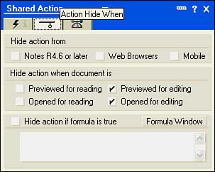
It is a good idea to create shared actions for commonly used actions, such as Edit and Save and Close. As pointed out earlier, both shouldn't be visible at the same time. To make this work, hide the Save and Close action when the document is previewed or opened for reading. Hide the Edit action when the document is previewed or opened for editing (see Figure 5.24).
Beyond these simple settings a myriad of possibilities are available by using a formula. The hide-when formula must be written in the Formula language, and it must evaluate to True or False . Typically, this formula is a simple equality test based on a field or fields in the form. Note that you don't always need to use @If(condition = value; @True, @False) ; the formula will work with the simpler, more direct statement condition = value . For example, you can hide a button that a supervisor uses to approve a document with the following formula (assume that the supervisor's name is stored in the field cSupervisor):
cSupervisor = @Name([CN]; @UserName)
In some cases, you want a group of people to be able to perform a certain type of action. Perhaps you have an awards process that requires a group of people to review nominations for a given award. You can set up a group in the public directory, add the group to the ACL of the database, and assign a role to the group ” [Reviewers] , for example. The following formula could be used to hide a Review button from everyone except the reviewers:
(@IsNewDoc !@Contains(@UserRoles; "Reviewer")) !cStatus = "Released"
Note that in this formula, the test for the users' roles is combined with other aspects of the document. First, you wouldn't want a review to be available for a new document, so the function @IsNewDoc is used. If the document is new, it returns True and the action isn't visible. In the case of this application, the client needed to approve the nomination before it was released to the reviewers, so a test for a status of Released is also included. Note that each argument is connected by an OR (the pipe symbol) so that if any of these conditions is True , the action would not display.
As a way of further limiting access to the Review document, the form property Include in Menu was deselected. Because it didn't show up on any menu, clicking the action button was the only way to create a review. As these last few examples have shown, combining the Hide-When tab with actions is a very powerful way of controlling your application.
The NotesFlow Publishing Tab
NotesFlow publishing is set up on the Advanced tab of the Action properties box (see Figure 5.25). Settings on this tab allow the developer to work with other applications that support OLE and share information between them. This can be a very powerful tool; actions that are published are available to other NotesFlow-enabled applications such as Lotus 1-2-3, Freelance Graphics, WordPro, and Microsoft Word.
Figure 5.25. The Advanced tab of the Action properties box enables you to publish the action to NotesFlow-enabled applications. The Shared Action properties box visible in this figure is identical to the Action properties box.
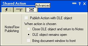
If you create an OLE object such as a Lotus WordPro or Microsoft Word document in a form, you can use NotesFlow to publish actions. When the action is published, it appears on the OLE application's menu. As you can see from Figure 5.25, you can control what happens when the action is chosen from the OLE application's menu system.
Publish Action with OLE Object places the action on the OLE application's Action menu. Close OLE Object and Return to Notes and OLE Object Remains Open is a radio button set that determines what happens when the action is chosen from the OLE application's menu. The last option is a check box and is available for all choices on the Advanced tab. This option makes the OLE document window the active window.
Understanding Action Bar Properties
The Action bar itself has properties also. To open the Action Bar properties box, you must have the Action pane open. Select Design, Action Bar Properties from the menu, or choose it from the drop-down list in the title bar of the properties box. The Action Bar properties box has changed substantially in Designer 6. There are six tabs on the Action Bar properties box: Action Bar Info, Action Bar Size , Action Bar Background, Action Bar Border, Button Properties, and Button Font (see Figure 5.26).
Figure 5.26. The Action Bar Info tab has Alignment and Web Access settings.
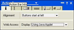
Working with the Action Bar Info Tab
The Action Bar Info tab has two sections: Alignment and Web Access (see Figure 5.26). The Alignment section has a single drop-down list with two choices: Buttons Start at Left (the default) and Buttons Start at Right. If you select Buttons Start at Right, the order is reversed . The first action appears in the rightmost position, the second appears to the left of the first, and so forth. The Web Access section has two display choices: Using HTML and Using Java Applet (the default). In general, it's best to select Using Java Applet because the function is better. Note that if the database property Web Access: Use JavaScript When Generating Pages is not set, you'll be prompted to set it when you choose Using Java Applet.
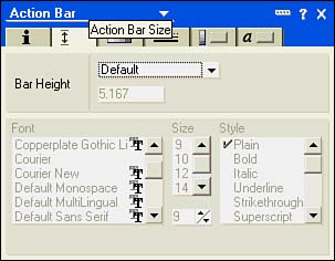
Working with the Action Bar Size Tab
The Size Tab has a setting for the bar height and the font face, size, and style (see Figure 5.27). The Bar Height drop-down list has three settings: Default, Exs, and Fixed. The font settings are available only for Exs. If you choose either Exs or Fixed, you can manually adjust the height in the spinner under the Bar Height option.
Figure 5.27. The Action Bar Size tab has settings for the height of the Action bar.
Working with the Action Bar Background Tab
The Action Bar Background tab has three sections: Color, Image, and Options (see Figure 5.28). The standard color picker is available from the Color field. You can choose from the standard palette, click the RGB button, and mix your own colors, or you can click the System icon to return to the default system color . You can choose an image resource or create a formula to select the image resource. The Options section has a Repeat field with the following choices:
Repeat Once
Repeat Vertically
Repeat Horizontally
Tile
Center-Based Tiling
Size to Fit
Center
Figure 5.28. The Action Bar Background tab has many new settings in Designer 6. In R5, you could specify only the color.
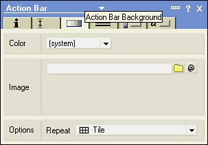
You use these settings to determine how your graphic image works on the Action bar.
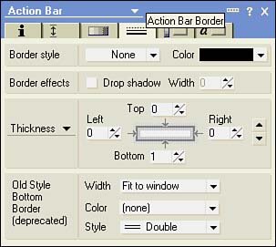
Working with the Action Bar Border Tab
The Designer 6 Action Bar Border tab gives you full control over the Action bar border, including the same options as there are for tables (see Figure 5.29). In R5, there were only three options; these are listed at the bottom of the Border tab in the Old Style Bottom Border. As you can see from the text, this section has been deprecated. The options for borders aren't covered here; see the section "Working with Table Borders," earlier in this chapter.
Figure 5.29. The Action Bar Border tab has many new options.
Working with the Button Properties Tab
The Button Properties tab has been renamed ; in R5, it was called the Button Background tab. Sections on the Button Properties tab control the appearance of the buttons themselves , distinct from the Action bar. With the settings on this tab, you can control the size of the buttons, when the border displays, and the background of the buttons (see Figure 5.30). There are three sections on this tab: Button Size, Button Options, and Button Background.
Figure 5.30. The Button Properties tab has been renamed in Designer 6.
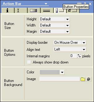
You can modify the height, width, and margin sizes of buttons on the Action bar in the Button Size section. Settings on this tab apply universally to all buttons on the button bar. You can choose from four settings for the height: Default, Minimum Size, Fixed Size, and Background Size. Fixed Size and Minimum Size opens a control at 8 pixels. The Width setting has three choices: Default, Background Size, and Fixed. Fixed again opens a control, this time set to 144 pixels. The Margin setting has two choices: Default and Fixed Size. If you choose Fixed Size, a control is opened at 2 pixels.
In the Button Options section, you specify the border display, text alignment, internal margins, and drop shadow. The default for the Button Border display is On Mouse Over, but you can also choose Always, Never, or Notes Style. You can align text either left (the default), center, or right. The internal margins are set to 0, but you can increase this with the control. A check box for the drop shadow is the last item in the Button Options section.
You can change the color of the buttons independently of the Action bar in the Button Background section, or you can select an image from the shared image resources. Any images attached to specific actions that appear in the Action bar display over top of the Button Background image, so be careful what sort of image you use. If the image used for the background is a different size than the default button bar, and if you choose Background Size for Height or Width, the button size will match the size of the image.
Working with the Button Font Tab
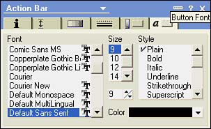
The Button Font tab is a very straightforward tab. You can choose the font, size, style, and color just as you would for any other text object (see Figure 5.31).
Figure 5.31. The Button Font tab of the Action Bar properties box functions just like the Font tab of the Text properties box.
Part I. Introduction to Release 6
Whats New in Release 6?
- Whats New in Release 6?
- A Brief History of Lotus Notes
- Major Features of Lotus Notes
- Types of Applications
- Whats New in Domino Designer?
- New Design Element Features
- New Language Features
The Release 6 Object Store
- The Release 6 Object Store
- Defining a Domino Database
- Understanding the Database Structure
- Creating a Database
- Working with Database Properties
- Understanding Design Templates
- Creating Your Own Templates
- Inheriting Designs from Templates
- Using Templates to Replicate Design Changes
- Using Templates as Design Libraries
- Archiving Versions with Templates
The Integrated Development Environment
- The Integrated Development Environment
- Working in the Application Design Environment
- Working with the Properties Box
- Understanding the Work Pane
- Using the Programmers Pane
- Understanding the Info List
- Understanding the Action Pane
- Customizing the Tools Menu
- Printing Source Code
- Using the HTML Editor
- Locking Design Elements
Part II. Foundations of Application Design
Forms Design
- Forms Design
- Designing Forms
- Setting Form Properties
- Working with Text Properties
- Working with Fields
- Writing Formulas in Fields
Advanced Form Design
- Advanced Form Design
- Working with Tables
- Using Graphic Objects on Forms
- Working with Form-Level Events
- Using Form Actions
- Working with Hotspots
- Understanding Sections and Section Properties
- Using Layout Regions
- Working with Special Forms
- Creating Reusable Design Objects
- Using Embedded Elements
- Using the Form Design Document
Designing Views
- Designing Views
- Defining the Elements of a View
- Creating a View
- Setting View Properties
- Creating Advanced View Selections
- Adding and Editing View Columns
- Using View Column Properties
- Adding Actions to a View
- Creating Calendar Views
- Understanding Folders
Using Shared Resources in Domino Applications
- Shared Resources
- Sharing Images Within a Database
- Creating Shared Files
- Creating Shared Applets
- Shared Code
- Creating Subforms
- Creating Shared Fields
- Creating Shared Actions
- Script Libraries
- Database Resources
Using the Page Designer
- Using the Page Designer
- Understanding Pages
- Working with the Page Properties Box
- Using the Page Designer
- Adding Layers to Your Pages
Creating Outlines
- Creating Outlines
- Creating an Outline
- Working with Outline Entries
- Embedding Outlines
- Adding an Outline to a Frameset
Adding Framesets to Domino Applications
- Adding Framesets to Domino Applications
- Creating a Frameset
- Using the Frameset Designer
- Working with Frames
- Viewing the HTML Source of Your Frameset
- Launching the Frameset
Automating Your Application with Agents
- Automating Your Application with Agents
- Working with Agents
- Creating an Agent
- Working in the Agent Builder Design Window
- Using @Commands in Agents
- Putting Your Agent to Work
- Creating a Complex Agent
- Using LotusScript in Agents
- Creating Web Agents Using Formulas and LotusScript
- Using Java in Agents
- Testing and Debugging Agents, the Agent Log, and Agent Properties
- Agent Properties via the Agent InfoBox
Part III. Programming Domino Applications
Using the Formula Language
- Using the Formula Language
- Overview of the Formula Language
- Knowing Where to Use @Functions and @Commands
- Formula Syntax
- Limitations of the Formula Language
- Working with Statements
- Using Logical @Functions
- Working with Date and Time @Functions
- Working with Strings
- Getting Session and User Information
- Working with Documents
- Retrieving Data with @DbColumn and @DbLookup
- Working with Lists
- Getting User Input
- Controlling the Flow of a Formula
- Error Handling
Real-World Examples Using the Formula Language
- Real-World Examples Using the Formula Language
- Programming Practices
- Using Formulas in Forms and Subforms
- Writing Field Formulas
- Writing View Formulas
- Using Hide When Formulas
- Working with Forms, Views, and Shared Actions
Writing LotusScript for Domino Applications
- Writing LotusScript for Domino Applications
- Software Construction
- Fundamental Elements of LotusScript
- New Technologies and LotusScript
Real-World LotusScript Examples
- Real-World LotusScript Examples
- Real-World Example 1: Importing a Delimited Text File
- Real-World Example 2: Delete a Parent Document and All Its Children: DeleteParentAndChildren
- Real-World Example 3: Schedule an Agent Robot to Refresh All the Documents in a View: Robot-DailyRefreshAllDocs
- Real-World Example 4: Return a Web User to the Place Where He Started After a Document Is Submitted: WebQuerySave-DocSubmit
Writing JavaScript for Domino Applications
- Writing JavaScript for Domino Applications
- What Is JavaScript?
- JavaScript Is Not Java
- JavaScript and the Domino IDE
- The Document Object Model
- JavaScript Support in Domino 6
- When to Use JavaScript
- A Look at JavaScript in Domino
- JavaScript Libraries in Domino
- JavaScript Principles 101
- Syntax and Command Blocks
- Statements
- Output
- Functions
- Objects
- Input Validation
- Validating Check Boxes
- Validating Radio Buttons
- Validating Selection Lists
- Calculations
- JavaScript Application
Real-World JavaScript Examples
- Real-World JavaScript Examples
- Real-World Example 1: Dynamic Drop-Down Lists on the Web
- Real-World Example 2: Dialog Boxes and window. opener on the Web
- Real-World Example 3: Dynamic Tables
- Real-World Example 4: Useful JavaScript Utilities
Writing Java for Domino Applications
- Writing Java for Domino Applications
- Introduction to Java
- Choosing a Java Solution in Domino
- Understanding the Notes Object Interface
- Writing Java Agents
- Using Other Java IDEs
- Other Uses for Java
Real-World Java Examples
Enhancing Domino Applications for the Web
- Enhancing Domino Applications for the Web
- Whats New in Designer 6
- Understanding the Domino Web Application Server
- Understanding the Basics of HTML
- Using HTML in Domino Designer
- Adding Power with Domino URLs
- Views and Forms Working Together on the Web
- Incorporating Flash into Your Web Pages
- What Its All About: XML Exposed
- How Does Domino Use XML?
Part IV. Advanced Design Topics
Accessing Data with XML
Accessing Data with DECS and DCRs
- Accessing Data with DECS and DCRs
- What Is DECS?
- The External Data Source
- DECS Administrator
- Creating the Activity
- Accessing the Application
- DECS Summary
- Data Connection Resources
- DCR Example
- Tips on External Data Access
Security and Domino Applications
- Security and Domino Applications
- How Does Domino Security Work?
- Enabling Physical Security
- Setting Server Access
- Database Access Control Lists
- The Role of the Domino Directory in Application Security
- ACL Privileges
- Enabling Database Encryption
- Using Roles
- Implementing View-Level Security
- Implementing Form-Level Security
- Implementing Document-Level Security
- Applying Field-Level Security
- Hiding the Design of Your Application
Creating Workflow Applications
- Creating Workflow Applications
- The Evolution of Groupware
- Introducing Workflow
- Creating Mail-Enabled Applications
- Using Triggers to Send Email
- Sending Mail with LotusScript
Analyzing Domino Applications
Part V. Appendices
Appendix A. HTML Reference
Appendix B. Domino URL Reference
EAN: 2147483647
Pages: 288
