Working with Tables
You can use tables in forms as well as in pages and rich-text fields in documents. Tables can help organize and present information in documents and forms. One advantage of using tables to position elements on a form is that each cell in a table can be treated as a paragraph. This means that you can apply different paragraph styles in the same row. For example, you can't position a text label for a field in a form by pixels as you can in certain other application designers that treat text as an object. Instead, the text wraps along with the field and any other text in the line. Using a table, you can create a column for field labels and a separate column for the fields and then format each column independently. The text labels can be set right-justified, and the fields can be set left-justified to make a neat display.
You might recall from Chapter 4 that hide-when attributes are applied to paragraphs. This means that you cannot selectively hide objects in a single line. The hide-when attribute applies to the entire paragraph. In a table, different hide-when attributes can be applied to individual cells. Text styles and properties can also be applied to each cell. In effect, this allows the conditional display of objects in a single line. All you have to do is selectively apply the attributes to the appropriate cells in a single row. If you then hide the table borders, the row appears as a single line in the form.
TIP
Ranges of cells can be changed by highlighting rows or columns and making the changes in the appropriate properties box or through the keyboard. For example, to change the column titles (the topmost row) of a table to bold, highlight the row with the mouse and press Ctrl+B or click the Text Bold SmartIcon.
What's New for Tables in Notes and Domino 6?
Not as many new features for tables are present in Notes and Domino 6 as there were in R5. Following are some of the new features:
- Tabs can now appear on all four sides of a table.
- Many new toolbar icons have been added.
- A new type of table, the captioned table, has been added. Row captions can be used to collapse and expand table rows.
Creating a Table
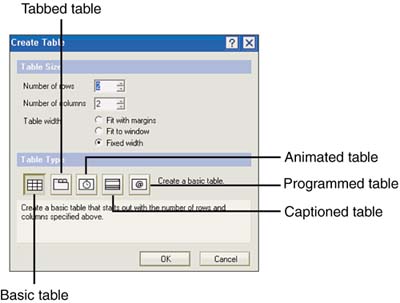
To create a table, click the Create Table SmartIcon or choose Create, Table from the menu. The resulting Create Table dialog box contains settings for Number of Rows, Number of Columns, Table Width, and Table Type. There are five types of tables: basic, tabbed, animated, captioned, and programmed. The default settings for the Create Table dialog box are two rows and two columns, with a fixed width and a type of basic, as shown in Figure 5.1. After you create a table, you can insert, append, and delete rows and columns.
Figure 5.1. The Create Table dialog box enables you to specify the number of rows and columns, and to choose the width and type.
NOTE
To include a table within a table, position the cursor in one of the cells, and either select Create, Table from the menu or click the Create Table SmartIcon. Specify the number of rows and columns and check or uncheck Fixed Width as appropriate. Tables within other tables are known as embedded or recursive tables. This technique is often used with tabbed tables; your location documents are an example of tabbed tables with recursive tables.
After you create a table, a Table Properties icon appears on the toolbar near the Text Properties icon. Six new icons appear on the toolbar next to the Create Table icon. Remember, you can use hover help to learn the function of icons on the toolbar. In order from left to right they are as listed here:
- Insert Row
- Insert Column in Table
- Insert/Append Special
- Delete Row
- Delete Column in Table
- Delete Special
A new menu, the Table menu, also has been added. This menu has the prompts listed in Table 5.1.
Table 5.1. Table Menu Prompts
| Prompt | Effect |
|---|---|
| Table Properties | Opens the Table properties box. |
| Table Select/Row(s) | Selects the row or rows where the cursor is positioned or which it has partially selected. |
| Table Select/Column(s) | Selects the column or columns where the cursor is positioned or which it has partially selected. |
| Table Select/All | Selects all cells inside the table. |
| Table Select/Entire | Selects the entire table, including the outside edges and a row of text before and after the table. This is useful if you need to delete the entire table. |
| Insert Row | Adds a row before the current cell. |
| Insert Column | Adds a column before the current cell. |
| Insert Special | Presents a dialog box with options to insert or append a specific number of rows or columns. |
| Append Row | Adds a row after the current cell. |
| Append Column | Adds a column after the current cell. |
| Delete Selected Row(s) | Deletes the current row or rows if cells from more than one row are highlighted. |
| Delete Selected Column(s) | Deletes the current column or columns if cells from more than one column are highlighted. |
| Delete Special | Presents a dialog box with options to delete a specific number of rows or columns. |
| Merge Cells | Combines two or more cells into a single cell. |
| Split Cells | Splits a merged cell into the constituent cells. |
| Auto Size | Resizes cells based on their contents. |
TIP
You can also append rows to tables by positioning the cursor in the cell in the lower-right cell and pressing the Tab key.
Working with Table Properties
The next several sections discuss the Table properties box. You can open the Table properties box by clicking the Table Properties icon or choosing Table, Table Properties from the menu when the cursor is within a table. In Notes and Domino 6, the properties box has seven tabs: Table Layout, Cell Borders, Table/Cell Background, Table Borders, Table Margins, Table Rows, and Table Programming. See Figure 5.2.
Figure 5.2. The Table properties box can also be opened by right-clicking in a table and choosing Table Properties from the context menu.
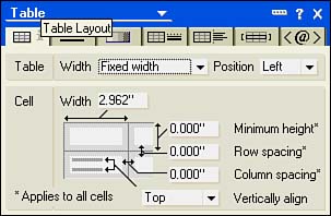
Understanding Table Layouts
The Table Layout tab consists of two sections: Table and Cell. The table settings are global, as are some cell attributes ”an asterisk marks those cell attributes that are global. The Table section has two drop-down lists, one for the width and one for the position. There are three choices for width: Fixed Width (the default), Fit to Window, and Fit with Margins. The Position setting is available only for fixed-width tables, and you can specify Left (the default), Right, or Center (see Figure 5.2). If you select Fit to Window or Fit with Margins, additional options display in the Cell Layout section.
Table 5.2 lists the options that are available in the Cell section of the Table Layout tab.
Table 5.2. Table Cell Layout Settings
| Setting | Options |
|---|---|
| Cell Width | Sets the width of cells; affects all cells in a given column. |
| Fixed Width | Available for Fit to Window or Fit with Margins. This check box keeps the width of the selected column fixed. |
| Size to Fit | Available for Fit to Window or Fit with Margins. Resizes the width of the selected column. |
| Minimum Height | Global; sets minimum cell height. |
| Row Spacing | Global; specifies the spacing between rows. |
| Column Spacing | Global; sets the spacing between columns. |
| Vertically Align | Specific to an individual cell. Choose from Top (the default), Center, and Bottom to position the cell contents within the cell. |
When you create a table containing multiple columns, all columns are initially the same width. If you want to have complete control over the width of a table, either select a fixed-width table or change the Table Width field to Fixed Width. The width of individual columns can be changed without affecting the remaining cells. With Fit to Window or Fit to Margin set, when an individual cell is changed, the other cells adjust to fill the remaining width. Note that although a value in inches can be typed into the Cell Width field on the Layout tab, it is often far easier to use the ruler to resize the columns. To turn the ruler on or off, click the Ruler icon in the toolbar or press Ctrl+R. To resize a column of cells using the ruler, click the drag handle in the ruler for the right column of the cell. A thin black line appears when dragging the cell border and helps to visually position the cell borders.
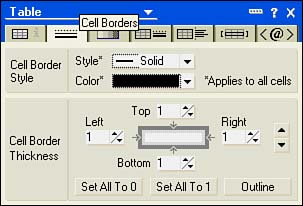
Setting Cell Borders
The Cell Borders tab has two sections: Cell Border Style and Cell Border Thickness . The Style section applies to the entire table.
NOTE
Settings that are global to a table apply to the currently selected table. If a table is embedded within another table, global settings apply to the embedded table if that is the selected table, or to the parent table, if the parent table is selected. In other words, the table properties of embedded and parent tables are distinct from each other.
You can choose a border style from Solid (the default), Ridge, or Groove. The standard color picker is available for border color .
The settings for border thickness can be applied to individual cells, to a range of cells, or to the entire table. Cell thickness is controlled by spinners on all four sides. There are three buttons on the tab: Set All to 0, Set All to 1, and Outline. The two Set All buttons can apply to a single cell, a range of cells, or the entire table. To select a range of cells or the entire table, drag the mouse pointer with the left button held down until the cells that you want to affect are highlighted. When you release the mouse, the cells remain highlighted until you click elsewhere. The Outline button is available only when more than one cell is selected. The large spinner buttons on the right side of the tab apply to the current cell selection. If multiple cells are selected, clicking the up or down arrow increases /decreases the border thickness for all cells in the selected range. The Cell Borders tab provides a high degree of control over the appearance of the table's borders (see Figure 5.3).
Figure 5.3. The Cell Borders tab of the Table properties box has settings for the style and thickness of the cell borders.
TIP
To make the cell borders of an entire table invisible, select all the cells and open the Table properties box to the Cell Borders tab. You can select all the cells by choosing Table, Select All from the menu. Click the Set All to 0 button. The table borders become invisible. Using an invisible table allows the text and fields to be tightly formatted without the extra clutter of cell borders.
Using the Table/Cell Background Tab
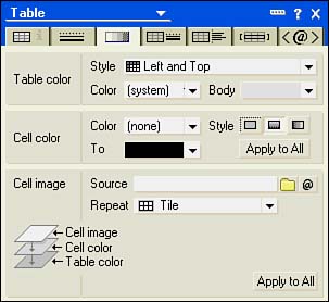
Colors of individual cells or of the entire table can be set from the Color tab, shown in Figure 5.4. This tab is essentially unchanged from R5. There are three sections on this tab: Table Color, Cell Color, and Cell Image.
Figure 5.4. The image and text in the Cell Image section of the Table/Cell Background tab indicates the order of precedence for color and images.
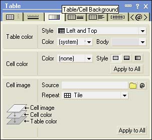
The Table Color section has a drop-down list of Table Style settings that apply color schemes to the entire table. When you select a scheme other than the default of None, one or two color picker boxes appear in the Table Color section, depending upon your selection. If you choose a solid color, a single color picker appears. All other choices result in two color pickers.
The default color choices for a two-color scheme are dark gray and gray, but you can change them with the Domino color picker. See Figure 5.5. Following are the choices for table styles:
- None (the default) ” No color style applied.
- Solid ” All cells have the same color.
- Alternating Rows ” The rows alternate between the two color choices.
- Alternating Columns ” The columns alternate between the two color choices.
- Left and Top ” The leftmost column and the top row are set to one color, and the remaining cells are set to the other color.
- Left ” The leftmost column is set to one color, and the remaining cells are set to the other color.
- Right and Top ” The rightmost column and the top row are set to one color, and the remaining cells are set to the other color.
- Right ” The rightmost column is set to one color, and the remaining cells are set to the other color.
- Top ” The top row is set to one color, and the remaining cells are set to the other color.
Figure 5.5. When table styles other than None or Solid are chosen , two color pickers appear.
The Cell Color section can apply to a single cell, a range of cells, or, when the Apply to All button is clicked, to the entire table. Initially, the style is solid and only one color picker is available. If you switch from solid to a horizontal or vertical gradient, a second color picker appears. The second color picker is labeled To (see Figure 5.6).
Figure 5.6. The To color picker appears when either the vertical or the horizontal gradient button is clicked.
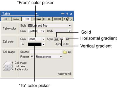
When you use two different colors and choose one of the two gradient settings, the colors in the range between the From and To colors are displayed as a gradient. The cell gradient is applied only to individual cells. If you click the Apply to All button, the gradient is added to each cell but doesn't apply across all cells. This can make a rather choppy appearance, especially if the vertical gradient is used.
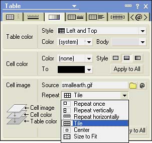
The Cell Image section enables you to select an image resource and to determine how the image is displayed. You can click the Browse Image button or enter a formula to choose an image resource. (For more information about shared image resources, see Chapter 7, "Using Shared Resources in Domino Applications.") Several Repeat styles are available, as shown in Figure 5.7.
Figure 5.7. The Cell Image section sets a Repeat style for the image.
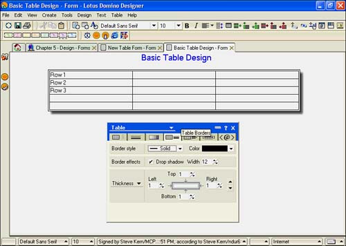
Working with Table Borders
The Table Borders tab (see Figure 5.8) sets border styles and colors. You can add a drop shadow and alter the thickness of the table borders. These settings apply only to the border of the table (the outside edges) and do not affect the cells inside the table.
Figure 5.8. A drop shadow with a width of 12 has been chosen for this table.
For a border style, you can choose from the following border styles:
- None
- Solid
- Double
- Dotted
- Dashed
- Inset
- Outset
- Ridge
- Groove
- Picture (new to Notes and Domino 6)
- Image (new to Notes and Domino 6)
Some of these styles are not readily apparent unless you change the settings for the thickness of the borders in the third section of this tab (discussed in the following section). To see the effects of the border styles, you can switch to a different color for the table borders than is used for the cell borders.
You can add a drop shadow to the table by checking Drop Shadow. The default width for a drop shadow is 12 pixels, but you can change this by clicking the spinner up or down, or by typing a value into the box.
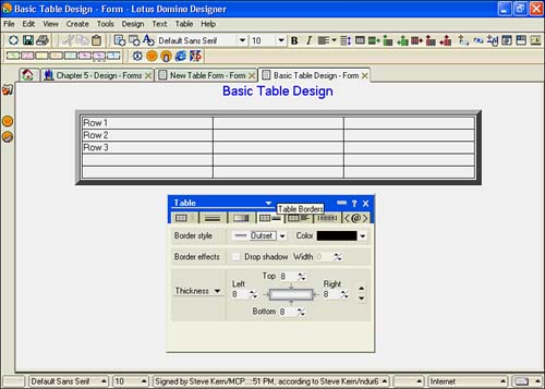
The final section lets you control the width of the table borders. Three settings are available: Inside, Thickness (the default choice), and Outside. Each side of the table border has an individual spinner that sets the property in pixels. You can also click the large spinner control on the right side of the tab to affect all settings. The borders in Figure 5.9 were set uniformly by clicking the up arrow until a thickness setting of 8 pixels was reached.
Figure 5.9. This table has a border style of Outset and a thickness of 8.
Working with Table Margins
The Table Margins tab has settings for Table Margins, Table Wrap, and R4 Compatibility (see Figure 5.10). The Table Margins section has settings for the left and right margins, which can be entered in inches or as a percent. The drop-down lists to the right of the settings have two choices: Absolute and Relative (%).
Figure 5.10. The Table Margins tab allows the right and left margins to be set by a percent or by a specific offset in inches.
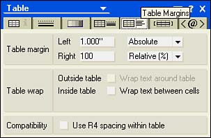
You can set word wrap around the table and inside the table in the Table Wrap section. The Outside Table check box is available only for fixed-width tables. Checking this setting causes text to wrap around the table. If you check Inside Table, a new field appears, At Height, which allows you to enter a height in inches at which text will wrap from one cell to the next. This is handy for setting up a table in "newspaper column" format.
Table Rows
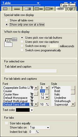
The Table Rows tab enables you to switch among the five table styles. Basic tables display only a single radio button in the Special Table Row Display section. The choices are Show All Table Rows and Show Only One Row at a Time. If Show All Table Rows is selected, no other choices appear on the tab (see Figure 5.11). Once you select the second setting, the properties box expands to show several other sections (see Figure 5.12). You can choose the type of table in the Which Row to Display radio button, which has options for four types of tables. Each type of table ”tabbed, captioned, animated, and programmed ”has its own options, which appear when you click the radio button. The four nonbasic table types are listed here:
- Tabbed ” Users Pick Row via Tab Buttons. Opens sections that let you label the tabs; choose font face, size, style, and color; size tabs equally; select the position of the tab (top, bottom, right, or left); and set an indent for the first tab.
- Captioned ” Users Pick Row via Captions. Captioned tables are new to Notes and Domino 6. Opens sections that let you add text for the caption, and choose font face, size, style, and color for the caption.
- Animated ” Switch Row Every n Milliseconds. Opens the Milliseconds field, which defaults to 2000, and opens a transition section, in which you choose the transition effect and how the rows cycle.
- Programmed ” Switch Rows Programmatically. Creates a tabbed table and opens a check box, Also Show Tabs so User Can Pick Row. When you check Also Show Tabs, the sections for tabbed tables display.
Figure 5.11. Basic tables show only one setting, Show All Table Rows, on the Table Rows tab.
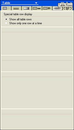
Figure 5.12. You can label the tab buttons in the last field on the properties box.
Some of these styles are useful when designing forms, but others are more useful for documents or pages. For example, animating a table is not as useful for a form as it would be for a document or a page. A tabbed table, on the other hand, is very useful for form design. Using a tabbed table, you can reduce the length of a form significantly, displaying it on a single screen so that the users don't have to page down through line after line of information.
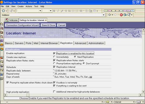
A good example of a tabbed table is found in the design of the location document for your local address book (see Figure 5.13). Each of the table rows has labels such as Basics, Servers, and Ports. Through the artful use of tabbed rows and tables within tables, this document can be presented in a visually appealing and much shorter format, reducing the need to scroll through a lengthy document to locate a setting.
Figure 5.13. The tabbed table of the location document shows how a lengthy document can be condensed to a more usable size.
NOTE
Tabbed tables do function on the Web. Each of the tabs becomes a hotspot, opening the row as a new HTML document.
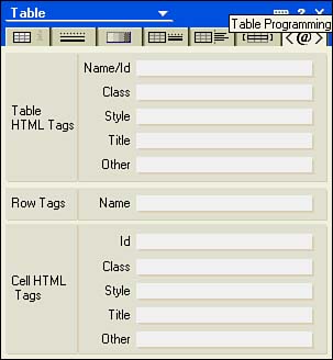
Using the Table Programming Tab
The Table Programming tab, not to be confused with a programmable table, contains HTML settings for the entire table, for rows, and for settings for individual cells. With the exception of the Other fields and the Row Tags field, all settings are for use with Cascading Style Sheets. The table row container tag in HTML can take the following attributes: ALIGN , BGCOLOR , and VALIGN (horizontal alignment, background color, and vertical alignment, respectively ”see Figure 5.14).
Figure 5.14. The Table Programming tab contains HTML attributes for the table itself and for individual rows and cells.
Using the Collapsed Table Properties Box
As with the Text properties box, when the Table properties box is collapsed, it displays several buttons, enabling you to change certain settings without fully expanding the properties box (see Figure 5.15). Table 5.3 lists the available buttons on the collapsed properties box from left to right.
Figure 5.15. The collapsed Table properties box becomes a toolbox for commonly used table-design functions.
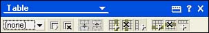
Table 5.3. The Collapsed Table Properties Box
| Button | Effect |
|---|---|
| Cell Color Picker | Displays the color picker for the current cell or selection |
| Cell Borders On | Turns borders on for the current cell or selection |
| Cell Borders Off | Turns borders off for the current cell or selection |
| Split Cells | Splits cells; available only for merged cells |
| Merge Cells | Merges two or more selected cells |
| Insert Column | Inserts a column before the current column |
| Delete Column | Deletes the current column |
| Append Column | Appends a column to the table |
| Insert Row | Inserts a row before the current row |
| Delete Row | Deletes the current row |
| Append Row | Appends a row to the table |
Merging and Splitting Cells
The capability to merge and split cells is available from the Table menu or from the collapsed Table properties box. To merge cells, highlight the cells with the mouse and choose Table, Merge Cells; or click the Merge Cells button on the collapsed Table properties box. To split cells that have been merged, position the cursor in the cell and choose Table, Split Cells from the menu, or click the Split Cells button. You can use this technique to create a multiple-column table that contains fields or labels of different widths.
TIP
Instead of using merged cells in a row to label blocks of information in a table, you can use a tabbed table and label the row tabs instead.
Using Tables to Format Data Entry
It is often very difficult to control the position and flow of text on a form. Creating a Notes form is much like creating a word-processing document ”except for layout regions , text such as a field label is not a discrete object. In a form, tabs can be set to present information, but fields can easily spill over the next tab stop and ruin the presentation. As you already know, when the form is presented to a Web client, any spaces or tabs basically vanish .
You can get around this limitation by placing fields, field labels, and graphics within a table in separate columns. Tables confine objects, text, and fields to cells. The width of these cells is set, and if the length of the field contents is greater than the width of the cell, the contents spill to the next line but remain within the cell borders.
For a simple data entry form, you can create a table with three columns and the appropriate number of rows. The leftmost column contains the field label, the middle column is a spacer, and the rightmost column contains the field itself. Because the contents of each cell can be controlled individually, advanced formatting can be applied to form design. One design standard places field labels flush right and fields flush left with a set space in between. Simply highlight the column for the field labels and change the alignment to flush right. Unless the alignment for the column containing the fields has been changed, it will already be flush left. By including a narrow separator column between the field labels and the fields themselves , you can then hide the table borders and give the form a very polished appearance.
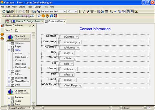
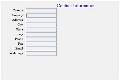
You can change the alignment of a column by highlighting all the cells in the column and choosing the desired alignment from the appropriate Alignment icon on the toolbar, or by making a selection in the Paragraph tab of a Text properties box, or by choosing Text, Align Paragraph from the menu. A sample Contacts form is shown in Figure 5.16. Although the borders of rows containing fields and field labels have been made invisible, you can still see them in design mode as dashed lines.
Figure 5.16. This form uses a table to align the text labels flush right and the fields flush left, with a narrow spacer column in between. The cell borders are invisible.
Using Tables with Web Forms
Because tables are supported on the Domino server, they are quite useful for presenting documents to Web browsers. In fact, tables are the preferred method of presenting information and fields to users of both Notes and Web clients . In general, when a table is displayed in a Web browser, the properties of a table are all taken from the first cell of the table. For example, if that cell has no border, all the cells in the table have no border. You can alter this by using HTML on the Programming tab of the Table properties box. HTML doesn't support items such as tabs, indents, and outdents, but a table can be used to simulate the effects by controlling the alignment of objects on the form. Figure 5.17 shows the Contact Information form in Figure 5.17 presented to a Web client.
Figure 5.17. The Contact Information form as it would appear presented to a Web client.
Using Graphic Objects in Tables
Graphic objects can be embedded in a table's cells. This allows graphics and text to be placed alongside each other, a feat that cannot be accomplished any other way, except in a layout region. (Layout regions are discussed later, in the section "Using Layout Regions.") A number of methods exist for placing graphics into the cells of a table. You can import a graphic image such as a .GIF or .JPG file into a cell. You can also copy the image to the Clipboard, place the cursor in a cell of the table, and press Ctrl+V to paste it into the cell.
NOTE
Two commonly used formats for graphics are JPEG and GIF. JPEG is short for Joint Photographic Experts Group , and GIF stands for Graphical Interchange Format. Both of these are in widespread use on the Web because they compress well. In graphics terms, compress means to reduce the size of the image file; these two formats do that quite well without significant loss of image fidelity. Alternatively, a Windows bitmap (.BMP) may have a higher image quality, but it is also significantly larger. In general, the larger the image is, the longer it takes a client ”either a Notes or a Web client ”to load.
You can also use a shared image resource. Shared image resources can be added through the menu using Create, Image Resource. You can also add an image through the Table/Cell Background tab. When you add an image to a table through the properties box, it is a background object. As a result, although you have control over how the image repeats, you lose a lot of control over the image in other areas. You cannot resize it, wrap text, or attach hotspots to a background image. You can, however, add text atop the image.
Part I. Introduction to Release 6
Whats New in Release 6?
- Whats New in Release 6?
- A Brief History of Lotus Notes
- Major Features of Lotus Notes
- Types of Applications
- Whats New in Domino Designer?
- New Design Element Features
- New Language Features
The Release 6 Object Store
- The Release 6 Object Store
- Defining a Domino Database
- Understanding the Database Structure
- Creating a Database
- Working with Database Properties
- Understanding Design Templates
- Creating Your Own Templates
- Inheriting Designs from Templates
- Using Templates to Replicate Design Changes
- Using Templates as Design Libraries
- Archiving Versions with Templates
The Integrated Development Environment
- The Integrated Development Environment
- Working in the Application Design Environment
- Working with the Properties Box
- Understanding the Work Pane
- Using the Programmers Pane
- Understanding the Info List
- Understanding the Action Pane
- Customizing the Tools Menu
- Printing Source Code
- Using the HTML Editor
- Locking Design Elements
Part II. Foundations of Application Design
Forms Design
- Forms Design
- Designing Forms
- Setting Form Properties
- Working with Text Properties
- Working with Fields
- Writing Formulas in Fields
Advanced Form Design
- Advanced Form Design
- Working with Tables
- Using Graphic Objects on Forms
- Working with Form-Level Events
- Using Form Actions
- Working with Hotspots
- Understanding Sections and Section Properties
- Using Layout Regions
- Working with Special Forms
- Creating Reusable Design Objects
- Using Embedded Elements
- Using the Form Design Document
Designing Views
- Designing Views
- Defining the Elements of a View
- Creating a View
- Setting View Properties
- Creating Advanced View Selections
- Adding and Editing View Columns
- Using View Column Properties
- Adding Actions to a View
- Creating Calendar Views
- Understanding Folders
Using Shared Resources in Domino Applications
- Shared Resources
- Sharing Images Within a Database
- Creating Shared Files
- Creating Shared Applets
- Shared Code
- Creating Subforms
- Creating Shared Fields
- Creating Shared Actions
- Script Libraries
- Database Resources
Using the Page Designer
- Using the Page Designer
- Understanding Pages
- Working with the Page Properties Box
- Using the Page Designer
- Adding Layers to Your Pages
Creating Outlines
- Creating Outlines
- Creating an Outline
- Working with Outline Entries
- Embedding Outlines
- Adding an Outline to a Frameset
Adding Framesets to Domino Applications
- Adding Framesets to Domino Applications
- Creating a Frameset
- Using the Frameset Designer
- Working with Frames
- Viewing the HTML Source of Your Frameset
- Launching the Frameset
Automating Your Application with Agents
- Automating Your Application with Agents
- Working with Agents
- Creating an Agent
- Working in the Agent Builder Design Window
- Using @Commands in Agents
- Putting Your Agent to Work
- Creating a Complex Agent
- Using LotusScript in Agents
- Creating Web Agents Using Formulas and LotusScript
- Using Java in Agents
- Testing and Debugging Agents, the Agent Log, and Agent Properties
- Agent Properties via the Agent InfoBox
Part III. Programming Domino Applications
Using the Formula Language
- Using the Formula Language
- Overview of the Formula Language
- Knowing Where to Use @Functions and @Commands
- Formula Syntax
- Limitations of the Formula Language
- Working with Statements
- Using Logical @Functions
- Working with Date and Time @Functions
- Working with Strings
- Getting Session and User Information
- Working with Documents
- Retrieving Data with @DbColumn and @DbLookup
- Working with Lists
- Getting User Input
- Controlling the Flow of a Formula
- Error Handling
Real-World Examples Using the Formula Language
- Real-World Examples Using the Formula Language
- Programming Practices
- Using Formulas in Forms and Subforms
- Writing Field Formulas
- Writing View Formulas
- Using Hide When Formulas
- Working with Forms, Views, and Shared Actions
Writing LotusScript for Domino Applications
- Writing LotusScript for Domino Applications
- Software Construction
- Fundamental Elements of LotusScript
- New Technologies and LotusScript
Real-World LotusScript Examples
- Real-World LotusScript Examples
- Real-World Example 1: Importing a Delimited Text File
- Real-World Example 2: Delete a Parent Document and All Its Children: DeleteParentAndChildren
- Real-World Example 3: Schedule an Agent Robot to Refresh All the Documents in a View: Robot-DailyRefreshAllDocs
- Real-World Example 4: Return a Web User to the Place Where He Started After a Document Is Submitted: WebQuerySave-DocSubmit
Writing JavaScript for Domino Applications
- Writing JavaScript for Domino Applications
- What Is JavaScript?
- JavaScript Is Not Java
- JavaScript and the Domino IDE
- The Document Object Model
- JavaScript Support in Domino 6
- When to Use JavaScript
- A Look at JavaScript in Domino
- JavaScript Libraries in Domino
- JavaScript Principles 101
- Syntax and Command Blocks
- Statements
- Output
- Functions
- Objects
- Input Validation
- Validating Check Boxes
- Validating Radio Buttons
- Validating Selection Lists
- Calculations
- JavaScript Application
Real-World JavaScript Examples
- Real-World JavaScript Examples
- Real-World Example 1: Dynamic Drop-Down Lists on the Web
- Real-World Example 2: Dialog Boxes and window. opener on the Web
- Real-World Example 3: Dynamic Tables
- Real-World Example 4: Useful JavaScript Utilities
Writing Java for Domino Applications
- Writing Java for Domino Applications
- Introduction to Java
- Choosing a Java Solution in Domino
- Understanding the Notes Object Interface
- Writing Java Agents
- Using Other Java IDEs
- Other Uses for Java
Real-World Java Examples
Enhancing Domino Applications for the Web
- Enhancing Domino Applications for the Web
- Whats New in Designer 6
- Understanding the Domino Web Application Server
- Understanding the Basics of HTML
- Using HTML in Domino Designer
- Adding Power with Domino URLs
- Views and Forms Working Together on the Web
- Incorporating Flash into Your Web Pages
- What Its All About: XML Exposed
- How Does Domino Use XML?
Part IV. Advanced Design Topics
Accessing Data with XML
Accessing Data with DECS and DCRs
- Accessing Data with DECS and DCRs
- What Is DECS?
- The External Data Source
- DECS Administrator
- Creating the Activity
- Accessing the Application
- DECS Summary
- Data Connection Resources
- DCR Example
- Tips on External Data Access
Security and Domino Applications
- Security and Domino Applications
- How Does Domino Security Work?
- Enabling Physical Security
- Setting Server Access
- Database Access Control Lists
- The Role of the Domino Directory in Application Security
- ACL Privileges
- Enabling Database Encryption
- Using Roles
- Implementing View-Level Security
- Implementing Form-Level Security
- Implementing Document-Level Security
- Applying Field-Level Security
- Hiding the Design of Your Application
Creating Workflow Applications
- Creating Workflow Applications
- The Evolution of Groupware
- Introducing Workflow
- Creating Mail-Enabled Applications
- Using Triggers to Send Email
- Sending Mail with LotusScript
Analyzing Domino Applications
Part V. Appendices
Appendix A. HTML Reference
Appendix B. Domino URL Reference
EAN: 2147483647
Pages: 288
