The AJAX Control Toolkit
Overview
Although ASP.NET AJAX is a framework designed to bring more programming power to the Web client, it happens to be mostly used by server developers-for example, ASP.NET developers or, at least, Web developers with strong server-side skills. Unfortunately, for the time being, there’s no way to add rich capabilities and functionalities to the Web client other than by crafting good and tricky JavaScript code.
ASP.NET AJAX takes up the challenge and provides two ways for developers to build rich Web applications using a server-centric development approach. As we discussed in Chapter 4, “Partial Page Rendering,” developers can refresh specific regions of the page using partial rendering instead of normal ASP.NET postbacks. To create such regions, you just use a particular set of server controls-the most important of which is the UpdatePanel control.
In addition to partial rendering, developers can use control extenders to add a predefined client-side behavior to new and existing ASP.NET controls. A client-side behavior is a block of JavaScript code that adds a new capability to the markup generated by a given ASP.NET control. An extender is basically a server control that emits proper script code-the client behavior-to enhance how a given ASP.NET control behaves on the client. An extender is not simply a custom control derived from an existing control. Rather, it represents a general behavior-such as auto-completion, focus management, generation of popups, and draggability-that can be declaratively applied to various target control types. For example, a special behavior can be applied to any focused control-be it a TextBox, Button, or CheckBox control.
ASP.NET AJAX Extensions 1.0 simply delivers the base class for extender controls. No concrete extender controls are provided with the binaries. The online documentation provides some good tutorials on how to build extenders. You can find one at http:// ajax.asp.net/docs/tutorials/ExtenderControlTutorial1.aspx. A fair number of sample extenders and additional rich client controls are provided through a separate download-the AJAX Control Toolkit (ACT).
In this chapter, I’ll first review the syntax and semantics of control extenders and then take you on a tour of the major components in the ACT.
Extender Controls
ASP.NET pages are made of server controls. ASP.NET comes with a fairly rich collection of built-in controls. In addition, plenty of custom controls are available for developers from third-party vendors, from community projects, and even from contributions by volunteers. If you need a text box with a set of features that the ASP.NET control can’t provide (for example, a numeric text box), you typically write one yourself or buy a new specialized control that extends the original control and adds the desired behavior. Object orientation, of course, encourages this approach.
However, it’s rare that you need to write a completely new control yourself. More often, your control will derive from an existing ASP.NET control base class. Blindly using inheritance for building specialized versions of controls might not be a wise choice, though. Even in relatively small projects, in fact, it can lead straight to a proliferation of controls. For example, you can end up with a regular text box, plus a numeric text box, a filtered text box, a text box that changes its style when focused, a text box that displays a prompt when left empty, and so on. On the other hand, merging all these behaviors into a single super TextBox control might not be wise either. In this case, the resulting code will be literally full of branches, logical conditions, and properties to check. For just a simple extra feature, you would load a huge control. There has to be a different approach. Enter extender controls.
What Is an Extender, Anyway?
First and foremost, an extender control is a server control itself. It represents a logical behavior that can be attached to one or more control types to extend their base capabilities.
Formalizing the Concept of a “Behavior”
Imagine you want only the text boxes in a given input form to change their style when focused. If you create a new control, say FocusedTextBox, you’re fine. What if, instead, you want the same behavior from buttons, check boxes, and drop-down lists? You should create a bunch of new controls-all of which will extend the target controls with the same logical behavior. Extender controls are just a formal way to define such a behavior.
| Note |
Virtually all behaviors require the injection of some script code in the client page. For this reason, extenders are naturally associated with ASP.NET AJAX. From a technology stand-point, on the other hand, ASP.NET AJAX and extenders are independent concepts. You could develop extenders for ASP.NET 1.1 and ASP.NET 2.0 that work without ASP.NET AJAX Extensions. However, ASP.NET AJAX Extensions provides some interesting facilities for writers of extender controls-specifically, base classes and, more importantly, the Microsoft AJAX library for developing JavaScript functionalities more comfortably. |
A typical extender control is made of a set of properties and one or more JavaScript files that, all together, define the expected behavior of the target control in the browser. The ASP.NET developer adds extenders declaratively to a server page and configures properties to obtain the desired behavior.
Next, when the extender renders out, it emits proper script code in the client page. This script code typically registers handlers for client-side events and modifies the Document Object Model (DOM) of the markup elements it is associated with. As a result, the original control looks and behaves in a slightly different manner while its programming interface remains intact.
To some extent, the concept of a “behavior” is similar to a theme. The theme is used to change the control’s look and feel. Where the behavior and theme differ, however, is that the behavior might change some visual aspects of the control, but it is not limited to graphical attributes. It can alter the structure of the control by accessing the client DOM, add event handlers, and even expose a true object model with properties and methods.
Examining a Sample Extender
To better understand the goals and characteristics of AJAX extenders, let’s briefly consider the behavior encapsulated by one of the extenders contained in the ACT-the TextBoxWatermark extender.
A text box watermark is a string of text that is displayed in an empty text box as a guide to the user. This help text is stripped off when the text box is submitted and is automatically removed as the user starts typing in the field. Likewise, it is automatically re-inserted when the user wipes out any text in the text box.
The watermark behavior hooks up three HTML events: onfocus, onblur, and onkeypress. In its initialization stage, it also sets a new style and default text for the target text box if the body of the field is empty. When the text box gets the input focus, the event handler promptly removes the watermark text and restores the original style. As the user types, the handler for onkeypress ensures that the current text box is watermarked. Finally, when the input field loses the focus-the onblur event-the handler sets the watermark back if the content of the field is the empty string.
To associate this behavior with an ASP.NET TextBox, you use the extender. Alternatively, if you feel comfortable with ASP.NET control development and JavaScript, you can use a client-side code fragment to achieve the same results.
| Note |
The concept of AJAX extenders closely resembles Dynamic HTML (DHTML) behavior. Introduced with Internet Explorer 5.0, DHTML behaviors were nothing more than a script file (or a compiled COM object) that hooked up HTML events and modified the DOM of a given HTML tag to implement a given behavior. DHTML behaviors were used to extend the capabilities of individual HTML tags. ASP.NET AJAX behaviors are used to extend the capabilities of the markup block generated by individual ASP.NET controls. |
Target Properties
Extender controls are characterized by a set of properties that determine the resulting behavior. The values of these properties are passed on to the client and incorporated in the client script.
Obviously, a made-to-measure framework is required both on the server and the client to make the implementation of behaviors effective and, more importantly, affordable. This framework is exactly the benefit that ASP.NET AJAX Extensions provides. We’ll examine the internals of extenders in a moment while going through some sample code. Meanwhile, let’s take a quick look at how you actually use extenders in ASP.NET pages.
In a page, you have one extender instance for each control you want to enhance. The extender is decorated with a set of properties, as shown here:
The TargetControlID property is common to all extenders and indicates the control in the page that is the target of the extender. Other properties specific to the extender tailor its individual behavior. The WatermarkText and WatermarkCssClass properties are implemented only by the Watermark Extender, for example, and serve to assign the text and style the watermarked text should exhibit.
Armed with this background information, let’s take the plunge into the programming interface of extender controls.
The ExtenderControl Class
As mentioned, ASP.NET AJAX Extensions doesn’t include any concrete implementation of an extender. However, it defines the base class from which all custom extenders, as well as all extenders in the ACT, derive. This class is named ExtenderControl.
Generalities of Extender Controls
The ExtenderControl class derives from Control and implements the IExtenderControl interface. The class defines one specific property-TargetControlID. The property is a string and represents the ID of the server control being extended. The Visible property, common to all server controls is overridden and made virtually read-only. More precisely, you can’t override a read/write property to remove the set modifier, but you can just make it throw an exception if invoked. Here’s the pseudocode of the property:
public override bool Visible
{
 get { return base.Visible; }
 set { throw new NotImplementedException(); }
}
An extender requires a script manager control in the page, just as any ASP.NET AJAX server controls do. Note that extenders are mostly used declaratively and are never modified programmatically. For this reason, an extender doesn’t need (and doesn’t use) view state.
The IExtenderControl Interface
The IExtenderControl interface defines the contract of an extender control. It comprises two methods: GetScriptDescriptors and GetScriptReferences. Here’s the definition of the interface:
public interface IExtenderControl
{
 IEnumerable
Note the usage of code blocks in JavaScript. In this way, the client ID of the label is merged in the script regardless of whether the page is a regular page or a content page (with a hierarchy of parent controls and naming containers). Figure 5-7 shows the control in action.
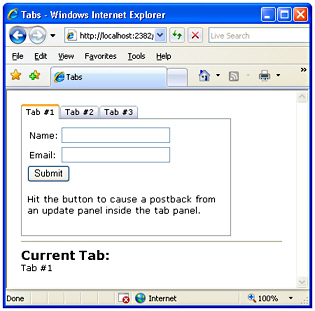
Figure 5-7: The TabContainer control in action
The Client-Side Object Model
As a full-fledged ASP.NET AJAX control, the TabContainer control exposes a client-side object model. In particular, there’s a set of properties that represents the programming interface of the container and another set of properties for each tab panel.
The container features read/write properties-such as activeTabIndex, activeTab, tabs, and scrollBars-plus the activeTabChanged event.
The tab panel exposes read/write properties such as enabled, headerText, and scrollBars along with a read-only tabIndex property and a few events-click, populating, and populated.
AJAX Control Toolkit Extenders
In addition to finding full-fledged server controls such as ReorderList and Accordion in the ACT, you find a bunch of other server controls designed to extend existing controls on the page and provide them with new and additional behaviors. Existing extenders can be categorized into a few groups: panel, input, popup, user interface, animation, and button. Let’s dig deeper into these groupings.
Panel Extenders
ASP.NET pages are full of blocks of markup that, ideally, users would love to move around, collapse if too large, and expand on demand. The perfect panel control in ASP.NET is, therefore, both draggable and expandable. Purposely, ASP.NET AJAX defines a few server-side behaviors that allow you to easily create collapsible sections and drag panels around the page.
The CollapsiblePanel Extender
The extender builds up a collapsible section in your pages by combining two panels-one acting as the content panel, and one being the expand/collapse controller. In its simplest form, the CollapsiblePanel extender looks like the following code sample:
As usual, the TargetControlID property sets the target panel to expand or collapse. ExpandControlID and CollapseControlID indicate the panel to use to expand and collapse the content panel. Note the extreme flexibility of the component design-it might not make sense in all cases, but you can use different panels to control the expansion and collapsing of the content panel. In most cases, though, you’ll be using the same header panel with an image button that changes according to the state of the content panel. The following code snippet shows a more complete usage for the extender:
The ImageControlID indicates the Image control, if any, that if clicked causes the panel to expand or collapse. The ExpandedImage and CollapsedImage properties set the URL of the images to use to expand and collapse. Likewise, CollapsedText and ExpandedText set the Tool-Tip text for the image. Collapsed sets the state of the panel, whereas ExpandDirection indicates whether the panel expands horizontally or vertically. Figure 5-8 provides a view of the control in action.
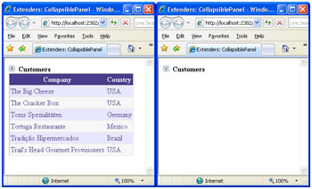
Figure 5-8: The CollapsiblePanel extender in action
The following code demonstrates a typical pair of Panel controls used with the extender:
 Customers


 ...
Unlike draggable panels, the header and content panels are distinct and are typically placed one after the next in the page layout. The extender panel is also postback aware, meaning that, on a client postback, it automatically records and restores its collapsed/expanded client state.
| Note |
To avoid the initial flickering when a collapsible panel is displayed, make sure you properly style the panel that is going to be collapsed and expanded. This panel needs to have Height=0 and the CSS overflow style set to hidden. |
The DragPanel Extender
The DragPanel extender is one of the simplest extenders in the ACT. It has only two properties-one to indicate the panel to drag, and one to indicate the panel to use as the drag handle:
As the name suggests, the TargetControlID property refers to the ID of the panel control in the page that is going to be moved. The DragHandleID, on the other hand, indicates the ID of the panel control that is used as the handle of the drag. In other words, to drag the target panel users drag and drop the handle panel. Although functionally distinct, the two panels are, in effect, logically correlated and rendered through nested tags:
Customers
...
The target panel usually contains as a child the drag handle panel. In this way, you obtain the effect of moving the whole panel as if it were a Microsoft Windows window. (See Figure 5-9.)
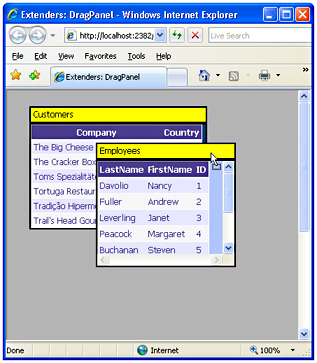
Figure 5-9: The DragPanel extender in action
The DropDown Extender
The DropDown extender can be attached to virtually any ASP.NET control. Once attached to a control, the extender provides a mouse-over link to open a drop-down panel. The contents of the panel are entirely up to you-typically, arranged as a menu. The drop-down is activated by clicking the extended control with any mouse buttons.
In the sample just shown, the drop-down user interface is a Panel that contains a list of link buttons. Link buttons are styled to look like menu items. Link and push buttons, and indeed embedded controls in general, operate normally. (See Figure 5-10.)
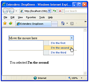
Figure 5-10: The DropDown extender in action
Button Extenders
Buttons are by far one of the most common elements in ASP.NET pages. However, as pages become functionally richer, additional features are required for buttons to stay in sync with users’ expectations. ASP.NET AJAX provides a few extenders that apply to submit buttons and to the pseudo-buttons that form a CheckBox element.
The ConfirmButton Extender
Many times, a safe approach to responding to a user clicking a button is to ask the user for a confirmation for the operation she’s going to start. A common solution for implementing this behavior entails that the ASP.NET page attach some script code to the button to pop up a JavaScript message box with a confirmation message. The ConfirmButton extender greatly simplifies this common task by making it declarative:
The ConfirmText property specifies the text of the message box being displayed as the user clicks the button. Note that HTML entities can be used in the text, but by design no HTML formatting, such as or , can be used. You can, however, use entitized special characters. For example, you can use ; to break the line and continue the text on the next line. The reason for this lies in the JavaScript code for the ConfirmButton-it’s using JavaScript’s window.confirm. Providing HTML formatting makes no sense because the confirmation dialog box is basically a non-HTML Windows MessageBox call.
Internally, the ConfirmButton extender sets a handler for the onsubmit event of the form and swallows the event if the user doesn’t confirm the operation. Only controls that implement the IButtonControl interface can be used with the extender, including LinkButton and ImageButton controls. (See Figure 5-11.)
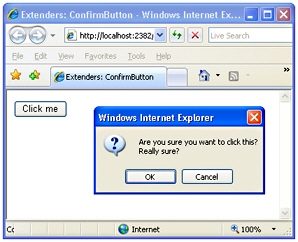
Figure 5-11: The ConfirmButton extender in action
The MutuallyExclusiveCheckBox Extender
The MutuallyExclusiveCheckBox extender can be attached to any ASP.NET CheckBox control to make it part of a group of logically related options. The extender implements a behavior that looks a lot like a list of radio buttons-multiple options are available but only one can be chosen. So what’s the point of having a mutually exclusive set of check boxes rather than a radio button list?
A list of radio buttons can be initially unselected, but once one option has been selected there’s no way for the user to return to the initial state of having all options unselected. Returning to the original, completely unselected state is possible with the MutuallyExclusiveCheckBox extender.
The idea is that you group a number of check boxes under the same key. The extender then ensures that only one check box with the specified key can be selected at a time:
What Kind of Experience Do You Have with ASP.NET?
It can be argued that the same functionality could have been applied to radio buttons instead of check boxes. Using check boxes was the choice of developers, and it also provides a more consistent and expected user interface. However, you can re-implement the behavior to use JavaScript to allow the deselection of a radio button item.
The ToggleButton Extender
Check boxes are graphical HTML elements visually represented by a pair of little bitmaps (selected and unselected) plus companion text. Each browser can use its own pair of bitmaps, thus resulting in the check boxes having a slightly different look and feel. Most browsers, though, tend to represent check-box buttons as square embossed buttons.
The ToggleButton extender provides a way to simulate a check-box element that uses custom bitmaps. The extender is applied to a CheckBox control, and it replaces the control with a completely new markup block that uses custom images and provides the same behavior as a standard check box:
ImageWidth and ImageHeight properties indicate the desired size of the images. Note that these attributes are required. UncheckedImageUrl and CheckedImageUrl specify the images to use when the check box is selected or not selected.
Pop up Extenders
Virtually every Web developer has a sort of love/hate relationship with pop-up windows. As a matter of fact, pop-up windows often greatly simplify a number of tasks-especially modal dialog boxes. One of the nasty things about HTML pop-up windows is that they are browser windows and require a page to navigate. The pop-up extenders that ASP.NET AJAX Extensions has to offer, on the other hand, do not require a new browser instance. Instead, they are limited to popping up the content of any panel you indicate, with or without modality.
The HoverMenu Extender
The HoverMenu extender is similar to the PopupControl extender and can be associated with any ASP.NET control. Both extenders display a pop-up panel to display additional content, but they do it for different events. The HoverMenu, in particular, pops up its panel when the user moves the mouse cursor over the target control. The panel can be displayed at a position specified by the developer. It can be at the left, right, top, or bottom of the target control. In addition, the control can be given an optional CSS style so that it looks like it is in a highlighted state. (See Figure 5-12.)
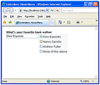
Figure 5-12: The HoverMenu extender in action
The HoverMenu extender is good for implementing an auto-display context menu for virtually every ASP.NET control instance and for providing tips to fill in some input fields. In Figure 5-12, for example, when the user hovers the cursor over the text box, a list of suggestions appears to simplify the work.
The Panel1 control defines a list of radio buttons, each containing a suggestion for filling the text box. The HoverMenu extender targets the text box control and defines Panel1 as its dynamic pop-up panel. The PopupPosition property indicates the position of the panel with respect to the target control. Likewise, other properties not shown in the previous example code, such as OffsetX and OffsetY, define the desired offset of the panel. The PopDelay sets the time (in milliseconds) to pass between the mouse movement and the display of the panel. The HoverCssClass can optionally be used to give the text box a different style when the hover menu is on. It is interesting to look at the CSS class associated with the panel:
.popupMenu
{
 position:absolute;
 visibility:hidden;
 background-color:#F5F7F8;
}
.hoverPopupMenu
{
 background-color:yellow;
}
It is key that the visibility attribute of the panel is set to hidden just as with CollapsiblePanel control; otherwise, the panel will display upon page loading and hidden immediately afterwards.
Just as for the PopupControl extender, to take full advantage of the HoverMenu extender you need to place extended controls inside of an UpdatePanel control. In this way, whenever the user clicks a radio button, the panel posts back asynchronously and fires the SelectedIndexChanged event on the server.
void RadioButtonList1_SelectedIndexChanged(object sender, EventArgs e)
{
 TextBox1.Text = RadioButtonList1.SelectedValue;
}
The server-side event handler will then just update the text in the text box., as shown in Figure 5-12.
The ModalPopup Extender
The ModalPopup extender displays in a modal way any content associated with the control identified by the PopupControlID property. The TargetControlID property in this case refers to a clickable control:
Notice that the ModalPopup extender is fired by the onclick event on the target control. It turns out, therefore, that the target control can only be a control that supports clicking. The pop-up control doesn’t have to be a Panel control; generally, it can be any control. However, it will normally be a control that contains a bunch of other controls-typically, a Panel.
In the pop-up panel you can optionally identify an OK control and a Cancel control. You set the ID of such controls (commonly, buttons) through the OkControlID and CancelControlID properties. The pop-up behavior is clearly a client-side action, so some JavaScript code might be required in response to the user’s clicking the OK or Cancel control. You use the OnOkScript property to specify the JavaScript function to run in case the user clicks the OK button; you use OnCancelScript otherwise.
The following markup shows the content of a sample modal panel. Note that the Panel control should set its CSS display attribute to none to make any contents invisible at first.
Take note of this message and tell us if you strongly agree.
Figure 5-13 shows the modal dialog box in action.
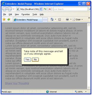
Figure 5-13: The ModalPopup extender in action
A couple of graphical properties-DropShadow and BackgroundCssClass-complete the extender. A Boolean property, DropShadow indicates whether a drop shadow-as shown in Figure 5-13-should be rendered. BackgroundCssClass, on the other hand, determines the style that is temporarily applied to the underlying page:
modalBackground {
 background-color:Gray;
 filter:alpha(opacity=70);
 opacity:0.7;
}
The preceding style grays out the page and makes it partially opaque for a nicer effect.
The PopupControl Extender
The PopupControl extender can be attached to any HTML element that fires the onclick, onfocus, or onkeydown events. The ultimate goal of the extender is to display a pop-up window that shows additional content, such as a calendar on a text box in which the user is expected to enter a date. The contents of the pop-up panel are expressed through a Panel control, and they can contain ASP.NET server controls as well as static text and HTML elements:
...
The TargetControlID property points to the control that triggers the popup, whereas PopupControlID indicates the panel to display. The Position property sets the position of the panel-either at the top, left, right, or bottom of the parent control. (See Figure 5-14.)
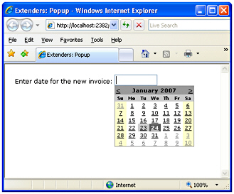
Figure 5-14: The PopupControl extender in action
Additional properties are OffsetX and OffsetY, which indicate the number of pixels to offset the popup from its position, as well as CommitProperty and CommitScript, which can be used to assign values to the target control.
The pop-up window will probably contain some interactive controls and post back. For this reason, you might want to insert it within an UpdatePanel control so that it can perform serverside tasks without refreshing the whole page. Typically, the popup will be dismissed after a postback-for example, the popup shown in Figure 5-14 is configured to be dismissed after the user has selected a date. The calendar in this case fires the SelectionChanged event on the server:
protected void Calendar1_SelectionChanged(object sender, EventArgs e)
{
 PopupExtender1.Commit(
 Calendar1.SelectedDate.ToShortDateString());
}
The Commit method sets the default property of the associated control to the specified value. If you want to control which (nondefault) property is set on the target when the popup is dismissed, use the CommitProperty property. Likewise, you use the CommitScript property to indicate the Javascript function to execute on the client after setting the result of the popup.
| Warning |
Note that an extender can’t be placed in a different UpdatePanel than the control it extends. If the extended control is incorporated in an UpdatePanel, the extender should also be placed in the updatable panel. If you miss this, you get a runtime exception. |
User Interface Extenders
In the family of ASP.NET AJAX extenders, the biggest group is user-interface extenders-that is, special components that help in the implementation of rich and user-friendly features.
The AlwaysVisibleControl Extender
The AlwaysVisibleControl extender allows you to pin a given control, or panel of controls, to one of the page corners so that it appears to float over the background body as the page is scrolled or resized. You can use the extender with virtually any ASP.NET control.
 Need a bit of dummy text? Look at
 http://www.loremipsum.net
You set the target position for the bound control using the HorizontalSide and VerticalSide properties to define the corner of the page where the content should be docked. The HorizontalSide property accepts Left and Right as values, whereas Top and Bottom are feasible values for the VerticalSide property. You can also control the offset from each border using the VerticalOffset and HorizontalOffset properties. Finally, ScrollEffectDuration indicates how many seconds the scrolling effect will last when the target control is repositioned. (See Figure 5-15.)
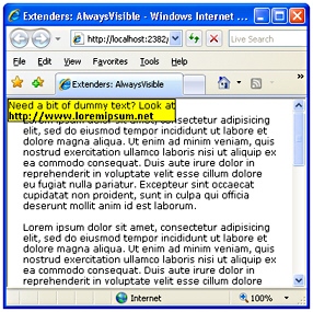
Figure 5-15: The AlwaysVisible extender in action
Note that you can’t add the extender to a plain HTML element. If you have an HTML block to keep always visible (for example, the tag in the previous example), add the runat=server attribute and give it a unique ID.
The CascadingDropDown Extender
The CascadingDropDown extender can be attached to a DropDownList control to automatically populate it based on the current selection of one or more parent DropDownList controls.
The CascadingDropDown extender is designed to fit in a relatively common scenario in which the contents of one drop-down list depend on the selection of another list. With this arrangement, you don’t need to transfer to the client the entire data set from which a child list can select a subset of items to display in accordance with the selection on its parent. For example, suppose you want the user to select a country and a city in that country. To minimize data transfer and provide a friendlier user interface, you might want to keep the city list empty until a selection is made on the country list. When a country is selected, you get back to the server to download the list of cities available for that country. The CascadingDropDown extender simplifies this scenario by injecting some glue code into the client page and also making some assumptions on the structure of your page code.
All the logic about the contents of the set of DropDownList controls is expected to reside on a Web service. The Web service, in turn, can use any suitable method for storing and looking up any relevant data. The Web service, though, is somewhat forced to use a contracted schema. In particular, it needs to have a method with the following signature:
[WebMethod]
public CascadingDropDownNameValue[] GetDropDownContents(
 string knownCategoryValues, string category)
{
 ...
}
The name of the method can vary, of course. The CascadingDropDownNameValue type is an internal collection type that is designed to contain the name/value items to show in the dropdown list. Each drop-down list bound to the extender belongs to a category:
The content of the Category property is any name that helps the Web service method to understand what kind of data should be retrieved and the meaning of the input arguments. The PromptText property sets any text that you want to display in the drop-down list when no selection is currently made and the control is typically disabled. The LoadingText property indicates any text that has to be displayed while the drop-down list is being populated. The ServiceMethod property indicates the method to call to fill in the list control. If no ServicePath is specified, the method is assumed to be a page method. Finally, ParentControlID creates a hierarchy and designates a list to be the child of another list.
Each time the selection changes in a parent DropDownList control, the extender makes a call to the Web service and retrieves the list of values for the next DropDownList in the hierarchy. If no selection is currently made, the extender automatically disables the control. (See Figure 5-16.)
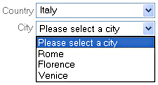
Figure 5-16: The CascadingDropDown extender in action on two drop-down lists
The DropShadow Extender
The DropShadow extender is designed to add a drop shadow to panel controls to make them look more professional. You can also set the opacity and width of the shadow:
The TargetControlID property sets the control that will be rendered with a drop shadow. This control should generally be a Panel; however, as long as you don’t set rounded corners, it can also be any other ASP.NET control, such as a TextBox. You control the opacity of the shadow through the Opacity property. Values for the property range from 0.0 to 1.0, where 0 (or 0.0) means total transparency. Hence, the closer the value is to 1 (or 1.0) the darker the shadow will be.
The Rounded Boolean property indicates whether the surrounding panel and the shadow should have rounded corners. The default is false. Figure 5-17 shows the extender in action.
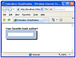
Figure 5-17: The DropShadow extender in action
The DynamicPopulate Extender
The DynamicPopulate extender is a sort of binder component that replaces the markup of a given control with the markup returned by a Web service method call. The extender can be seen as a shrink-wrapped and simplified version of the UpdatePanel control that we discussed in Chapter 4. It captures a client event and fires a remote call. The returned string is inserted in the page DOM as the child of the target element. Here’s an example:
Last updated:
When the user clicks on the specified item-in this case, the button named Button1-the extender starts working. It invokes the method GetTimeOnServer and replaces the subtree rooted in the Msg control with its output. The method GetTimeOnServer is a Web service method. You specify the URL to the service using the ServicePath property. If this property is not set, the method is assumed to be a page method defined either in the code file of the page or inline through a server
Part I - ASP.NET AJAX Building Blocks
Part II - Adding AJAX Capabilities to a Site
Part III - Client-Centric Development
EAN: 2147483647
Pages: 81
