How to Use BoxLayout
| < Day Day Up > |
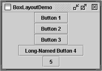
| The Swing packages include a general-purpose layout manager named BoxLayout . [3] BoxLayout either stacks its components on top of each other (see Figure 2) or places them in a rowyour choice. You might think of it as a full-featured version of FlowLayout .
Figure 2. An application that demonstrates using BoxLayout to display a centered column of components.
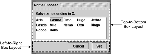
By creating one or more lightweight containers that use BoxLayout , you can achieve some layouts for which the more complex GridBagLayout is often used. BoxLayout is also useful in situations where you might consider using GridLayout or BorderLayout . One big difference between BoxLayout and many earlier layout managers is that it respects each component's maximum size and X and Y alignment. We'll discuss that later. Figure 3 shows a GUI that uses two instances of BoxLayout . In the upper part, a top-to-bottom box layout places a label above a scroll pane. In the lower part, a left-to-right box layout places two buttons next to each other. BorderLayout combines the two parts of the GUI and ensures that any excess space is given to the scroll pane. Figure 3. ListDialog uses two instances of BoxLayout , indicated by the dashed lines.
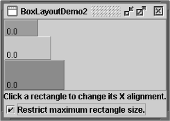
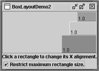
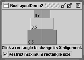
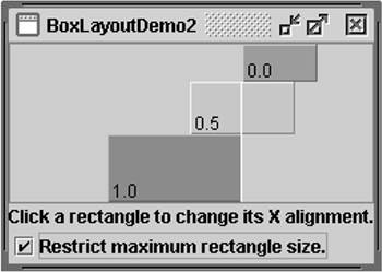
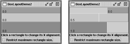
The following code, taken from ListDialog.java , lays out the GUI. It's in the constructor for the dialog, which is implemented as a JDialog subclass. The bold lines of code set up the box layouts and add components to them. JScrollPane listScroller = new JScrollPane(list); listScroller.setPreferredSize(new Dimension(250, 80)); listScroller.setMinimumSize(new Dimension(250, 80)); listScroller.setAlignmentX(LEFT_ALIGNMENT); ... //Lay out the label and scroll pane from top to bottom. JPanel listPane = new JPanel(); listPane.setLayout(new BoxLayout(listPane, BoxLayout.PAGE_AXIS)); JLabel label = new JLabel(labelText); listPane.add(label); listPane.add(Box.createRigidArea(new Dimension(0,5))); listPane.add(listScroller); listPane.setBorder(BorderFactory.createEmptyBorder(10,10,10,10)); //Lay out the buttons from left to right. JPanel buttonPane = new JPanel(); buttonPane.setLayout(new BoxLayout(buttonPane, BoxLayout.LINE_AXIS)); buttonPane.setBorder(BorderFactory.createEmptyBorder(0, 10, 10, 10)); buttonPane.add(Box.createHorizontalGlue()); buttonPane.add(cancelButton); buttonPane.add(Box.createRigidArea(new Dimension(10, 0))); buttonPane.add(setButton); //Put everything together using the content pane's BorderLayout. Container contentPane = getContentPane(); contentPane.add(listPane, BorderLayout.CENTER); contentPane.add(buttonPane, BorderLayout.SOUTH); The first bold line creates a top-to-bottom box layout and sets it up as the layout manager for listPane . The two arguments to the BoxLayout constructor are the container that it manages and the axis along which the components will be laid out. The next three bold lines add the label and the scroll pane to the container, separating them with a rigid area that is, an invisible lightweight component used to add space between other components. In this case, the rigid area has no width and puts exactly 5 pixels between the label and the scroll pane. Rigid areas are discussed later, in Using Invisible Components as Filler (page 468). The next chunk of bold code creates a left-to-right box layout and sets it up for the buttonPane container. Then it adds two buttons to the container, using a rigid area to put 10 pixels between them. To place the buttons at the right side of their container, the first component added to the container is glue . This glue is an invisible, lightweight component that grows as necessary to absorb any extra container space. Glue is discussed in Using Invisible Components as Filler (page 468). As an alternative to invisible components, you can sometimes use empty borders to create space around components. For example, the preceding code snippet uses empty borders to put 10 pixels between all sides of the dialog and its contents and between the two parts of the contents. Borders are completely independent of layout managers. They're simply how Swing components draw their edges. See How to Use Borders (page 535) in Chapter 9 for more information. Don't let the length of the BoxLayout discussion scare you. You can probably use BoxLayout with the information you already have. If you run into trouble or if you want to take advantage of BoxLayout 's power, read on. BoxLayout FeaturesAs we said before, BoxLayout arranges components either on top of each other or in a row. As it arranges components, it takes their alignments and minimum, preferred, and maximum sizes into account. This section discusses top-to-bottom layout. The same concepts apply to left-to-right or right-to-left layout, simply substituting X for Y, height for width, and so on. Version Note: Before v1.4, no constants existed for specifying the box layout's axis in a localizable way. Instead, you specified X_AXIS (left to right) or Y_AXIS (top to bottom). Our examples use the constants LINE_AXIS and PAGE_AXIS , which are preferred because they enable programs to adjust to languages that have different orientations. In the default left-to-right orientation, LINE_AXIS specifies left-to-right layout and PAGE_AXIS specifies top-to-bottom layout. When BoxLayout lays out components from top to bottom, it tries to size each one at its preferred height. If the amount of vertical space isn't ideal, the BoxLayout tries to adjust individual components' height so that they fill the available space. However, the components might not fit exactly, since BoxLayout respects each component's requested minimum and maximum heights. Any extra space appears at the bottom of the container. A top-to-bottom BoxLayout tries to make all of its container's components equal in widthas wide as the largest preferred width. If the container is forced to be wider than that, BoxLayout tries to make all of the components as wide as the container as well. If the components aren't all the same width (because of restricted maximum size or any of them have a strict left or right alignment), then X alignment comes into play. The X alignments affect not only the components' positions relative to each other but also their location (as a group ) within their container. Figures 4 through 6 illustrate alignment of components that have restricted maximum widths. Figure 4. Left alignment with a restricted maximum width. Figure 6. Right alignment with a restricted maximum width. As shown in Figure 4, all three components have an X alignment of 0.0 ( Component. LEFT_ALIGNMENT ). This means that their left sides should be aligned. Furthermore, it means that all three components are positioned as far left in their container as possible. In Figure 5, all three components have an X alignment of 0.5 ( Component. CENTER_ALIGNMENT ). This means that their centers should be aligned and that they should be positioned in the horizontal center of their container. Figure 5. Center alignment with a restricted maximum width. In Figure 6, the components have an X alignment of 1.0 ( Component.RIGHT_ALIGNMENT ). You can guess what that means for the components' alignment and position relative to their container. You might be wondering what happens when the components have both restricted maximum sizes and different X alignments. Figure 7 is an example. Figure 7. The components have restricted maximum sizes and different X alignments. As you can see, the left side of the component that has an X alignment of 0.0 ( Component. LEFT_ALIGNMENT ) is aligned with the center of the component that has the 0.5 X alignment ( Component.CENTER_ALIGNMENT ), which is aligned with the right side of the component that has an X alignment of 1.0 ( Component.RIGHT_ALIGNMENT ). Mixed alignments like this are discussed in the section Fixing Alignment Problems (page 471). What if none of the components has a maximum width? If all of them have identical X alignments, then they're all made as wide as their container. If the X alignments are different, then any component with an X alignment of 0.0 (left) or 1.0 (right) is smaller. All components with an intermediate X alignment (such as center) will be as wide as their container. To get to know BoxLayout better, you can run your own experiments with BoxLayoutDemo2 . Try This:
Using Invisible Components as FillerEach component controlled by a box layout butts up against its neighboring components. If you want space between components, you can either add an empty border to one or both or insert invisible components to provide the space. You can create invisible components with the Box class. [7]
The Box class defines a nested class, Box.Filler , [8] that provides invisible components. The Box class also has convenience methods to help you create common types of filler. Table 2 gives details about creating invisible components with Box and Box.Filler .
Table 2. Creating Invisible Components with Box and Box.Filler
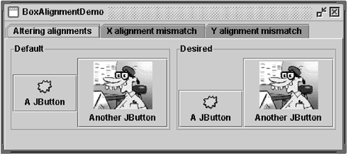
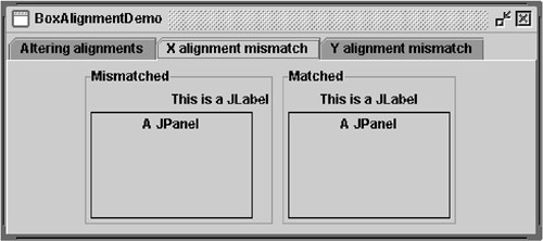
Here's how you generally use each filler type: Rigid AreaUse this when you want a fixed-size space between two components (see Figure 9). For example, to put five pixels between two components in a left-to-right box, use this code: container.add(firstComponent); container.add(Box.createRigidArea(new Dimension(5,0))); container.add(secondComponent); Figure 9. With and without a rigid area. Note: The Box class provides another kind of filler for putting fixed space between components: a vertical or horizontal strut. Unfortunately, struts have unlimited maximum heights and widths (for horizontal and vertical struts, respectively). This means that a horizontal box within a vertical box, for example, can sometimes be too tall. For this reason, we recommend that you use rigid areas instead of struts. GlueUse this to specify where excess space in a layout should go. Think of it as a semi-wet adhesive stretchy and expandable yet taking up no space unless you pull apart the components it's joining. For example, by putting horizontal glue between two components in a left-to-right box, you make any extra space go between them instead of to the right of them. Figure 10 is an example of making the space in a left-to-right box go between two components instead of to their right. container.add(firstComponent); container.add(Box.createHorizontalGlue()); container.add(secondComponent); Figure 10. With and without horizontal glue. Custom Box.FillerUse this to specify a component with whatever minimum, preferred, and maximum sizes you want. For example, to create some filler in a left-to-right layout that puts at least 5 pixels between two components and ensures a minimum container height of 100 pixels, you could use this code: container.add(firstComponent); Dimension minSize = new Dimension(5, 100); Dimension prefSize = new Dimension(5, 100); Dimension maxSize = new Dimension(Short.MAX_VALUE, 100); container.add(new Box.Filler(minSize, prefSize, maxSize)); container.add(secondComponent); Figure 11 illustrates a layout with and without a custom filler. Figure 11. With and without a custom filler. Fixing Alignment ProblemsTwo types of alignment problems sometimes occur with BoxLayout . In one group of components all have the same alignment but you want to change that to make them look better. Instead of having the centers of a group of left-to-right buttons all in a line, you might want to align them at their bottoms. Figure 12 shows an example. Figure 12. You can alter the default alignment of components. Two or more components controlled by BoxLayout have different default alignments, which causes them to be misaligned . As Figure 13 shows, if a label and a panel are in a top-to-bottom box layout, the label's left edge is, by default, aligned with the panel center. Figure 13. Misalignment can occur when two or more components controlled by BoxLayout have different default alignments. In general, all components controlled by a top-to-bottom BoxLayout object should have the same X alignment. Similarly, all components controlled by a left-to-right BoxLayout should have the same Y alignment. You can set a JComponent 's X alignment by invoking its setAlignmentX method. An alternative available to all components is overriding the getAlignmentX method in a custom subclass of the component class. You set the Y alignment of a component by invoking the setAlignmentY method or by overriding getAlignmentY . Here's an example, taken from an application called BoxAlignmentDemo , [9] of changing the Y alignments of two buttons so that the buttons' bottoms are aligned:
button1.setAlignmentY(Component.BOTTOM_ALIGNMENT); button2.setAlignmentY(Component.BOTTOM_ALIGNMENT); By default, most components have center X and Y alignment. However, buttons, combo boxes, labels, and menu items have a different default X alignment value: LEFT_ALIGNMENT . The BoxAlignmentDemo program gives examples of fixing mismatched alignment. Usually, it's as simple as center-aligning an offending button or label. For example: label.setAlignmentX(Component.CENTER_ALIGNMENT); Specifying Component SizesAs we mentioned before, BoxLayout pays attention to a component's requested minimum, preferred, and maximum sizes. You might need to adjust these sizes while you're fine-tuning the layout. Sometimes the need to adjust size is obvious. For example, a button's maximum size is generally the same as its preferred size. If you want the button to be wider when additional space is available, you need to change its maximum size. At other times, however, the need to adjust size is not so obvious. You might be getting unexpected results with a box layout and might not know why. In this case, it's usually best to treat the problem as one of alignment first. If adjusting the alignments doesn't help, you might have a size problem. We'll discuss this further a bit later. Note: Although BoxLayout pays attention to a component's maximum size, many layout managers don't. For example, if you put a button in the bottom part of a BorderLayout , it will probably be wider than its preferred width, no matter what its maximum size. BoxLayout , on the other hand, never makes a button wider than its maximum size. You can change the minimum, preferred, and maximum sizes in two ways:
If you're running into trouble with a box layout and you've ruled out alignment, the problem might well be size- related . For example, if the container controlled by the box layout is taking up too much space, one or more of the components in the container probably needs to have its maximum size restricted. Two techniques track down size trouble in a box layout:
The Box Layout APITables 3 through 5 list the commonly used BoxLayout and Box constructors and methods. You can find the BoxLayout API documentation online at: http://java.sun.com/j2se/1.4.2/docs/api/javax/swing/BoxLayout.html. Table 3. Creating BoxLayout Objects
Table 4. Creating Space Fillers
Table 5. Other Useful Methods
Examples That Use Box LayoutsThe following table lists some of the many examples that use box layouts.
|
| < Day Day Up > |
EAN: 2147483647
Pages: 171
