Chart and Graph Components
| Graphs and charts have many powerful features that you can use to customize your plots. This section covers how to configure these options.
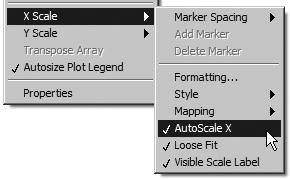
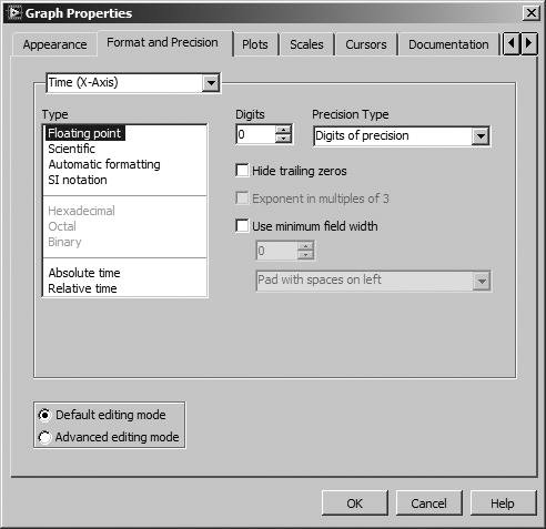
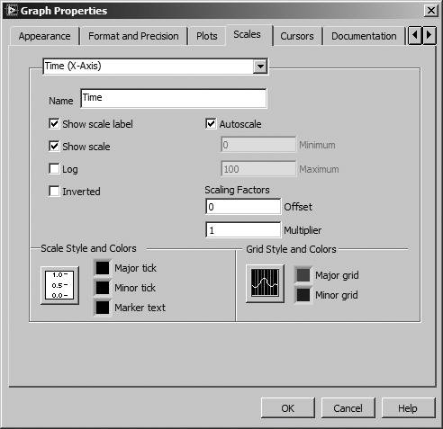
Figure 8.31. Graph elements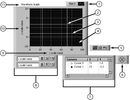 Playing with the ScalesCharts and graphs can automatically adjust their horizontal and vertical scales to reflect the points plotted on them; that is, the scales adjust themselves to show all points on the graph at the greatest resolution. You can turn this autoscaling feature on or off using the AutoScale X and AutoScale Y options from the X Scale menu, or the Y Scale menu of the object's pop-up menu. You can also control these autoscaling features from the scale legend (which we'll get to in a minute). LabVIEW defaults to autoscaling on for graphs and off for charts. However, using autoscaling may cause the chart or graph to update more slowly, depending upon the computer and video system you use, because new scales must be calculated with each plot. If you don't want to autoscale, you can change the horizontal or vertical scale directly using the Operating or Labeling tool to type in a new number, just as you can with any other LabVIEW control or indicator, and turn autoscaling off. X and Y Scale MenusThe X and Y scales each have a submenu of options, as shown in Figure 8.32. Figure 8.32. X Scale and Y Scale graph pop-up submenu options Use AutoScale to turn the autoscaling option on or off. Normally, the scales are set to the exact range of the data when you perform an autoscale operation. You can use the Loose Fit option if you want LabVIEW to round the scale to "nicer" numbers. With a loose fit, the numbers are rounded to a multiple of the increment used for the scale. For example, if the markers increment by five, then the minimum and maximum values are set to a multiple of five instead of the exact range of the data. The Formatting . . . option brings up a Graph Properties dialog box with the Format and Precision tab active, as shown in Figure 8.33. From here, you can configure the numeric formatting of the scale. Figure 8.33. Format and Precision tab of the Graph Properties dialog From the Scales tab of the Graph Properties dialog box, as shown in Figure 8.34, you can configure the following items:
Figure 8.34. Scales tab of the Graph Properties dialog The Scale LegendThe scale legend lets you create labels for the X and Y scale (or for multiple XY scales, if you have more than one), and have easy pop-up access to their configuration. The scale legend gives you buttons for scaling the X or Y axis, changing the display format, and autoscaling. Popping up on the graph or chart and choosing Visible Items>>Scale Legend will give you a box like the one shown in Figure 8.35. Figure 8.35. Scale legend In the scale legend, you can type the names of your scales in the textbox. This text will show up on the graph or chart's box X or Y axis. You can click on the buttons to configure the same options as in the X|Y Scale Formatting pop-up window just described (see Figure 8.36). It's just a more convenient way to access this information for some people. Figure 8.36. Scale legend buttons pop-up menu options
Scale Lock Button Use the Operating tool to click on the Scale Lock button to toggle autoscaling for each scale, the visibility of scales, and so on.
You can resize the scale legend with the Positioning tool, just like an array, to create, show, or hide additional scales on your chart or graph. The Plot LegendCharts and graphs use a default style for each plot unless you have created a custom plot style for it. The plot legend lets you label, color, select line style, and choose point style for each plot. Show or hide the legend using the Visible Items>>Plot Legend option of the chart or graph pop-up menu. You can also specify a name for each plot in the legend. An example of a legend is shown in Figure 8.37. Figure 8.37. Plot Legend When you select Plot Legend, only one plot shows in the box that appears. You can show more plots by dragging down a corner of the legend with the Positioning tool. After you set plot characteristics in the Plot Legend, the plot retains those settings, regardless of whether the legend is visible. If the chart or graph receives more plots than are defined in the legend, LabVIEW draws the extra plots in default style. When you move the chart or graph body, the legend moves with it. You can change the position of the legend relative to the graph by dragging only the legend to a new location. Resize the legend on the left to give labels more room in the window or on the right to give plot samples more room.
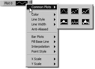
By default, the plot legend of a graph or chart will automatically resize to the width of the longest plot name visible in the legend. This behavior can be disabled by popping up on the graph or chart and selecting Autosize Legend from the shortcut menu to remove the checkmark. By default, each plot is labeled with a number, beginning with zero. You can modify this label the same way you modify other LabVIEW labelsjust start typing with the Labeling tool. Each plot sample has its own menu to change the plot, line, color, and point styles of the plot. You can also access this menu by clicking on the legend with the Operating tool.
|
EAN: 2147483647
Pages: 294
