Recipe 3.15. Rounding Corners (Sliding Doors Technique)
ProblemYou want to round corners in columns that have flexible widths. SolutionUse the Sliding Doors technique that was made popular by web designer Douglas Bowman. Create the design of the rounded corners (see Figure 3-32). Figure 3-32. The basic design for the column Then create separate graphics for the four corners like the ones in Figure 3-33. Wrap the content that is in the column with additional div elements: <div > <div > <h2> I Met a Girl I’d Like to Know Better </h2> </div> <div > <div > <p>Lorem ipsum dolor sit amet, consectetuer adipiscing elit, sed diam nonummy nibh euismod tincidunt ut laoreet dolore magna aliquam erat volutpat. Ut wisi enim ad minim veniam.</p> </div> </div> </div> Figure 3-33. The column design split up into four graphics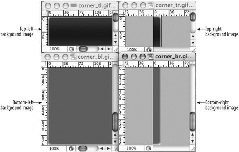 Then place the background images through CSS (see Figure 3-34). The top-left corner goes in the "inner-head" id selector, the top-right corner slides into the preexisting h2 element, the "content" id selector gets the bottom-left selector, and the "inner-content" id selector houses the bottom-right graphic. #innerhead { background-image: url(corner_tl.gif); background-position: top left; background-repeat: no-repeat; } h2 { background-image: url(corner_tr.gif); background-position: top right; background-repeat: no-repeat; margin: 0; padding: 7px; border-bottom: 1px solid #999; font-size: 1.3em; font-weight: normal; color: #eee; } #content { background-image: url(corner_bl.gif); background-position: bottom left; background-repeat: no-repeat; } #innercontent { background-image: url(corner_br.gif); background-position: bottom right; background-repeat: no-repeat; } Figure 3-34. Rounded corners appear on the column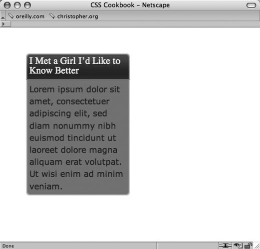 DiscussionThe div and h2 elements act as hooks to add background images into all four corners of the column. As the browser resizes, the background images stay in their respective corners (see Figure 3-35). Figure 3-35. Rounded corners are maintained even though the column expands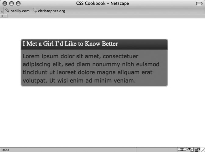 To make sure that the design integrity is maintained as the column expands, further digital image editing is required. Manipulate one side, either left or right, and expand the two graphics both vertically and horizontally. For example, the top-left and bottom-left graphics (see Figures 3-36 and 3-37) were expanded for this solution. Figure 3-36. The bottom-right graphic is 600 pixels wide and over 250 pixels tall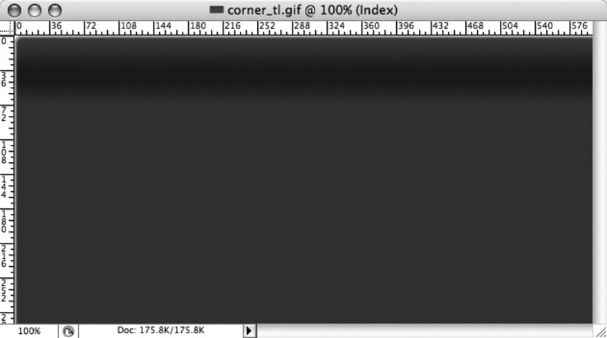 Figure 3-37. The bottom-left graphic is 600 pixels wide and 600 pixels tall See AlsoRecipe 3.16 for a simple solution to rounding corners of a column. |
EAN: 2147483647
Pages: 235