Section 13.1. Creating the Buttons
13.1. Creating the ButtonsA navigation bar (or nav bar) begins life as a mockup in your image editor. Figure 13-1 shows a typical example. Assume that you want this to be a straightforward nav bar with a simple rollover behavior on the buttons, and you don't want the buttons to change their default appearance depending upon the page. Figure 13-1. This is the nav bar that you want to build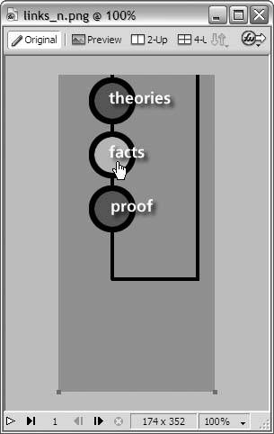 To break this nav bar into separate buttons, you make use of a technique called slicing, which is exactly what it sounds like: you cut up the image into smaller rectangular areas, each of which you save as a separate image file. (In your Dreamweaver template, you'll eventually reconstruct the nav bar from the individual slices, just like putting together a jigsaw puzzle.) Figure 13-2 shows the slices that you make in your image editor after trimming off the excess space at the bottom of the mockup. Figure 13-2. Slice the mockup into separate filesone for each button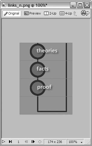 This nav bar is going to have a rollover effect. You'll remember from Chapter 4 that a rollover graphic is actually two separate image filesone for the default button or up state; and one for the over state, or button as it looks when the visitor rolls over it with the mouse pointer. By slicing your mockup, you created separate image files for the up state, but you still need the image files for the over state. Lighten the color of the button face for the rollover effect, and save the slices as separate image files. Figure 13-3 shows what you come up with, all sliced and ready to go. Notice that you don't need to create an over state for the decoration at the bottom of the nav bar, because it doesn't have a rollover effect. Figure 13-3. Sliced and ready to go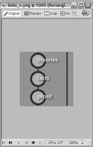
Your nav bar now consists of seven separate image files, shown in Figure 13-4:
These are for a standard two-state nav bar, which matches your specifications exactly. It's worth noting, though, that Dreamweaver nav bars can have up to four button states. In addition to the up and over states, you can also define a down state, which is how the button looks when the visitor is on the corresponding page or section of the site; and the over-while-down state, which is the rollover effect for a button in the down state. Figure 13-5 shows the sliced nav-bar mockups for a four-state nav bar: the up state (top left), the over state (bottom left), the down state (top right), and the over-while-down state (bottom right). Figure 13-6 shows the resulting separate image files, which are seventeen in number (four buttons times four states, plus one graphic for the decoration at the top). Figure 13-4. Your nav bar now consists of seven separate image files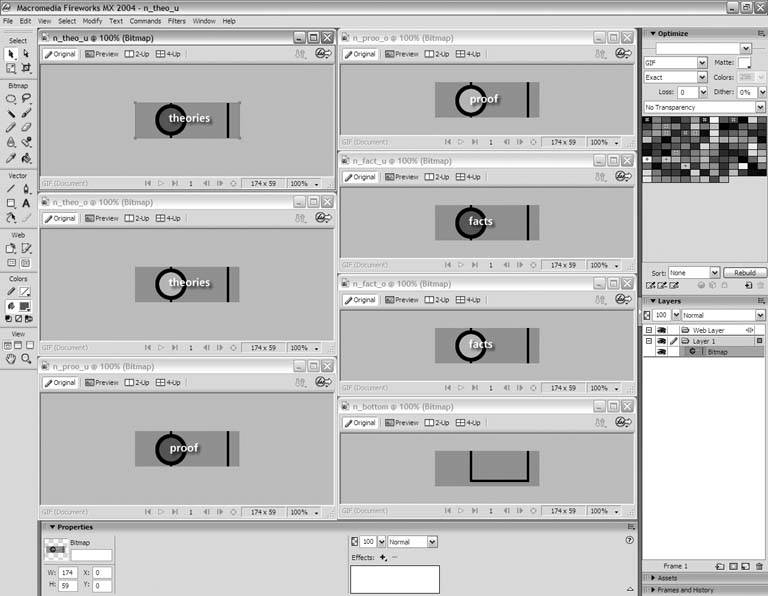
Figure 13-5. The up state (top left), the over state (bottom left), the down state (top right), and the over-while-down state (bottom right)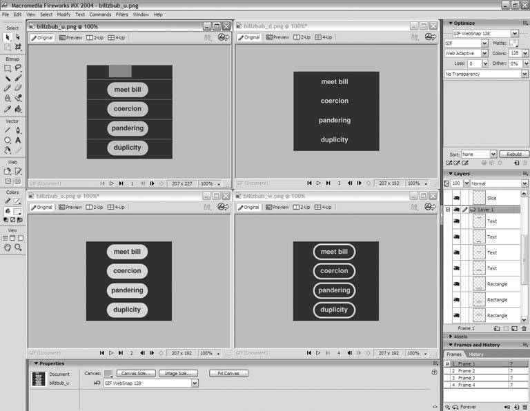
Figure 13-6. Save the slices as separate image files, and you get these seventeen graphics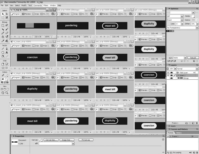 |
EAN: 2147483647
Pages: 154