Analyzing Data with PivotChart Reports
As PivotTable reports help make sense of large quantities of data, PivotChart reports help bring PivotTables to life by adding visual context and meaning to the data. In Excel, PivotChart reports are always linked to PivotTable reports.
To create a PivotChart report, you follow the same steps to create a PivotTable report (described earlier in the chapter), but in step 1 of the wizard, you select PivotChart Report (With PivotTable Report). When you create a PivotChart report, the report is bound to a PivotTable report. Any changes that you make in the PivotChart report are reflected in the PivotTable report’s layout and vice versa.
The field list and shortcut menu for a PivotChart report behave the same way as they do for a PivotTable. The PivotTable toolbar contains fewer commands for a PivotChart report than for a PivotTable report. For a PivotChart report, the PivotTable menu is renamed PivotChart.
Your Turn
In this exercise, you will use the PivotTable And PivotChart Wizard to create a PivotTable report and a linked PivotChart report.
-
Start Excel, and open the
 HomeSale.xls file in the Chap04 folder. If the file is already open, close it (do not save the file) and reopen the file.
 -
On the worksheet labeled West Region, click cell A1.
-
On the Data menu, click PivotTable And PivotChart Report.
-
Click the PivotChart Report (With PivotTable Report) option, and then click Finish.
-
On the worksheet labeled Chart1, from the PivotTable field list, drag the Month icon to the Drop Category Fields Here area of the PivotChart report.
-
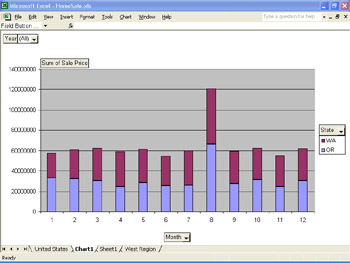
From the PivotTable Field List, drag the Year icon to the Drop Page Fields Here area, drag the State icon to the Drop Series Fields Here area, and drag the Sale Price icon to the Drop Data Items Here area. Compare your results to Figure 4-28.

Figure 4-28: PivotChart report for yearly West region home sales.
On the worksheet labeled Sheet1, notice the layout of the PivotTable report. Now let’s change the PivotChart report layout and see what happens to the PivotTable report layout.
-
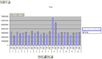
On the worksheet labeled Chart1, from the PivotTable field list, drag the State icon next to the Month field in the category drop zone. Compare your results to Figure 4-29.
On the worksheet labeled Sheet1, notice that the data in the PivotTable report has changed to reflect the layout of the PivotChart report. Now let’s change the PivotTable report layout and see what happens to the PivotChart report layout.

Figure 4-29: PivotChart report displaying columns for both state and month. -
On the worksheet labeled Sheet1, click the arrow in cell B4 and clear the Show All check box.
-
Select the OR box, and then click OK. Compare your results to Figure 4-30.

Figure 4-30: PivotTable report displaying sales figures for Oregon state.On the worksheet labeled Chart1, notice the layout of the PivotChart report has changed to reflect the data shown in the PivotTable report.
Experiment with dragging fields from the PivotTable field list to the various areas of the PivotChart report and the PivotTable report. As you make changes to the reports, go back and forth between the reports to see how the data is synchronized.
EAN: 2147483647
Pages: 137