Understanding PivotTable and PivotChart Reports
As you saw in the previous chapter, analyzing lists with a few hundred records is fairly manageable. But data sources that consist of only a few hundred records are rare. Data sources usually contain from tens of thousands to millions of data records. To make sense of the information in large data sources, you can use PivotTable reports and PivotChart reports to extract and summarize these sources of data.
PivotTable reports organize data in a list format: each column contains similar data, the columns have headings in the first row, and the list isn’t interrupted by any blank rows or columns (although having blank cells within the data source is perfectly acceptable). For even greater organization, you can separate a PivotTable report or PivotChart report into pages so that you can view a manageable subset of the data. With pages, you can display data as you would with a stack of index cards: one page might have data for the first quarter’s sales, the next page data for the second quarter’s sales, and so on.
To understand the rest of the concepts and procedures in this chapter you need to understand some terminology that applies to PivotTable reports and PivotChart reports. Figure 4-1 shows the framework from which you start building a PivotTable report. In the list that follows, I’ll explain each item.
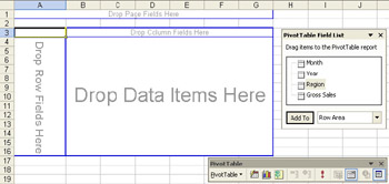
Figure 4-1: An empty PivotTable report.
-
The PivotTable Field List window contains an entry for each field in the data source. In Figure 4-1, the data source is a list of records, and the fields in the list are Month, Year, Region, and Gross Sales.
Note The PivotTable Field List window does not exist in Excel 2000. Instead, the available fields are included as part of the PivotTable toolbar. If you are using Excel 2000, in the procedures and exercises in this chapter, drag fields to PivotTable reports or PivotChart reports from the PivotTable toolbar instead of the PivotTable field list.
-
Areas are locations on the PivotTable report where you place and organize data. As you can see in Figure 4-1, the areas are labeled Drop Page Fields Here, Drop Column Fields Here, Drop Row Fields Here, and Drop Data Items Here. These areas are also referred to as drop zones because you can drag fields from the PivotTable field list and drop them in one of the report areas. Notice that the areas in which you can place data are outlined with a thick blue border. If you click outside these borders, the thick blue borders disappear, the PivotTable Field List window disappears, and the PivotTable toolbar options are disabled. When the borders are visible, the PivotTable report is said to be active.
-
A row field is a field in the data source that you assign to the row area in a PivotTable report. In Figure 4-2, the Month field (with the values 1, 2, 3, and so on) is a row field. Row fields are one of the basic building blocks of PivotTable reports. Row fields can contain child fields. For example, you might have a Month field with a child Week field and so on, which allows you to see different levels of summarization.
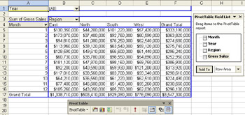
Figure 4-2: A completed PivotTable report. Month has been assigned as a row field, and Region as the column field. The data is the sum of gross sales. -
A column field is a field from the data source that you assign to the column area in a PivotTable report. In Figure 4-2, the Region field (with the values East, North, South, and West) is a column field. Column fields are ideal for visual data comparisons. For example, you can quickly spot the differences among the monthly figures for the East, North, South, and West regions. With the Month and Region fields, you can compare data across both time and geography. Without the Region column field, you could compare figures only across time.
-
A page field is a field from the data source that you assign to the page (or filter) area in a PivotTable report. In Figure 4-2, the Year field (with the value All) is a page field. Page fields are typically used to organize data into manageable screens of data. In this example, you could use the Year field to display data for all years or filter the data to display information for only a specific year.
-
An item is a subcategory of a row, column, or page field. For instance, you could subcategorize a department store by clothes, housewares, toys, and so on. In Figure 4-2, the Region column field contains the items East, North, South, and West.
-
A data field is a field from the data source that contains the values to be summarized. In Figure 4-2, the Sum Of Gross Sales field (displaying the dollar figures) is a data field. For most types of data, you can choose how to summarize data (for example, by sum, average, or count). A data field usually summarizes numbers, but it can also summarize text values. For example, you can count the number of times a specific word (such as North or South) appears in a field.
PivotChart reports are a more graphical version of PivotTable reports. In Excel, a PivotChart report is associated with a specific PivotTable report. When you pivot data in a PivotTable report, any PivotChart report associated with that PivotTable report changes its display to synchronize with the PivotTable report’s view of the data. The process works the other way as well: changing a PivotChart report’s layout changes the data displayed in any PivotTable report to which the PivotChart report is associated.
The concepts used in a PivotChart report are much the same as with a PivotTable. The basic layout of a PivotChart report is shown in Figure 4-3. Figure 4-4 shows a completed PivotChart.
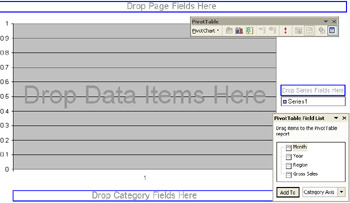
Figure 4-3: An empty PivotChart report.
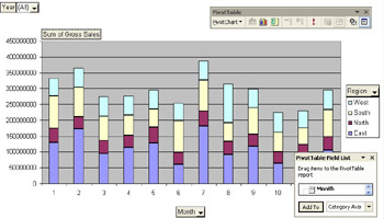
Figure 4-4: A completed PivotChart report.
-
Similar to the PivotTable report, the PivotTable field list contains one field for each field in the data source.
-
Areas or drop zones on a PivotChart, as you can see in Figure 4-3, include Drop Page Fields Here, Drop Data Items Here, Drop Series Fields Here, and Drop Category Fields Here. The names of the areas reflect that charts use series and categories instead of columns and rows. Notice also that before you place data in a PivotChart report, the areas in which you can place data are outlined with a thick blue border (except for the Drop Data Items Here area). Unlike a PivotTable report, however, after you drop a field into a PivotChart report area, any thick blue border associated with the area disappears.
-
A category field is a field from the data source that you assign to the category axis in a PivotChart report. In Figure 4-4, the Month field (with the values 1, 2, 3, and so on) is a category field.
-
A series field is a field from the data source that you associate with the series axis in a PivotChart report. In Figure 4-4, the Region field (with the values East, North, South, and West) is a series field.
Note For information about category fields and series fields, see the descriptions of category axes and series axes in Chapter 3, “Analyzing Data with Microsoft Excel.”
-
A page field is a field from the data source that you assign to a page (or filter) area in a PivotChart report. In Figure 4-4, the Year field (with the value All) is a page field. Similar to the way you use a page field in a PivotTable report, you can use a page field in a PivotChart to display all data or filter data for a particular view.
-
An item is a subcategory of a series or category field. In Figure 4 4, the Month category field contains the items 1 through 12. Similarly, the Region series field contains the items West, South, North, and East.
-
A data field is a field from the data source that contains the values to be summarized. In Figure 4-4, the Sum of Gross Sales field (displaying the dollar figures on the left side of the PivotChart report) is the data field.
Now that you have a sense of the terminology used to define a PivotTable report and PivotChart report, try out the following exercise to become more familiar with these data analysis tools.
Putting It Together
In this exercise, you will discover why PivotTable reports and PivotChart reports are such valuable tools. Let’s say that you’re a sales analyst, and you want to draw some conclusions about last month’s sales activity, such as the highest overall order price, the product with the most sales, and the orders with the highest discount.
-
Start Excel, and open the
 SaleOrd.xls file in the Chap04 folder. Using the techniques you learned in the previous chapter, can you determine which order had the highest overall price? You might try inserting subtotals in the list.
 -
Click cell A1.
-
On the Data menu, click Subtotals and then click OK.
-
Click the button labeled “2” in the subtotals area at the left of the worksheet.
The list includes a large number of subtotals. Can you spot the highest one? You might consider sorting the list by the Extended Price field and then creating subtotals. However, with the list sorted in this manner, the items are no longer in order by Order ID. If you add subtotals for each order ID at this point, the subtotals apply to each item in an order, not to the entire order. Also, if you want to ask questions such as which product sold the most or which order had the highest discount, you would have to go through these steps again. You can see that even if you sort or filter a list of this size, it is difficult to see the trends and results. You have too many records to analyze at a glance. The solution is to create a PivotTable report. Let’s tackle the first problem: creating a report to display and sort the order subtotals. You must remove subtotals first, so click Subtotals on the Data menu and then click Remove All.
-
On the Data menu, click PivotTable And PivotChart Report.
-
Click Finish.
-
On the worksheet labeled Sheet1, drag the Order ID icon from the PivotTable field list to the Drop Row Fields Here area.
-
Next drag the Extended Price icon to the Drop Data Items Here area.
-
Click cell A4.
-
On the PivotTable toolbar, click the PivotTable menu and then click Sort And Top 10.
-
Click the Descending option.
-
In the Using Field list, click Sum Of Extended Price. Compare your results to Figure 4-5, and then click OK. As you can see in Figure 4-6, order ID 10865 has the highest total price ($16,387.50).
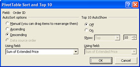
Figure 4-5: The PivotTable Sort And Top 10 dialog box for order IDs sorted by Sum Of Extended Price.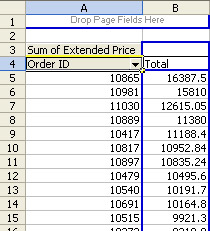
Figure 4-6: Order IDs sorted by highest overall total price. -
Now let’s figure out which product had the most sales. To do so, right-click cell A4 and then click Hide.
-
From the PivotTable field list, drag the Product icon to cell A4 (labeled “Total”).
-
On the PivotTable toolbar, click the PivotTable menu and then click Sort And Top 10.
-
Click the Descending option.
-
In the Using Field list, click Sum Of Extended Price and then click OK. C te de Blaye has the highest overall total sales of $141,396.73, as shown in Figure 4-7.
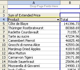
Figure 4-7: Products sorted by highest overall total sales. -
Finally, let’s figure out which orders had the highest discount. Start by right-clicking cell A4 and then clicking Hide.
-
Right-click cell A3, and then click Hide.
-
From the PivotTable field list, drag the Order ID icon to the Drop Row Fields Here area. Drag the Discount icon to the Drop Data Items Here area.
-
Right-click cell A3, and then click Field Settings.
-
In the Summarize By list, click Max and then click OK.
-
Click cell A4, click the PivotTable menu, and then click Sort And Top 10.
-
In the Top 10 AutoShow area, click the On option.
-
In the Using Field list below the On option, click Max Of Discount. Compare your results to Figure 4-8, and then click OK. Notice in Figure 4-9 that the highest discount for an order was 25 percent. That discount was the same for 72 orders. (To get the order count, select cells B5 through B76, right-click anywhere on the status bar, and click Count).
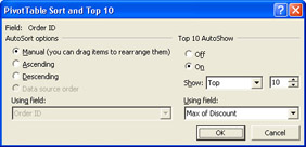
Figure 4-8: The PivotTable Sort And Top 10 dialog box with options for showing the 10 order IDs with the highest discount.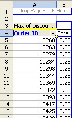
Figure 4-9: Order IDs with the highest discount.
EAN: 2147483647
Pages: 137