In-Process Metrics and Reports
We have thus far discussed an overall framework and the models associated with the framework for quality management during the development process. To facilitate the implementation of these models, we need a defect tracking and reporting system and a set of related in-process metrics. This is especially true for large development projects that involves many teams . In-process measurements and feedback, therefore, need to be available at various levels, ranging from the component team (several members ) level to the entire product and system, which may involve more than one organization. In this section we present some examples of in-process metrics and reports.
Figures 9.17 and 9.18 are examples of reports that can support the implementation of the front end of the Rayleigh model ”the design and code inspection phases. Figure 9.17 is the implementation version of the effort/outcome model in Figure 9.3. It is the first part of the inspection report and provides guidelines for interpretation and for actions with regard to the data in Figure 9.18.
Figure 9.17. An Inspection Report ”Effort/Defect Matrix
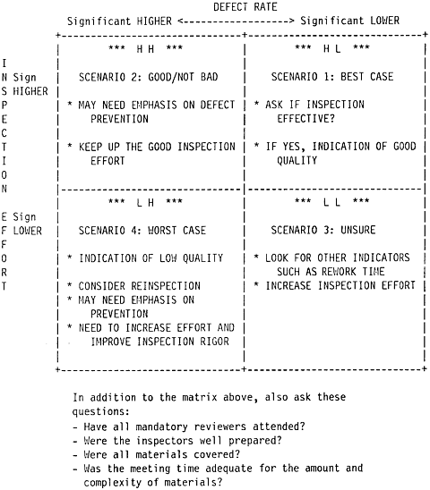
Figure 9.18. An Inspection Report ”Inspection Effort and Defect Rate
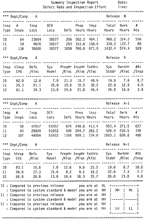
Figure 9.18 shows the number of inspections completed by stage (I0, high-level design review; I1, low-level design review; and I2, code inspection). The first part of the upper panel gives information about actual lines of code inspected (Insp Locs), total lines of code in the current plan for the department (DCR Locs), number of defects found, inspection effort in terms of preparation hours and inspection hours, rework hours, and the number of participants at the inspections (#Ats). The second part of the first panel (defined by double dashed lines) shows the normalized metrics such as percent inspection coverage (%Insp CVG), defects per thousand lines of code (Defs/Kloc), preparation hours per KLOC (PrepHr/Kloc), actual inspection hours per KLOC (InspHr/Kloc), total hours on inspection (the sum of preparation time and inspection time) per KLOC (TotHrs/Kloc), rework hours per KLOC (RwrkHr/Kloc) to complete the design or coding phase, and the average number of participants per inspection. The system model in terms of inspection defect rates (Sys Model) and inspection effort (Sys Stddr) are also presented for comparison.
In the second panel the same information for the previous release by the same team or department is shown. The bottom panel shows comparisons according to the scenarios of the effort/outcome model. For each phase of inspection, two comparisons are made: current release compared to the previous release, and current release compared to the system model. Specifically, the first comparison involves comparing "Defs/Kloc" and "TotHrs/Kloc" in the first panel with the corresponding numbers in the second panel. The second comparison involves comparing "Defs/Kloc" with "Sys Model" and "TotHrs/Kloc" with "Sys Stddr" in the first panel (current release). The report also automatically flags the total inspection effort (TotHrs/Kloc) if its value is lower than the system standard (Sys Stddr). As discussed in Chapter 6, inspection defect removal is much more cost effective than testing. Therefore, if a team's inspection effort is below the system standard, the minimum the team should do is to examine if there is enough rigor in their inspections, and if not, take appropriate action.
Note that for the effort/defect matrix, the inspection effort indicator is a proxy variable to measure how well the inspection process was executed. It is one, but not the only, operational definition to measure process quality. An alternative could be the inspection team's assessment and the inspection scoring approach. Specifically, instead of (or in addition to) the tracking of inspection effort, the inspection team assesses the effectiveness of the inspection and the quality of the design (or code) at the end of an inspection. Simple checklists such as the one in Table 9.1 can be used.
It is preferable to conduct two assessments for each inspection, one before and one after. Such pre- and postinspection evaluations provide information on the effect of the inspection process. For the preinspection assessment, the questions on inspection effectiveness and whether another inspection is needed may not apply.
The inspection scores can then be used as indicators of the process quality as well as the interim product (design and code) quality. When data on multiple inspections are available, the technique of control charting can be used for in-process quality control. For instance, the team may establish a requirement for mandatory rework or reinspection if the score of a design or an implementation is below the lower control limit.
Table 9.1. An Inspection Scoring Checklist
|
Response |
||||||||||
|---|---|---|---|---|---|---|---|---|---|---|
|
Poor |
Acceptable |
Excellent |
||||||||
|
Design |
1 |
2 |
3 |
4 |
5 |
6 |
7 |
8 |
9 |
10 |
|
Work meets requirements |
1 |
2 |
3 |
4 |
5 |
6 |
7 |
8 |
9 |
10 |
|
Understandability of design |
1 |
2 |
3 |
4 |
5 |
6 |
7 |
8 |
9 |
10 |
|
Extensibility of design |
1 |
2 |
3 |
4 |
5 |
6 |
7 |
8 |
9 |
10 |
|
Documentation of design |
1 |
2 |
3 |
4 |
5 |
6 |
7 |
8 |
9 |
10 |
|
Effectiveness of this inspection |
1 |
2 |
3 |
4 |
5 |
6 |
7 |
8 |
9 |
10 |
|
Does another inspection need to be held? |
_____Yes |
_____No |
||||||||
|
Code Implementation |
1 |
2 |
3 |
4 |
5 |
6 |
7 |
8 |
9 |
10 |
|
Work meets design |
1 |
2 |
3 |
4 |
5 |
6 |
7 |
8 |
9 |
10 |
|
Performance considerations |
1 |
2 |
3 |
4 |
5 |
6 |
7 |
8 |
9 |
10 |
|
Understandability of implementation |
1 |
2 |
3 |
4 |
5 |
6 |
7 |
8 |
9 |
10 |
|
Maintainability of implementation |
1 |
2 |
3 |
4 |
5 |
6 |
7 |
8 |
9 |
10 |
|
Documentation |
1 |
2 |
3 |
4 |
5 |
6 |
7 |
8 |
9 |
10 |
|
Effectiveness of this inspection |
1 |
2 |
3 |
4 |
5 |
6 |
7 |
8 |
9 |
10 |
|
Does another inspection need to be held? |
_____Yes |
_____No |
||||||||
When using the inspection scoring approach, factors related to small team dynamics should be considered . Data from this approach may not be unobtrusive and therefore should be interpreted carefully , and in the context of the development organization and the process used. For instance, there may be a tendency among the inspection team members to avoid giving low scores even though the design or implementation is poor. A score of 5 (acceptable) may actually be a 2 or a 3. Therefore, it is important to use a wider response scale (such as the 10-point scale) instead of a narrow one (such as a 3-point scale). A wider response scale provides room to express (and observe) variations and, once enough data are available, develop valid interpretations.
Figure 9.19 is another example of inspection defect reports. The defects are classified in terms of defect origin (RQ = requirements, SD = system design, I0 = high-level design, I1 = low-level design, I2 = code development) and defect type (LO = logic, IF = interface, DO = documentation). The major purpose of the report is to show two metrics ”in-process escape rate and percent of interface defects. The concept of in-process escape rate is related to the concept of defect removal effectiveness, which is examined in Chapter 6. The effectiveness metric is a powerful but not an in-process metric. It cannot be calculated until all defect data for the entire development process become available. The in-process escape metric asks the question in a different way. The effectiveness metric asks "what is the percentage of total defects found and removed by this phase of inspection?" The in-process escape metric asks "among the defects found by this phase of inspection, what is the percentage that should have been found by previous phases?" The lower the in-process escape rate, the more likely that the effectiveness of the previous phases was better. The in-process escape metric also supports the early defect removal approach. For example, if among the defects found by I2 (code inspection) there is a high percentage that should have been found by I1 (low-level design review), that means I1 (low-level design) was not done well enough and remedial actions should be implemented.
Figure 9.19. An Inspection Report ”Defect Origin and Defect Type
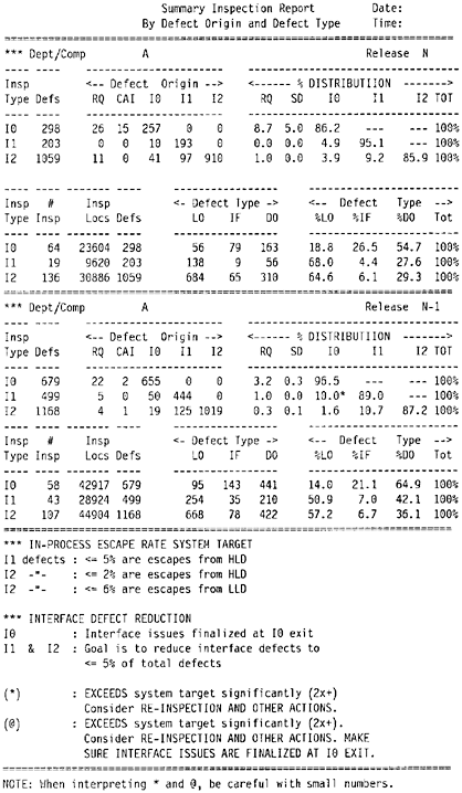
The rationale for the metric of percentage of interface defects is that a large percentage of defects throughout the development life cycle (from design defects to field defects) is due to interface issues. Furthermore, interface problems are to a large extent related to human communications and, therefore, preventable. Reducing interface defects should be an objective of in-process quality management. One of the objectives of high-level design is to finalize interface issues at the exit of I0 (high-level design review). Therefore, it is logical to see high percentages of interface defects at I0. However, at subsequent phases, if the percentage of interface defects remains high, it implies that the goal of resolving interface issues at I0 has not been achieved. In this example, the predetermined targets for in-process escape rates and for interface defect reduction were also shown in the report, and exceptions were flagged.
Figure 9.20 shows a report on unit test coverage and defects. Ideally, unit tests are conducted before the code is integrated into the system library. For various reasons (dependencies, schedule pressures, etc.), it is not uncommon that some unit tests are done after code integration. The in-process metrics and reports, therefore, should reflect the state of practice and encourage defect removal before integration. In Figure 9.20 the columns include the product ID (PROD), the ID of the components (CPID) that the organization owns, the lines of code by components for the current release (DCRLOC), the lines of code that have been unit tested (UTLOC), the unit test coverage so far (%CVG = UTLOC x 100/DCRLOC), the number of unit test defects found before integration [DEFS (DCR)], the number of unit test defects found after integration and expressed in the form of problem tracking reports (UT PTRs), and the normalized rates. The key interests of the report are the ratio of pre-integration defect removal [DEFS (DCR)] to postintegration defects (UT PTRS) and the overall unit test defect rate (TOTAL DEFS/DCR KLOC). The interpretation is that the higher the ratio (the higher defect removal before integration), the better. Components with high unit test defects found after code integration should be examined closely. Comparisons can also be made for the same components between two consecutive releases to reveal if an earlier defect removal pattern is being achieved.
Figure 9.20. A Unit Test Coverage and Defect Report
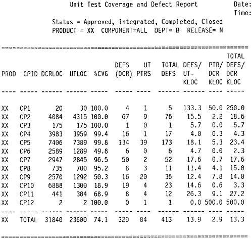
Figure 9.21 shows the test defect rate by phase. In addition to postintegration unit test defects (UT), it shows defects found during the build and integration process (BI), component test (CT), component regression test (CRT), system test (ST), and early customer programs (customer field test, customer early burn-in program, etc.).
Figure 9.21. A Defects by Test Phase Report
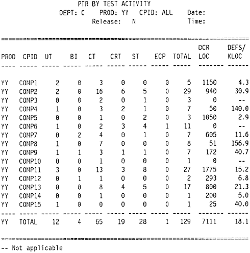
The column DCR LOC again shows the lines of new and changed code for the current release. The DEFS/KLOC column shows the defect rate per KLOC. The three components that have 0 in the DCR LOC column did not have new and changed code for that release but took part in the testing effort to remove defects in the existing code.
Data from Figure 9.21, together with data for unit test and the front-end inspections, provide sufficient information for the overall defect removal patterns for the entire development process. These in-process metrics and reports cannot be used in a piecemeal fashion. They should be used together in the context of the quality management models.
In addition to the basic metrics and reports, many other reports are useful for in-process quality management. The first is perhaps the test defect origin report. Similar to the inspection defect origin report, this reports classifies defects for each test phase by where they should have been found. For instance, when a defect is reported during a system test, its test origin (UT, CT, or ST) will be determined by involved parties. Usually it is easier to determine if a certain defect is a system test type defect, than to distinguish the difference between a unit test defect and a component test defect.
Other reports such as severity distribution of test defects, defect cause by test phase, and changes during the test phases due to performance reasons also provide important indicators of the product's quality. Testing defect rates have a strong correlation with field defect rates; the severity of test defects is also a good indicator of the severity distribution of field defects. Severe problems, usually difficult to circumvent, tend to have a more pervasive impact on customer business. Performance changes, especially the late ones, are error-prone activities. If negative signals are detected from these metrics, proactive actions (e.g., special customer evaluation or extended customer burn-in) should be planned before the release of the product.
There are more in-process metrics for testing that are not covered in this chapter. The next chapter provides a more detailed discussion of the subject.
What Is Software Quality?
Software Development Process Models
- Software Development Process Models
- The Waterfall Development Model
- The Prototyping Approach
- The Spiral Model
- The Iterative Development Process Model
- The Object-Oriented Development Process
- The Cleanroom Methodology
- The Defect Prevention Process
- Process Maturity Framework and Quality Standards
Fundamentals of Measurement Theory
- Fundamentals of Measurement Theory
- Definition, Operational Definition, and Measurement
- Level of Measurement
- Some Basic Measures
- Reliability and Validity
- Measurement Errors
- Be Careful with Correlation
- Criteria for Causality
Software Quality Metrics Overview
- Software Quality Metrics Overview
- Product Quality Metrics
- In-Process Quality Metrics
- Metrics for Software Maintenance
- Examples of Metrics Programs
- Collecting Software Engineering Data
Applying the Seven Basic Quality Tools in Software Development
- Applying the Seven Basic Quality Tools in Software Development
- Ishikawas Seven Basic Tools
- Checklist
- Pareto Diagram
- Histogram
- Run Charts
- Scatter Diagram
- Control Chart
- Cause-and-Effect Diagram
- Relations Diagram
Defect Removal Effectiveness
- Defect Removal Effectiveness
- Literature Review
- A Closer Look at Defect Removal Effectiveness
- Defect Removal Effectiveness and Quality Planning
- Cost Effectiveness of Phase Defect Removal
- Defect Removal Effectiveness and Process Maturity Level
The Rayleigh Model
- The Rayleigh Model
- Reliability Models
- The Rayleigh Model
- Basic Assumptions
- Implementation
- Reliability and Predictive Validity
Exponential Distribution and Reliability Growth Models
- Exponential Distribution and Reliability Growth Models
- The Exponential Model
- Reliability Growth Models
- Model Assumptions
- Criteria for Model Evaluation
- Modeling Process
- Test Compression Factor
- Estimating the Distribution of Total Defects over Time
Quality Management Models
- Quality Management Models
- The Rayleigh Model Framework
- Code Integration Pattern
- The PTR Submodel
- The PTR Arrival and Backlog Projection Model
- Reliability Growth Models
- Criteria for Model Evaluation
- In-Process Metrics and Reports
- Orthogonal Defect Classification
In-Process Metrics for Software Testing
- In-Process Metrics for Software Testing
- In-Process Metrics for Software Testing
- In-Process Metrics and Quality Management
- Possible Metrics for Acceptance Testing to Evaluate Vendor-Developed Software
- How Do You Know Your Product Is Good Enough to Ship?
Complexity Metrics and Models
- Complexity Metrics and Models
- Lines of Code
- Halsteads Software Science
- Cyclomatic Complexity
- Syntactic Constructs
- Structure Metrics
- An Example of Module Design Metrics in Practice
Metrics and Lessons Learned for Object-Oriented Projects
- Metrics and Lessons Learned for Object-Oriented Projects
- Object-Oriented Concepts and Constructs
- Design and Complexity Metrics
- Productivity Metrics
- Quality and Quality Management Metrics
- Lessons Learned from OO Projects
Availability Metrics
- Availability Metrics
- 1 Definition and Measurements of System Availability
- Reliability, Availability, and Defect Rate
- Collecting Customer Outage Data for Quality Improvement
Measuring and Analyzing Customer Satisfaction
- Measuring and Analyzing Customer Satisfaction
- Customer Satisfaction Surveys
- Analyzing Satisfaction Data
- Satisfaction with Company
- How Good Is Good Enough
Conducting In-Process Quality Assessments
- Conducting In-Process Quality Assessments
- The Preparation Phase
- The Evaluation Phase
- The Summarization Phase
- Recommendations and Risk Mitigation
Conducting Software Project Assessments
- Conducting Software Project Assessments
- Audit and Assessment
- Software Process Maturity Assessment and Software Project Assessment
- Software Process Assessment Cycle
- A Proposed Software Project Assessment Method
Dos and Donts of Software Process Improvement
- Dos and Donts of Software Process Improvement
- Measuring Process Maturity
- Measuring Process Capability
- Staged versus Continuous Debating Religion
- Measuring Levels Is Not Enough
- Establishing the Alignment Principle
- Take Time Getting Faster
- Keep It Simple or Face Decomplexification
- Measuring the Value of Process Improvement
- Measuring Process Adoption
- Measuring Process Compliance
- Celebrate the Journey, Not Just the Destination
Using Function Point Metrics to Measure Software Process Improvements
- Using Function Point Metrics to Measure Software Process Improvements
- Software Process Improvement Sequences
- Process Improvement Economics
- Measuring Process Improvements at Activity Levels
Concluding Remarks
- Concluding Remarks
- Data Quality Control
- Getting Started with a Software Metrics Program
- Software Quality Engineering Modeling
- Statistical Process Control in Software Development
A Project Assessment Questionnaire
EAN: 2147483647
Pages: 176
