The Rayleigh Model Framework
Perhaps the most important principle in software engineering is "do it right the first time." This principle speaks to the importance of managing quality throughout the development process. Our interpretation of the principle, in the context of software quality management, is threefold:
- The best scenario is to prevent errors from being injected into the development process.
- When errors are introduced, improve the front end of the development process to remove as many of them as early as possible. Specifically, in the context of the waterfall development process, rigorous design reviews and code inspections are needed. In the Cleanroom methodology, function verification by the team is used.
- If the project is beyond the design and code phases, unit tests and any additional tests by the developers serve as gatekeepers for defects to escape the front-end process before the code is integrated into the configuration management system (the system library). In other words, the phase of unit test or pre-integration test (the development phase prior to system integration) is the last chance to do it right the "first time."
The Rayleigh model is a good overall model for quality management. It articulates the points on defect prevention and early defect removal related to the preceding items. Based on the model, if the error injection rate is reduced, the entire area under the Rayleigh curve becomes smaller, leading to a smaller projected field defect rate. Also, more defect removal at the front end of the development process will lead to a lower defect rate at later testing phases and during maintenance. Both scenarios aim to lower the defects in the latter testing phases, which in turn lead to fewer defects in the field. The relationship between formal machine-testing defects and field defects, as described by the model, is congruent with the famous counterintuitive principle in software testing by Myers (1979), which basically states that the more defects found during formal testing, the more that remained to be found later. The reason is that at the late stage of formal testing, error injection of the development process ( mainly during design and code implementation) is basically determined (except for bad fixes during testing). High testing defect rates indicate that the error injection is high; if no extra effort is exerted, more defects will escape to the field.
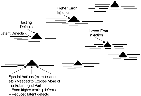
If we use the iceberg analogy to describe the relationship between testing and field defect rates, the tip of the iceberg is the testing defect rate and the submerged part is the field defect rate. The size of the iceberg is equivalent to the amount of error injection. By the time formal testing starts, the iceberg is already formed and its size determined. The larger its tip, the larger the entire iceberg. To reduce the submerged part, extra effort must be applied to expose more of the iceberg above the water. Figure 9.1 shows a schematic representation of the iceberg analogy.
Figure 9.1. Iceberg Analogy ”Error Injection, Testing Defects, and Latent Defects
A Rayleigh model derived from a previous release or from historical data can be used to track the pattern of defect removal of the project under development. If the current pattern is more front loaded than the model would predict, it is a positive sign, and vice versa. If the tracking is via calendar time such as month or week (versus by development phase), when enough data points are available, early estimation of model parameters can be performed. Quality projections based on early data would not be reliable compared to the final estimate at the end of the development cycle. Nonetheless, for in-process quality management, the data points can indicate the direction of the quality in the current release so that timely actions can be taken.
Perhaps more important than for quality projections, the Rayleigh framework can serve as the basis for quality improvement strategy ” especially the two principles associated with defect prevention and early defect removal. At IBM Rochester the two principles are in fact the major directions for our improvement strategy in development quality. For each direction, actions are formulated and implemented. For instance, to facilitate early defect removal, actions implemented include focus on the design review/code inspection (DR/CI) process; deployment of moderator training (for review and inspection meeting); use of an inspection checklist; use of in-process escape measurements to track the effectiveness of reviews and inspections; use of mini builds to flush out defects by developers before the system library build takes place; and many others. Plans and actions to reduce error injection include the laboratory-wide implementation of the defect prevention process; the use of CASE tools for development; focus on communications among teams to prevent interface defects; and others. The bidirectional quality improvement strategy is illustrated in Figure 9.2 by the Rayleigh model.
Figure 9.2. Rayleigh Model ”Directions for Development Quality Improvement
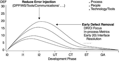
In summary, the goal is to shift the peak of the Rayleigh curve to the left while lowering it as much as possible. The ultimate target of IBM Rochester's strategy is to achieve the defect injection/removal pattern represented by the lowest curve, one with an error injection rate similar to that of IBM Houston's space shuttle software projects. In the figure, the Y -axis represents the defect rate. The development phases represented by the X -axis are high-level design review (I0), low-level design review (I1), code inspection (I2), unit test (UT), component test (CT), system test (ST), and product general availability (GA, or field quality, Fd).
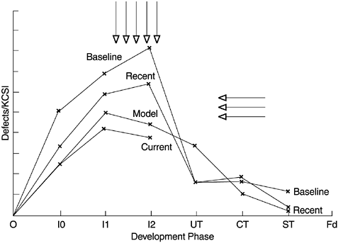
This type of strategy can be implemented whether the defect removal pattern of an organization follows a Rayleigh curve or not. If not, the discrete phase-based defect model can be used. The key is that the phase-based defect removal targets are set to reflect an earlier defect removal pattern compared to the baseline. Then action plans should be implemented to achieve the targets. Figure 9.3 shows the defect removal patterns of several releases of a systems software developed at IBM Rochester. As can be seen from the curves, the shifting of the defect removal patterns does reflect improvement in the two directions of (1) earlier peaking of the defect curves, and (2) lower overall defect rates. In the figure, the Y -axis is the number of defects normalized per thousand new and changed source instructions (KCSI). The development phases on the X -axis are the same as those in Figure 9.2.
Figure 9.3. An Example of Improvement of the Defect Removal Pattern
One major problem with the defect removal model is related to the assumption of the error injection rate. When setting defect removal targets for a project, error injection rates can be estimated based on previous experience. However, there is no way to determine how accurate such estimates are when applied to the current release. When tracking the defect removal rates against the model, lower actual defect removal could be the result of lower error injection or poor reviews and inspections. In contrast, higher actual defect removal could be the result of higher error injection or better reviews and inspections. From the in-process defect removal data of the project under development, how do we know which scenario (better defect removal, higher error injection, lower error injection, or poorer defect removal) fits the project? To solve this problem, additional indicators must be incorporated into the context of the model for better interpretation of the data.
One such additional indicator is the quality of the process execution. For instance, at IBM Rochester the metric of inspection effort (operationalized as the number of hours the team spent on design and code inspections normalized per thousand lines of source code inspected) is used as a proxy indicator for how rigorous the inspection process is executed. This metric, combined with the inspection defect rate, can provide useful interpretation of the defect model. Specifically, a 2 x 2 matrix such as that shown in Figure 9.4 can be used. The high “low comparisons are between actual data and the model, or between the current and previous releases of a product. Each of the four scenarios imparts valuable information.
Figure 9.4. Inspection Effort/Defect Rate Scenarios Comparing Actuals to Model
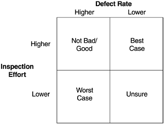
- Best case scenario ”high effort/low defect rate: The design/code was cleaner before inspections, and yet the team spent enough effort in DR/CI (design review/code inspection) that good quality was ensured.
- Good/not bad scenario ”high effort/high defect rate: Error injection may be high, but higher effort spent is a positive sign and that may be why more defects were removed. If effort is significantly higher than the model target, this may be a good scenario.
- Unsure scenario ”low effort/low defect rate: Not sure whether the design and code were better, therefore less time was needed for inspection or inspections were hastily done, so fewer defects were found. In this scenario, we need to rely on the team's subjective assessment and other information for a better determination.
- Worst case scenario ”low effort/high defect rate: High error injection but inspections were not rigorous enough. Chances are more defects remained in the design or code at the exit of the inspection process.
The matrix is formed by combining the scenarios of an effort indicator and an outcome indicator. We call this approach to evaluating the quality of the project under development the effort/outcome model. The model can be applied to any phase of the development process with any pairs of meaningful indicators. In Chapter 10, we discuss the application of the model to testing data in details. We contend that the effort/ outcome model is a very important framework for in-process quality management.
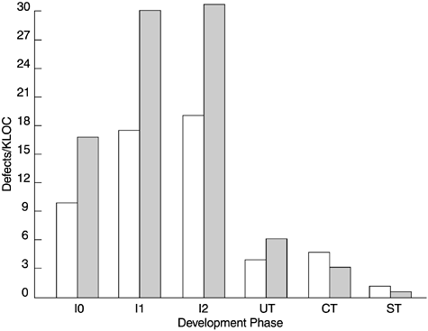
Figures 9.5 and 9.6 show a real-life example of the high effort/high defect rate scenario from two software products. Compared to a predecessor product, the inspection effort of this product increased by more than 60%, and as a result the defect removal during the design and code inspection process was much higher than that of the predecessor product. As a result of the front-end effort, the test defect rate was significantly lower, and better field quality was observed. When development work was almost complete and lower test defect rates were observed , it was quite clear that the product would have better quality. However, during the front-end development it would have been difficult to interpret the defect removal pattern without the effort/defect matrix as part of the defect model. This example falls into the good/not bad scenario in Figure 9.4.
Figure 9.5. Inspection Effort Comparison by Phase of Two Products
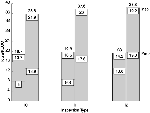
Figure 9.6. Defect Removal Patterns of Two Products
What Is Software Quality?
Software Development Process Models
- Software Development Process Models
- The Waterfall Development Model
- The Prototyping Approach
- The Spiral Model
- The Iterative Development Process Model
- The Object-Oriented Development Process
- The Cleanroom Methodology
- The Defect Prevention Process
- Process Maturity Framework and Quality Standards
Fundamentals of Measurement Theory
- Fundamentals of Measurement Theory
- Definition, Operational Definition, and Measurement
- Level of Measurement
- Some Basic Measures
- Reliability and Validity
- Measurement Errors
- Be Careful with Correlation
- Criteria for Causality
Software Quality Metrics Overview
- Software Quality Metrics Overview
- Product Quality Metrics
- In-Process Quality Metrics
- Metrics for Software Maintenance
- Examples of Metrics Programs
- Collecting Software Engineering Data
Applying the Seven Basic Quality Tools in Software Development
- Applying the Seven Basic Quality Tools in Software Development
- Ishikawas Seven Basic Tools
- Checklist
- Pareto Diagram
- Histogram
- Run Charts
- Scatter Diagram
- Control Chart
- Cause-and-Effect Diagram
- Relations Diagram
Defect Removal Effectiveness
- Defect Removal Effectiveness
- Literature Review
- A Closer Look at Defect Removal Effectiveness
- Defect Removal Effectiveness and Quality Planning
- Cost Effectiveness of Phase Defect Removal
- Defect Removal Effectiveness and Process Maturity Level
The Rayleigh Model
- The Rayleigh Model
- Reliability Models
- The Rayleigh Model
- Basic Assumptions
- Implementation
- Reliability and Predictive Validity
Exponential Distribution and Reliability Growth Models
- Exponential Distribution and Reliability Growth Models
- The Exponential Model
- Reliability Growth Models
- Model Assumptions
- Criteria for Model Evaluation
- Modeling Process
- Test Compression Factor
- Estimating the Distribution of Total Defects over Time
Quality Management Models
- Quality Management Models
- The Rayleigh Model Framework
- Code Integration Pattern
- The PTR Submodel
- The PTR Arrival and Backlog Projection Model
- Reliability Growth Models
- Criteria for Model Evaluation
- In-Process Metrics and Reports
- Orthogonal Defect Classification
In-Process Metrics for Software Testing
- In-Process Metrics for Software Testing
- In-Process Metrics for Software Testing
- In-Process Metrics and Quality Management
- Possible Metrics for Acceptance Testing to Evaluate Vendor-Developed Software
- How Do You Know Your Product Is Good Enough to Ship?
Complexity Metrics and Models
- Complexity Metrics and Models
- Lines of Code
- Halsteads Software Science
- Cyclomatic Complexity
- Syntactic Constructs
- Structure Metrics
- An Example of Module Design Metrics in Practice
Metrics and Lessons Learned for Object-Oriented Projects
- Metrics and Lessons Learned for Object-Oriented Projects
- Object-Oriented Concepts and Constructs
- Design and Complexity Metrics
- Productivity Metrics
- Quality and Quality Management Metrics
- Lessons Learned from OO Projects
Availability Metrics
- Availability Metrics
- 1 Definition and Measurements of System Availability
- Reliability, Availability, and Defect Rate
- Collecting Customer Outage Data for Quality Improvement
Measuring and Analyzing Customer Satisfaction
- Measuring and Analyzing Customer Satisfaction
- Customer Satisfaction Surveys
- Analyzing Satisfaction Data
- Satisfaction with Company
- How Good Is Good Enough
Conducting In-Process Quality Assessments
- Conducting In-Process Quality Assessments
- The Preparation Phase
- The Evaluation Phase
- The Summarization Phase
- Recommendations and Risk Mitigation
Conducting Software Project Assessments
- Conducting Software Project Assessments
- Audit and Assessment
- Software Process Maturity Assessment and Software Project Assessment
- Software Process Assessment Cycle
- A Proposed Software Project Assessment Method
Dos and Donts of Software Process Improvement
- Dos and Donts of Software Process Improvement
- Measuring Process Maturity
- Measuring Process Capability
- Staged versus Continuous Debating Religion
- Measuring Levels Is Not Enough
- Establishing the Alignment Principle
- Take Time Getting Faster
- Keep It Simple or Face Decomplexification
- Measuring the Value of Process Improvement
- Measuring Process Adoption
- Measuring Process Compliance
- Celebrate the Journey, Not Just the Destination
Using Function Point Metrics to Measure Software Process Improvements
- Using Function Point Metrics to Measure Software Process Improvements
- Software Process Improvement Sequences
- Process Improvement Economics
- Measuring Process Improvements at Activity Levels
Concluding Remarks
- Concluding Remarks
- Data Quality Control
- Getting Started with a Software Metrics Program
- Software Quality Engineering Modeling
- Statistical Process Control in Software Development
A Project Assessment Questionnaire
EAN: 2147483647
Pages: 176
