Concepts
The GCHART procedure produces charts based on the values of a chart variable . These values are represented by a set of midpoints . The chart itself displays information about the chart variable in the form of chart statistics .
Figure 29.8 on page 778 and Figure 29.9 on page 779 illustrate these terms as well as other terms used with the GCHART procedure.
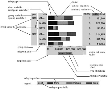
Figure 29.8: Terms Used with Bar Charts
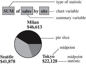
Figure 29.9: Terms Used with Pie and Donut Charts
Bar charts have two axes: a midpoint axis that shows the categories of data, and a response axis that displays the scale of values for the chart statistic. The response axis is divided into evenly spaced intervals identified with major tick marks that are labeled with the corresponding statistic value. Minor tick marks are evenly distributed between the major tick marks. Each axis is labeled with the chart variable name or label. The response axis is also labeled with the statistic type.
Pie charts show statistics based on values of a variable called the chart variable. Generally, the values of the chart variable are represented by the slices in the chart. Next to each pie slice a number (or character string) appears that identifies the value or range of values assigned to that slice by the GCHART procedure. This number (or character string) is known as the midpoint for that slice. The statistic value for each midpoint is displayed beneath the midpoint. The slices in the chart represent all the values of the chart variable included in the chart. The number of degrees included in each slice represents the statistic value for the midpoint.
About Chart Variables
The chart variable is the variable in the input data set whose values determine the categories of data represented by the bars, blocks, slices, or spines. The chart variable generates the midpoints to which each observation in the data set contribute.
The chart variable can be either character or numeric. Character chart variables contain character values, which are always discrete. Numeric chart variables fall into two categories: discrete and continuous.
-
Discrete variables contain a finite number of specific numeric values that are to be represented on the chart. For example, a variable that contains years , such as 1984 or 2001, is a discrete variable.
-
Continuous variables contain a range of numeric values that are to be represented on the chart. For example, a variable of temperature data that contains real values between 0 and 212 is a continuous variable.
Numeric chart variables are always treated as continuous variables unless the DISCRETE option is used in the action statement.
Missing Values
By default, the GCHART procedure ignores missing midpoint values for the chart variable. If you specify the MISSING option, then missing values are treated as a valid midpoint and are included on the chart. Missing values for the group and subgroup variables are always treated as valid groups and subgroups.
When the value of the variable that is specified in the FREQ= option is missing, 0, or negative, the observation is excluded from the calculation of the chart statistic.
When the value of the variable specified in the SUMVAR= option is missing, the observation is excluded from the calculation of the chart statistic.
About Midpoints
Midpoints are the values of the chart variable that identify categories of data. By default, midpoints are selected or calculated by the procedure. The way the procedure handles the midpoints depends on whether the values of the chart variable are character, discrete numeric, or continuous numeric.
Character Values
A character chart variable generates a midpoint for each unique value of the variable. For example, if the chart variable CITY contains the names of three different cities, each city is a midpoint, resulting in three midpoints for the chart:
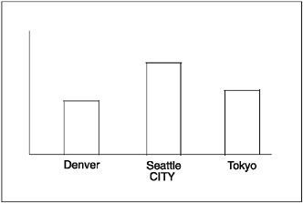
Figure 29.10: Character Midpoints
(In pie charts, midpoint values that compose a small percentage of the total for the chart may be placed in the OTHER slice and will not produce a separate midpoint.)
By default, character midpoints are arranged in alphabetic order. If a character variable has an associated format, the values are arranged in order of the formatted values.
Discrete Numeric Values
A numeric chart variable used with the DISCRETE option generates a midpoint for each unique value of the chart variable. For example, the numeric variable YEAR used with DISCRETE produces one midpoint for each year:
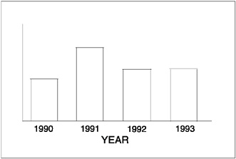
Figure 29.11: Discrete Numeric Midpoints
By default, numeric midpoints are arranged in ascending order. If the numeric variable has an associated format, each formatted value generates a separate midpoint. Formatted numeric variables are arranged in ascending order according to their unformatted numeric values.
Continuous Numeric Values
A continuous numeric variable generates midpoints that represent ranges of values. By default, the GCHART procedure determines the ranges, calculates the median value of each range, and displays the appropriate median value at each midpoint on the chart. A value that falls exactly halfway between two midpoints is placed in the higher range.
For example, the numeric variable AGE produces four midpoints, each of which represents a ten-year age range; the median value of the range is displayed at each midpoint:
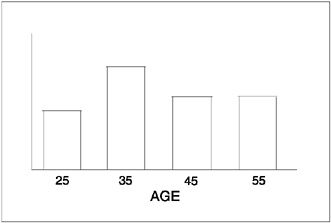
Figure 29.12: Continuous Numeric Midpoints
By default, midpoints of ranges are arranged in ascending order.
Selecting and Ordering Midpoints
For character or discrete numeric values, you can use the MIDPOINTS= option to rearrange the midpoints or to exclude midpoints from the chart. For example, to change the default alphabetic order of the midpoints in Figure 29.10 on page 780, specify
midpoints='Tokyo' 'Denver' 'Seattle'
To exclude the midpoint for Denver, specify
midpoints='Tokyo' 'Seattle'
In this case, values excluded by the option are not included in the calculation of the chart statistic.
You can order or select discrete numeric midpoint values just as you do character values, but you omit the quotation marks when specifying numeric values.
For continuous numeric variables, use the LEVELS= or MIDPOINTS= option to change the number of midpoints, to control the range of values each midpoint represents, or to change the order of the midpoints. To control the range of values each midpoint represents, use the MIDPOINTS= option to specify the median value of each range. For example, to select the ranges 20 “29, 30 “39, and 40 “49, specify
midpoints=25 35 45
Alternatively, to select the number of midpoints that you want and let the procedure calculate the ranges and medians, use the LEVELS= option.
You can also use formats to control the ranges of continuous numeric variables, but in that case the values are no longer continuous but discrete.
Note: You cannot use the MIDPOINTS= option to exclude continuous numeric values from the chart because values below or above the ranges specified by the option are automatically included in the first and last midpoints, respectively. To exclude continuous numeric values from a chart, use a WHERE statement in a DATA step or the WHERE= DATA set option.
See also the description of the LEVELS= and MIDPOINTS= options for the appropriate statement.
About Chart Statistics
The chart statistic is the statistical value calculated for the chart variable and represented by each block, bar, or slice. The GCHART procedure calculates six chart statistics; the default statistic is frequency.
The examples given in the descriptions of these statistics assume a data set with two variables, CITY and SALES. The values of CITY are Denver , Seattle , and Tokyo . There are 21 observations: seven for Denver, nine for Seattle, and five for Tokyo.
Frequency
The frequency statistic is the total number of observations in the data set for each midpoint. For example, seven observations of the chart variable, CITY, contain the value Denver , so the frequency for the Denver midpoint is 7.
Cumulative Frequency
The cumulative frequency statistic adds the frequency for the current midpoint to the frequency of all of the preceding midpoints. For example, the frequency for the Denver midpoint is 7, and the frequency for the next midpoint, Seattle , is 9, so the cumulative frequency for Seattle is 16.
You cannot request cumulative frequency with the DONUT, PIE, PIE3D, or STAR statements.
Percentage
The percentage statistic is calculated by dividing the frequency for each midpoint by the total frequency count for all midpoints in the chart or group and multiplying it by 100. For example, the frequency count for the Denver midpoint is 7 and the total frequency count for the chart is 21, so the percentage statistic for Denver is 33.3%.
Cumulative Percentage
The cumulative percentage statistic adds the percentage for the current midpoint to the percentage for all of the preceding midpoints in the chart or group. For example, the percentage for the Denver midpoint is 33.3, and the percentage for the next midpoint, Seattle , is 42.9, so the cumulative percentage for Seattle is 76.2.
You cannot request cumulative percentage with the DONUT, PIE, PIE3D, or STAR statements.
Sum
The sum statistic is the total of the values for the SUMVAR= variable for each midpoint. For example, if you specify SUMVAR=SALES and the values of the SALES variable for the seven Denver observations are 8734 , 982 , 1504 , 3207 , 4502 , 624 , and 918 , the sum statistic for the Denver midpoint is 20,471.
You must use the SUMVAR= option to specify the variable for which you want the sum statistic.
Mean
The mean statistic is the average of the values for the SUMVAR= variable for each midpoint. For example, if TYPE=MEAN and SUMVAR=SALES, the mean statistic for the Denver midpoint is 2924.42.
You must use the SUMVAR= option to specify the variable for which you want the mean statistic.
Calculating Weighted Statistics
By default, each observation is counted only once in the calculation of the chart statistic. To calculate weighted statistics in which an observation can be counted more than once, use the FREQ= option. This option identifies a variable whose values are used as a multiplier for the observation in the calculation of the statistic. If the value of the FREQ= variable is missing, 0, or negative, the observation is excluded from the calculation.
If you use the SUMVAR= option, then the SUMVAR= variable value for an observation is multiplied by the FREQ= variable value for the observation for use in calculating the chart statistic.
For example, to use a variable called COUNT to produce weighted statistics, assign FREQ=COUNT. If you also assign the variable HEIGHT to the SUMVAR= option, then the following table shows how the values of COUNT and HEIGHT would affect the statistic calculation:
| Value of COUNT | Value of HEIGHT | Number of times the observation is used | Value used for HEIGHT |
|---|---|---|---|
| 1 | 55 | 1 | 55 |
| 5 | 65 | 5 | 325 |
| . | 63 |
| - |
| ˆ’ 3 | 60 |
| - |
By default, the percentage and cumulative percentage statistics are calculated based on the frequency. If you want to chart a percentage or cumulative percentage based on a sum, you can use the FREQ= option to specify a variable to use for the "sum" calculation and specify the PCT statistic, as shown in this example:
freq=count type=pct
Because the variable that is used by FREQ= determines the number of times an observation is counted, the value of COUNT is the equivalent of the sum statistic.
See also the descriptions of the TYPE=, SUMVAR=, and FREQ= options for the action statements.
About Patterns
When a chart needs one or more patterns, the procedure uses either
-
default patterns and outlines that are automatically generated by SAS/GRAPH or
-
patterns, colors, outlines, and images that are defined by PATTERN statements, graphics options, and procedure options.
The following sections summarize pattern behavior for the GCHART procedure. For more information, see PATTERN Statement on page 169.
Default Patterns and Outlines
In general, the default pattern that the GCHART procedure uses is a solid fill that it rotates once through the colors list, skipping the foreground color. The procedure also outlines all areas in the foreground color. (Typically, the foreground color is the first color in the device's colors list.)
Specifically, the GCHART procedure uses default patterns and outlines when you
-
do not specify any PATTERN statements, and
-
do not use the CPATTERN= graphics option, and
-
do not use the COLORS= graphics options (that is, you use the device's default colors list and it has more than one color), and
-
do not use the COUTLINE= option in the action statement.
If all of these conditions are true, then the GCHART procedure
-
selects the first default fill pattern, which is always solid, and rotates it through the colors list, generating one solid pattern for each color. If the first color in the device's colors list is black (or white), the procedure skips that color and begins generating patterns with the next color.
-
uses the foreground color to outline every patterned area.
If the procedure needs additional patterns, GCHART selects the next default pattern fill that is appropriate to the type of chart and rotates it through the colors list, skipping the foreground color as before. The procedure continues in this fashion until it has generated enough patterns for the chart.
Changing any of these conditions may change or override the default behavior:
-
If you specify a colors list with the COLORS= option in a GOPTIONS statement and the list contains more than one color, the procedure rotates the default solid pattern through that list, using every color, even if the foreground color is black (or white). The default outline color remains the foreground color.
-
If you specify either COLORS=( one-color ) or the CPATTERN= graphics option, the default fill pattern changes from solid to the list of appropriate hatch patterns. The procedure uses the specified color to generate one pattern definition for each hatch pattern in the list. The default outline color remains the foreground color.
-
Whenever there are PATTERN definitions in effect, whether or not the GCHART procedure can use them, the default outline color for all patterns changes from foreground to SAME, as described in the following section.
For a description of these graphics options, see Chapter 8, Graphics Options and Device Parameters Dictionary, on page 261.
User -Defined Patterns, Outlines, and Images
You can use PATTERN statements to explicitly specify patterns, including color or fill type or both. You can also specify images to fill the bars of two-dimensional bar charts. For complete information on all patterns, see PATTERN Statement on page 169. See also the section on controlling patterns and colors for each chart type.
When you use PATTERN statements, the procedure uses the specified patterns until all of the PATTERN definitions they generate have been used. Then, if more patterns are required, it returns to the default pattern rotation.
Whenever you specify any PATTERN statement, the default pattern outline changes. Instead of the foreground color, the outline color is the same as the fill color; for example, a blue bar has a blue outline. The effect is the same as specifying COUTLINE=SAME. Even when the procedure runs out of user-defined patterns and generates default patterns, the outlines continue to match the interior pattern color.
To change the outline color of any pattern, whether it's a default or user-defined pattern, use the COUTLINE= option in the action statement that generates the chart.
Two-dimensional bar charts created with the HBAR and VBAR statements can use the PATTERN statement to fill specified bars with specified images. For details, see the IFRAME= option on page 806 and the IBACK= goption Controlling Bar Chart Patterns, Colors, and Images on page 816.
Other means of including images in charts include adding background images to two-and three-dimensional bar charts. For two-dimensional bar charts created with HBAR and VBAR statements, the IBACK= goption IBACK on page 317 specifies image files that fill the backplane frame. To fill the backplane frame of a three-dimensional image created with the HBAR3D or VBAR3D statements, use the IFRAME= option on page 806. For further information, including a listing of recognized image file types, see Image File Types Supported by SAS/GRAPH on page 106.
Version 6 Patterns
If you specify the V6COMP graphics option, then the procedure generates patterns by rotating the appropriate Version 6 default patterns through all of the colors in the colors list. With V6COMP, all patterns are outlined in the same color as the fill.