User Interfaces in FileMaker Pro
| < Day Day Up > |
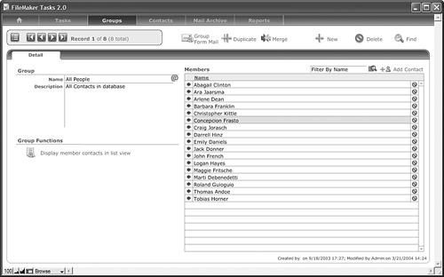
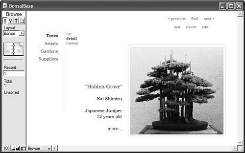
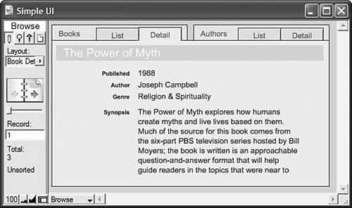
User Interfaces in FileMaker ProEvery new FileMaker Pro database essentially begins with a single, blank layout. User interface designers ”and, yes, you're now one by definition ”often have to approach each solution they design somewhat differently, to tailor it for the specific use in question, for the users for whom the system is ultimately intended, and in keeping with the time/budget/scope variables we all struggle with in some form or another. This chapter is not intended to present a complete user interface discourse . How to approach a user interface is a widely debated topic in both the FileMaker and computer science worlds . On the Web, as you no doubt know, what works for one site doesn't often work for another ”nor should it. We won't presume to know what the world's most perfect user interface might be. Rather than trying to present the "what" or "why" of user interface and layout design, we're going to focus on the "how." There are some constants in FileMaker interface design: Almost every database solution ever built has some form of navigation, meaning a button-and-script “driven means of moving from layout to layout. Data presentation ”how you view and access information in your system ”varies, and we explore some of the options there as well. We also examine how to approach working with multiple windows . This chapter presents a number of different topics. Each section could comfortably stand on its own; the idea here is to present you with some ideas that you can apply to your solutions as you see fit. The chapter assumes a moderately advanced familiarity with FileMaker Pro, but beginners should be able to grasp the concepts quite easily, if they don't immediately understand the implementation. User interfaces are central to most FileMaker databases. It is rare (though entirely possible) that a FileMaker database would serve only as a back-end data repository, with some other system providing a visual front-end. The Web is an obvious exception, but many FileMaker-based Web systems also have administrative or data-entry functions built into "native" FileMaker Pro layouts and accessed with FileMaker Pro, not to mention IWP (Instant Web Publishing) that depends on layouts being created in FileMaker. Some FileMaker systems also serve as front-end extensions of larger systems through ODBC or XML connections; one of the core reasons why organizations choose to use FileMaker in such cases is the rapidity and flexibility with which interfaces can be built. It's safe to say that not only is storing data fundamental to FileMaker Pro, so too is its presentation. Figures, 13.1, 13.2, and 13.3, present some interface examples we've come across in our travels . Figure 13.1. This is a fairly typical example of a tabbed interface in FileMaker Pro. Figure 13.2. FileMaker Tasks, produced by FileMaker, Inc. itself, is a solid example of a classic design. Notice the two tiers of tabs. Figure 13.3. Here's a different twist on user interface ”lean, with lots of white space. Primary user interface considerations include how to trigger functions specific to your database solution (for example, a series of scripts that create monthly invoices), how to manage creating and deleting records, whether or not you want to build some form of interface to help with Find requests , and how a user might run a report. Other issues will also need to be worked out: What colors do you want the database to be? How much screen real estate do you have? What font will work for all the users in your system? TIP We recommend two things when defining an interface for a new solution. First, define one. Rather than having things just evolve at random, you'll be well served by spending a few minutes up front coming up with a standard approach. Second, create a prototypical layout for your system and then test it with users before building the rest of your system. Establish a common standard for where things go, how large the screen is, how portals look, and where field labels sit, and then get buy-in from the people who will ultimately live with the database day in and day out. It's far easier to spend a little time in the beginning discovering that your boss deeply loathes the color green than having to go back and rework your database. When moving forward in your system, it will be easier to duplicate your template layout than to start from scratch each time. FileMaker's Native User InterfaceAnother critical consideration for your user interface (UI) is to what degree to use FileMaker's own native elements ”the Status Area, menu commands, and Scripts menu ”or how to go about replacing them with your own buttons and scripts. It is entirely possible to build a perfectly usable FileMaker database without a single button. Users rely on the layout menu in the Status Area and, for those reports and functions that require scripts, turn to the Scripts menu. This approach delivers some significant benefits in the time it takes you to build a database, and your users are likely already to understand at least some of the basics of working with a FileMaker database. This bare-bones approach can "just get it working" quite quickly. The downside, aside from simple aesthetics, is that your database may not be particularly easy for non-developers to manipulate in cases where your data structure becomes complex. Data integrity is also an issue: By leaving things "wide open ," you invite trouble if you allow anyone to use Replace, Import, Export, Delete Record, and other menu commands. We strongly recommend embracing FileMaker's raison d'etre : flexibility. Although it's possible to pull off some quite advanced user interface systems, make sure you take on added complexity deliberately, by choice, and recognize the cost. NOTE Be sure if you use a native approach in FileMaker to do so fully and make use of its security. You can still leave FileMaker's menu commands available to your users if you carefully think through your security setup. Building Your Own InterfaceThe equally possible alternative to a native FileMaker approach is to completely replace the Status Area and menu functions with one's own buttons and scripts. The approach here gives you the most control, but also signs you up for the most work. You will need to replace all the functions of the Status Area in three of the four modes (it is not possible to replicate its functions in Layout mode), and you'll likely opt to close and lock the Status Area after you've done so.
Interface Look and FeelRemember that container fields and objects simply pasted onto a layout can be associated with a script or button action. This enables you to design quite complete user interface elements in the image-editing software of your choice. Buttons can be far more than simply gray rectangles, and it's quite possible to create a user experience that feels nothing like FileMaker in its native state. We recommend that you insert all such graphical UI elements into container fields set for global storage, rather than paste them directly on layouts. If you ever need to make a change, you need only do so in one place, rather than having to paste an element back onto all the layouts on which it was used and re-apply its script or button behavior. TIP Remember, when you are placing a button on multiple layouts, first apply the script behavior to the element, then copy-paste on all layouts with the behavior intact. It's even possible to create a kiosk experience in FileMaker Pro that takes complete control of the screen. Single File Interface Versus Distributed InterfaceWe can now put to rest one of our favorite debates from prior versions of FileMaker Pro. Given FileMaker Pro 7's capability to combine tables into one file ”that includes external table references to other files ”it's the rare case in which you'd ever choose to distribute your user interface across multiple files. We recommend building your user interface layouts in a single file of your solution. The only exception to this is if you undertake building a modular application ”where parts of it are compartmentalized so that they can either be upgraded separately or, for a particularly challenging architecture, optionally used. You may also opt to develop two systems in parallel with an eye toward integration at a later date. Obviously, there might be times where you have no choice: Your database might have been converted from a distributed interface system from prior versions of FileMaker, in which case you'd need to do substantial rewriting to bring the interface elements into one file. |
| < Day Day Up > |
 For more detail on Instant Web Publishing,