| A chart can summarize your presentation, and audiences often glean information from charts that they might not otherwise get from long lists of data or from you listing scores of numbers for them. So often you'll want to use charts in your presentations to make your data more available to your audience. Before You Begin  93 Change a Presentations Background 93 Change a Presentations Background
See Also  95 Insert Graphics into a Presentation 95 Insert Graphics into a Presentation
Impress (as does Writer) includes its own Calc-like charting capability. Impress accomplishes this by supporting the use of a mini-version of Calc right inside Impress. In other words, when you want to place a chart on an Impress slide, you can build the chart from within Impress, entering data into a spreadsheet as though Calc were inside Impress, ready to build your charts. TIP  | 67 Add a Chart to a Spreadsheet , although a Calc-based lesson, describes charts and terminology related to them. If you are unfamiliar with OpenOffice.org charts, take a few minutes to review this task. |
-
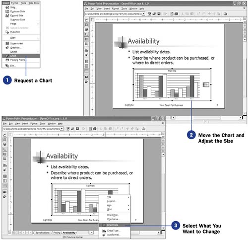
Request a Chart Select Insert, Chart from the menu. Impress places a sample chart directly in the center of your slide. You now must position the chart where you want it and change the data values used in the chart to match the data you want to portray in your presentation. In addition, you can change the chart type as well as all its labels. NOTE  | Remember, Impress generates a sample chart for you, and you must change the chart's data and labels to suit your purpose. |   -
Move the Chart and Adjust the Size
The chart that Impress places on your slide appears in the center of the slide. Move the chart to where you want it to go. Even though this sample chart is not the chart you want to present, you can go ahead and position as well as resize the chart to make it easier to see later, along with the rest of your slide's contents. You now must enter data and edit the chart so it reflects the information you need in the slide.
-
Select What You Want to Change Right-click the chart to display a menu showing you all the chart-related elements you can now change. You'll certainly want to modify the chart data because you don't want to use the chart's sample data for your presentation. In addition, you'll always want to modify the title so that your chart is labeled on your slide as well as on any printed handouts you might make from your presentation. Generally, the legend and the axis labels need to be changed. Finally, the chart type might very well need to be changed to reflect your data's intent. TIP  | 67 Add a Chart to a Spreadsheet describes each chart type and the best use for each one. | -
Modify the Data in Spreadsheet Form
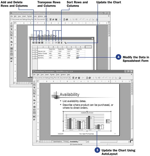
When you select Chart Data from the right-click menu, a small spreadsheet appears in the center of your slide. This is a Calc-like spreadsheet add-in program. Although all of Calc's features aren't represented in Impress's spreadsheet, you can easily enter the data needed to create your chart in the rows and columns there.
Replace the sample row and column labels with your own data's label information. Replace the data inside the spreadsheet's body with your own data. You can add or delete rows or columns, simply by selecting a row or column that precedes the one you want to add or by selecting a row or column to delete. You may sort by rows or columns, as you might do if you wanted data to appear alphabetically in the chart.
-
Update the Chart Using AutoLayout After editing the spreadsheet, click the Apply to Chart button to update the chart on your slide. Once you update the chart, you cannot right-click the chart to display the editing options again without first right-clicking the chart and selecting OLE Object, Edit . As soon as you update your chart with your data, Impress converts the chart to an OLE object . You must tell Impress that you want to edit that object when you want to make additional changes, such as changing the title or legend. KEY TERM  | OLE object ” Abbreviation for Object Linking and Embedding . This term refers to an object that can be placed inside documents of different types, such as a Writer word processing document and an Impress presentation. You can place charts in Impress and Calc because OpenOffice.org converts the charts to OLE objects that both programs accept. | Once you've entered your specific data into the chart, the AutoFormat dialog box is the simplest place to update all the chart's details, such as titles and legends. After making the request to edit the chart as an OLE object, select AutoFormat from the right-click menu to modify the other chart features, including changing the chart's type, such as from a bar chart to a pie chart. |
 93 Change a Presentations Background
  95 Insert Graphics into a Presentation
