Dynamic Layout
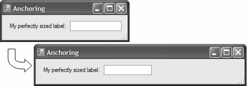
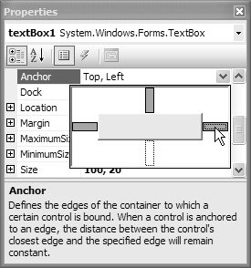
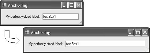
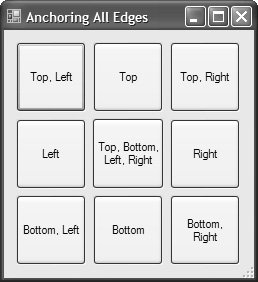
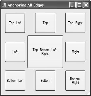
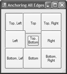
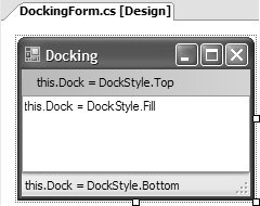
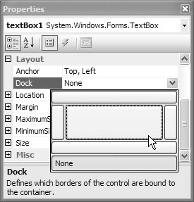
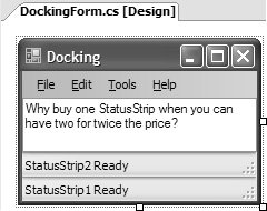
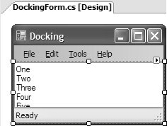
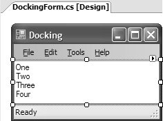
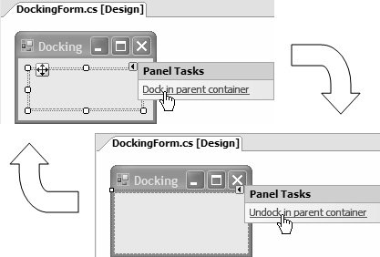
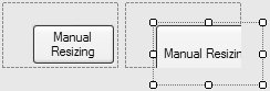
| After controls are positioned, sized, and z-ordered the way you like, you might think that's all you need to do. That is, until a user resizes your form. For example, suppose users want to enter a long string into a text box. They may attempt to widen your form, as shown in Figure 4.8. Figure 4.8. All Controls Anchored Top, Left Users aren't likely to be happy with this less-than-professional resizing; ideally, the text box should expand as the form does. AnchoringPreserving the distance between the edge of a control and the adjacent edge of a control's container is a technique known as anchoring. By default, all controls are anchored to the top, left edges of their containers. We're accustomed to Windows moving child controls to keep this anchoring intact as the container's left or top edge changes. However, Windows does only so much; it doesn't resize controls to anchor them to other edges. Fortunately, Windows Forms does so without any coding required on your part. For example, you can change the edges to which a control is anchored by changing the Anchor property to any bitwise combination of the values in the AnchorStyles enumeration: namespace System.Windows.Forms { enum AnchorStyles { None = 0, Top = 1, // default Bottom = 2, Left = 4, // default Right = 8, } }Getting our text box to resize as the form is resized, we change the Anchor property to include the right edge as well as the left and the top edges. Using the Properties window, you even get the fancy drop-down editor shown in Figure 4.9. Figure 4.9. Setting the Anchor Property in the Properties Window When we set the text box from Figure 4.8 to be anchored to the top, left, and right, the Windows Forms Designer generates the following (elided) code: // AnchoringForm.designer.cs partial class AnchoringForm { ... void InitializeComponent() { ... this.anchoredTextBox.Anchor = AnchorStyles.Top | AnchorStyles.Left | AnchorStyles.Right; ... } }This code makes sure that the text box resizes so that its right edge always resides the same distance from the right edge of the host form's client area, as illustrated in Figure 4.10. Figure 4.10. Automatic Control Resizing with the Anchor Property Even though the default for Windows Forms controls is to anchor to the top and left edges of a form, anchoring does not have to include either of those edges. For example, it's common to anchor a modal dialog's OK and Cancel buttons to only the bottom and right edges; in this way, these buttons stay at the bottom-right corner as the dialog is resized but aren't resized themselves. A control is resized if the user has selected two opposing edges. If neither of the opposing edges is selected, neither left nor right, then the control is not resized in that dimension but instead maintains the same proportion of space between the opposing edges. The middle square in Figures 4.11 and 4.12 shows this behavior as well as several other anchoring combinations. Figure 4.11. Anchoring Settings Before Widening Figure 4.12. Anchoring Settings After Widening So far, we've concentrated on what happens when a form increases in size. However, you may need to pay special attention when a form's size decreases. For example, consider what happens when the form in Figure 4.11 is made smaller, resulting in the form shown in Figure 4.13. Figure 4.13. Anchor Settings After Narrowing The way the controls are anchored causes controls to overlap as the edges they are anchored to come close together. You can resolve this by setting your form to a suitable minimum size using its MinimumSize property. DockingAs powerful as anchoring is, it doesn't do everything by itself. For example, if you wanted to build a text editor, you'd probably like to have a menu, a tool strip, and a status strip hugging the edges with a text box that takes up the rest of the client area not occupied by the other controls. Anchoring would be tricky in this case, because some controls need more or less space depending on the run-time environment they find themselves in. Because anchoring depends on keeping a control a fixed number of pixels away from a form's edge, we'd have to do some programming at run-time to figure out, for example, how high the status strip was and then set that as the distance to anchor the text box away from the edge. Instead, it is far easier to tell the form that the text box should simply take whatever space remains in the client area. For that, we have docking. Docking is a way to identify the edge that we want a control to "stick" itself to. For example, Figure 4.14 shows a form with three controls, all docked. The menu strip is docked to the top edge, the status strip is docked to the bottom edge, and the text box is docked to fill the rest. Figure 4.14. A Docking Example You configure docking behavior in the Properties window (shown in Figure 4.15) by setting a control's Dock property, which is one of the DockStyle enumeration values: Figure 4.15. Setting the Dock Property in the Properties Window namespace System. Windows.Forms { enum DockStyle { None = 0, // default Top = 1, Bottom = 2, Left = 3, Right = 4, Fill = 5, } }Docking can also be affected by z-order and needs special consideration. Docking and Z-OrderAs a form resizes, the docking settings keep the controls along their designated edges (or the rest of the space, as determined by the Fill DockStyle). It's even possible to have multiple controls docked to the same edge, as shown in Figure 4.16. Figure 4.16. Two Status Strips Docked to the Bottom Edge Although I don't recommend docking two status strips to the same edge, it's certainly possible. Docking is done in reverse z-order priority. In other words, for statusStrip1 to be closest to the bottom edge, it must be further down in the z-order than statusStrip2. The following Add calls give statusStrip1 edge priority over statusStrip2: // DockingForm.designer.cs partial class DockingForm { ... void InitializeComponent() { ... this.Controls.Add(this.textBox1); // z-order 0 this.Controls.Add(this.menuStrip1); // z-order 1 this.Controls.Add(this.statusStrip2); // z-order 2 this.Controls.Add(this.statusStrip1); // z-order 3 ... } }Given the drag-and-drop Windows Forms Designer model, which inserts each new control with a z-order of 0, it makes sense that docking priority is the reverse of z-order. However, as you add new controls on the form and need to adjust the z-order, you may find a conflict between controls along a certain edge and those set to fill. In that case, the fill control needs to have the lowest edge priority on the form, or else it will dock all the way to an edge that is set to be used by another control. Figure 4.17 shows an example. Figure 4.17. TextBox Whose DockStyle.Fill Has Higher Docking Priority Than a StatusStrip Notice that the text in the bottom part of the text box is cut off by the status strip along the bottom edge. This indicates that the status strip has a lower docking priority than the text box. However, docking priority isn't set directly in the Designer. Instead, you set the z-order. In our example, right-clicking on the text box in the Designer and choosing Bring To Front pushes the text box to the top of the z-order but to the bottom of the docking priority, letting the status strip own the bottom edge and removing it from the client area that the text box is allowed to fill, as Figure 4.18 illustrates. Figure 4.18. TextBox Whose DockStyle.Fill Has Lower Docking Priority Than a StatusStrip Whenever you see a visual anomaly like this on your form, you can usually resolve the problem by bringing to the front the control whose Dock property is set to DockStyle.Fill. Alternatively, you can use Document Outline from the View | Other Windows menu. DockStyle.Fill has special significance in Windows Forms because there are several controls that should naturally fill their containers as soon as they are dropped onto a form. It's common for these controls, including Panel, to implement smart tags, with an option to toggle a control's Dock property between DockStyle.Fill and the previous DockStyle value, as shown in Figure 4.19. Figure 4.19. Setting the Dock Property via a Smart Tag The set of controls that actually provides the "Dock in parent container" smart tag is somewhat smaller than you might expect. For example, DataGridView and Panel offer this, but GroupBox, ListBox, and TabControl don't.1[1]
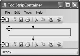
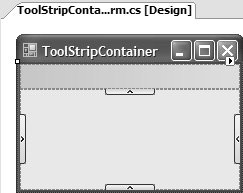
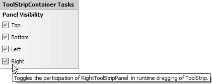
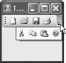
Some controls, such as MenuStrip, ToolStrip, and StatusStrip, take it one step further by automatically docking to the most logical edge when dropped onto a form; MenuStrip and ToolStrip dock to the top, and StatusStrip docks to the bottom. The default dock settings can be changed as necessary, although they suffice for most scenarios. Docking with Tool Strip Controls After most controls are docked to a particular edge at design time, they remain there after compilation until the UI needs an update or an application becomes obsolete. In this respect, tool strip controls are special because they allow users to dynamically redock them at run-time. For example, Figure 4.20 shows a ToolStrip control being dragged from a form's top edge to the same form's bottom edge by the user at run-time. Figure 4.20. Dragging a ToolStrip Control at Run-Time Rather than force you to handle the complexities of dynamically juggling the Dock property values of all controls to cope with run-time tool strip dragging, System.Windows.Forms comes with the ToolStripContainer control. Its purpose is to simplify design-time tool strip composition and enable run-time tool strip dragging independently of the docked arrangement of other controls on a form. ToolStripContainerWhen you drag a ToolStripContainer onto your form, the first thing you should do is set its Dock property to DockStyle.Fill, as shown in Figure 4.21. Figure 4.21. Form Filled with a ToolStripContainer (with the top ToolStripPanel visible) By its nature, ToolStripContainer should be dock-filled to cover the entire surface area of a form, because it provides special docking semantics to the form itself, independent of controls hosted on the form. However, ToolStripContainer provides a special area for those controls known as the content panel. The content panel is abstracted as the ToolStripContentPanel, which derives from Panel. ToolStripContainer exposes the content panel through its ContentPanel property. ToolStripContainer provides four special areas to host the tool strip controls, one for each edge of the ToolStripContainer. Each of these is a ToolStripPanel hosted by ToolStripContainer and exposed via four properties: TopToolStripPanel, BottomToolStripPanel, LeftToolStripPanel, and RightToolStripPanel.2[1] By default, all tool strip panels are visible, although you can hide or show each by setting one of the four following properties as appropriate: TopToolStripPanelVisible, BottomToolStripPanelVisible, LeftToolStripPanelVisible, and RightToolStripPanelVisible. Alternatively, you can use the ToolStripContainer's Properties window or smart tag, as shown in Figure 4.22
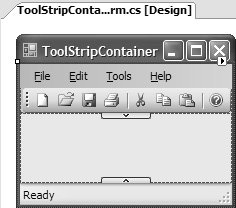
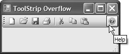
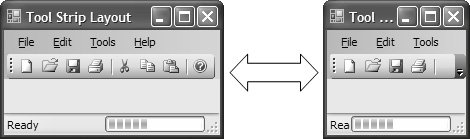
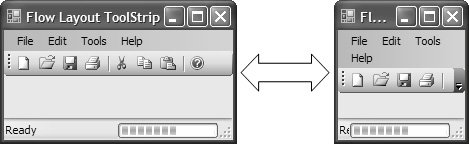
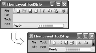
Figure 4.22. Configuring Which Edges That Tool Strip Controls Can Be Dragged to at Run-Time Users can drag tool strip controls across any tool strip panels that remain visible after your configurations. Each tool strip panel needs to be expanded before you can drop tool strip controls onto it by clicking its expand or collapse button, shown in Figure 4.21. By default, the top tool strip panel is expanded so that you can drag a tool strip control right onto it without manually expanding it. Figure 4.23 shows a form that uses a ToolStripContainer hosting a MenuStrip and ToolStrip control in its top tool strip panel, and a StatusStrip in its bottom tool strip panel. It supports tool strip dragging across only the top and bottom tool strip panels. Figure 4.23. A ToolStripContainer with Three Tool Strip Controls and Dragging Supported Between Top and Bottom Panels As you can see, tool strip panels can host multiple tool strips, stacking them either horizontally or vertically to match the tool strip panel in which they're hosted. Also, one or more tool strip controls can be hosted in the same row; they do not have to be positioned flush against another tool strip control in the same row, or flush against the adjacent form edge. The Windows Forms Designer allows you to drag and position tool strips within these constraints, storing the final design-time position of each using the Location property. Run-Time Tool Strip SupportAt run-time, a tool strip can be dragged from one tool strip panel to another, as long as it has a drag grip, as determined by a tool strip's GripStyle property. GripStyle can be one of two ToolStripGripStyle enumeration values: Visible or Hidden. By default, ToolStrip.GripStyle is set to ToolStripGripStyle.Visible, whereas MenuStrip.GripStyle and StatusStrip.GripStyle are set to ToolStripGripStyle.Hidden. Additionally, you can allow users to drag tool strip items around their host tool strip. You enable this by setting a tool strip's AllowItemReorder property to true. At run-time, users drag a tool strip item by pressing the Alt key and dragging the item using the left mouse button. Of course, when users can move tool strips and tool strip items around, they'll want them to appear in the same position they left them in the previous application session when they start a new session. Consequently, you need to store pertinent tool strip details such as size, location, visibility, and order of tool strip items at the end of a session, refreshing them at the beginning of the next. This support is dependent on the settings system and is discussed in Chapter 15: Settings. ToolStrip Overflow There is one side effect you should consider when allowing users to drag tool strips around a form: Tool strips might end up being aligned to edges that are too small to display them in their entirety. Some tool strip items may overflow the edge of a form and their functionality become hidden. The solution is to give users a visual cue that more tool strip items are available and then provide access to them. Such support is native to all tool strip controls via a special drop-down menu, called a chevron, shown on a ToolStrip in Figure 4.24. Figure 4.24. ToolStrip Control with Overflowing Tool Strip Items Whether a tool strip supports overflow is determined by its Boolean CanOverflow property, which is set to true by default. But that's only half the story; hosted tool strip items are also responsible for instructing their containing tool strip how they should be treated if visual overflow is enabled. To do this, each tool strip item exposes an Overflow property, which stores one of the following values of the ToolStripItemOverflow enumeration: namespace System.Windows.Forms { enum ToolStripItemOverflow { Never = 0 // Never overflow Always = 1, // Always overflow, even if enough space to show AsNeeded = 2, // Overflow space runs out (default) } }For ToolStrip, CanOverflow defaults to true, and the Overflow property for most tool strip items defaults to ToolStripItemOverflow.AsNeeded. As a result, most of your tool strip resizing needs are handled out of the box, at both design-time and run-time. MenuStrip exposes CanOverflow, although it's false by default and can't be set from the various Designer windows such as the Properties window. However, you can programmatically set it to true, and you need to update the Overflow property for any hosted tool strip menu items because their default Overflow value is Never. StatusStrip has the same design as MenuStrip with regard to its CanOverflow property, so if you need it to overflow, you must do so programmatically. You also need to change its layout style to StackWithOverflow (discussed later), because the default is Table, which doesn't support overflowing. Fortunately, the various tool strip items you can host on a StatusStrip have their Overflow properties set to AsNeeded, so you don't need to reconfigure them. Tool strip item alignment also plays a role in overflow behavior by determining which tool strip items overflow before others. Tool strip alignment is governed by the Alignment property, which is implemented by tool strip items to allow you to specify that they glue themselves to the left or right edge of a tool strip control, as shown in Figure 4.25. Figure 4.25. Tool Strip Items with Left and Right Alignment For a tool strip whose items are all left-aligned, the right-most item is the first to overflow, followed by its siblings in right-to-left order as their host tool strip's width decreases. When a combination of left- and right-aligned tool strip items coexists on a tool strip, the set of right-aligned items overflows starting with the leftmost tool strip item, and then each tool strip item overflows in left-to-right order. When all right-aligned items have overflowed, the set of left-aligned items overflows in right-to-left order. ToolStrip Layout StylesSometimes, it is preferable to show all tool strip items irrespective of the size of a host form. One common example is the menu strip, which typically increases in height to make room for tool strip items that would otherwise become hidden as the width decreases. Figure 4.26 illustrates the default behavior of MenuStrip. Figure 4.26. Collapsing MenuStrip Control As the form's width decreases, the MenuStrip hides its items while providing an overflow chevron to access them. A tool strip's behavior is determined by its LayoutStyle property, whose value comes from ToolStripLayoutStyle: namespace System.Windows.Forms { enum ToolStripLayoutStyle { StackWithOverflow = 0, // MenuStrip and ToolStrip default HorizontalStackWithOverflow = 1, // Items placed horizontally, // with overflow VerticalStackWithOverflow = 2, // Items laid out vertically, // with overflow Flow = 3, // Items wrap horizontally, in either RTL or LTR order Table = 4 // Items arranged in rows and columns // (StatusStrip default) } }By default, MenuStrip and ToolStrip controls have a ToolStripLayoutStyle of StackWithOverflow, whose effect is to automatically switch between HorizontalStackWithOverflow and VerticalStackWithOverflow as either MenuStrip or ToolStrip is dragged to a horizontal or vertical edge, respectively. If you want your MenuStrip's or ToolStrip's items to always be laid out either horizontally or vertically, irrespective of the orientation of the edge to which they are aligned, you can explicitly choose HorizontalStackWithOverflow or VerticalStackWithOverflow as required. All three of these options automatically set a MenuStrip or ToolStrip to overflow its items as necessary. While a MenuStrip might be set to horizontally stack with overflow by default, but it doesn't actually provide overflow behavior (by showing the overflow chevron). Instead, items become hidden as a form's width decreases, which is fine because the default behavior for a MenuStrip is to expand its height to provide extra space for the overflow items. You configure this by setting the MenuStrip's LayoutStyle to Flow, which yields the effect illustrated in Figure 4.27. Figure 4.27. MenuStrip Wrapping ToolStrip Items Horizontally With this layout style, items flow from left to right by default, and, as they wrap, they do so starting from the top-left corner of the tool strip. You can swap the flow order to right-to-left by setting the tool strip's RightToLeft property to true.3[1] Note that ToolStrip doesn't support flowing if hosted by a ToolStripContainer, whereas MenuStrip does. Additionally, if you're using the Windows Form Designer, you can configure flow layout only to support horizontal flowing. If you need vertical flowing, you must write code. For example, the following code supports vertical flowing for a MenuStrip control that's docked to the left edge of the form.
// MainForm.cs partial class MainForm : Form { public MainForm() { InitializeComponent(); // MenuStrip docked left with vertical flow MenuStrip ms = this.menuStrip1; ms.LayoutStyle = ToolStripLayoutStyle.Flow; FlowLayoutSettings flowLayout = ms.LayoutSettings as FlowLayoutSettings; flowLayout.FlowDirection = FlowDirection.TopDown; ms.Dock = DockStyle.Left; } }As you can see, we set the LayoutStyle to ToolStripLayoutStyle.Flow. But that's not enough; items on a vertical tool strip don't automatically flow vertically when the LayoutStyle is ToolStripLayoutStyle.Flow. To ensure that they do, you update the tool strip's LayoutSettings property, which references the LayoutSettings object, whose job is to manage layout for the tool strip. When a tool strip is set to the StackWithOverflow, HorizontalStackWithOverflow, or VerticalStackWithOverflow layout style, the LayoutSettings property is null, because this support is implemented natively by the tool strip. When you set the layout style of a tool strip to Flow, however, LayoutSettings is provided with an instance of the FlowLayoutSettings object, which supports tool strip content flowing. The key feature is the direction in which the items can flow, which is specified by the FlowDirection property. For vertical flowing, we set the FlowDirection to TopDown, resulting in the form shown in Figure 4.28 Figure 4.28. MenuStrip Wrapping ToolStrip Items Vertically FlowLayoutSettings.FlowDirection can be one of several values of the FlowDirection enumeration, which is discussed in detail later in this chapter. The final LayoutStyle is Table, which allows you to construct a tool strip in a tabular fashion using rows, columns, and cells. This is the default LayoutStyle for StatusStrip, and for good reason: to support springing of tool strip items, which we discussed in Chapter 2. You may also need springing in a MenuStrip or ToolStrip, although neither supports it natively. Instead, you write the code to handle it if, for example, you'd like an Internet Explorer-like Address tool strip, shown in Figure 4.29. Figure 4.29. ToolStrip with Internet Explorer-like Address ToolStrip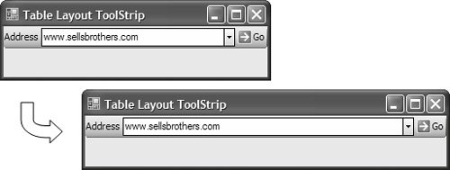 The important thing is to ensure that the drop-down list expands and shrinks as the form resizes, which is shown in Figure 4.29. You could probably handle the ToolStrip's Resize event and update the length of the drop-down list to suit, but there is an easier way: You set the ToolStrip's LayoutStyle property to Table and write some additional code:4[2]
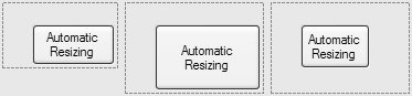
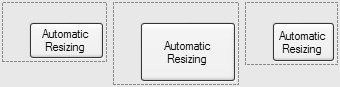
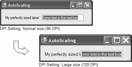
// Configure table structure partial class MainForm : Form { public MainForm() { InitializeComponent(); ToolStrip ts = this.toolStrip1; // Configure table structure ts.LayoutStyle = ToolStripLayoutStyle.Table; TableLayoutSettings tableLayout = ts.LayoutSettings as TableLayoutSettings; tableLayout.ColumnCount = 3; tableLayout.RowCount = 1; tableLayout.ColumnStyles.Add(new ColumnStyle()); // Spring contents of this column, which will be the drop-down list tableLayout.ColumnStyles.Add( new ColumnStyle(SizeType.Percent, 100F)); tableLayout.ColumnStyles.Add(new ColumnStyle()); tableLayout.RowStyles.Add(new RowStyle(SizeType.Absolute, 25F)); // Fill the entire cell foreach( ToolStripItem toolStripItem in ts.Items ) { toolStripItem.Dock = DockStyle.Fill; } } }When a ToolStrip control's LayoutStyle is set to Table, a custom table-oriented LayoutSettings object is created and set as the LayoutSettings object. This allows us to configure the table's rows and columns using the ColumnCount and RowCount properties. In our example, the table contains three columns and one row, just enough to fit each tool strip item. To enable springing, we make sure that the column that contains the drop-down list takes up 100% of the space on the ToolStrip not used by the other tool strip items. You configure this using ColumnStyle objects that you add to the TableLayoutSettings.ColumnStyles collection. You must create one style for each column, in column order; for example, if you created a column style for the third column but it was the only style you added, it would be applied to the first column. That's why the code creates three. The second column style applies to the second column and uses the ColumnStyle class's constructor overload to pass in a SizeType of Percent, and specifies it to size to 100% automatically. However, configuring columns and rows to resize appropriately is not enough. We also need the cell contents to resize, so we enumerate the table's tool strip item contents and dock, filling them within their cells. This code generates the UI shown in Figure 4.29. When you set tool strip items hosted on a StatusStrip to spring, the behavior is basically implemented in the same fashion as in our springing ToolStrip example. When you choose either LayoutStyle.Flow or LayoutStyle.Table, you should be aware of three limitations in the current tool strip implementation. First, flow layout and springing contents in ToolStrips don't work when tool strips are hosted in ToolStripContentPanels. Second, a tool strip's grip disappears irrespective of the value you've specified for the GripStyle property. Third, you can't support tool strip item overflowing and alignment, irrespective of your tool strip's CanOverflow property setting and the Overflow property setting for each tool strip item. Automatic Resizing When containers are resized around content, you need to take steps to make sure that the content is still visible. Conversely, when content is resized, you need to take steps to make sure that containers still display the content, something that isn't happening in Figure 4.30. Figure 4.30. Resized Control Becoming Hidden When controls become hidden as a result of a move or resize, you need to resize the container control to show the hidden parts of the resized or moved control. When many controls are involved, this is a tedious process. Instead, you can use the AutoSize and AutoSizeMode properties to do it for you. AutoSize is a Boolean property that, when set to true, specifies that a control will resize automatically to fit its contents. AutoSizeMode governs how the control resizes, as specified by the GrowOnly and GrowAndShrink values of the AutoSizeMode (System.Windows.Forms) enumeration. GrowOnly tells a container to automatically resize if the new size of the contained control will be the same size or bigger than its size, as shown in Figure 4.31. Figure 4.31. Automatic Resizing with AutoSize = True and AutoSizeMode = GrowOnly GrowAndShrink tells a container to increase and decrease in size in response to a contained control's resizing and moving, as illustrated in Figure 4.32. Figure 4.32. Automatic Resizing with AutoSize = True and AutoSizeMode = GrowAndShrink Automatic resizing is triggered when the edges of a resizing or repositioning control come close enough in proximity to the host container's right and bottom edges that their margins overlap. A variety of controls supports AutoSize alone, or AutoSize and AutoSizeMode together. Form supports both AutoSize and AutoSizeMode, but only at run-time. You need to experiment with each control to determine its level of automatic resizing support. Automatic Scaling Automatic resizing allows forms to resize to accommodate relocated or resized controls. But forms also come equipped to resize in the face of the needs of different users with respect to system font size and dpi (dots per inch). For example, if you lay out a form with the system font size set to Normal (96 dpi) in the Display control panel, what happens when your users are using Large (120 dpi) or one of the custom settings?5[1] Figure 4.33 illustrates the default for a Windows Forms application.
Figure 4.33. Form Scaling Up from Smaller to Larger dpi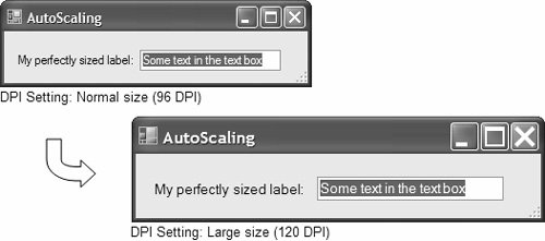 As you can see, the changed dpi setting not only increases the size of all fonts displayed on the form and its title bar, but also increases the form's overall size as well as increases control sizes and changes locations to maintain the same proportional sizing and spacing. The best part is that this happened without your configuring anything, and without the application being recompiled. Two key elements are required if you want to maintain the same proportions, or scale, across multiple dpi settings: The first is to tell the form to automatically scale, and the second is to acquire a scale factor that can be applied to the widths and heights to scale a form and its controls proportionally. By default, a form automatically scales because its AutoScale property is set to true. The type of scale factor is specified by the AutoScaleMode property and defaults to Font, meaning that the scale factor is based on the ratio between the average widths and heights of the default system font when the form was created and when the form executes. For example, if a form was created under Windows XP Normal fonts (96 dpi), the default font is 8.25-point MS Sans Serif and has an average width and height of 6 points x 13 points. (A point is a traditional unit of measure for type characters. For more, see Chapter 6: Drawing Text.) This information is stored by the Windows Forms Designer in InitializeComponent against the form's AutoScaleDimensions property: // AutoScalingForm.designer.cs partial class AutoScalingForm { ... void InitializeComponent() { ... this.AutoScaleDimensions = new SizeF(6F, 13F); ... } }Then, if the form is re-opened or executed under Large fonts (120 dpi), where the default font is 7.8-point MS Sans Serif, the average width and height of the font increases to 8 x 16 (that is why they call it "Large" fonts). This data is stored in a form's read-only CurrentAutoScaleDimensions property. When the form is loaded into the Windows Forms Designer or executed, it notices the difference between AutoScaleDimensions and CurrentAutoScaleDimensions by calling its own PerformAutoScale method to adjust the height and width of itself and its controls, along with the positions of the controls. This keeps the "feel" of the form roughly the same, no matter what the system font settings are. In our sample, the form's client area width increased from 293 to 391 (~33%) as the width of the font went from 6 to 8 (~33%). Similarly, the height increased from 50 to 62 (~24%) as the height of the font went from 13 to 16 (~23%). As you can see, the form's client area scaled horizontally and vertically to almost exactly the same degree, yielding a form that looks good at both 96 dpi and 120 dpi, especially given the amount of work you had to do to achieve the effect (~0%). AutoScale ModesOur example so far has used a scaling factor based on font size, although three other autoscaling modes can be set via the AutoScaleMode property. These are determined by the AutoScaleMode enumeration: namespace System.Windows.Forms { enum AutoScaleMode { None = 0 // Don't scale Font = 1, // Scale in relation to font size at current dpi (default) Dpi = 2, // Scale in relation to dpi Inherit = 3, // Inherit container's AutoScaleMode } }So, if you want your form to resize in direct proportion to the dpi setting itself, you change the AutoScaleMode value to AutoScaleMode.Dpi. This changes the values captured by AutoScaleDimensions to match the dpi at the time the form was created: this.AutoScaleDimensions = new SizeF(96F, 96F); If the sample were changed like this, the form's client area width would increase from 293 to 366 (~24%) as the dpi x dimension increased from 96 to 120 (25%). Similarly, the height would increase from 50 to 62 (24%) as the dpi y dimension increased from 96 to 120 (25%). Both AutoScaleMode.Font and AutoScaleMode.Dpi are driven by a change in dpi setting, but the comparative ratios between the two may differ. Specifically, the average width and height of a font may not change from one dpi setting to another in the same proportion as a change in the dpi settings themselves. This is because fonts vary in the widths and heights of their characters. Consequently, you can get away with AutoScaleMode.Dpi when your applications run over various dpi settings on computers having the same language version. However, if an application needs to scale in the face of different fonts and therefore different font widths and heights, your life is made easy because the recommended setting is also the defaultthat is, AutoSizeMode.Font. Figure 4.34 illustrates the difference between AutoSizeMode.Font and AutoSizeMode. Dpi. Figure 4.34. AutoScaleMode.Dpi and AutoScaleMode.Font Autoscaling from 96 dpi to 120 dpi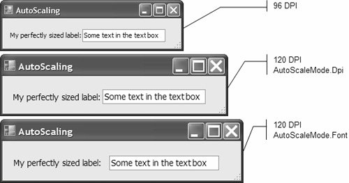 AutoScaleMode is implemented internally on the ContainerControl class, and you can programmatically set it on container controls. However, when using the Properties window, you can set AutoScaleMode only for those container controls that have their own designers, including Form and UserControl. Because user controls are typically hosted on forms, you can set a user control's AutoScaleMode to Inherit to make sure it picks up the host form's AutoScaleMode to scale consistently. If the host form has a different AutoScaleMode value from that of the contained user control, scaling is unlikely to be pretty. AutoScaleMode.None turns off scaling altogether, the equivalent of setting AutoScale to false, and it doesn't look pretty at all if an application runs in a dpi that differs from the dpi it was created in. Figure 4.35 should scare you. Figure 4.35. Form Scaling Up from Smaller to Larger dpi (Using AutoScaleMode.None) When considering the various AutoScaleMode options, you'll find that AutoScaleMode.Font is the least likely to cause scaling issues, and that is why you should prefer it as the default. |
EAN: 2147483647
Pages: 216
- Challenging the Unpredictable: Changeable Order Management Systems
- The Effects of an Enterprise Resource Planning System (ERP) Implementation on Job Characteristics – A Study using the Hackman and Oldham Job Characteristics Model
- Distributed Data Warehouse for Geo-spatial Services
- Data Mining for Business Process Reengineering
- A Hybrid Clustering Technique to Improve Patient Data Quality