Animating Charts
Animating Charts
Most people don't realize it, but Excel is capable of performing simple animations. For example, you can animate shapes and charts. Consider the XY chart shown in Figure 18-23.
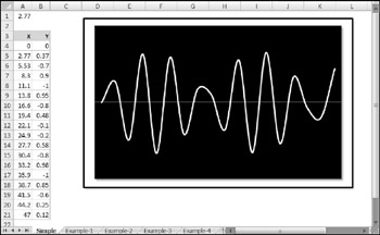
Figure 18-23: A simple VBA procedure will turn this graph into an interesting animation.
The — values (column A) depend on the value in cell A1. The value in each row is the previous row's value plus the value in A1. Column B contains formulas that calculate the SIN of the corresponding value in column A. The following simple procedure produces an interesting animation. It uses a loop to continually change the value in cell A1, which causes the values in the — and Y ranges to change. The effect is an animated chart.
Sub AnimateChart() Dim i As Long Range("A1") = 0 For i = 1 To 150 DoEvents Range("A1") = Range("A1") + 0.035 DoEvents Next i Range("A1") = 0 End Sub The key to chart animation is to use one or more DoEvents statements. This statement passes control to the operating system, which (apparently) causes the chart to be updated when control is passed back to Excel. Without the DoEvents statements the chart's changes would not be displayed inside of the loop.
| CD-ROM | The companion CD-ROM contains a workbook that includes this animated chart, plus several other animation examples. The filename is |
Scrolling a chart
Figure 18-24 shows a chart with 5,218 data points in each series. The workbook contains six names :
-
StartDay : A name for cell F1.
-
NumDays : A name for cell F2.
-
Increment : A name for cell F3 (used for automatic scrolling).
-
Date : A named formula:
=OFFSET(Sheet1!$A,StartDay,0,NumDays,1)
-
ProdA : A named formula:
=OFFSET(Sheet1!$B,StartDay,0,NumDays,1)
-
ProdB : A named formula:
=OFFSET(Sheet1!$C,StartDay,0,NumDays,1)
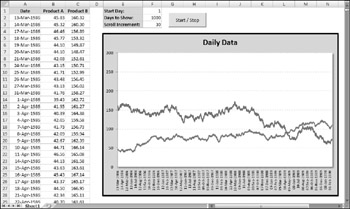
Figure 18-24: The values in column F determine which data to display in the chart.
Each of the SERIES formulas in the chart uses names for the category values and the data. The SERIES formula for the Product A series is as follows (I deleted the sheet name and workbook name for clarity):
=SERIES($B,Date,ProdA,1)
The SERIES formula for the Product B series is:
=SERIES($C,Date,ProdB,2)
Using these names enables the user to specify a value for StartDay and NumDays , and the chart will display a subset of the data. Figure 18-25 shows the chart when StartRow is 700 and NumDays is 365. In other words, the chart display begins with the 700th row, and shows 365 days of data.
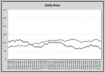
Figure 18-25: The chart displays a subset of the data, determined by the values of two named cells .
| CD-ROM | The companion CD-ROM contains a workbook that includes this animated chart, plus several other animation examples. The filename is |
A relatively simple macro makes the chart scroll. The button in the worksheet executes the following macro that scrolls (or stops scrolling) the chart:
Public AnimationInProgress As Boolean Sub AnimateChart() Dim StartVal As Long, r As Long If AnimationInProgress Then AnimationInProgress = False End End If AnimationInProgress = True StartVal = Range("StartDay") For r = StartVal To 5219 - Range("NumDays") _ Step Range("Increment") Range("StartDay") = r DoEvents Next r AnimationInProgress = False End Sub The AnimateChart procedure uses a public variable ( AnimationInProgress ) to keep track of the animation status. The animation results from a loop that changes the value in the StartDay cell. Because the two chart series use this value, the chart is continually updated with a new starting value. The Scroll Increment setting determines how quickly the chart scrolls.
To stop the animation, I use an End statement rather than an Exit Sub statement. For some reason, Exit Sub doesn't work reliably and may even crash Excel.
Creating a hypocycloid chart
Even if you hated your high school trigonometry class, you'll probably like the example in this section - which relies heavily on trigonometric functions. The workbook shown in Figure 18-26 contains an XY chart that displays a nearly infinite number of dazzling hypocycloid curves. A hypocycloid curve is the path formed by a point on a circle that rolls inside of another circle. This, as you might recall from your childhood, is the same technique used in Hasbro's popular Spirograph toy.
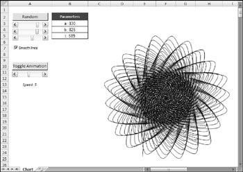
Figure 18-26: This workbook generates hypocycloid curves.
| CD-ROM | This workbook is available on the companion CD-ROM. The filename is hypocycloid - animate.xlsm . |
The chart is an XY chart, with everything hidden except the data series. The — and Y data are generated by using formulas stored in columns A and B. The scroll bar controls at the top let you adjust the three parameters that determine the look of the chart. In addition, clicking the Random button generates random values for the three parameters.
The chart itself is interesting enough, but it gets really interesting when it's animated. The animation occurs by changing the starting value for the series within a loop.
Creating a "clock" chart
Figure 18-27 shows an XY chart formatted to look like a clock. It not only looks like a clock, but it also functions as a clock. I can't think of a single reason why anyone would need to display a clock like this on a worksheet, but creating the workbook was challenging, and you might find it instructive.
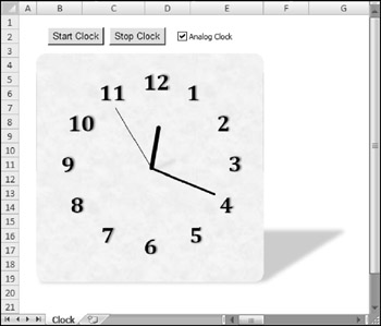
Figure 18-27: This clock is fully functional and is actually an XY chart in disguise.
| CD-ROM | This workbook, named |
Besides the clock chart, the workbook contains a text box that displays the time as a normal string, as shown in Figure 18-28. Normally this is hidden, but it can be displayed by deselecting the Analog Clock check box.
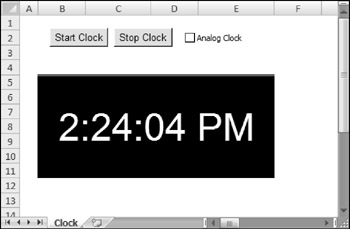
Figure 18-28: Displaying a digital clock in a worksheet is much easier but not as much fun to create.
As you explore this workbook from the CD-ROM, here are a few things to keep in mind:
-
The ChartObject is named ClockChart , and it covers up a range named DigitalClock , which is used to display the time digitally.
-
The two buttons on the worksheet are from the Forms toolbar, and each has a macro assigned ( StartClock and StopClock ).
-
The CheckBox control (named cbClockType ) on the worksheet is from the Forms toolbar - not from the Control Toolbox toolbar. Clicking the object executes a procedure named cbClockType_Click , which simply toggles the Visible property of the ChartObject . When it's invisible, the digital clock is revealed.
-
The chart is an XY chart with four Series objects. These series represent the hour hand, the minute hand, the second hand, and the 12 numbers .
-
The UpdateClock procedure is executed when the Start Clock button is clicked. It also uses the OnTime method of the Application object to set up a new OnTime event that will occur in one second. In other words, the UpdateClock procedure is called every second.
-
Unlike most charts, this one does not use any worksheet ranges for its data. Rather, the values are calculated in VBA and transferred directly to the Values and XValues properties of the chart's Series object.
| Caution | Although this clock is an interesting demo, it isn't feasible to display a continually updating clock in a worksheet. The VBA macro must be running at all times in the background, and this may interfere with other macros and reduce the overall performance. |
EAN: 2147483647
Pages: 319