Chapter 37: Summarizing Data by Using Descriptive Statistics
Overview
-
What defines a typical value for a data set?
-
How can I measure how much a data set spreads from its typical value?
-
Together, what do the mean and standard deviation of a data set tell me about the data?
-
How can I use descriptive statistics to compare data sets?
-
For a given data point, can I easily find its percentile ranking within the data set? For example, how can I find the 90th percentile of a data set?
-
How can I easily find the second largest or second smallest number in a data set?
-
How can I rank numbers in a data set?
-
What is the trimmed mean of a data set?
-
When I select a range of cells, is there an easy way to get a variety of statistics that describe the data in those cells?
-
Why do financial analysts often use the geometric mean to summarize the average return on a stock?
In Chapter 36, “Summarizing Data by Using Histograms,” I showed how you can describe data sets by using histograms. In this chapter, I’ll show how to describe a data set by using particular characteristics of the data, such as the mean, median, standard deviation, and variance-measures that Microsoft Office Excel 2007 groups together as descriptive statistics. You can obtain the descriptive statistics for a set of data by clicking Data Analysis on the Analysis tab of the Ribbon, and then selecting the Descriptive Statistics option. After you enter the relevant data and click OK, all the descriptive statistics of your data are displayed.
-
What defines a typical value for a data set?
-
To illustrate the use of descriptive statistics, let’s return to the Cisco and GM monthly stock return data in the file Stock.xlsx. To create a set of descriptive statistics for this data, click Data Analysis on the Analysis tab, and then select Descriptive Statistics. Fill in the Descriptive Statistics dialog box as shown in Figure 37-1.
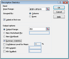
Figure 37-1: Descriptive Statistics dialog box -
The Input Range is the monthly Cisco and GM returns, located in the range E51:F181 (including the labels in row 51). I filled in the remainder of the Descriptive Statistics dialog box as shown in Figure 37-1 for the following reasons:
-
I selected Columns in the Grouped By options because each data set is listed in a different column.
-
I checked the Labels In First Row box because the first row of the data range contains labels and not data.
-
I selected cell I53 of the current worksheet as the first cell in the output range.
-
By selecting Summary Statistics, I ensure that we get the most commonly used descriptive-statistics measures for both GM and Cisco monthly returns.
-
-
When you click OK, Excel calculates the descriptive statistics, as shown in Figure 37-2.
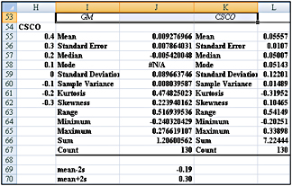
Figure 37-2: Descriptive statistics results for Cisco and GM stocks -
Let’s interpret the descriptive statistics that define a typical value (or a central location) for Cisco’s monthly stock returns. The Descriptive Statistics output contains three measures of central location: mean (or average), median, and mode.
Mean The mean of a data set is written as x and is simply the average of all observations in the sample. Thus, if the data values were x1, x2,…, xn, then the following equation calculates the mean.
![]()
Here, n equals the number of observations in the sample, and xi is the ith observation in the sample. We find that Cisco’s mean monthly return was 5.6 percent per month.
It is always true that the sum of the deviations of all values from the mean equals 0. Thus, you can think of a data set’s mean as a “balancing point” for the data. Of course, without using the Descriptive Statistics option, we can obtain a sample’s mean in Excel by applying the AVERAGE function to the appropriate cell range.
Median The median of a sample is the “middle” observation, when the data is listed from smallest to largest. If a sample contains an odd number of observations, the median is the observation that has as many observations below it as above it. Thus, for a sample of 9, the median would be the fifth smallest (or fifth largest) observation. When a sample includes an even number of observations, you can simply average the two middle observations. Essentially, the median is the 50th percentile of the data. For example, the median monthly return on Cisco was 5 percent. We could also obtain this information by using the MEDIAN function.
Mode The mode is the most frequently occurring value in the sample. If no value occurs more than once, the mode does not exist. For GM, no monthly return occurred more than once for the years 1990–2000, so the mode does not exist. For Cisco, the mode was approximately 5.14 percent. You can also use the MODE function to compute the mode. If no data value occurs more than once, the MODE function returns #NA.
The mode is rarely used as a measure of central location. It is interesting to note, however, that for a symmetric data set, the mean, median, and mode are equal.
A natural question is whether the mean or median is a better measure of central location. Essentially, we use the mean as the best measure of central location if the data set does not exhibit an excessive skew. Otherwise, we use the median as the measure of central location. If a data set is highly skewed, extreme values distort the mean. In this case, the median is a better measure of a typical data set value. For example, the U.S. government reports median family income instead of mean family income because family income is highly positively skewed.
The skewness measure reported by the Descriptive Statistics output informs us whether a data set is highly skewed.
-
A skew greater than +1 indicates a high degree of positive skew.
-
A skew less than –1 indicates a high degree of negative skew.
-
A skew between –1 and +1 inclusive indicates a relatively symmetric data set.
Thus, monthly returns of GM and Cisco exhibit a slight degree of positive skewness. Because the skewness measure for each data set is less than +1, the mean is a better measure of a typical return than the median. You can also use the SKEW function to compute the skew of a data set.
Kurtosis Kurtosis, which sounds like a disease, is not a very important measure. Kurtosis near 0 means a data set exhibits “peakedness” close to the normal (or standard Bell-shaped) curve. (I’ll discuss the normal curve in Chapter 58, “The Normal Random Variable.”) Positive kurtosis means that a data set is more peaked than a normal random variable, whereas negative kurtosis means that data is less peaked than a normal random variable. GM monthly returns are more peaked than a normal curve, whereas Cisco monthly returns are less peaked than a normal curve.
-
How can I measure how much a data set spreads from its typical value?
Let’s consider two investments that each yield an average of 20 percent per year. Before deciding which investment we prefer, we’d like to know about the spread, or riskiness, of the investment. The most important measures of the spread (or dispersion) of a data set from its mean are sample variance, sample standard deviation, and range.
Sample variance and sample standard deviation The sample variance s2 is defined by the following formula.
![]()
You can think of the sample variance as the average squared deviation of the data from its mean. Intuitively, it seems like we should divide by n to compute a true average squared deviation, but technical reasons require us to divide by n–1.
Dividing the sum of the squared deviations by n–1 ensures that our sample variance will be an unbiased measure of the true variance of the population from which the sampled data was drawn.
The sample standard deviation s is just the square root of s2.
Here is an example of these computations for the three numbers 1, 3, and 5.
![]()
Then we find that
![]()
We find that the sample standard deviation of monthly returns for Cisco is 12.2% with a sample variance of 0.015%2. Naturally, %2 is hard to interpret, so we usually look at the sample standard deviation. For GM, the sample standard deviation is 8.97%.
Range The range of a data set is the largest number in the data set minus the smallest number. We find that the range in the monthly Cisco returns is equal to 54 percent and the range for GM monthly returns is 52 percent.
-
Together, what do the mean and standard deviation of a data set tell me about the data?
Assuming that a histogram is symmetric, the rule of thumb tells us the following:
-
Approximately 68 percent of all observations are between x–s and x+s.
-
Approximately 95 percent of all observations are between x–2s and x+2s.
-
Approximately 99.7 percent of all observations are between x–3s and x+3s.
-
-
For example, we would expect approximately 95 percent of all Cisco monthly returns to be from –19 percent through 30 percent.
-
Mean–2s=.056-2*(.122)=–19% and Mean+2s=.056+2*(.122)=30%
-
Any observation more than two standard deviations away from the mean is called an outlier. For the Cisco data, 9 of 130 observations (or roughly 7 percent of all returns) are outliers. In general, the rule of thumb is less accurate for highly skewed data sets than it is for relatively symmetric data sets.
-
Many valuable insights can be obtained by finding causes of outliers. Companies should try to ensure that the causes of “good outliers” occur more frequently and the causes of “bad” outliers occur less frequently.
Using Conditional Formatting to Highlight Outliers
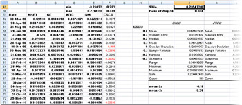
Figure 37-3: Outliers for Cisco highlighted with conditional formatting
To begin, I computed the lower cutoff for an outlier (mean–2s) in cell J69 and the upper cutoff for an outlier (mean+2s) in cell J70. Next, I selected the entire range of Cisco returns (cells F52:F181). I then go to the first cell in the range (F52), select Conditional Formatting on the Home tab, and select New Rule. Then in the New Formatting Rule dialog box, select Use A Formula To Determine Which Cells To Format and fill in the rest of the dialog box as shown in Figure 37-4.
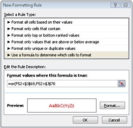
Figure 37-4: Conditional formatting rules to select outliers, as shown in the New Formatting Rule dialog box
This condition ensures that if cell F52 is either more than 2s above or below the mean monthly Cisco return, the format we select (a red font color in this case) will be applied to cell F52. This formatting condition is automatically copied to our selected range. Note that all outliers show up in red.
-
How can I use descriptive statistics to compare data sets?
As an example, you can use descriptive statistics to summarize the differences between Cisco and GM monthly returns. Looking at the shape and the measures and spread of a typical value, we can conclude the following:
-
Typically (looking at either mean or median), Cisco monthly returns are higher than GM.
-
Cisco monthly returns are more variable (looking at standard deviation, variance, and range) than monthly GM returns.
-
Both Cisco and GM monthly returns exhibit slightly positive skews. GM monthly returns are more peaked than a normal curve, whereas Cisco monthly returns are less peaked than a normal curve.
-
-
For a given data point, can I easily find its percentile ranking within the data set? For example, how can I find the 90th percentile of a data set?
-
The PERCENTILE and PERCENTRANK functions are useful when you want to determine an observation’s relative position in a data set.
-
The PERCENTILE function returns the percentile of a data set that you specify. The syntax of the PERCENTILE function is PERCENTILE(data,k), which returns the kth percentile of the information in the cell range specified by data. For example, k=.9 returns a value such that 90 percent of all data points are below the returned value, and k=.10 returns a value such that 10 percent of all data points are below the returned value. To find the 90th percentile of the monthly Cisco returns, I entered in cell J49 the formula PERCENTILE(CSCO,0.9). (The range F52:F181, where Cisco returns are recorded, is named CSCO.) As you can see in Figure 37-3, during 10 percent of all months, monthly returns on Cisco exceeded 20.5 percent.
-
The PERCENTILE function will yield the exact kth percentile only if k is an exact multiple of 1/(n–1). Thus, we would obtain the exact percentile for 1/129, 2/129,…,128/129. Otherwise, Excel interpolates in a complex fashion to obtain an approximation for the percentile specified.
-
The PERCENTRANK function returns the ranking of an observation relative to all values in a data set. The syntax of this function is PERCENTRANK(data,value). For example, in cell J50, we calculate the percentage rank for August 1998 with the formula PERCENT-RANK(CSCO,F153). As shown in Figure 37-3, only 3.8 percent of all months yielded a return lower than August 1998.
Note The PERCENTILE and PERCENTRANK functions are easily confused. To simplify, PERCENTILE yields a value of the data, whereas PERCENTRANK yields a percentage.
-
How can I easily find the second largest or second smallest number in a data set?
The formula =LARGE(range,k) returns the kth largest number in a cell range. The formula =SMALL(range,k) returns the kth smallest number in a cell range. For example, in the file Trimmean.xlsx, in cell F1 the formula =LARGE(C4:C62,2) returns the second largest number in the cell range C4:C62 (99), whereas in cell F2 the formula =SMALL (C4:C62,2) returns the second smallest number in the cell range C4:C62 (80). (See Figure 37-5 on the next page.)
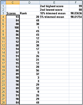
Figure 37-5: LARGE and SMALL functions and trimmed mean -
How can I rank numbers in a data set?
-
With the RANK function, we can rank numbers in a data set. The syntax of the rank function is =RANK(number,array,0). This formula yields the rank of a number in a given array, where the largest number in the array is assigned rank 1, the second largest number is rank 2, and so on. The syntax =RANK(number,array,1) results in assigning a rank of 1 to the smallest number in the array, a rank of 2 to the second smallest number, and so on. In the file Trimmean.xlsx (see Figure 37-5), copying the formula =RANK(C4,$C$4, $c$62,0) from cell D4 to D5:D62 returns the rank of each test score. For example, the score of 100 in cell C7 was the highest score, whereas the scores of 98 in cells C21 and C22 tied for third highest.
-
What is the trimmed mean of a data set?
-
Extreme skew in a data set can distort the mean of the data set. In these situations, people usually use median as a measure of the data set’s typical value. The median, however, is unaffected by many changes in the data. For example, compare the following two data sets:
-
Set 1: –5, –3, 0, 1,3, 5, 7, 9,11,13,15
-
Set 2: –20, –18, –15, –10, –8, 5, 6, 7, 8, 9, 10
-
-
These have the same median (5), but the second data set should have a lower “typical” value than the first. The Excel TRIMMEAN function is less distorted by extreme values than the AVERAGE function, but is more influenced by extreme values than the median. The formula =TRIMMEAN(range,percent) computes the mean of a data set after deleting the top percent divided by 2 and bottom percent divided by 2 data points. For example, applying the TRIMMEAN function with percent=10% converts the mean after deleting the top 5% and bottom 5% of the data. For example, in cell F3 of the file Trimmean.xlsx the formula =TRIMMEAN(C4:C62,.10) in cell F3 computes the mean of the golf scores in C4:C62 after deleting the three highest and three lowest scores (result is 90.06). In cell F4, the formula =TRIMMEAN(C4:C62,.05) computes the mean of the golf scores in C4:C62 after deleting the top and bottom scores. This is because .05*59=2.95 would indicate the deletion of 1.48 of the largest observations and 1.48 of the smallest. Rounding off 1.48 results in deleting only the top and bottom observations. (See Figure 37-5.)
-
When I select a range of cells, is there an easy way to get a variety of statistics that describes the data in those cells?
-
As an example, select the cell range C4:C36 in the file Trimmean.xlsx. In the lower-right corner of your screen, the Excel status bar displays a cornucopia of statistics describing the numbers in the selected cell range. (See Figure 37-6.) For example, for the cell range C4:C36, the mean is 90.39, there are 33 numbers, the smallest value is 80, and the largest value is 100. If you right-click the status bar, you can change the displayed set of statistics.

Figure 37-6: Status bar -
Why do financial analysts often use the geometric mean to summarize the average return on a stock?
-
The file Geommean.xlsx contains the annual returns on two fictitious stocks. (See Figure 37-7.)
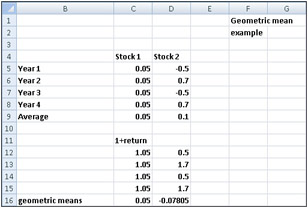
Figure 37-7: Geometric mean -
Cell C9 indicates the average annual return on Stock 1 is 5 percent and the average annual return on Stock 2 is 10 percent. This would seem to indicate that Stock 2 is a better investment. If you think about it, however, what will probably happen with Stock 2 is that one year, you will lose 50 percent, and the next, gain 70 percent. This means that every two years $1.00 will become 1(1.7)(.5)=.85. Because Stock 1 never loses money, we know that it is clearly the better investment. Using the geometric mean as a measure of average annual return helps us to correctly conclude that Stock 1 is the better investment. The geometric mean of n numbers is simply the nth root of the product of the numbers. For example, the geometric mean of 1 and 4 is the square root of 4 (2), whereas the geometric mean of 1, 2, and 4 is the cube root of 8 (also 2). To use the geometric mean to calculate an average annual return on an investment, we add 1 to each annual return and take the geometric mean of the resulting numbers. Then subtract 1 from this result to obtain an estimate of the stock’s average annual return.
-
The formula =GEOMMEAN(range) finds the geometric mean of numbers in a range. Thus to estimate the average annual return on each stock, we proceed as follows:
-
Compute 1+each annual return by copying from C12 to C12:D15 the formula =1+C5.
-
Copy from C16 to D16 the formula =GEOMEAN(C12:C15)–1.
-
-
We estimate that the annual average return on Stock 1 is 5 percent and the annual average return on Stock 2 is –7.8 percent. Note that if Stock 2 yields our mean return of –7.8 percent during two consecutive years, $1 will become 1(1–.078)2=.85, which agrees with common sense.
EAN: 2147483647
Pages: 200