Chapter 43: Estimating Straight Line Relationships
Overview
Suppose you manage a plant that manufactures small refrigerators. National headquarters tells you how many refrigerators to produce each month. For budgeting purposes, you want to forecast your monthly operating costs. You have the following questions:
-
How can I determine the relationship between monthly production and monthly operating costs?
-
How accurately does this relationship explain the monthly variation in plant operating cost?
-
How accurate are my predictions likely to be?
-
When estimating a straight line relationship, which functions can I use to get the slope and intercept of the line that best fits the data?
Every business analyst should have the ability to estimate the relationship between important business variables. In Microsoft Office Excel 2007, the trend curve, which we’ll discuss in this chapter as well as in Chapter 44, “Modeling Exponential Growth,” and in Chapter 45, “The Power Curve,” is often helpful in determining the relationship between two variables. The variable we’re trying to predict is called the dependent variable. The variable we use for prediction is called the independent variable. Here are some examples of business relationships we might want to estimate.
| Independent variable | Dependent variable |
|---|---|
| Units produced by plant in a month | Monthly cost of operating plant |
| Dollars spent on advertising in a month | Monthly sales |
| Number of employees | Annual travel expenses |
| Company revenue | Number of employees (headcount) |
| Monthly return on the stock market | Monthly return on a stock (for example, Dell) |
| Square feet in home | Value of home |
The first step in determining how two variables are related is to graph the data points (by using the Scatter Chart option) so that the independent variable is on the x-axis and the dependent variable is on the y-axis. With the chart selected, you click a data point (they are then all displayed in blue), click Trendline in the Analysis group on the Chart Tools Layout tab, and then click More Trendline Options (or right-click and select Add Trendline). You’ll see the Format Trendline dialog box, which is shown in Figure 43-1.
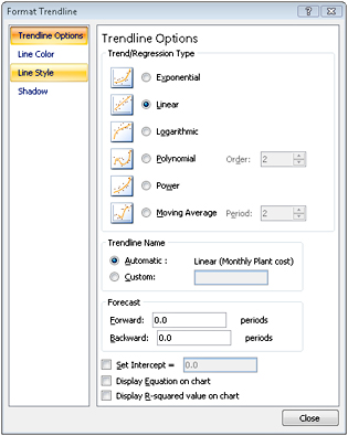
Figure 43-1: Format Trendline options
If your graph indicates that a straight line is a reasonable fit to the points, choose the Linear option. If the graph indicates that the dependent variable increases at an increasing rate, the Exponential (and perhaps Power) option probably fits the relationship. If the graph shows that the dependent variable increases at a decreasing rate, or that the dependent variable decreases at a decreasing rate, the Power option is probably the most relevant.
In this chapter, I’ll focus on the Linear option. In Chapter 44, I’ll discuss the Exponential option. In Chapter 45, I’ll cover the Power option. In Chapter 52, “Using Moving Averages to Understand Time Series,” I’ll discuss the moving average curve, and in Chapter 71, “Pricing Products by Using Tie-Ins,” I’ll discuss the polynomial curve. (The logarithmic curve is of little value in this discussion, so I won’t address it.)
-
How can I determine the relationship between monthly production and monthly operating costs?
-
The file Costestimate.xlsx, shown in Figure 43-2, contains data about the units produced and the monthly plant operating cost for a 14-month period. We are interested in predicting monthly operating costs from units produced, which will help the plant manager determine the operating budget and better understand the cost to produce refrigerators.
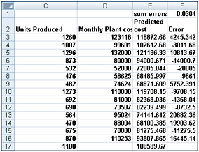
Figure 43-2: Plant operating data -
We begin by creating an XY chart (or a scatter plot) that displays our independent variable (units produced) on the x-axis and our dependent variable (monthly plant cost) on the y-axis. The column of data that you want to display on the x-axis must be located to the left of the column of data you want to display on the y-axis. To create the graph, we select the data in the range C2:D16 (including the labels in cells C2 and D2). We then click Scatter in the Charts group on the Insert tab of the Ribbon, and select the first option (Scatter With Only Markers) as the chart type. You’ll see the graph shown in Figure 43-3.
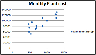
Figure 43-3: Scatter plot of operating cost vs. units produced -
If you want to modify this chart, you can click anywhere inside the chart to display the Chart Tools contextual tab. Using the commands on the Chart Tools Design tab, you can:
-
Change the chart type.
-
Change the source data.
-
Change the style of the chart.
-
Move the chart.
-
-
Using the commands on the Chart Tools Layout tab, you can:
-
Add a chart title.
-
Add axis labels.
-
Add labels to each point that give the x and y coordinate of each point.
-
Add gridlines to the chart.
-
-
Looking at our scatter plot, it seems reasonable that there is a straight line (or linear relationship) between units produced and monthly operating costs. We can see the straight line that “best fits” the points by adding a trendline to the chart. Click within the chart to select it, and then click a data point. All the data points are displayed in blue with an X covering each point. Right-click, and then click Add Trendline. In the Format Trendline dialog box, select the Linear option, and then check the Display Equation On Chart and the Display R-Squared Value On Chart boxes, as shown in Figure 43-4.
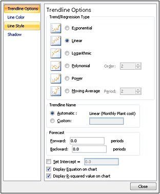
Figure 43-4: Selecting trendline options. -
After clicking Close, you’ll see the results shown in Figure 43-5. Notice that I added a title to the chart and labels for the x-and y-axes by selecting Chart Tools and clicking Chart Title and then Axis Titles in the Labels group on the Layout tab.
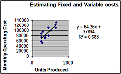
Figure 43-5: Completed trend curve -
To add more decimal points to the equation, I right-clicked the trendline equation, clicked Format Trendline Label, and set the number of decimal points to four.
-
How does Excel determine the “best fitting” line? Excel chooses the line that minimizes (over all lines that could be drawn) the sum of the squared vertical distance from each point to the line. The vertical distance from each point to the line is called an error, or residual. The line created by Excel is called the least-squares line. We minimize the sum of squared errors rather than the sum of the errors because in simply summing the errors, positive and negative errors can cancel each other out. For example, a point 100 units above the line and a point 100 units below the line will cancel each other if we add errors. If we square errors, however, the fact that our predictions for each point are wrong will be used by Excel to find the best fitting line.
-
Thus, Excel calculates that the best fitting straight line for predicting monthly operating cost from monthly units produced as
(Monthly operating cost)=37,894.0956+64.2687(Units produced)
-
By copying from cell E3 to the cell range E4:E16 the formula 64.2687*C3+37894.0956, we compute the predicted cost for each observed data point. For example, when 1260 units are produced, the predicted cost is $123,118 (see Figure 43-2).
-
You should not use a least-squares line to predict values of an independent variable that lie outside the range for which you have data. Our line should be used only to predict monthly plant operating costs during months in which production is between approximately 450 and 1300 units.
-
The intercept of this line is $37,894.10, which can be interpreted as the monthly fixed cost. So, even if the plant does not produce any refrigerators during a month, we estimate the plant will still incur costs of $37,894.10. The slope of this line (64.2687) indicates that each extra refrigerator we produce increases monthly cost by $64.27. Thus we estimate the variable cost of producing a refrigerator is $64.27.
-
In cells F3:F16, I’ve computed the errors (or residuals) for each data point. We define the error for each data point as the amount by which the point varies from the least-squares line. For each month, error equals the observed cost minus the predicted cost. Copying from F3 to F4:F16 the formula D3-E3 computes the error for each data point. A positive error indicates a point is above the least-squares line, and a negative error indicates that the point is below the least-squares line. In cell F1, I computed the sum of the errors and obtained –0.03. In reality, for any least-squares line, the sum of the errors should equal 0. (I obtained –0.03 because I rounded the equation to four decimal points.) The fact that errors sum to 0 implies that the least-squares line has the intuitively satisfying property of splitting the points in half.
-
How accurately does this relationship explain the monthly variation in plant operating cost?
-
Clearly, each month both the operating cost and the units produced vary. A natural question is, what percentage of the monthly variation in operating cost is explained by the monthly variation in units produced? The answer to this question is the R2 value (0.688) shown in Figure 43-5. We can state that our linear relationship explains 68.82 percent of the variation in monthly operating costs. This implies that 31.8 percent of the variation in monthly operating costs is explained by other factors. Using multiple regression (see Chapters 46 through 48), we can try to determine other factors that influence operating costs.
-
People always ask, what is a good R2 value? There is really no definitive answer to this question. With one independent variable, of course, a larger R2 value indicates a better fit of the data than a smaller R2 value. A better measure of the accuracy of your predictions is the standard error of the regression, which I’ll describe in the next section.
-
How accurate are my predictions likely to be?
-
When we fit a line to points, we obtain a standard error of the regression that measures the “spread” of the points around the least-squares line. The standard error associated with a least-squares line can be computed with the STEYX function. The syntax of this function is STEYX(yrange,xrange), where yrange contains the values of the dependent variable, and xrange contains the values of the independent variable. In cell K1, I computed the standard error of our cost estimate line with the formula STEYX(D3:D16,C3:C16). The result is shown in Figure 43-6.
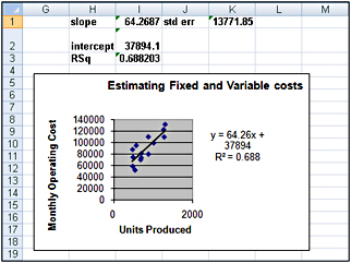
Figure 43-6: Computation of slope, intercept, RSQ, and standard error of regression -
Approximately 68 percent of our points should be within one standard error of regression (SER) of the least-squares line, and about 95 percent of our points should be within two SER of the least-squares line. These measures are reminiscent of the descriptive statistics rule of thumb that I described in Chapter 37, “Summarizing Data by Using Descriptive Statistics.” In our example, the absolute value of around 68 percent of the errors should be $13,772 or smaller, and the absolute value of around 95 percent of the errors should be $27,544, or 2*13,772, or smaller. Looking at the errors in column F, we find that 10 out of 14, or 71 percent, of our points are within one SER of the least-squares line and all (100 percent) of our points are within two standard SER of the least-squares line. Any point that is more than two SER from the least-squares line is called an outlier. Looking for causes of outliers can often help you to improve the operation of your business. For example, a month in which actual operating costs were $30,000 higher than anticipated would be a cost outlier on the high side. If we could ascertain the cause of this high cost outlier and prevent it from recurring, we would clearly improve plant efficiency. Similarly, consider a month in which actual costs are $30,000 less than expected. If we could ascertain the cause of this low cost outlier and ensure it occurred more often, we would improve plant efficiency.
-
When estimating a straight line relationship, which functions can I use to get the slope and intercept of the line that best fits the data?
-
The Excel SLOPE(yrange,xrange) and INTERCEPT(yrange,xrange) functions return the slope and intercept, respectively, of the least-squares line. Thus, entering in cell I1 the formula SLOPE(D3:D16,C3:C16) (see Figure 43-6) returns the slope (64.27) of the least-squares line. Entering in cell I2 the formula INTERCEPT(D3:D16,C3:C16) returns the intercept (37,894.1) of the least-squares line. By the way, the RSQ(yrange,xrange) function returns the R2 value associated with a least-squares line. So, entering in cell I3 the formula RSQ(D3:D16,C3:C16) returns the R2 value of 0.6882 for our least-squares line.
EAN: 2147483647
Pages: 200