Using Links
| Without links, web pages would be really dull and finding anything interesting on the Web would be close to impossible. In many ways, the quality of your links can be as important as the writing and design of your actual pages. Here's some friendly advice on creating and using links. Use Link Menus with Descriptive TextAs I've noted throughout this book, using link menus is a great way of organizing your content and the links on a page. If you organize your links into lists or other menu-like structures, your visitors can scan their options for the page quickly and easily. Just organizing your links into menus might not be enough, however. Make sure that your descriptions aren't too short. For example, using menus of filenames or other marginally descriptive links in menus can be tempting (see Figure 16.11). Figure 16.11. DON'T: A poor link menu.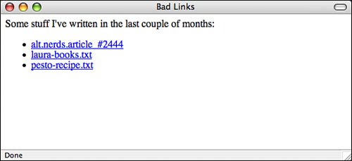 Each link describes the actual page to which it points, but it doesn't really describe the content of the page. How do visitors know what's on the other side of the link, and how can they decide whether they're interested in it from the limited information you've given them? Of these three links, only the last (pesto-recipe.txt) gives the visitors a hint about what they'll see when they jump to that file. A better plan is either to provide some extra text describing the content of the file, as shown in Figure 16.12, or to avoid the filenames altogether. Just describe the contents of the files in the menu with the appropriate text highlighted, as shown in Figure 16.13. Figure 16.12. DO: A better link menu.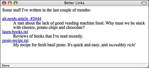 Figure 16.13. DO: Another better link menu.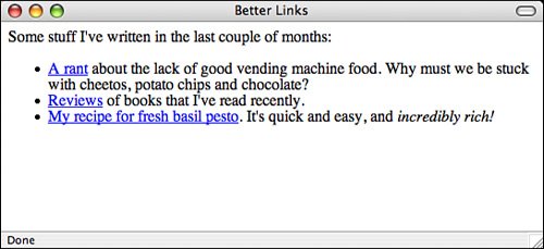 Either one of these forms is better than the first. They both give your visitors more clues about what's on the other side of the link. Use Links in TextThe best way to provide links in text is to first write the text as if it isn't going to have links at allfor example, as if you were writing it for hard copy. Then you can highlight the appropriate words that will link to other pages. Make sure that you don't interrupt the flow of the page when you include a link. The text should stand on its own. That way, the links provide additional or tangential information that your visitors can choose to follow or ignore at their own whim. Figure 16.14 shows another example of using links in text. Here the text itself isn't particularly relevant; it's just there to support the links. If you're using text just to describe links, consider using a link menu instead of a paragraph. Instead of having to read the entire paragraph, your visitors can skim for the links that interest them. Figure 16.14. DON'T: Links in text that don't work well.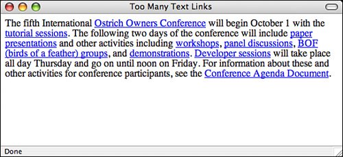 Figure 16.15 shows one way to restructure the previous example. The most important items on the page are the name of the conference, the events, and the dates on which they occur. You can restructure the page so that this information stands out. As you can see in Figure 16.15, presenting the events in a preformatted text table makes the important information stand out from the rest. Figure 16.15. DO: Restructuring the links in the text.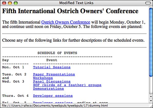 Probably the easiest way to figure out whether you're creating links within text properly is to print out the formatted web page from your browser. In hard copy, without hypertext, does the paragraph still make sense? If the page reads funny on paper, it'll read funny online as well. The revisions don't always have to be as different as they are in this example. Sometimes, a simple rephrasing of sentences can make the text on your pages more readable and more usable, both online and when printed. Avoid the "Here" SyndromeA common mistake that many web authors make when creating links in body text is using the "Here" syndrome. This is the tendency to create links with a single highlighted word (here) and to describe the links somewhere else in the text. Look at the following examples, with underlining to indicate link text:
Because links are highlighted on the web page, the links visually pop out more than the surrounding text (or draw the eye, in graphic design lingo). Your visitors will see the link first, before reading the text. Try creating links this way. Figure 16.16 shows a particularly heinous example of the "Here" syndrome. Close your eyes, open them quickly, pick a "here" in the figure at random, and then see how long it takes you to find out what the "here" is for. Figure 16.16. DON'T: The "Here" syndrome.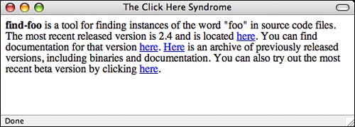 Now try the same exercise with a well-organized link menu of the same information, as shown in Figure 16.17. Figure 16.17. DO: The same page reorganized.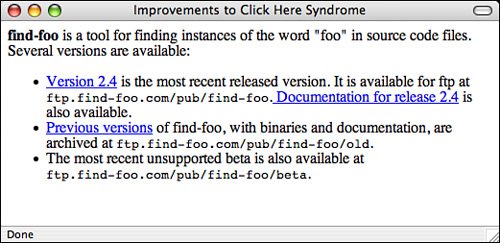 Because "here" says nothing about what the link is used for, your poor visitors have to search the text before and after the link itself to find out what's supposed to be "here." In paragraphs that have many occurrences of "here" or other nondescriptive links, matching up the links with what they're supposed to link to becomes difficult. This forces your visitors to work harder to figure out what you mean. To Link or Not to LinkJust as with graphics, every time you create a link, consider why you're linking two pages or sections. Is the link useful? Does it give your visitors more information or bring them closer to their goal? Is the link relevant in some way to the current content? Each link should serve a purpose. Just because you mention the word "coffee" on a page about some other topic, you don't have to link that word to the coffee home page. Creating such a link may seem cute, but if a link has no relevance to the current content, it just confuses your visitors. The following list describes some of the categories of useful links in web pages. If your links don't fall into one of these categories, consider the reasons why you're including them in your page:
Be careful that you don't get carried away with definitions and tangent links. You might create so many tangents that your visitors spend too much time linking elsewhere to follow the point of your original text. Resist the urge to link every time you possibly can, and link only to tangents that are relevant to your own text. Also, avoid duplicating the same tangentfor example, linking every instance of the letters "WWW" on your page to the WWW Consortium's home page. If you're linking twice or more to the same location on one page, consider removing most of the extra links. Your visitors can select one of the other links if they're interested in the information. Note Thanks to Nathan Torkington for his "Taxonomy of Tags," published on the www-talk mailing list, which inspired this section. |
EAN: 2147483647
Pages: 305
