Using Media-Specific Style Sheets
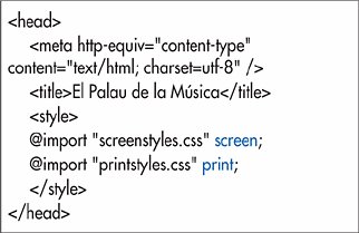
| You can designate a style sheet to be used only for a particular output, perhaps only for printing, or only for handhelds. For example, you might create one general style sheet with features common to both the print and screen versions, and then individual print and screen style sheets with properties to be used only for print and screen, respectively. To designate media-specific style sheets: Add media="output" to the opening link or style tags, where output is one or more of the following: print, screen, handheld, or all (Figure 8.17). Separate multiple values with commas. Figure 8.17. Limit the style sheet to a particular output by adding the media attribute to the link element. Or, in an @import rule, as described on the previous page, after the URL, add output, where output has the same values as above, after the URL but before the semicolon (Figure 8.18). Again, separate multiple values with commas. Figure 8.18. If you're importing style sheets rather than linking them, you add the media attribute's value to the end of the @import rule.
|
EAN: 2147483647
Pages: 340


 Tips
Tips