Directives
[Previous] [ Next ]
13.1 Ensure thorough keyboard navigation and interaction.
Depending on the type of program you're creating, it might not be possible to provide keyboard accessibility for all functions that are accessible with the mouse. However, a user should be able to navigate your program without a mouse. This means that your menus should support shortcut keys and access keys. For more information on these methods of keyboard access, refer to Chapter 12, "Interface Design."
In addition to making your menus keyboard-friendly, you must also make it possible for users to use the keyboard to easily navigate the controls of every form and dialog box. Furthermore, it should be possible for a user to accept or reject changes in a dialog box via the keyboard. Enabling full keyboard access can be quite tedious , and chances are you won't account for all situations prior to releasing your product, but you can rest assured that your customers will be more than enthusiastic about letting you know the situations you forgot !
Practical Applications
13.1.1 Thoughtfully set the tab order of all of your forms. Even if a user loves using the mouse, it's inevitable that sooner or later he is going to want to progress forward or backward through the controls on a form by using the Tab key. The Tab key is the Microsoft Windows standard key for moving the focus forward (and backward using Shift+Tab) through the controls on a form. Every one of your forms should allow complete forward and backward navigation by way of Tab and Shift+Tab . There is simply no good excuse for not providing this.
The order in which the Tab key progresses through the controls on a form is known as the tab order . The tab order is determined by the TabIndex and TabStop properties of the controls on the form. All controls that can receive the focus have a TabIndex property, but not all controls have a TabStop property. Controls that have a TabIndex property but not a TabStop property are treated as though they have a TabStop property always set to True. When a user presses the Tab key, the focus is moved from the control that currently has the focus to the control that has the next highest TabIndex property value. If the control with the next highest TabIndex value is not visible or has its TabStop property set to False, the search continues until a visible control is found that has its TabStop property set to True.
To define a tab order for a form, simply assign the first control to receive the focus a TabIndex of 0, the next control a TabIndex of 1, and so on. Although the concept is simple, it's an amazingly tedious process in Visual Basic.
As you add controls to a form, Visual Basic assigns values incrementally to the TabIndex properties. For instance, the first control placed on a form has a TabIndex of 0, the next control a TabIndex of 1, and so on. This is rarely the order you want by the time a form is finished being designed. As you develop the form, you usually add new controls, delete existing controls, and shuffle controls around so as to create that killer interface. As you perform these actions, the system-assigned TabIndex values become arbitrary. Thus, verifying the tab order of a form should be one of the last tasks you perform before a form is put into production (that is, compiled into a usable file). This isn't to say you shouldn't adjust your tab order as you work on a form, because you really should. However, regardless of how many times you've tweaked a form's tab order, when you're done working with a form and are ready to move onto another, verify the tab order.
Setting the tab order of the controls on a form should be a simple point-and-click process; after all, you have to do this with every form you create. However, Visual Basic does not include such functionality, and you have to change the TabIndex property value of each and every control individually. I've tried to come up with a more diplomatic way to say this, but I can't: this sucks . Let's hope that the Visual Basic team gives us this ability soon; it would save countless hours of development time for hundreds of thousands of developers.
When manually assigning values to the TabIndex properties of a form's controls, you can take two approaches. The first, and most obvious, method is selecting the control you want to be the first control in the tab order and assigning it a TabIndex of 0. Then select the next control in the order and give it a TabIndex of 1. Continue this process until all controls have the proper TabIndex setting. This is beyond tedious and will soon have you bashing your head against the keyboard; or, worse yet, you'll get tired of the process and give up. Fortunately, an easier (yet not as obvious) approach exists.
Instead of working from the first control to the last, work from the last to the first. The great thing about this approach is that you have to assign only a single value to all the TabIndex properties: the value 0. When you assign a control a TabIndex value, any control with the same value, as well as every control with a higher value, is automatically adjusted to preserve its place in the tab order. So, when you assign the last control in the tab order a TabIndex of 0, it becomes the first control in the tab order. However, when you assign the second-to-last control a TabIndex of 0, the last control's TabIndex is automatically set to 1. When the third-to-last control has its TabIndex property set to 0, the second-to-last control is assigned a TabIndex of 1 and the last control is assigned a TabIndex of 2. It's much easier to select the controls in reverse order and give them each a TabIndex of 0 rather than selecting them in forward order and explicitly entering their distinct TabIndex values.
NOTE
When using a container control, such as the frame control, assign the container control a TabIndex value one less than that of the first control to receive the focus in the container.
Incorrect:
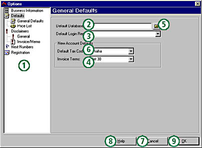
Figure 13-1. An incorrect tab order confuses and slows down the user. Often, the user has to reach for the mouse to get where he or she wants to go.
Correct:
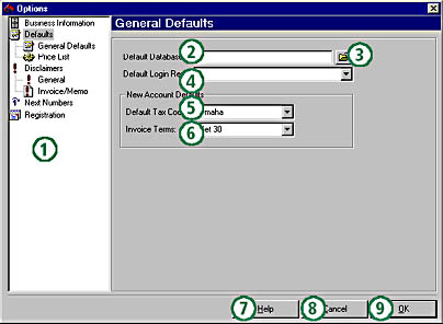
Figure 13-2. The tab order shown here doesn't include the container controls. It's meant to show you the flow that the user would experience when pressing the tab key.
13.1.2 Create a default command button and a cancel command button in dialog boxes when feasible . Most applications display modal dialog boxes. These dialog boxes are used to gather information from the user before they are closed. Generally, such dialog boxes include at least two command buttons : OK and Cancel. Clicking the OK button commits the user's settings and closes the dialog box; clicking the Cancel button closes the dialog box and discards the user's settings. You may have noticed that in most programs pressing the Esc key (Escape) has the same effect as clicking the Cancel button. You can (and should) duplicate this behavior in your applications.
To assign the Esc key to a command button, set the command button's Cancel property to True. When a command button's Cancel property is set to True, pressing Esc while any control on the form has the focus triggers that command button's Click event. Only one command button per form can have its Cancel property set to True. If you set one command button's Cancel property to True and then set the Cancel property of a second command button to True, the first button's Cancel property will be automatically set to False.
To assign the Enter key to a command button, you set the button's Default property to True. When a command button's Default property is set to True, pressing Enter while any control on the form has the focus triggers that button's Click event. As in the case of the Cancel property, only one command button per form can have its Default property set to True and setting the Default property of a command button to True sets the Default property of all the other command buttons to False.
Although the Cancel property of every dialog box's Cancel button should be set to True, you'll have to determine whether to assign a default command button (by setting a certain command button's Default property to True) based on the nature of the dialog box. The main issue to consider when assigning a default command button is whether the dialog box includes any multiline text boxes. In a multiline text box, pressing Enter causes a new line of text to be created (such as when creating a new paragraph). Unfortunately, Visual Basic doesn't recognize this special situation and interprets the user pressing Enter as a clicking of the default button. This is extremely aggravating to a user. If you're including a multiline text box in a dialog box, you're better off not designating a command button as the default button for the form.
13.1.3 Assign access keys to commonly used command buttons. Almost everyone is familiar with menu access keys. When a letter in the name of a top-level menu is underlined (such as the F in File ), pressing the Alt key in conjunction with the underlined letter opens the menu. What many developers are unaware of, however, is that you can assign access keys to command buttons.
How to go about assigning access keys to command buttons isn't obvious because of the lack of a dedicated access key property. You designate an access key by prefixing a character in the command button's Caption property with an ampersand (&). When Visual Basic displays a command button's caption, it looks for an ampersand. If one is found, the ampersand is not displayed. Instead, the character immediately following the ampersand is shown with an underscore , and that character becomes the access key for the command button. Pressing Alt in conjunction with a command button's access key triggers the command button's Click event just as though the user clicked the button with a mouse.
NOTE
To display an ampersand within the caption, use two ampersands. For instance, to display the caption Print & Exit , set the Caption property to Print && Exit .
Access keys are great because they give keyboard users an efficient means to trigger command buttons without clicking them ”you should assign access keys to all commonly used command buttons on your forms. However, when assigning access keys, be aware of the following points:
- Don't assign an access key to a command button that has either its Default or Cancel property set to True. When a command button has its Default or Cancel property set to True, it can be "clicked" by pressing Enter or Esc, respectively; there is simply no need to assign access keys in these situations.
- Don't assign access keys that conflict with the access keys of menu items. For instance, if a form has a File menu, the F in File should be designated as the access key for the menu to be consistent with other programs. Don't assign the letter F as a button access key on a form that already has F as the access key of a menu; the menu always wins. Refer to Chapter 12 for more information on menus.
Incorrect:
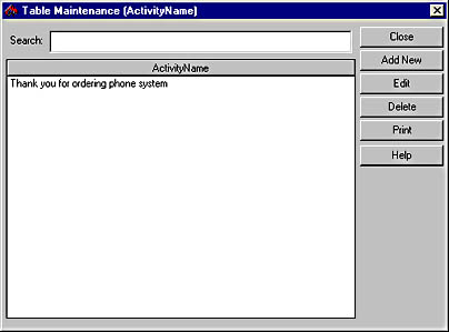
Figure 13-3. Without access keys, a user is forced to tab to the desired command button or reach for the mouse.
Correct:
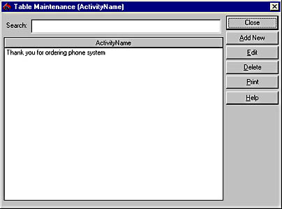
Figure 13-4. Notice the use of logical access keys. The Close button doesn't have an access key because it is the default button.
13.1.4 Set the MaxLength property of controls bound to data fields. When creating data forms, make the forms as easy to use as possible. This includes making functions and menus accessible via the keyboard, assigning access keys to command buttons, and creating default and cancel buttons when appropriate. Another helpful practice you can follow with data entry forms actually involves stopping the user from typing too much at the keyboard.
Most fields in a database table have a maximum number of characters that they can store. Attempting to store more characters in a field than allowed results in the error shown in Figure 13-5. When a user encounters this error, she's forced to stop working, determine which field on the screen is the culprit, and reduce the number of characters in her entry. Often, she'll shorten the entry and then try to save it again, only to find that the entry is still too long. This process is repeated until the user finally enters a string small enough to fit in the data field. But there's no good reason for making the user go through this.

Figure 13-5. This is most certainly not a friendly way to treat a user.
Text box controls include a MaxLength property. When a single line text box's MaxLength property is set to 0 (the default), the only constraint on the number of characters the text box can contain is the amount of memory on the user's computer. Multiline text boxes have a limit of 32 KB. Any value greater than 0 for MaxLength causes the text box to limit the number of characters it accepts. If the user attempts to enter more characters than the amount allowed by MaxLength , Visual Basic stops the characters from being entered in the text box and alerts the user with a beep. This situation is definitely preferable to being allowed to enter anything you like and then being shown an error when you attempt to save a record.
If you bind your text boxes to a data control, you might be under the assumption that Visual Basic automatically sets the MaxLength property when the control is bound. This is a great idea, but it doesn't actually work that way. Binding a text box control has no effect on the control's MaxLength property; the text box continues to have the same value in its MaxLength property as it had before it was bound to the data source. Therefore, to prevent the user from entering more data in a text box than can be saved in the underlying Recordset, you have to set the MaxLength property manually for each text box.
You can take two approaches to setting the MaxLength property: set the MaxLength property of a text box at design time, or retrieve the maximum number of characters allowed by a field in the Recordset and set the MaxLength property of the corresponding text box at run time (using the Size property of a DAO Field object, for example). The latter method gives you more flexibility in that if you change a field size you don't have to worry about making the change manually to all text boxes that access the field. Setting the properties at run time is a bit slower than having the properties set at design time, but the performance difference is probably negligible. Still, it's a consideration. Choose whichever method you think is best ”just be sure to set the MaxLength properties.
Incorrect:
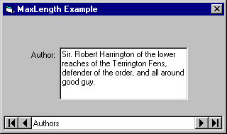
Figure 13-6. If a very long text string can't be saved, why let the user enter it?
Correct:
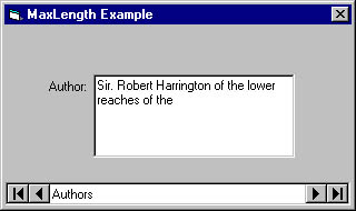
Figure 13-7. Setting a text box's MaxLength property restricts the number of characters that can be entered.
13.2 Provide consistent and intuitive mouse interaction.
For most users, the mouse is the primary device for interacting with the computer. Although keyboard users are often neglected, sometimes developers neglect mouse users as well.
Practical Applications
13.2.1 Provide pop-up menus whenever possible. A pop-up menu is a menu that appears when the user right-clicks an object that supports pop-up menus. (See Figure 13-8.) This section's focus is not on the organization of pop-up menus but rather on the proper ways to invoke pop-up menus. Microsoft Windows 95 started the era of pop-up menus, and now most users can't live without them.
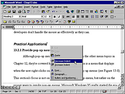
Figure 13-8. Pop-up menus let users quickly access context-sensitive functions by right-clicking an object.
Right-clicking an object is an easy way to explore an application. For instance, if you're not sure what you can do with a message item in Microsoft Outlook, you need only right-click an item to see a pop-up menu of commands related to the item. You should create pop-up menus for as many items as possible in your program. Windows displays standard pop-up menus for certain controls such as the text box, so don't go crazy and think you have to add a pop-up menu to every control on a form. Use your head, and try to put yourself in the user's place. In general, lists of items, whether in a list box, tree view, or list view control, are good candidates for pop-up menus.
When you display a pop-up menu for an item, the pop-up menu should contain items specifically related to the item that was right-clicked. For instance, when displaying a pop-up menu for a person's name in a contact list, it would be perfectly logical to show items such as Add New, Delete, Send Fax, and Dial Phone. However, items that aren't directly related to the object being clicked ”such as Mark As Read or Save As in this example ”shouldn't appear on the menu. Think of pop-up menus as being context menus . Just as pressing F1 displays context-sensitive help, right-clicking an object should display a context-sensitive menu.
Pop-up menus are displayed by using the PopupMenu method of a Form object. The PopupMenu method has the following syntax:
object .PopupMenu menuname,flags,x,y,boldcommand |
The following table describes the PopupMenu method's syntax.
| Part | Description |
|---|---|
| object | Optional. The form that displays the pop-up menu. If object is omitted, the form with the focus is used. |
| menuname | Required. The name of the pop-up menu to display. The specified menu must have at least one submenu. |
| flags | Optional. A value or constant that specifies the location and behavior of the pop-up menu being displayed. |
| x | Optional. Specifies the x-coordinate where the pop-up menu is displayed. If omitted, the x-coordinate of the mouse is used. |
| y | Optional. Specifies the y-coordinate where the pop-up menu is displayed. If omitted, the y-coordinate of the mouse is used. |
| boldcommand | Optional. Specifies the name of a menu item in the pop-up menu that will be displayed in bold text. If omitted, no items in the pop-up menu will be bold. |
To display, for example, the File menu as a pop-up menu on a form ( assuming the menu control's name is mnuFile ), you could use a statement like this:
PopupMenumnuFile |
Generally, I don't like to take anything for granted, so I explicitly specify objects whenever possible. I would use the following statement instead:
Me.PopupMenumnuFile |
It's not usually necessary to use any of the optional parameters ”the defaults work just fine. However, if you want to adjust the location or behavior of the pop-up menu, use one or more of the constants for the flags parameter.
| Constant (Location) | Value | Description |
|---|---|---|
| vbPopupMenuLeftAlign | The left side of the pop-up menu is located at x . (Default) | |
| vbPopupMenuCenterAlign | 4 | The pop-up menu is centered at x . |
| vbPopupMenuRightAlign | 8 | The right side of the pop-up menu is located at x . |
| Constant (Behavior) | Value | Description |
|---|---|---|
| vbPopupMenuLeftButton | An item on the pop-up menu reacts to a mouse click only when clicked with the left mouse button. (Default) | |
| vbPopupMenuRightButton | 2 | An item on the pop-up menu reacts to a mouse click when clicked with either the right or the left mouse button. |
Since you must display pop-up menus by explicitly calling the PopupMenu method, you have to add code to a mouse event. The proper event from which to display a pop-up menu is the MouseUp event, not the MouseDown event.
Incorrect:
PrivateSub lstContacts_MouseDown(Button AsInteger ,_ Shift AsInteger ,X AsSingle ,Y AsSingle ) '*Purpose:Displayapop-upmenuforthecontactlist. OnErrorGoTo PROC_ERR '*Iftheuserclickedwiththerightbutton, '*showthemenuatthedefaultlocation. If Button=vbRightButton Then Me.PopupMenumnuContacts EndIf PROC_EXIT: ExitSub PROC_ERR: Call ShowError(Me.Name,"lstContacts_MouseDown",Err.Number,_ Err.Description) GoTo PROC_EXIT EndSub |
Correct:
PrivateSub lstContacts_MouseUp(Button AsInteger ,_ Shift AsInteger ,X AsSingle ,Y AsSingle ) '*Purpose:Displayapop-upmenuforthecontactlist. OnErrorGoTo PROC_ERR '*Iftheuserclickedwiththerightbutton, '*showthemenuatthedefaultlocation. If Button=vbRightButton Then Me.PopupMenumnuContacts EndIf PROC_EXIT: ExitSub PROC_ERR: Call ShowError(Me.Name,"lstContacts_MouseUp",Err.Number,_ Err.Description) GoTo PROC_EXIT EndSub |
13.2.2 Use the mouse pointer to give the user feedback. Most of the time, the mouse behaves like a one-way street. The user manipulates it to provide information to a program, and the program takes the information generated by the mouse and performs some sort of action. However, the mouse is also capable of sending information to the user by way of its icon.
You change the icon of the mouse pointer by changing the MousePointer property of an object. For example, to change the mouse pointer of the Screen object to an hourglass, use this statement:
'*Setthescreenmousepointertoanhourglass. Screen.MousePointer=vbHourglass |
The following table lists the constants for the MousePointer property. These constants are system constants and are not part of an enumeration; you won't get a drop-down list of these constants when writing code. Instead, you'll have to use online Help, refer to this table, use the MousePointer class provided on the CD, or create your own custom enumeration.
NOTE
On the CD you'll find a MousePointer class that you can add to your own projects. This class wraps the MousePointer property of the Screen object into an easy-to-use object, complete with an enumeration for the value constants.
| Constant | Value | Description |
|---|---|---|
| vbDefault | Shape determined by the object (default) | |
| vbArrow | 1 | Arrow |
| vbCrosshair | 2 | Cross (crosshair pointer) |
| vbIbeam | 3 | I beam (often used for positioning within text) |
| vbIconPointer | 4 | Icon (small square within a square) |
| vbSizePointer | 5 | Size (four-pointed arrow pointing north, south, east, and west) |
| vbSizeNESW | 6 | Size NE SW (double arrow pointing northeast and southwest) |
| vbSizeNS | 7 | Size N S (double arrow pointing north and south) |
| vbSizeNWSE | 8 | Size NW SE (double arrow pointing northwest and southeast ) |
| vbSizeWE | 9 | Size W E (double arrow pointing west and east) |
| vbUpArrow | 10 | Up arrow |
| vbHourglass | 11 | Hourglass (wait) |
| vbNoDrop | 12 | No drop |
| vbArrowHourglass | 13 | Arrow and hourglass |
| vbArrowQuestion | 14 | Arrow and question mark |
| vbSizeAll | 15 | Size all |
| vbCustom | 99 | Custom icon specified by the MouseIcon property |
Although all these icons have a useful purpose, the two used most often are vbDefault and vbHourglass . When your program is busy processing and can't accept input from the user, display the hourglass by setting the Screen object's MousePointer property to vbHourglass . Users get extremely frustrated and perplexed when the program looks as though it will accept input but it doesn't. This often results in a three-fingered salute (Ctrl+Alt+Delete), which just leads to real complications. Most of the time, you can avoid this simply by displaying an indicator ”the hourglass ”to show that the program is busy. When the process is finished and control is returned to the user, set the Screen object's MousePointer property back to vbDefault .
The behavior of the Screen object's mouse pointer has changed since previous versions of Visual Basic. In earlier versions, setting the Screen object's MousePointer property to vbHourglass changed the pointer to an hourglass, regardless of where on the screen it was. Now, the changes you make to the Screen object's MousePointer property affect the pointer only when it's over a window of your application . This makes sense because although your program might be busy, the user could still switch to a different program and continue working; you don't want to affect the pointer in other programs or within Windows itself.
When a procedure that has changed the mouse pointer finishes what it's doing, it must always set the mouse pointer back to the default. When the mouse pointer's icon is not appropriate for a given situation, it confuses and frustrates users. For instance, leaving the pointer as an hourglass when the system isn't busy leads the user to thinking she can't interact with the program even though she can. Imagine waiting for a program to return control to you when all the while the program has been waiting for you to do something.
Incorrect:
PrivateSub cmdFillYears_Click() '*Purpose:Fillalistboxwiththeyearsfrom1900to2050. OnErrorGoTo PROC_ERR Dim intYear AsInteger Const c_YearMin=1900 Const c_YearMax=2050 '*Setthepointertoanhourglasssothattheuserknows '*we'rebusy. Screen.MousePointer=vbHourglass '*Populatethelistboxwiththerangeofyears. For intYear=c_YearMin To c_YearMax lstYears.AddItemintYear Next intYear PROC_EXIT: ExitSub PROC_ERR: Call ShowError(Me.Name,"cmdFillYears_Click",Err.Number,_ Err.Description) GoTo PROC_EXIT EndSub |
Correct:
PrivateSub cmdFillYears_Click() '*Purpose:Fillalistboxwiththeyearsfrom1900to2050. OnErrorGoTo PROC_ERR Dim intYear AsInteger Const c_YearMin=1900 Const c_YearMax=2050 '*Setthepointertoanhourglasssothattheuserknows '*we'rebusy. Screen.MousePointer=vbHourglass '*Populatethelistboxwiththerangeofyears. For intYear=c_YearMin To c_YearMax lstYears.AddItemintYear Next intYear '*Restorethemousepointer. Screen.MousePointer=vbDefault PROC_EXIT: ExitSub PROC_ERR: Call ShowError(Me.Name,"cmdFillYears_Click",Err.Number,_ Err.Description) GoTo PROC_EXIT EndSub |
Also correct:
PrivateSub cmdFillYears_Click() '*Purpose:Fillalistboxwiththeyearsfrom1900to2050. OnErrorGoTo PROC_ERR Dim intYear AsInteger Dim intMousePointer AsInteger Const c_YearMin=1900 Const c_YearMax=2050 '*Getthecurrentmousepointer. intMousePointer=Screen.MousePointer '*Setthepointertoanhourglasssothattheuserknows '*we'rebusy. Screen.MousePointer=vbHourglass '*Populatethelistboxwiththerangeofyears. For intYear=c_YearMin To c_YearMax lstYears.AddItemintYear Next intYear '*Restorethemousepointer. Screen.MousePointer=intMousePointer PROC_EXIT: ExitSub PROC_ERR: Call ShowError(Me.Name,"cmdFillYears_Click",Err.Number,_ Err.Description) GoTo PROC_EXIT EndSub |
13.2.3 When displaying pop-up menus that perform actions on selected list items, always select the item that is clicked before displaying the pop-up menu. Although the right mouse button is used to display pop-up menus, the list box control doesn't recognize the right click as a way to select an item. When you display a pop-up menu with commands that operate on the selected item in a list box control, you must write code to ensure that the item under the mouse when the right click occurred is the item that is selected when the menu appears. This is best done with the MouseDown event.
Selecting an item in a list box with the right mouse button is trickier than you might think. Essentially, you have to calculate the row that was clicked by considering the y-coordinate of the mouse and the height of a capital letter. This becomes even more complex when you consider that a list box's container can have one of many different scale modes and that some containers (such as the frame control) don't have scale modes at all! I've created a procedure that you can add to a project and call from the MouseDown event of any list box. This procedure determines the row that is clicked and selects the item if there is one at that location. It takes advantage of the fact that the y-coordinate passed to the MouseDown event is always in twips, regardless of the scale mode of the container, and it uses the list box's parent to compute the average height of a letter. If you change the font used in a list box or on the parent form to something other than the standard font, this procedure might not work correctly.
PublicSub SelectListBoxItemFromY(ctlListBox As ListBox,_ intButton AsInteger ,sngYTwips AsSingle ) '*Purpose:Determinewhichitem(ifany)inalistbox '*liesunderthey-coordinate,andselectit. '*Accepts:ctlListBox-thelistboxcontrol. '*intButton-themousebuttonclicked. '*sngYTwips-theverticalcoordinate.Thisis '*expectedintwips,whichisthewayallMouseDown '*eventsreceiveit. OnErrorGoTo PROC_ERR Dim intSelectedIndex AsInteger '*Iftheuserclickedthemousewithabuttonotherthan '*therightbutton,getout. If intButton<>vbRightButton ThenGoTo PROC_EXIT '*Thisisatechniquefordeterminingwhichrowtheuserclicked. '*WeusetheletterAtodeterminehowhigheachrowis. '*NOTE:Sincethelistboxcanappearinanynumberofcontainers '*havinganyscalemode,weusetheScaleModeandScaleYof '*thelistbox'sparentcontrol(usuallyaform)tomake '*sureallofthenumbersinvolvedareofthesamescale. '*Remember,yisexpectedintwips. intSelectedIndex=(sngYTwips\_ ctlListBox.Parent.ScaleY(ctlListBox.Parent._ TextHeight("A"),ctlListBox.Parent.ScaleMode,_ vbTwips))+ctlListBox.TopIndex '*Iftheselectedindexisgreaterthantheindexofthelast '*item,theemptyareabelowthelistwasclicked. '*Otherwise,avaliditemwasclicked,soselectit. If intSelectedIndex<ctlListBox.ListCount Then ctlListBox.ListIndex=intSelectedIndex EndIf PROC_EXIT: ExitSub PROC_ERR: Call ShowError(Me.Name,"SelectListBoxItemFromY",Err.Number,_ Err.Description) GoTo PROC_EXIT EndSub |
To use this procedure, simply call it from the MouseDown event of a list box control, passing it a reference to the list box, the button, and the y-coordinate, as shown here:
PrivateSub lstNames_MouseDown(Button AsInteger ,Shift AsInteger ,_ X AsSingle ,Y AsSingle ) '*Purpose:Displayapop-upmenurelatedtotheitem '*clickediftheuserclickedwiththerightmouse '*button. OnErrorGoTo PROC_EXIT '*Selecttheitemwheretheuserclickediftheuserclickedwith '*therightmousebutton. Call SelectListBoxItemFromY(lstNames,Button,Y) Me.PopupMenumnuNames PROC_EXIT: ExitSub PROC_ERR: Call ShowError(Me.Name,"lstNames_MouseDown",Err.Number,_ Err.Description) GoTo PROC_EXIT EndSub |
13.3 Create thoughtful and functional message boxes.
The most common way to notify a user about something is to use the MsgBox function. The MsgBox function is extremely flexible ”with it you can ask a question or make a statement. You can also control the type of icon shown (if any), as well as the buttons available to the user. Because creating message boxes is such a common and easy task, the process is often taken for granted and it's easy to create bad message boxes. In this section, I'll discuss the techniques you can use to create better messages.
When writing messages, use a formal tone. Don't use large words, and avoid using contractions. The text should be immediately understandable and not overly fancy. Remember: a message box is not a place to show off your literary prowess; it's a place to convey a simple and clear message to a user. When a message box must ask a question, create an accurate and succinct question so that the user can make an educated decision.
Although sometimes you simply can't avoid displaying a long message, you should limit messages to only two or three lines. You want a user to feel comfortable and in control at all times. Lengthy messages spanning multiple lines not only are harder for a reader to digest but also can intimidate the user, which you absolutely don't want to do.
It's a fact that users make mistakes, and sometimes they really screw up . However, it's your job to make them feel as though they haven't done anything wrong, even when they do. If a message comes across as personal, a user will take it personally .
Practical Applications
13.3.1 Create the proper type of message box for a given situation. There are four types of messages: information, warning, critical, and question (or query). Information message boxes should be displayed with the information icon (as shown in Figure 13-9), warning messages with the exclamation icon (Figure 13-10), and critical messages with the red icon with the X in it (Figure 13-11). For messages that ask the user a question, display the question mark icon shown in Figure 13-12. To display an icon in a message box, you supply the appropriate constant in the MsgBox function's buttons parameter. (Note: The buttons parameter is actually used to specify the buttons and the icon that are shown.)
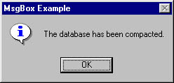
Figure 13-9. Information message boxes are simple, noncritical notifications. They should display the information icon.
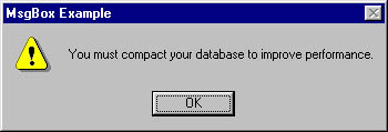
Figure 13-10. Warning message boxes are used to notify the user of something that's fairly important. When the user sees the exclamation icon, the user knows to take note.
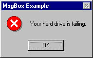
Figure 13-11. Critical message boxes are used to notify the user of something that absolutely must be attended to. Don't overuse the critical message icon on less-than -important messages ”you'll be crying wolf, and the user won't pay attention when it's necessary.
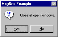
Figure 13-12. The question icon should be reserved for messages that ask the user a question.
The following table lists the constants that specify icons in a message box, their values, and their descriptions.
| MsgBox Icon Constant | Value | Description |
|---|---|---|
| vbInformation | 64 | Displays the information icon |
| vbExclamation | 48 | Displays the exclamation icon |
| vbCritical | 16 | Displays the critical message icon |
| vbQuestion | 32 | Displays the question icon |
Although you can specify the text to appear in the title bar of a message box in the third parameter of the MsgBox function, you're often better off omitting the title parameter. When you omit the title parameter, Visual Basic uses the text supplied for the application title in the Project Properties dialog box. (See Figure 13-13.) When you allow this to happen, your message boxes will have a more consistent feel because they will always show the name of the program that's displaying them.
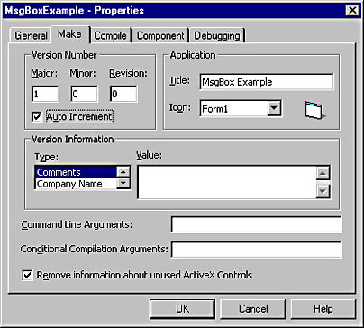
Figure 13-13. Omit the title parameter of a MsgBox function so that the title will be set to the application's title as entered in the Project Properties dialog box.
Incorrect:
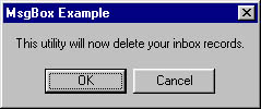
Figure 13-14. This message box does not have an icon, and therefore it does not provide a visual clue as to its importance.
Correct:
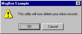
Figure 13-15. This notification needs to be taken seriously by the user, and the exclamation icon should do the trick. Note that you could also create a Yes/No message box for the same purpose.
13.3.2 Provide buttons that make sense. Designating the proper icon as described in Practical Application 13.3.1 is just the first step in building a good message box. The message box is capable of displaying many different buttons, and it's up to you to choose which button or buttons will appear in any given message box. The following table lists the constants available for specifying buttons, along with their values and descriptions.
| MsgBox Button Constant | Value | Description |
|---|---|---|
| vbOKOnly | Displays an OK button only | |
| vbOKCancel | 1 | Displays the OK and Cancel buttons |
| vbAbortRetryIgnore | 2 | Displays the Abort, Retry, and Ignore buttons |
| vbYesNoCancel | 3 | Displays the Yes, No, and Cancel buttons |
| vbYesNo | 4 | Displays the Yes and No buttons |
| vbRetryCancel | 5 | Displays the Retry and Cancel buttons |
To specify more than one constant for the buttons parameter, use Or . For instance, to display an OK button along with an exclamation icon, use a statement like this:
'*CombineconstantsforasingleparameterbyusingOr. MsgBox"Finishedupdatingtable.",vbOKOnly Or vbInformation |
The constants of the message box are system constants and can be used anywhere in your code, and you must take care that you don't interchange them. For example, the MsgBox function has a return constant of vbOK , indicating that the user clicked the OK button. The constant vbOK has a value of 1. If you mistakenly build a MsgBox statement by using a statement like the one following, you'll end up with a message box containing an OK button and a Cancel button, not just an OK button:
'*Thisstatementhasanerror.TheconstantvbOKshouldonly '*beusedtocheckthereturnvalueoftheMsgBoxfunction. MsgBox"Finishedupdatingtable.",vbOK Or vbInformation |
To designate a specific button as the default button (that is, the button that appears with a dark rectangle around it and that is "clicked" when the user presses Enter), add one of the constants in the following table to the buttons parameter.
| MsgBox Default Button Constant | Value | Description |
|---|---|---|
| vbDefaultButton1 | The first button is the default. | |
| vbDefaultButton2 | 256 | The second button is the default. |
| vbDefaultButton3 | 512 | The third button is the default. |
| vbDefaultButton4 | 768 | The fourth button is the default. |
Make the default button of every message box a deliberate choice. For example, if you're displaying a message box with a Yes button and a No button and you're asking the user if he wants to format his hard drive, set No as the default button. The order of the buttons on a message box is always the same as the order listed in the buttons parameter. For example, to default to the No button in a Yes/No message box, you could use a statement like this:
'*Thebuttonorderisthesameaslistedintheconstant. '*Sobutton1isYes,andbutton2isNo. If MsgBox("Formatc:?",vbYesNo Or vbQuestion Or vbDefaultButton2)_ Then ... |
When using the MsgBox function to solicit a decision from the user, the function returns one of the values listed in the following table. To ensure that your code is as easy to understand as possible, always refer to the return value by its constant, not by its literal value.
| MsgBox Return Constant | Value |
|---|---|
| vbOk | 1 |
| vbCancel | 2 |
| vbAbort | 3 |
| vbRetry | 4 |
| vbIgnore | 5 |
| vbYes | 6 |
| vbNo | 7 |
The icon, buttons, and default button must all be chosen to work in unison . If, for example, you're not asking a yes/no question, don't use a question mark icon. If you're displaying a critical message prior to performing some task that the user won't be able to undo, provide a Cancel button. Every message box is different, and I can't give you a hard-and-fast rule for every situation. Consider the ideas presented here, and use common sense. Consider what you would want and expect from each message box.
Incorrect:

Figure 13-16. This message box has a few problems. First, if you're going to update a user's files, provide a Cancel button so that the user can stop and back up the files. If you're not giving an option, there's no need for the message box. Second, you don't press a button, you click it. And, finally, there's no need to tell the user to click anything; that much is obvious.
Correct:
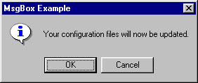
Figure 13-17. This message box is simple and to the point. Furthermore, the user is given an opportunity to prevent an irreversible process from starting.
13.3.3 Proofread all messages. This idea is so fundamental that it seems silly to have to mention it. Yet time and time again messages with poor spelling and bad grammar are displayed. If you're not particularly adept at writing, find someone in your organization who is and have that person proofread your messages. Also, if you're localizing a program into a language that's not your native language, find someone who speaks the language fluently to check your messages.
Think of message box text as if it were an important document on company letterhead, signed by your CEO, and sent to all your customers. If your messages are terse, they will reflect negatively on your company. If you've got a particular developer who's a bit short on people skills, write that developer's message box statements or at least proofread them before they're released.
Incorrect:
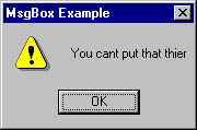
Figure 13-18. Even forgetting the spelling errors, this is rather unpleasant. Can't put what where? Why the exclamation icon?
Correct:
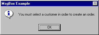
Figure 13-19. Notice the friendlier tone and the information icon. This message box is helpful, as opposed to obnoxious.
13.3.4 Avoid using technical jargon in a message box. Have you ever tried to explain a programming-related issue to a person who has never programmed before? If so, you're probably familiar with the glazed look that appears on the person's face as a little propeller attached to a yellow and red beanie is pictured atop your head. When you live and breathe a technology, it's easy to forget that not everyone else does. Also, just because a person uses software doesn't mean he or she is a technical person.
Unless your program is written for a very specific vertical market, avoid using technical jargon in your messages. Remember that messages should be clear and concise . When you use technical jargon, you risk confusing the reader. If you find yourself creating a message with technical jargon, consider rewriting the message in a nontechnical way.
Users are continuously interacting with your program. Make it easy for them to navigate your program and execute the functions they need to get their jobs done. When your program must stop the user's work flow to display a notification or get an answer to a question, make sure that it does it in the clearest and most concise manner possible. The smoother the interaction, the more productive (and grateful) the user will be.
EAN: 2147483647
Pages: 57