Layered Interfaces
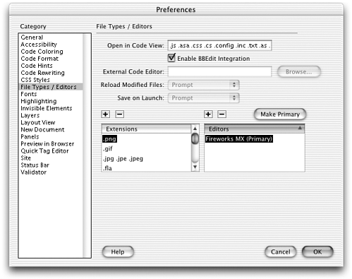
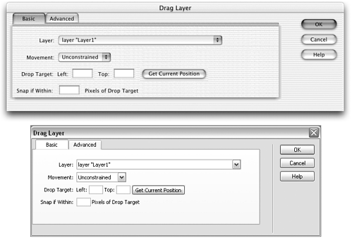
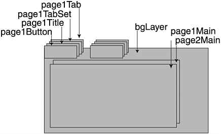
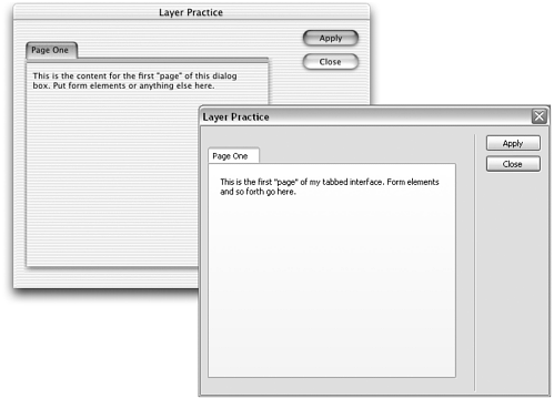
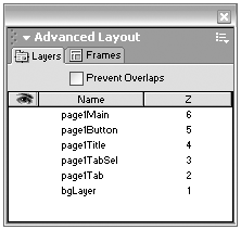
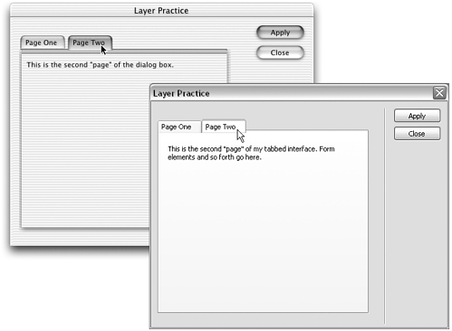
| If your interface won't fit properly in a reasonably sized dialog box, you can break it into two or more dialog boxes, or you can create one multipart dialog box that is essentially several dialog boxes' worth of interface sharing one space. Multipart dialog boxes are used throughout the Dreamweaver interface. They're created by putting different form elements on different layers, and using JavaScript to alternately show and hide each layer. In some dialog boxes, the layered effect is done almost invisiblythe Preferences and Site Definition interfaces, for instance,display different contents depending on which category is chosenan effect easily created by showing and hiding layers (see Figure 10.11). In other dialog boxes, such as the Drag Layer behavior and Clean Up Word HTML command, the layers are a graphic presence, appearing like a stack of tabbed note cards (see Figure 10.12). In this section of the chapter, we'll be focusing mainly on the tabbed layer interface because it's more graphically challenging; but similar scripting techniques are involved in both kinds of interfaces. Figure 10.11. Subtle layer-swapping can create interfaces like that seen in the Preferences dialog box. Figure 10.12. The graphically presented "tabbed" layer interface as seen in other parts of the interface. (Mac OS X and Windows XP versions shown.) note Because neither the Preferences nor the Site Definition dialog box is written as an extension, it's impossible to tell for sure how their content-swapping interfaces have been created. However, it seems logical to assume that some sort of layer scripting is involved. SpecificationsThere really are no special API tools for working with layered interfaces; there are only common sense and some slightly sneaky scripting. There are two general ways to approach the tabbed layer interface: the easy way and the hard way. Although the basic layer setup is the same for both, the scripting setup is drastically different, as are the structural requirements for how the layers are put together. The simple way is quick and easy to set up, but it offers only a fraction of the power and flexibility of the hard way. We'll look at both, beginning with the simpler. Layers the Simple WayA simple tabbed layer interface is created from a layout built with layers and a JavaScript function controlling layer visibility. Creating the LayersThe first step in creating a tabbed interface is assembling various interface elements into layers. As with any layered extension interface, it's not crucial how the layers are coded. Both <div> and <span> tags will work, and there are no special restrictions except the general warning that layers may not display exactly the same across platforms. If you're creating a tabbed layer interface, the structure of your layers gets a bit more complicated. The "tabbed" look of a layered interface is created from the graphics employed in the various layers. Figure 10.13 shows a diagram of the layer structure utilized in the Macromedia extensions (such as the Drag Layer dialog box shown in Figure 10.12). From this diagram, you can see that a large layer containing a background graphic creates the main 3D note card effect. In front of this layer, each "page" of interface elements consists of five layers: the contents layer and four smaller layers creating the tab effect. These four layers consist of one layer to hold the " unselected " tab graphic, one to hold the "selected" tab graphic, one to hold the title that appears in the tab, and one to hold an invisible image field form element. The JavaScript for showing and hiding the layers is called onClick from that invisible button. Image files are available for all of these graphic needs, all stored in the Configuration/Shared/MM/Images folder. Table 10.5 lists the different images available, along with their uses. (Note that most are platform-specific, so you must target your tabbed layer interface to one platform or another.) Figure 10.13. The tabbed layer interface effect, diagrammed to show layer stacking. Table 10.5. Macromedia Images Available for Use with Tabbed Layer Interfaces (All Can Be Found in Configuration/Shared/MM/Images)
note Although you are free to use any graphics you choose if you want your tabbed layers to blend seamlessly with the rest of the Dreamweaver interface, you should use the Macromedia standard graphics. If you find that the dimensions of any of these graphics don't suit your interface needs, you can make duplicates and tweak them in an image-editing program, or you can just stretch and squash the originals by changing their width and height attributes in your extension file. (Warning: This may result in visual distortions.) How you create the layers is not crucial as long as you follow certain conventions in naming them (covered in the next section) and stick to the general structure diagrammed in Figure 10.13. You can create your layered page layout by hand-coding or by working in Dreamweaver Design view. Scripting the Layered InterfaceThe key to a good, layered interface (tabbed or plain) is the scripting that hides and shows the various layers. Ultimately, it's up to you to create a script that works best for you; but you can start from the sample code here. Generally, only one layer (or one set of content) is visible at a time. The key to accomplishing this is to create a global variable that holds the name of the visible layer; and to create a function for showing one layer and hiding all others. Because any layer in the interface should be able to call this function, each layer must pass its name to the function as a parameter so that Dreamweaver knows which layer to make visible when the function runs. The basic code structure is like this: var gCurrentLayer="page1";//this is the name of the currently visible page function bringMeForward(myName) {//each layer passes its own name as a parameter //if the layer that called the function (myName) is already visible, stop //otherwise, make that layer (myName) visible //make the layer that's currently visible (gCurrentLayer) invisible //set gCurrentLayer to myName } For a non-tabbed layered interface (like the Preferences or Site Definition dialog box), the fleshed-out version of the code looks like this: var gCurrentLayer="page1"; function bringMeForward(myName) { //if the layer that called the function (myName) is already visible, stop if (gCurrentLayer==myName) { return; } //otherwise, make that layer (myName) visible eval("document."+myName+".visibility=visible"); //make the layer that's currently visible (gCurrentLayer) invisible eval("document."+gCurrentLayer+".visibility='hidden'"); //set gCurrentLayer to myName gCurrentLayer=myName; } The eval() function helps you construct the DOM accessing statement ( document.myForm.myLayer.visibility=visible ) to accommodate whatever layers have been defined as myName and gCurrentLayer . As long as the names of your layers are legal (no special characters , and so forth), it doesn't matter what you have named them for this to work. For a tabbed layer interface, the code has to be more complex because several layers are being shown and hidden at a time (the content layer, the layer containing the selected tab graphic, and so forth). To accommodate this complexity and make your scripting task much easier, name the layers according to a set naming scheme that incorporates a base name and consistent prefixes or suffixes. If the layers that comprise the first tabbed layer are named page1Main , page1Tab , page1TabSel , page1Title , and page1Button , for instance, the fleshed-out function will look like this: var gCurrent="page1"; function bringMeForward(myShortName){ //if the layer that called the function (myShortName) is already visible, stop if (gTab == myShortName) { return; } //otherwise, make that layer (myShortName) visible eval("document."+myShortName+"Main.visibility='visible'"); eval("document."+myShortName+"TabSel.visibility='visible'"); //make the layer that's currently visible (gCurrentLayer) invisible eval("document."+gCurrent+"Main.visibility='hidden'"); eval("document."+gCurrent+"TabSel.visibility='hidden'"); //set gCurrent to myShortName gCurrent=myShortName; } note Don't forget: Whenever you design an interface in layers, you'll need to use findObject() or some other equivalent functionto access the form elements. Link to UI.js or another shared file containing findObject() , or copy the function into your extension file. note Thanks to Andrew Wooldridge's QuickTime object extension, from which I adapted this function code. Each function call to this function must then pass only its base name (for example, page1 ) to the function. The function will construct all other names by adding various suffixes ( Main , Tab , TabSel , and so forth) to this base; and the eval() statement will hide or show all layers associated with the same base name. note The layer terminology can get confusing here. Because, in a tabbed interface, multiple <div> or <span> elements go to make up each tab, Macromedia's convention is to refer to each <div> or <span> element as a layer, and each tabbed unit as a page. Thus, page1 refers to five layers. Layers the Fancy WayNow for the more complex and powerful way to set up the tabbed interface. This is the method used in the standard Dreamweaver extensions. It involves utilizing custom TabControl class objects, as well as custom page objects defined according to a specific set of rules. Setting up to use this system is much more of an undertaking than just writing the simple script shown above. But you get a payoff in the form of much more flexible functionality if you're willing to put some work in up front. Creating the LayersBecause the layers in this kind of interface must work with predefined TabControl objects, the requirements for constructing them are more exact. This is especially true of the layers that create the tabbed effect. You have much more freedom in constructing the content layers (the layers containing the actual form elements). The safest way to begin constructing the interface is to copy the existing code for the tab layers from one of the standard extensions. These include Commands/Clean Up Word HTML.htm, Behaviors/Actions/Drag Layer.htm, and Commands/Insert Nav Bar.htm. You can also retype the code from here, if you like. The following style information should be added to your extension file's <head> section: <style type="text/css"> .pageBg { position:absolute; left:18px; top:21px; width:10px; height:10px; z-index:1; And the following code to create the tab layers should be added to the <body> section: <div class="pageBg" style="visibility:visible; left:4px; "> <img name="tabBgWin" width="335" height="290" src="../Shared/MM/Images/tabBgWin335x290. You can substitute different graphics as needed, as well as adjust the size of the background layer. You may also need to adjust the path to the image files, depending on where your extension is stored. But it's easiest and safest not to change any other names. note You can find a copy of the basic framework code for this tabbed layer interface on the book's companion web site: www.newriders.com. As noted, you can create the page content layers without such coding restrictions, in Dreamweaver Design view or elsewhere. There are no special naming restrictions on content layers, either. Scripting the LayersHere's how this system works, in brief: You create a custom page class for each different kind of page in your interface, based on a model PageControl class provided in the shared files. You then link to the TabControlClass.js shared file, which defines a custom class for TabControl objects. In your extension file, you create an instance of a TabControl object, passing it your custom pages. You can then call on the various TabControl methods , each of which in turn will call on your custom page class's methods. You can also put custom functionality into the page class methods. Get it? If not, you will when you've seen it in action. First, you'll create the custom page classes.
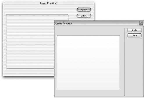
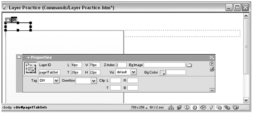
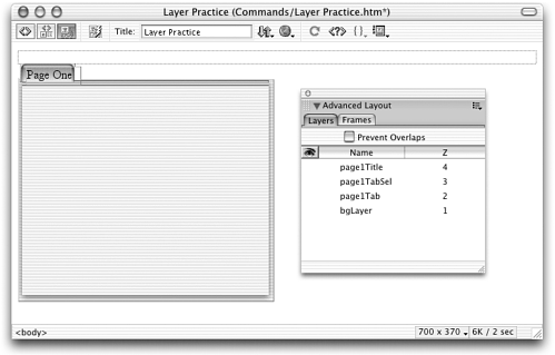
Simple versus Fancy LayersAs you can tell just from looking at the TabControl methods, interfaces created with the more complex method have much greater flexibility than those created the simple way. In addition to tabbing between content pages, pages can be dynamically generated, pages can be grouped to create customized content for every situation, and pages can act on one another. Layered Interface PracticeThis practice session will help familiarize you with tabbed layer interfaces. At the end of the session, you'll also have a handy framework file to use as stationery for other layered interfaces you want to build. Task 1: Create a command file with one tabbed layer Probably the hardest part of building a layered interface is keeping track of all those groups of layers, or pages. For this task, you'll create a command with a dialog box that consists of one page only. That involves one content layer and four layers to hold the graphics for the tabbing effect.
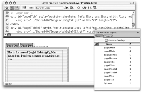
Task 2: Create the second "page" of the interface The steps for creating the second page, or tabbed layer, are the same as those for the first page, with the exception that the base name should be page2 , various tab layers should be moved over to the right to create that stack-of-notecards look, and the title and content should be different. Go ahead and create that second page now. If you're working in Dreamweaver, make life easy on yourself and temporarily hide the layers that belong to page1 so that they don't get in your way. Your resulting layout should look like the one shown in Figure 10.19. Figure 10.19. The two-page interface of the Practice Layers command, in DreamweaverCode and Design view. Task 3: Add the scripting to switch between layers Okay, you have two pages to your dialog box, and they look good when the right layers are visible and hidden. It's time to build that visibility control into the extension.
|
EAN: 2147483647
Pages: 141
