#78. Working with Components in GoLive Components in GoLive are blocks of your Web pages that you can reference within multiple pages throughout your site and then have them automatically update whenever a component is changed. Components behave similarly to Smart Objects in GoLive (see #70) but instead of helping with graphic-based source files, they help you manage chunks of HTML code that are susceptible to changes and may appear on several pages in your site. This makes components ideal for headers, footers, mastheads, and other common navigation elements that would be tedious to update on every single page of your site. Detaching Components You can detach a selected component on a page by choosing Special > Component > Detach Selected Component and clicking OK. This makes the content that was in the component a part of the page so that you can directly edit it, but you lose the automatic updating of changes that the component once offered. You can also detach all components on a page by choosing Special > Component > Detach All Components. |
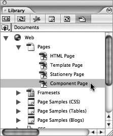
Follow these steps to create a component source file and then use it in other pages: 1. | With your GoLive site open, create a new component page by opening the Library palette (Window > Site > Library), choosing the Documents tab, and double-clicking Component Page (Figure 78a).
Figure 78a. Although you can use any HTML page as a component, using the Library palette's preset component page in the Documents tab is an uncomplicated way of creating your component. 
| 2. | Remove the placeholder text on the new component page and add any content you like. For example, you could add all the links that appear in the footer of your site. You needn't worry about linking your external stylesheet (CSS) to the component page since the component will ultimately exist in the actual pages the CSS is applied to. GoLive will also contend with reconciling links to other pages in the site once the component is added to them.
| 3. | Save the component page (File > Save As) to the Components folder of your site. GoLive targets this location (web-data\Components) when the Save As dialog opens because you started with a preset component page.
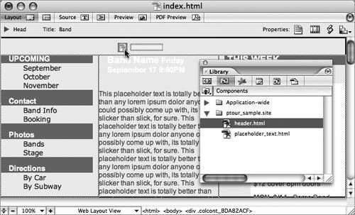
| 4. | Once the component is saved, you can start using it in other pages in your site. To add your component to a page, drag it from the Components tab of the Library palette onto the page (Figure 78b). Components are also available in the Extras tab of the site window.
Figure 78b. To add a component to a page, drag it from the Components tab of the Library palette onto the page. 
| 5. | Add the components to one or more pages within your site. To update a component, just double-click it in any page where it's been added. Make any changes to the component, and once you save them, all the pages where the component has been added will automatically update.
|
Cropping Text in Components GoLive CS2 lets you crop text in components you've added to your pages. You can use one component to create several instances, all cropped differently. With a component selected in the Layout Editor, open the Inspector palette and click the Crop Text button  . Then select the text you want to keep in the component or jump to the Main toolbar to specify a certain amount using the Crop Text By menu. When you're ready to apply the crop, click the Accept Crop button in the Main toolbar . Then select the text you want to keep in the component or jump to the Main toolbar to specify a certain amount using the Crop Text By menu. When you're ready to apply the crop, click the Accept Crop button in the Main toolbar  . . |
|

