| Button symbols handle the scripting necessary for displaying the common button states, but they also allow you to define the graphic look of a button. Using button symbols, you can create infinite interface looks for your projects. Flash also provides a different type of buttonthe button componentthat has a predefined graphic look. A component is a special type of movie clip called a .swc file, or compiled clip. Although it's possible to change the graphic elements of a component, the techniques for doing so are beyond the scope of this book (see the sidebar "The Mystery of Components," later in this chapter). Each component has certain parameters that you can modify via the Component inspector panel or the Property inspector. To put a component to use, you place an instance of it in your Flash document. To place an instance of the button component 1. | Open a Flash document to which you'd like to add a button component.
| 2. | Access the following panels: Components, Component inspector, Library, and the Parameters tab of the Property inspector.
These panels are all found under the Window menu. To access the Parameters tab, choose Window > Properties > Parameters; or, if the Property inspector is open, click the Parameters tab.
| 3. | If necessary, in the Components panel, expand the list of user interface components (Figure 12.18).
Figure 12.18. The Components panel lists all the default components that come with Flash. In Flash Professional (shown) there are five categories of components. Buttons are found under User Interface. To expand or collapse the list click the plus sign (Windows) or triangle (Mac) to the left of the title User Interface. Flash Basic's Components panel only offers the user-interface components. 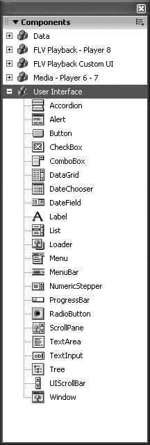
Click the triangle (Mac) or plus sign (Windows) to the left of the name User Interface to toggle between the expanded and collapsed views of the list.
| 4. | Drag an instance of the button component to the Stage.
Flash adds the button component to the document's library as a compiled-clip symbol (Figure 12.19).
Figure 12.19. A button component is a special form of movie clip. When you drag a component from the Components panel to your document, the component symbol appears in the Library panel of that document, with its Type listed as Compiled Clip. 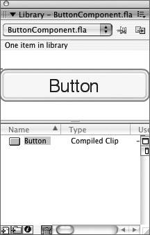
|
 Tip Tip
In many ways, compiled clips work just like other library assets (for more about working with library assets, see Chapter 7). In other ways they are different (see the sidebar "The Mystery of Components"). A confusing seeming similarity is that you can rename a component in the Library panel by double-clicking the compiled clip's name (Button) to activate the text field, and typing a new name. It's unadvisable to do so, however. You can change the name of the master compiled-clip symbol, but the symbol itself still bears the label Button. Moreover, if you bring another copy of the button component into the same document the two components will have the same linkage ID which may create problems in using the components in your published movie.
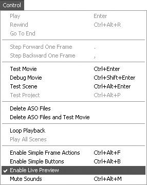
To preview the component instance - To view a limited component preview during authoring, choose Control > Enable Live Preview (Figure 12.20).
Figure 12.20. Choose Control > Enable Live Preview to see the basic look of a component as you edit your Flash document. 
As a default, the Enable Live Preview setting is active. If you're working with many components, this setting can slow things down; you may prefer to turn it off for a time. Whereas the Enable Simple Buttons setting lets you preview a button symbol's Up, Over, and Down states; Enable Live Preview reveals the button's parameter settings in the Up state (Figure 12.21). To view a fully enabled button component, you must view it in Flash Player. When Enable Live Preview is inactive, Flash previews component instances as simple outline rectangles on the Stage.
Figure 12.21. With Enable Live Preview active (Flash's default setting), you can see the parameters for component instances on the Stage while authoring (top). With Enable Live Preview inactive, Flash previews components with simple rectangular outlines that give no hint about what kind of element they represent (bottom). 
- To view all the parameters and button states of a component, choose Control > Test Movie.
|


 Tip
Tip