Waveform Charts
| A plot is simply a graphical display of X versus Y values. Often, Y values in a plot represent the data value, while X values represent time. The waveform chart, located in the Modern>>Graph subpalette of the Controls palette, is a special numeric indicator that can display one or more plots of data. Most often used inside loops, charts retain and display previously acquired data, appending new data as they become available in a continuously updating display. In a chart, the Y values represent the new data, and X values represent time (often, each Y value is generated in a loop iteration, so the X value represents the time for one loop). LabVIEW has only one kind of chart, but the chart has three different update modes for interactive data display. Figure 8.1 shows an example of a multiple-plot waveform chart. Figure 8.1. Waveform Chart with multiple plots
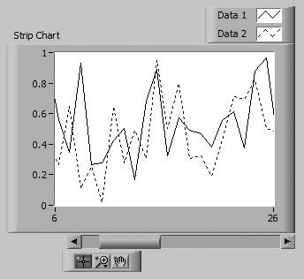
The waveform chart has three update modesstrip chart mode, scope chart mode, and sweep chart mode, shown in Figure 8.2. The update mode can be changed by popping up on the waveform chart and choosing one of the options from the Advanced>>Update Mode>> menu. If you want to change modes while the VI is running (and is consequently in run mode, where the menus are slightly different), select Update Mode from the chart's runtime pop-up menu. Figure 8.2. Chart update modes The strip chart has a scrolling display similar to a paper strip chart. The scope chart and the sweep chart have retracing displays similar to an oscilloscope. On the scope chart, when the plot reaches the right border of the plotting area, the plot erases, and plotting begins again from the left border. The sweep chart acts much like the scope chart, but the display does not blank when the data reaches the right border. Instead, a moving vertical line marks the beginning of new data and moves across the display as new data are added. These distinctions are much easier to understand when you actually see the different modes in action, so don't worry if it sounds confusing now. You'll get to experiment with them in the next activity. Because there is less overhead in retracing a plot, the scope chart and the sweep chart operate significantly faster than the strip chart.
Charts assume that the X-values always represent evenly spaced points. With LabVIEW's charts, you only provide the Y value, and do not specify the X value. The X value automatically increments every time a new Y value is appended to the chart. For arbitrary X values, use a graph instead of a chart. We'll discuss graphs shortly.
The chart accepts the waveform data type (which you will learn about later in this chapter), in addition to numeric scalars and arrays. As you will learn, the waveform data type contains timing information inside of it (such as the time stamp of the first data point and the time spacing between points). The chart will use this timing information for displaying the data, which means that the initial X value and spacing between points can be different each time data are written to the chart. Once you have learned about the waveform data type, give this technique a try.
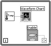
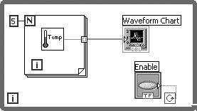
The simplest way to use a chart is to wire a scalar value to the chart's block diagram terminal, as shown in Figure 8.3. One point will be added to the displayed waveform each time the loop iterates. Figure 8.3. Single-plot chart, updated one point at a time You can also update a single-plot chart with multiple points at a time, as shown in Figure 8.4, by passing it an array of values. Figure 8.4. Single-plot chart, updated with multiple points at a time
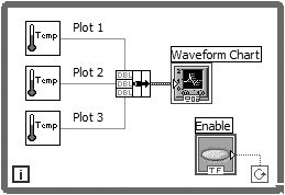
Waveform charts can also accommodate more than one plot. However, because you can't wire from multiple block diagram sources to a single chart terminal, you must first bundle the data together using the Bundle function (Programming>>Cluster & Variant palette). In Figure 8.5, the Bundle function "bundles" or groups the outputs of the three different VIs that acquire temperature into a cluster so they can be plotted on the waveform chart. Notice the change in the waveform chart terminal's appearance when it's wired to the Bundle function. To add more plots, simply increase the number of Bundle input terminals by resizing using the Positioning tool. Figure 8.5. Bundling data points to create a multi-plot Waveform Chart
When wiring a multiple-plot chart, make sure to use a Bundle function and not a Build Array function. LabVIEW treats points in an array as belonging to a single plot and treats points in a cluster as belonging to multiple plots. If you build an array, you will have a single plot that has three new points for each loop iteration. This behavior is useful when reading waveforms from hardware, where you are reading multiple samples for a single channel.
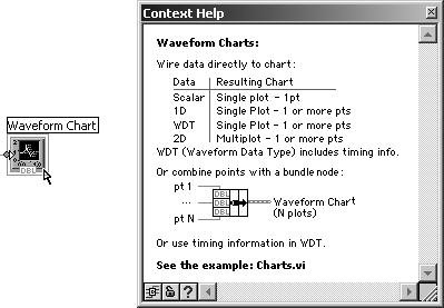
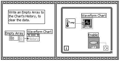
For an online example of charts, their modes, and their expected data types, open and run Charts.vi in the EVERYONE\CH08 directory. Single-Plot Versus Multi-Plot Data Types: A Trick for RememberingCharts and graphs are polymorphic; they will accept several different data types, allowing you to create single-plots and multi-plots. However, it is often difficult to remember which data types are used for single-plot and multi-plot. Additionally, there are several different types of charts and graphs, which makes matters worse. Fortunately, there is a way to quickly find out which data types may be used with a specific type of chart or graph. Simply hover the mouse over the chart or graph terminal, on the block diagram, and a detailed description of the plot data types will appear in the Context Help window, as shown in Figure 8.6. (Note that the WDT item in the third row of the table shown in the Context Help window is the waveform data type, which will soon be discussed.) The Context Help window can be made visible by selecting Help>>Show Context Help from the menu or by using the shortcut key <control-H> (in Windows), <command-H> (in Mac OS X), or <meta-H> (in Linux). Figure 8.6. Waveform Chart terminal's context help Show the Digital Display?Like many other numeric indicators, charts have the option to show or hide the digital display (pop up on the chart to get the Visible Items>> option). The digital display shows the most recent value displayed by the chart. The X ScrollbarCharts also have an X Scrollbar that you can show or hide from the Visible Items>> pop-up submenu. You can use the scrollbar to display older data that has scrolled off the chart. Clearing the ChartSometimes you will find it useful to remove all previous data from the chart display. Select Data Operations>>Clear Chart from the chart's pop-up menu to clear a chart from edit mode (remember, you are usually in edit mode if your VI is not running. To switch between modes when the VI is not running, choose Change to Run/Edit Mode from the Operate menu). If you are in run mode, Clear Chart is a pop-up menu option instead of being hidden under Data Operations. Sometimes you will want to perform the Clear Chart operation programmaticallyfor example, when you first start running your VI. To do this, you will need to write an empty array to the chart control's History Data property, as shown in Figure 8.7. We will discuss property nodes in Chapter 13, "Advanced LabVIEW Structures and Functions," but we will give you a sneak preview now. Figure 8.7. Writing to a Waveform Chart's History with empty data to clear it, prior to collecting new data
Stacked and Overlaid PlotsIf you have a multiple-plot chart, you can choose whether to display all plots on the same Y-axis, called an overlaid plot; or you can give each plot its own Y scale, called a stacked plot. You can select Stack Plots or Overlay Plots from the chart's pop-up menu to toggle the type of display. Figure 8.8 illustrates the difference between stacked and overlaid plots. Figure 8.8. Waveform Charts in Stack Plots mode (left) and Overlay Plots mode (right)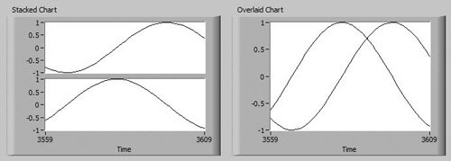
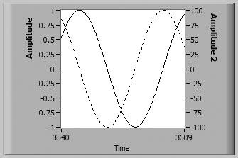
If you have a multi-plot chart, sometimes you will want an overlaid plot that has different scales for each plot; for example, if one plot's Y range is from -1 to +1 and the other is -100 to +100, it would be difficult to see both of them overlaid without a separate scale for each. You can create multiple scales for the Y axis by popping up on the Y axis and selecting Duplicate Scale. After duplicating a scale, you may want to move it to the other side of the chart by popping up on the scale and selecting Swap Sides. To delete a Y scale, pop up on the scale and select Delete Scale. Figure 8.9 illustrates two Y scales for a multi-plot chart, each scale on one side of the chart. Figure 8.9. Waveform Chart with two Y scales
You cannot duplicate X scales on a chartthere can be one and only one X scale on a chart. If you pop up on the X scale, you will notice that the Duplicate Scale option is grayed out. (Multiple X scales are allowed on graphs.)
You can reset the scale layout by right-clicking a graph or chart and selecting Advanced>>Reset Scale Layout from the shortcut menu. This will return the Y scale to the left of the plot area, return the X scale to the bottom of the plot area, and reset the scale markers.
By default, a waveform chart can store up to 1,024 data points. If you want to store more or fewer data, select Chart History Length . . . from the pop-up menu and specify a new value of between 10 and 2,147,483,647 points (however, your actual limit may be lower, depending on the amount of RAM you have in your system). Changing the buffer size does not affect how much data are shown on the screenresize the chart to show more or fewer data at a time. However, increasing the buffer size does increase the amount of data you can scroll back through. |
EAN: 2147483647
Pages: 294
