8.3. Core Control Reference | Button | Hierarchy: UIElement  FrameworkElement FrameworkElement  Control ContentControl ButtonBase Control ContentControl ButtonBase |
<Button Click="OnSubmitButtonClicked"> Button Label </Button>
or: <Button Click="OnSubmitButtonClicked" Content="Button Label" />
<Button .../> displays a push button. Attributes
Click (optional) This attribute sets the name of the codebehind handler that executes when the button is clicked.
Content (optional) This attribute sets the value that is displayed on the button. Events Click | CheckBox | Hierarchy: UIElement FrameworkElement Control ContentControl ButtonBase ToggleButton |
<CheckBox IsChecked="true|false" Content="This box is checked" IsCheckedChanged="OnCheckedChangedEvent" />
or: <CheckBox IsChecked="true|false" IsCheckedChanged="OnCheckedChangedEvent"> This is a checkbox label </CheckBox>
<CheckBox .../> displays a checkbox. Attributes
Click (optional) This attribute sets the name of the codebehind handler that executes when the button is clicked.
Content (optional) This attribute describes the element that is displayed next to the CheckBox. This is usually a text-based value, but can be any single UIElement.
IsChecked (optional) This attribute sets the initial state of the checkbox.
true The CheckBox is checked.
false The CheckBox is not checked. This is the default.
IsCheckedChanged (optional) This attribute sets the name of the codebehind handler that executes when the checkbox changes state. Events Click IsCheckedChanged | ComboBox | Hierarchy: UIElement FrameworkElement Control ItemsControl Selector |
<ComboBox IsEditable="true|false" IsSelectionRequired="true|false" SelectionChanged="SelectionChangedHandler"> </ComboBox>
<ComboBox .../> displays a selection control in a drop-down list form. A ComboBox is a container for ComboBoxItems. Attributes
IsEditable (optional) This attribute determines whether users can edit the ComboBoxItems. If it is true, the user can type in the ComboBox as though it were a text field.
true The items are editable by the user.
false The items are not editable.
IsSelectedRequired (optional) This attribute determines whether the first ComboBoxItem will be selected when the control is initially drawn.
true The ComboBox will be displayed with an empty selection.
false The first ComboBoxItem will be initially selected.
SelectionChanged (optional) This attribute sets the name of the codebehind handler that executes when the selection changes. Events SelectionChanged | ContextMenu | Hierarchy: UIElement FrameworkElement Control ItemsControl MenuBase |
<ContextMenu Opened="OpenedHandler" Closed="ClosedHandler" />
<ContextMenu .../> represents a menu control containing a contextually accurate pop-up menu for the control to which it is attached. ContextMenu is a container for a collection of MenuItem elements and must be nested within another control. ContextMenu is automatically placed inside a Popup element. Example of a fully defined ContextMenu: ContextMenu Opened="OpenedHandler Closed="ClosedHandler"> <MenuItem Header="File"/> <MenuItem Header="Save"/> <MenuItem Header="SaveAs"/> <MenuItem Header="Recent Files"> <MenuItem Header="Readme.txt"/> <MenuItem Header="Schedule.xls"/> </MenuItem> </ContextMenu>
Attributes
Closed (optional) This attribute sets the name of the codebehind handler that executes when the ContextMenu closes.
Opened (optional) This attribute sets the name of the codebehind handler that executes when the ContextMenu opens. Events Closed Opened | DocumentViewer | Hierarchy: UIElement FrameworkElement Control |
<DocumentViewer FirstVisiblePage="0" // 0 based integer GridColumnCount="1" // sets the number of columns in the viewer HorizontalOffset="0.5" // Double, ele scrolls to value HorizontalPageSpacing="2" // Double, space between pages IsToolBarMaximized="true|false" ShowPageBorders="true|false" VerticalOffset="2" // double, sets vert scroll VerticalPageSpacing="10" // vert page spacing ZoomPercentage="5.0 ... 5000.0" //default 100.0 />
<DocumentViewer .../> implements a control that allows users to view paginated documents in a fixed or flow format. It may contain only child elements of either FlowDocument or FixedDocument. Attributes
FirstVisiblePage (optional) This attribute is a zero-based Integer indicating the first visible page of content. This value must be non-negative. Setting this value causes the DocumentViewer to load the specified page and scroll to the top if necessary.
GridColumnCount (optional) This Integer value represents the number of grid columns in the DocumentViewer. The value must be non-negative and cannot be greater than the total page count.
HorizontalOffset (optional) This Double value represents the horizontal scroll position in 1/96". It must be non-negative.
HorizontalPageSpacing (optional) This Double value specifies the amount of horizontal space between pages. It must be non-negative. The default value is 10.0.
IsToolBarMaximized (optional) This attribute determines whether the DocumentViewer toolbar is visible or hidden.
true The toolbar is visible. This is the default.
false The toolbar is hidden.
ShowPageBorders (optional)
VerticalOffset (optional) This Double value represents the vertical scroll position in 1/96". It must be non-negative.
VerticalPageSpacing (optional) This Double value specifies the amount of vertical space between pages. It must be non-negative. The default value is 10.0.
ZoomPercentage (optional) This attribute is a Double value between 5.0 and 5000.0 that represents the zoom percentage. The default value is 100.0. Attached Attributes
ContentHost The ContentHost for a DocumentViewer must be a ScrollViewer. The attribute is a Boolean that marks the ScrollViewer as the ContentHost: <ScrollViewer DocumentViewer.ContentHost="true|false" />
| Expander | Hierarchy: UIElement FrameworkElement Control ContentControl HeaderedContentControl |
<Expander IsExpanded="true|false" Header="this is an Expander" Content="content"/>
or: <Expander IsExpanded="true|false" Header="this is an Expander"> Content string </Expander>
<Expander . . . /> allows a user to collapse an element to show only the header, or to expand it to show more content. An Expander object may contain only one child element, but there are no limitations on how many children that element may have. Figure 8-1 shows the result of evaluating Example 8-5 in XamlPad and shows the Expander both closed (on the left) and open (on the right). Figure 8-1. An Expander in collapsed state and fully expanded 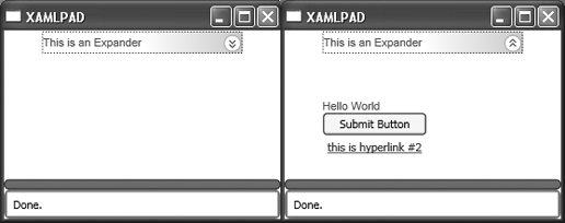
Attributes
Content (optional) The value of this attribute will be displayed when the Expander state is expanded and hidden when the Expander state is collapsed.
IsExpanded (optional) This attribute sets the initial state of the Expander.
true The initial state is open.
false The initial state is closed.
Header (optional) The value of this attribute will be displayed in the header area. | Hyperlink | Hierarchy: DependencyObject FrameworkContentElement TextElement Inline |
<Hyperlink NavigateUri="Page2.xaml">Next Page </Hyperlink>
<Hyperlink .../> displays a hyperlink. A Hyperlink is a mechanism used to load a new page or to navigate to an inline section of a document. This element can only be included where text is allowed, e.g., within a TextBlock or Label object. It cannot be defined as a standalone or root element. Navigating to an inline section of a document uses the same syntax as linking to an anchor in an HTML document: <Hyperlink NavigateUri="#paragraph3">Paragraph 3</Hyperlink>
Attributes
Click (optional) This attribute sets the name of the codebehind handler that executes when the element is clicked.
NavigateUri (required) This attribute loads the page designated by the hyperlink or navigates to the appropriate place within a document. Events Click | ListBox | Hierarchy: UIElement FrameworkElement Control ItemsControl Selector |
<ListBox SelectionChanged="SelectionChangedHandler" SelectionMode="Single|Multiple|Extended" />
<ListBox .../> is a control that implements a list of selectable items. Like ComboBox, ListBox is a container for other elements, namely ListBoxItem. (See Example 8-6.) Attributes
SelectionChanged (optional) This attribute sets the name of the codebehind handler that executes when the selection changes.
SelectionMode (optional) This attribute determines how items are selected.
Extended Multiple items may be selected in groups by using the Shift key with either the mouse or the arrow keys.
Multiple Multiple items may be selected.
Single A single item may be selected. Events SelectionChanged | MediaElement | Hierarchy: UIElement FrameworkElement |
<MediaElement Source="c:\\media \\mymedia.wmv" Stretch="Fill|None|Uniform|UniformFill" StretchDirection="Both|DownOnly|UpOnly"/>
<MediaElement .../> provides a mechanism for including media resources, such as video, in a XAML interface. Attributes
Source (optional) A MediaTimeline (detailed in Chapter 11) describing the source video.  | MediaTimeline requires an absolute path to the media source. |
|
Stretch (optional) Determines how the MediaElement will be drawn.
Fill The content is stretched to fill the destination. Aspect ratio is not preserved.
None The content's original size is preserved.
Uniform Content is resized to fit the destination. Aspect ratio is preserved.
UniformFill Content is resized to fit the destination. Aspect ratio is preserved. If the resized content overflows the destination, it is clipped.
StretchDirection (optional) Determines how content is stretched to fit the Viewbox.
Both Content is stretched to fit the Viewbox according to the Stretch attribute.
DownOnly Content is scaled downward if it is larger than the parent Viewbox.
UpOnly Content is scaled upward if it is smaller than the parent Viewbox. | Menu | Hierarchy: UIElement FrameworkElement Control ItemsControl MenuBase |
<Menu />
<Menu .../> defines a control that allows you to hierarchically represent commands. On its own, Menu has very little meaning and must contain child elements of type MenuItem to be useful. | MenuItem | Hierarchy: UIElement FrameworkElement Control ItemsControl HeaderedItemsControl |
<MenuItem Header="File" IsCheckedChanged="CheckedChangedHandler" Click="ClickHandler" IsChecked="true|false" InputGestureText="Ctrl+X" Command="ApplicationCommand" Mode="Default|Separator|Checked" />
| In the previous code block, Header is used to represent text. To use other elements for display, define the desired elements between the tags instead of using Header, e.g., <MenuItem ...><element .../></MenuItem>. |
|
<MenuItem .../> is used by both Menu and ContextMenu as a child element that represents menu options. MenuItem headers may be defined inline using the Header attribute or in context. MenuItem can be: Attributes
Click (optional) This attribute sets the name of the codebehind handler that executes when the MenuItem is clicked.
Command (optional) This attribute is used to assign an application command to the menu item, which automatically assigns the command's associated input gesture to the object. This attribute must be one of the commands defined by the System.Windows.Input.ApplicationCommands class. For a full listing of these commands, see Appendix F.
Header (optional) This attribute defines the visible text of the menu item that is displayed.
InputGestureText (optional) This attribute describes the sequence of keystrokes that accesses this menu item. An example is Ctrl-X or Ctrl-Z. This text is displayed on the right side of the menu item as a user prompt. Figure 8-2 shows an example of declaring InputGestureText="Ctrl+N" and InputGestureText="Ctrl+X" for two separate instances of MenuItem.
IsChecked (optional) This attribute sets the initial state of the MenuItem.
true The MenuItem is checked.
false The MenuItem is not checked. Figure 8-2 shows the result of declaring <MenuItem Header= "Open" IsChecked= "true" />.
IsCheckedChanged (optional) This attribute sets the name of the codebehind handler that executes when the MenuItem state changes from checked to unchecked, or vice versa.
Mode (optional) This attribute defines the operational mode of the menu item.
Checkable The menu item can be clicked, which toggles its checked state.
Default The menu item can be clicked. This is the default mode and is assigned if a mode is not explicitly declared.
Separator The menu item is a separator and cannot be clicked. Figure 8-2. A Menu with InputGestureText and IsChecked declared 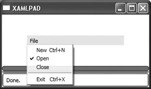
Events ClickIsCheckedChanged | NavigationWindow | Hierarchy: UIElement FrameworkElement Control ContentControl Window |
<NavigationWindow StartupUri="StartPage.xaml" />
<NavigationWindow .../> extends Window and adds standard back and forward web navigation capabilities. NavigationWindow is always created with a navigation "chrome," which contains the controls that allow a user to move forward and backward through the navigation stack. The navigation chrome is indicated in Figure 8-3 by the space containing the back and forward navigation arrows. Figure 8-3. Navigation chrome 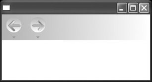
Attributes
StartUri (required) Specifies the URI of the starting page | Page | Hierarchy: UIElement FrameworkElement |
<Page xmlns="http://schemas.microsoft.com/winfx/avalon/2005" xmlns:x="http://schemas.microsoft.com/winfx/xaml/2005" x: Name="myWindow" WindowHeight="400" WindowWidth="400" Text="Title of the Page" WindowState="Maximized|Minimized|Normal" <Page.Resources> ... </Page.Resources> </Page>
| Note that x is replaceable both for Class and the namespace declaration. It refers to the XAML namespace (http://schemas.microsoft.com/winfx/xaml/2005), which must be included when using this method of reference . |
|
<Page .../> is a root-level element that can be used to set window properties and event handlers. Attributes
Name (optional) This attribute determines the name of the Page. Name must be set in order to access the element instance from codebehind functions.
Resources (optional) This attribute determines a collection of Style, TRigger, and Storyboard.
Text (optional) Sets the title of the Page. The default value is null; no title is displayed.
WindowHeight (optional) This Double value specifies the height of the Page.
WindowState (optional) This attribute determines the initial state of the window.
Maximized The Page starts maximized.
Minimized The Page starts minimized.
Normal The Page starts at its specified dimensions.
WindowWidth (optional) This Double value specifies the width of the Page.
x:Class (optional) This attribute defines the name of the codebehind class responsible for implementing event handlers. The namespace for this class is determined by the declaration of the WinFX XAML namespace. x may be replaced with any namespace reference you desire, as long as it matches the declaration of the codebehind class in which event handlers and other application logic will be implemented. If the declaration in XAML for the Page codebehind class is x:, then the associated C# codebehind file would appear as shown in Example 8-7. Example 8-7. Declaring a codebehind class for Page namespace XAML_Space { public partial class Page1 : Page { // code goes here for page level event handlers } }
|
| PasswordBox | Hierarchy: UIElement FrameworkElement Control |
<PasswordBox MaxLength="0" PasswordTextChanged="PasswordChangedHandler" PasswordChar="*" Password="MyPassword" />
<PasswordBox . . . /> implements a TextBox with special provisions for handling passwords. Attributes
MaxLength (optional) This attribute is an Integer value specifying the maximum length of the password. A 0 indicates there is no maximum. The default value is 0.
Password (optional) This attribute is a SecureString representing the password to be displayed.
PasswordChar (optional) This attribute is the Char displayed in place of typed characters in the password box. The default value is *.
PasswordTextChanged (optional) This attribute describes the codebehind handler that executes when the Password-TextChanged event is raised. Events PasswordTextChanged | Popup | Hierarchy: UIElement FrameworkElement |
<Popup Child="MyChild" HasDropShadow="true|false" HorizontalOffset="3" IsOpen="true|false" Placement="Absolute|AbsolutePoint|Top|Bottom|Right|Center|Left|Relative| RelativePoint|Mouse|MousePoint" PlacementRectangle="0,0 5 10" PlacementTarget="Target" PopupAnimation="None|Fade|Scroll|Slide" StaysOpen="true|false" VerticalOffset="5" CustomPopupPlacementCallback="CustomCallback" Opened="OpenedHandler" Closed="ClosedHandler" />
<Popup .../> creates a top-level window that displays content. It is not affected by styles or properties in the existing tree unless it is specifically bound to them. Attributes
Child (optional) This attribute sets the child element. Child elements can also be defined between the tags.
Closed (optional) This attribute sets the name of the codebehind handler that executes when the Popup is closed.
CustomPopupPlacementCallback (optional) This attribute identifies a codebehind callback function, which returns the placement for this element.
HasDropShadow (optional) This attribute determines whether the Popup has a drop shadow.
true The element has a drop shadow.
false The element does not have a drop shadow. This is the default.
HorizontalOffset (optional) This attribute determines the offset of the Popup from the left. It is of type Double.
IsOpen (optional) This attribute determines whether the Popup is visible.
true The element is visible.
false The element is not visible.
Opened (optional) This attribute sets the name of the codebehind handler that executes when the Popup is opened.
Placement (optional) This attribute determines where the PopUp appears.
Absolute Uses HorizontalOffset and VerticalOffset to position the Popup relative to the upper-left corner of the screen.
AbsolutePoint Uses HorizontalOffset and VerticalOffset to position the Popup relative to the upper-left corner of the screen. If the Popup extends beyond the edges of the screen, it flips to the other side of the point.
Bottom Positions the Popup on the bottom edge of its parent, aligning left edges.
Center Centers the Popup over the parent.
Left Positions the Popup on the left side of the parent, aligning upper edges.
Mouse Behaves the same way as Bottom but uses the bounding box of the mouse cursor.
MousePoint Behaves the same way as RelativePoint, but its reference point is the tip of the mouse cursor.
Relative Uses HorizontalOffset and VerticalOffset to position the Popup relative to the upper-left corner of the parent element.
RelativePoint Uses HorizontalOffset and VerticalOffset to position the Popup relative to the upper-left corner of the parent element. If the popup extends beyond the edges of the screen, it flips to the other side of the point.
Right Positions the Popup on the right side of the parent, aligning upper edges.
Top Positions the Popup on the top edge of the parent, aligning left edges.
PlacementRectangle (optional) If this attribute is null, then the Popup will be placed relative to its visual parent. If this attribute is set, then the Popup will be placed relative to the rectangle it describes. PlacementRectangle is of type Rect and can be expressed through markup as the top-left coordinate pair, height, and width, e.g., 5,5 10 10.
PlacementTarget (optional) This attribute specifies the element used to calculate the position of the Popup as though it were the parent element.
PopupAnimation (optional) This attribute specifies the animation used when the element opens.
Fade Animates the opacity. The element appears to fade in.
None No animation is used.
Scroll Animates the height of the element.
Slide Animates the width and height at the same time.
StaysOpen (optional) This attribute determines the automatic closure behavior of the Popup.
true The element stays open and must be closed programmatically.
false The element automatically closes.
VerticalOffset (optional) This attribute determines the offset of the Popup from the bottom. It is of type Double. Events OpenedClosed | RadioButton | Hierarchy: UIElement FrameworkElement Control ContentControl ButtonBase ToggleButton |
<RadioButton IsChecked="true|false" Content="Checked Radio Button" IsCheckedChanged="CheckedChangedHandler" Click="ClickHandler"/>
or: <RadioButton IsChecked="true|false" IsCheckedChanged="CheckedChangedHandler" Click="ClickHandler"> Checked Radio Button </RadioButton>
<RadioButton .../> displays a single button that can be selected but not deselected. To display a group of RadioButton elements, use RadioButtonList. Although the content of a RadioButton is usually text, any UIElement can be used, as demonstrated in Example 8-8. Figure 8-4 shows an example of several RadioButton elements using text, Button, and Ellipse as content. Figure 8-4. RadioButton using non-text content 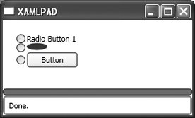
Attributes
Click (optional) This attribute sets the name of the codebehind handler that executes when the RadioButton is clicked.
Content (optional) This attribute's value will be displayed as the RadioButton label.
IsChecked (optional) This attribute sets the initial state of the RadioButton.
true Sets the initial state to selected
false Sets the initial state to unselected
IsCheckedChanged (optional) This attribute sets the name of the codebehind handler that executes when the RadioButton changes state. Events ClickIsCheckedChanged | RadioButtonList | Hierarchy: UIElement FrameworkElement Control ItemsControl Selector |
<RadioButtonList SelectionChanged="RadioButtonSelectionChangedHandler"> <RadioButton Name="rb1">Radio Button 1</RadioButton> <RadioButton Name="rb2">Radio Button 2</RadioButton> <RadioButton Name="rb3">Radio Button 3</RadioButton> </RadioButtonList>
<RadioButtonList .../> is a selector containing a group of RadioButton elements and is limited to a single selection mode. RadioButtonList can contain any type of element, but all elements declared within its beginning and ending tags will be interpreted as a RadioButton and displayed as the RadioButton's label. If you declare a Button in the middle of the list, the user interface will display a typical RadioButton with a Button next to it instead of a text-based prompt. Attributes
SelectionChanged (optional) This attribute sets the name of the codebehind handler that executes when the selection changes. Events SelectionChanged | RepeatButton | Hierarchy: UIElement FrameworkElement Control ContentControl ButtonBase |
<RepeatButton Delay="500" Interval="100" Click="ClickHandler" Content="Increment Counter" />
<RepeatButton .../> is a button that continually raises its Click event until it is released. The interval between Click events is controlled through the event's properties. RepeatButton is used to implement the composite components HorizontalSlider and VerticalSlider. Attributes
Click (optional) This attribute sets the name of the codebehind handler that executes when the RepeatButton is clicked.
Content (optional) This attribute's value will be displayed as the RepeatButton label.
Delay (optional) This attribute sets the amount of time, in milliseconds, that the RepeatButton waits before it starts repeating. This value must be a non-negative Integer.
Interval (optional) This attribute sets the amount of time, in milliseconds, between repeats. This value must be a non-negative Integer. Events Click | ScrollViewer | Hierarchy: UIElement FrameworkElement Control ContentControl |
ScrollViewer HorizontalScrollBarVisibility="Auto|Visible|Hidden|Disabled" VerticalScrollBarVisibility=" Auto|Visible|Hidden|Disabled" ScrollChanged="ScrollChangedHandler" CanContentScroll="true|false" > ... </ScrollViewer>
<ScrollViewer .../> represents a scrollable area that contains other visible elements. The visible area of the content is called the viewport. The viewport for the ScrollViewer is defined by the Height and Width properties. Attributes
CanContentScroll (optional) Determines whether content is scrollable
true The content is scrollable.
false The content is not scrollable.
HorizontalScrollBarVisibility (optional) Determines the properties of the horizontal scrollbar
Auto The scrollbar will be visible only if there is more content than can fit in the viewport.
Disabled No scrolling is allowed.
Hidden The scrollbar should never be visible or have space reserved for it.
Visible The scrollbar should always be visible and have space reserved for it.
ScrollChanged (optional) Sets the name of the codebehind handler that executes when a scrollbar changes position
VerticalScrollBarVisibility (optional) Determines the properties of the vertical scrollbar
Auto The scrollbar will be visible only if there is more content than can fit in the viewport.
Disabled No scrolling is allowed.
Hidden The scrollbar should never be visible or have space reserved for it.
Visible The scrollbar should always be visible and have space reserved for it. Events ScrollChanged | Slider | Hierarchy: UIElement FrameworkElement Control RangeBase |
Slider controls provide a thumb that slides from side to side to change a value, usually a number with a large range or a percentage. Slider is the parent of two objects: HorizontalSlider and VerticalSlider. These elements are controlled in a like fashion and have the same attributes. Attributes are applied based on whether the slider is displayed vertically or horizontally, but the two components are identical in all other respects. HorizontalSlider Hierarchy: UIElement FrameworkElement Control RangeBase Slider <HorizontalSlider IsSnapToTickEnabled="true|false" Minimum="0" Maximum="3" Delay="100" Interval="100" TickPlacement=" Both|BottomRight|TopLeft|None" AutoToolTipPlacement="BottomRight|TopLeft|None" AutoToolTipPrecision="2" SmallChange="0.5" LargeChange="1" Ticks="0, 1, 2, 3" TickFrequency="1" Value="2" />
<HorizontalSlider .../> is a composite component that allows the user to select a range of values using a sliding control displayed horizontally. VerticalSlider Hierarchy: UIElement FrameworkElement Control RangeBase Slider <VerticalSlider IsSnapToTickEnabled="true|false" Minimum="0" Maximum="3" Delay="100" Interval="100" TickPlacement="Both|BottomRight|TopLeft|None" AutoToolTipPlacement="BottomRight|TopLeft|None" AutoToolTipPrecision="2" SmallChange="0.5" LargeChange="1" Ticks="0, 1, 2, 3" TickFrequency="1" Value="2" />
<VerticalSlider .../> is a composite component that allows the user to select a range of values using a sliding control displayed vertically. Attributes
AutoToolTipPlacement (optional) Determines whether an auto-generated ToolTip will be shown and where it will appear.
BottomRight Shows the auto ToolTip at the bottom edge of the Thumb in a HorizontalSlider and at the right edge in a VerticalSlider.
None Auto ToolTips will not be shown.
TopLeft Shows the auto ToolTip at the top edge of the Thumb in a HorizontalSlider and at the left edge in a VerticalSlider.
AutoToolTipPrecision (optional) Determines the number of decimal places shown in the auto-generated ToolTip.
Delay (optional) The amount of time, in milliseconds, that the object's RepeatButton waits before processing an increase or decrease command.
Interval (optional) Sets the amount of time, in milliseconds, between repeats. This value must be non-negative.
IsSnapToTickEnabled (optional) Determines whether the Thumb will snap to tick marks. Snap describes the behavior of a thumb control when the mouse is clicked either to its left or right.
true Thumb will snap.
false Thumb will not snap.
LargeChange (optional) The amount added or subtracted from the Value when the scrollbar is clicked. The default is 1.
Maximum (optional) Determines the maximum value for this object. The Value attribute will not be allowed to increase beyond this value.
Minimum (optional) Determines the minimum value for this object. The Value attribute will not be allowed to decrease beyond this value.
SmallChange (optional) The amount added or subtracted from the Value when the Thumb is moved. The default is 0.1.
TickFrequency (optional) Sets the distance between Ticks. The default value for this attribute is 1.0. Ticks start at Minimum and end at Maximum.
TickPlacement (optional) Determines where Ticks should be displayed relative to the slidebar.
Both Displays tick marks on both sides of the slidebar.
BottomRight Displays tick marks below the track in a HorizontalSlider and to the right in a VerticalSlider.
None No tick marks are shown.
TopLeft Displays tick marks above the track in a HorizontalSlider and to the left in a VerticalSlider.
Ticks (required) A collection of Double values that indicates the values of displayed tick marks.
Value (optional) The initial value of the control. | TabControl | Hierarchy: UIElement FrameworkElement Control ItemsControl Selector |
<TabControl TabStripPlacement="Bottom|Top|Right|Left" SelectionChanged="SelectionChangedHandler" />
<TabControl .../> allows content to be organized in tabbed panes. It must contain at least one TabItem to be useful. Attributes
SelectionChanged (optional) Sets the name of the codebehind handler that executes when the selected TabItem changes
TabStripPlacement (optional) Determines where individual TabItem objects will be placed
Bottom Tabs are placed at the bottom of content.
Left Tabs are placed to the left of content.
Right Tabs are placed to the right of content.
Top Tabs are placed at the top of content. Events SelectionChanged | TabItem | Hierarchy: UIElement FrameworkElement Control ContentControl HeaderedItemsControl |
<TabItem Header="Tab 1" IsSelected="true|false" Content="Content" />
<TabItem .../> is a child of TabControl and defines individual tabs. Content may be omitted if elements other than text will be included. Figure 8-5 shows a TabControl with three TabItem declarations. Figure 8-5. A TabControl with three elements 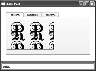
Attributes
Content (optional) This attribute determines the text-based content of the TabItem.
Header (optional) This attribute sets the title of the TabItem.
IsSelected (optional) This Boolean determines whether a TabItem is initially selected.
true The TabItem is initially selected.
false The TabItem is not selected. | TextBox | Hierarchy: UIElement FrameworkElement Control TextBoxBase |
<TextBox MaxLength="10" AcceptsDigitsOnly="true|false" TextChanged="TextChangedHandler" CaretIndex="3" CharacterCasing="Upper|Normal|Lower" AcceptsReturn="true|false" AcceptsTab="true|false" TextTrimming="CharacterEllipsis|WordEllipsis|None" Text="123" />
<TextBox .../> defines an editable region in which a user can enter text. Attributes
AcceptsDigitsOnly (optional) Determines whether this element will accept alphanumeric characters or numeric only.
true This element accepts only numeric input.
false This element accepts alphanumeric input.
AcceptsReturn (optional) Determines the element's behavior when the Enter key is pressed.
true The Enter key inserts a new line at the current cursor position. This is the default behavior.
false Enter is ignored.
AcceptsTab (optional) Determines the element's behavior when the Tab key is pressed.
true The Tab key inserts a tab character at the current cursor position. This is the default behavior.
false The Tab key moves to the next control in the tab order; no tab character is inserted.
CaretIndex (optional) Determines the position of the caret. The value is of type Integer and is zero-based.
CharacterCasing (optional) Determines the casing of characters during input. Typed characters are automatically converted according to this attribute.
Lower Converts typed characters to lowercase
Normal Does not convert typed characters
Upper Converts typed characters to uppercase
MaxLength (optional) Determines the maximum length of the string that this element will accept. The default is 0 and is of type Integer. The string can be set to a longer value programmatically.
Text (optional) Sets the initial content of the TextBox.
TextChanged (optional) Sets the name of the codebehind handler that executes when the text changes.
TextTrimming (optional) Determines how text that flows past the end of the element is treated.
CharacterEllipsis Text is trimmed at a character boundary. Remaining text is replaced with an ellipsis ( . . . ).
None Text is not trimmed.
WordEllipsis Text is trimmed at a word boundary. Remaining text is replaced with an ellipsis ( . . . ). Events TextChanged | ToolBar | Hierarchy: UIElement FrameworkElement Control ItemsControl HeaderedItemsControl |
<ToolBar BandIndex="0" Band="0" OverflowMode="Always|Never|AsNeeded|Never" />
<ToolBar . . . /> represents a standard UI toolbar with facilities to handle the overflow of items. ToolBar holds objects of type UIElement. Figure 8-6 shows the result of evaluating Example 8-9, which builds a ToolBar out of Button elements. Each Button contains an Image elementa common mechanism for building toolbars. Figure 8-6. ToolBar containing Buttons with images 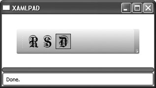
The Band and BandIndex attributes are useful only when more than one ToolBarPanel is contained within a ToolBar. Example 8-9 contains example code and figures that demonstrate the usefulness of these two attributes. Attributes
Band (optional) This Integer value determines which band, or row, in the ToolBarTray this ToolBar should occupy.
BandIndex (optional) This Integer value determines which band, or row, in the ToolBarTray this ToolBar should occupy.
IsOverFlowOpen (optional) This Boolean determines the initial state of the ToolBarOverflowPanel.
true The overflow panel is open.
false The overflow panel is closed. Attached Attributes
ToolBar.OverflowMode Determines how an element should be added to the overflow panel, if ever
Always This element should always be added to the overflow panel.
AsNeeded This element should be added to the overflow panel if necessary.
Never This element should never be added to the overflow panel. | ToolBarOverflowPanel | Hierarchy: UIElement FrameworkElement Panel |
<ToolBarOverflowPanel WrapWidth="100" />
<ToolBarOverflowPanel .../> describes the overflow panel for a ToolBar. It is used in conjunction with a ToolBarPanel to determine which elements are automatically placed into the overflow panel when there is not enough room in the ToolBar to display all of them. If there is not enough room for even one element in the ToolBar, then all elements declared in the ToolBarOverflowPanel will appear there. If there is enough room for all the elements declared in the ToolbarOverflowPanel to be displayed on the ToolBarPanel, then they will appear there. Attributes
WrapWidth (optional) This Integer value sets the width at which items will begin to flow into the overflow panel. | ToolBarPanel | Hierarchy: UIElement FrameworkElement Panel StackPanel |
<ToolBarPanel />
<ToolBarPanel .../> is responsible for arranging items in a ToolBar and determining which elements will fit there and which will be placed into the ToolBarOverflowPanel. Example 8-10 describes a ToolBarPanel with two ToolBar elements, one of which is always an overflow item and one that is not. The result is shown in Figure 8-7. Figure 8-7. A ToolBarPanel with overflow 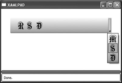
| ToolBarTray | Hierarchy: UIElement FrameworkElement Panel Canvas |
<ToolBarTray IsLocked="true|false" Orientation="Vertical|Horizontal" >
<ToolBarTray .../> defines a toolbar tray that holds a group of ToolBar elements. The BandIndex and Band attributes indicate the order of these elements in the ToolBarTray. Figure 8-8 shows the result of specifying Band="0" for both ToolBar elements. Specifying the same Band for both ToolBar elements lines them up horizontally. Changing the first value to Band="1" results in Figure 8-9, in which the ToolBar elements line up vertically. Example 8-11 demonstrates the code for a ToolBarTray with multiple ToolBars. Figure 8-8. Specifying the same value for Band in a ToolBarTray 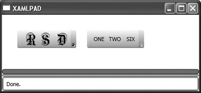
Figure 8-9. Specifying two different values for Band in a ToolBarTray 
Attributes
IsLocked (optional) Specifies whether child instances of ToolBar can be moved within the ToolBarTray
true ToolBar elements may not be moved.
false ToolBar elements may be moved. This is the default behavior.
Orientation (optional) Determines the orientation of the ToolBarTray
Horizontal The element is oriented horizontally.
Vertical The element is oriented vertically. | ToolTip | Hierarchy: UIElement FrameworkElement Control ContentControl |
<ToolTip Placement="Absolute|AbsolutePoint|Top|Bottom|Right|Center|Left|Relative| RelativePoint|Mouse|MousePoint" HorizontalOffset="50" VerticalOffset="20" StaysOpen="true|false" Opened="OpenedHandler" Closed="ClosedHandler" PlacementTarget="Target" HasDropShadow="true|false" />
<ToolTip .../> displays a small pop-up window after particular events are raised or when the mouse hovers over a control. Assigning a ToolTip to a control requires the explicit declaration of the ToolTip attribute, which is inherited from FrameworkElement. ToolTip can be declared inline as a String, in which case the system automatically displays the tool tip with its default style. ToolTip can also be explicitly declared, as shown in Example 8-12, as any derivative of UIElement. Attributes
Closed (optional) Sets the name of the codebehind handler that executes when the ToolTip closes.
HasDropShadow (optional) Determines whether the ToolTip has a drop shadow.
true ToolTip has a drop shadow.
false ToolTip does not have a drop shadow. This is the default value.
HorizontalOffset (optional) Determines the offset of the pop up from the left. It is of type Double.
Opened (optional) Sets the name of the codebehind handler that executes when the ToolTip opens.
Placement (optional) Determines where the ToolTip appears.
Absolute Uses HorizontalOffset and VerticalOffset to position the ToolTip relative to the upper-left corner of the screen.
AbsolutePoint Uses HorizontalOffset and VerticalOffset to position the ToolTip relative to the upper-left corner of the screen. If the pop up extends beyond the edges of the screen, it flips to the other side of the point.
Bottom Positions the pop up on the bottom edge of its parent, aligning left edges.
Center Centers the pop up over the parent.
Left Positions the pop up on the left side of the parent, aligning upper edges.
Mouse Behaves the same way as Bottom but uses the bounding box of the mouse cursor.
MousePoint Behaves the same way as RelativePoint, but its reference point is the tip of the mouse cursor.
Relative Uses HorizontalOffset and VerticalOffset to position the ToolTip relative to the upper-left corner of the parent element.
RelativePoint Uses HorizontalOffset and VerticalOffset to position the ToolTip relative to the upper-left corner of the parent element. If the pop up extends beyond the edges of the screen, it flips to the other side of the point.
Right Positions the pop up on the right side of the parent, aligning upper edges.
Top Positions the pop up on the top edge of the parent, aligning left edges.
PlacementTarget (optional) Determines the element relative to which the ToolTip is displayed. This element is used to calculate placement. If null, the parent element is used.
StaysOpen (optional) Determines the behavior of the ToolTip when opened.
true The ToolTip stays open.
false The ToolTip automatically closes after a specified period of time. This is the default behavior.
VerticalOffset (optional) Determines the offset of the pop up from the top. It is of type Double. Events ClosedOpened | Window | Hierarchy: UIElement FrameworkElement Control ContentControl |
<Window Left="10" ResizeMode="CanMinimize|CanResize|CanResizeWithGrip|NoResize" ShowInTaskbar="true|false" StatusBarContent="My Status Bar Content" Text="Window Title" Topmost="true|false" WindowState="Maximized|Minimized|Normal" WindowStyle="None|SingleBorderWindow|ThreeDBorderWindow|ToolWindow" />
Attributes
HasStatusBar (optional) A Boolean value determining whether the Window has a status bar.
true The Window has a status bar.
false The Window has no status bar. This is the default.
Left (optional) An Integer value that describes the location of the left edge of the window in logical units (1/96").
ResizeMode (optional) Determines how, if at all, the user can resize the Window.
CanMinimize The user can only minimize the window and restore it from the task bar. Only the minimize box is enabled, even though the maximize box is shown.
CanResize The user can resize the window.
CanResizeWithGrip The user can resize the window, and a resize grip is displayed in the window's lower-right corner.
NoResize The user cannot resize the window. The maximize and minimize boxes are not displayed.
ShowInTaskbar (optional) A Boolean value that determines whether the window shows up in the task bar.
true The window shows up in the task bar and can be accessed through Alt-Tab.
false The window does not show up in the task bar.
StatusBarContent (optional) The content shown in the status bar. This attribute is meaningless if HasStatusBar is set to false.
Text (optional) The title of the Window.
Top (optional) An Integer value that describes the location of the top edge of the window in logical units (1/96").
Topmost (optional) A Boolean value determining whether this window should be on top at all times.
true The window always appears on top.
false The window behaves normally.
WindowState (optional) Determines the initial state of the window.
Maximized The Window starts maximized.
Minimized The Window starts minimized.
Normal The Window starts at its specified dimensions.
WindowStyle (optional) Determines the core style for the Window.
None The Window has no border or caption.
SingleBorderWindow The Window will have a single border. This is the default.
ThreeDBorderWindow The Window will have a 3-D border.
ToolWindow The Window will appear as a fixed-tool window. | 