Section 9.1. HTML Tables
A table is a grid of cells that's built out of rows and columns . Originally, HTML tables were used (predictably) to show tables of information. But crafty Web developers quickly discovered that invisible tables offered a perfect way to get around the limits of plain vanilla HTML, allowing Web page creators to lay out content in a variety of new ways (see Figure 9-1).
|
In the following sections, you'll explore how to create a table using HTML.
9.1.1. The Anatomy of an HTML Table
All you need to whip up a table is a few new tags:
-
< table > wraps the whole shebang. This is the starting point for every table.
-
< tr > represents a single table row. A <table> contains a series of one or more <tr> tags.
-
< td > represents a table cell (it stands for table data). Inside each <tr> tag, you add one <td> tag for each cell in the row. Inside the <td> tag, you place the text (or numbers , or <img> tags, or pretty much any HTML you like) that should appear in that cell. If you place text here, it gets displayed with the same font as ordinary body text.
-
< th > is an optional tag used to define column headings. You can use a <th> tag instead of a <td> tag at any time, although it makes most sense in the first row of the table. The text inside the <th> tag is formatted in almost the same way as the text in a <td> tag, except it's bold and centered (unless you've applied different formatting rules with a style sheet).
Note: There are a few other table-specific tags that have fallen by the wayside. These tags, which either aren't needed or aren't supported in all browsers, include <thead>, < tbody >, < tfoot >, and <caption>.
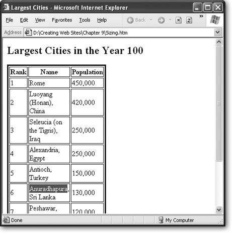
Figure 9-2 shows a table at its simplest. Here's a portion of the HTML used to create the table in Figure 9-2:
<table> <tr> <th>Rank</th> <th>Name</th> <th>Population</th> </tr> <tr> <td>1</td> <td>Rome</td> <td>450,000</td> </tr> <tr> <td>2</td> <td>Luoyang (Honan), China</td> <td>420,000</td> </tr> <tr> <td>3</td> <td>Seleucia (on the Tigris), Iraq</td> <td>250,000</td> </tr> </table>
|
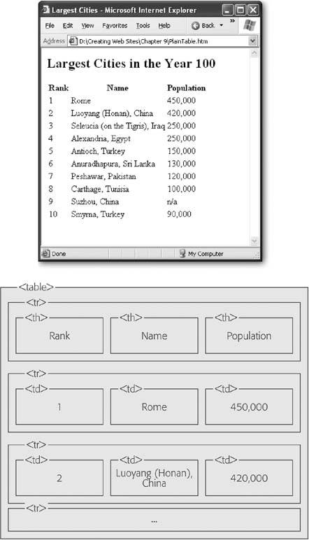
In this example, the tags are indented to help you see the structure of the table. Indenting your table tags like this is always a good idea, as it helps you spot mismatched tags. In this example, the only content in the <td> tags is ordinary text. But you can also add other HTML tags into a cell, including hyperlinks (the <a> tag) and images (the <img> tag).
Tip: You might be able to avoid writing tables by hand, as most Web design tools include their own table editors that let you point and click your way to success. These table-creation features are similar to those you'd find in a word processor.
9.1.2. Formatting Table Borders
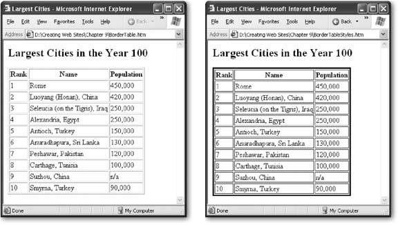
Traditional tables have borders around each cell. You can turn on table borders using the border attribute. The border attribute specifies the width (in pixels) of the line that is added around each cell and around the entire table. Here's an example:
<table border="1"> </table>
Although you can choose the line thickness , you can't control the style of a table border. Most browsers use a solid black line with a raised edge to outline a table.
If this lack of control troubles you, you can always use style sheets. The basic trick is to create a borderless table and then apply a border to the <tr> and <table> tags. Style sheet border properties are described on Section 6.5.1.
The following style sheet rules set a thin blue border around every cell, and create a thick blue border around the entire table:
table { border-width: 3px; border-style: solid; border-color: blue; } td, th { border-width: 1px; border-style: solid; border-color: blue; } Figure 9-3 shows the result.
Tip: Borders aren't the only style sheet feature you can apply to table cells. You can also change the font and text alignment, the padding and margins (Section 6.3.3.3), and the colors. You can even set a background image for an individual cell or the whole table using the background-image property (Section 7.2.5). And if you want to apply style rules to individual cells (rather than the whole table), you just need to use class names (Section 6.6).
|
There's one hiccup to watch out for when creating tables with borders. Empty table cells will appear to be " collapsed ," which means they won't get any borders at all (see Figure 9-4).
|
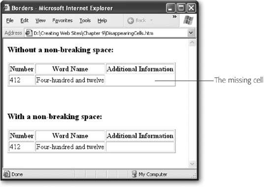
To prevent your cell from collapsing, add a single non-breaking space:
<td> </td>
This space won't be displayed in the browser, but it will ensure the borders stay put.
9.1.3. Cell Spans
HTML tables support spanning , a feature that allows a single cell to stretch out over several columns or rows. Spanned cells let you tweak your tables in all kinds of funky ways.
You can use a column span to stretch a cell out over two or more columns. To make this happen, just add the colspan attribute to the <td> tag you want to extend, and specify the total number of columns you want it to occupy. Here's an example that stretches a cell out over two columns, so that it actually occupies the space of two full cells:
<table border="1" cellpadding="2" width="100%" id="table1"> <tr> <td>Column 1</td> <td>Column 2</td> <td>Column 3</td> <td>Column 4</td> </tr> <tr> <td> </td> <td colspan="2">Look out, this cell spans two columns!</td> <td> </td> </tr> </table>
Figure 9-5 shows this trick in action.
In order to make sure your table doesn't get mangled when you're using column spanning, you need to keep track of the total number of columns you have to work with in each row. In the previous example, the first row starts off by defining the four basic columns:
<tr> <td>Column 1</td> <td>Column 2</td> <td>Column 3</td> <td>Column 4</td> </tr>
In the next row, the second column extends over the third column, thanks to column spanning. As a result, the next <td> tag actually becomes the fourth column. That means you need only three <td> tags to fill up the full width of the table:
<tr> <!-- This fills column 1 --> <td> </td> <!-- This fills columns 2 and 3 --> <td colspan="2">Look out, this cell spans two columns!</td> <!-- This fills column 4 --> <td> </td> </tr>
|
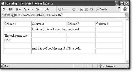
The same principle works with row spanning and the rowspan attribute . In the following example, the first cell in this row leaks through to the second row:
<tr> <td rowspan="2">This cell spans two rows.</td> <td> </td> <td> </td> <td> </td> </tr>
In the next row, the first cell is already occupied by the cell from above. That means the first <td> tag you declare actually becomes the second column. All in all, this row needs only three <td> tags:
<tr> <td> </td> <td> </td> <td> </td> </tr>
If you miscount and add too many cells to a row, you'll end up with an extra column at the end of your table.
Tip: Many HTML editors let you create spans by joining cells. In Nvu, just select a group of cells, right-click them, and select Join Selected Cells. In FrontPage and Dreamweaver it's the same process, but the menu command is named Merge Cells.
9.1.4. Sizing and Aligning Tables
If you don't explicitly set the size of a table, each column grows just wide enough to fit the longest line of text (or to accommodate any picture you add with an <img> tag). Likewise, the table grows big enough to fit all the columns. However, there's one exceptionif these adaptations would cause the table to grow outside the bounds of the browser window, the table's width is limited to the browser window size . In that case, text gets wrapped inside each column.
Tip: Need more space inside your table? Style rules can make it easy. To add more space between the cell content and its borders, increase the padding property for the <td> and <tr> tags. To add more space between the cell borders and any adjacent cells, up the margin width for the <td> and <tr> tags. Section 6.4.2 has more on adjusting these dimensions.
In most cases, you'll want to explicitly set the width of your table and its columns. Once again, style sheets provide the best approach. All you need to use are the height and width properties, as explained in the next section.
9.1.4.1. Sizing the table
You have two choices when specifying table dimensions.
-
Relative sizing sizes the table in sync with the dimensions of the browser window. You supply the percentage of the window that the table should fill.
-
Absolute sizing uses pixel sizes to set an exact size for the table.
For example, the following style sheet rule ensures that this table always occupies the full width of the browser window:
table { width: 100%; } Thus, the table gets sized in relation to the size of the browser window. And this rule limits the table to half of the current window:
table { width: 50%; } Either way, the table resizes dynamically as you resize the browser window.
If you use exact pixel widths, you choose the exact size you want. For example, the following rule creates a table that's a generous 500 pixels wide.
table.Cities { width: 500px; } Because this is a very specific width, it will only be suitable for certain tables. To prevent the rule from being applied to every table, this example uses the class name Cities. Therefore you'll need to edit your HTML so that only specific tables adopt this class:
<table class="Cities"> </table>
You can also set the height of a table. Usually, you'll set the height using an absolute size, as shown here:
table.Cities { height: 500px; } Although you can set a table height as a percentage of the browser window, that creates a strange , rarely seen effect (a table that grows taller and shorter as you resize the page).
There's one important caveat to table sizing. Although you can enlarge a table as large as you want (even if it stretches off the borders of the page), you don't have the same power to shrink a table. If you specify a table size that's smaller than the minimum size needed to fit the table's data, the table appears at this minimum size (see Figure 9-6).
9.1.4.2. Sizing a column
Now that you know how to expand the size of a table, you're probably wondering where the extra space goes. Assuming the table has reached its standard size (just large enough to fit all the data), the extra space is distributed proportionately so that every column grows by the same amount.
Of course, this isn't necessarily what you want. You might be planning to create a wide descriptive column paired with a narrow column of densely-packed text. Or, you might just want to set columns to a specific size so that all your pages look the same, even if the content differs .
|
To set a column's size, you simply need to use the width property with the <td> and <th> tags. Once again, you can do this proportionately, using a percentage, or exactly, using a pixel width. However, percentages have a slightly different meaning when used with columns. When you use a percentage value for the table width, you're in effect sizing the entire table up against the width of the page. So, for example, 50 percent means 50 percent of the full width of the page. But when you use a percentage value to set a column width, you're defining the percentage of the table that the column should occupy. So a column with a 50 percent width takes up 50 percent of the table.
When you size columns, you need to create style rules that use class names (Section 6.6). That's because each table column is potentially a different widthyou can't just write a single style rule that applies to every column.
The following style rules set different widths for each of the three columns that you see in Figure 9-6.
th.Rank { width: 10%; } th.Name { width: 80%; } th.Population { width: 10%; } In this example, the class names match the column titles, which makes it easier to keep track of which style rule applies to each column.
Note: When you're using percentage widths for columns, you don't need to specify values for all three columns. If you leave one out, the browser will size it to fill the rest of the space in the table. If you do decide to include widths for each column (as in the previous example), make sure they add up to 100 percent, to avoid confusion. Otherwise, the browser will need to override one of your settings, and you won't know how your table will actually appear.
In order for these rules to take effect, you need to apply them to the corresponding cells:
<table class="Cities"> <tr> <th class="Rank">Rank</th> <th class="Name">Name</th> <th class="Population">Population</th> </tr> <tr> <td>1</td> <td>Rome</td> <td>450,000</td> </tr>
Notice that the widths are applied only to the first row (which contains the cell headers in this example). You could apply the rule to every single row, but there's really no point. When the browser builds a table, it scans the whole table structure to determine the required size, based on the cell content and any explicit width settings. If you apply a different width to more than one cell in the same column, the browser simply uses the largest value.
Tip: It's a good idea to size your table by applying style rules to the first row. This makes your HTML more readable, because it's immediately obvious what the dimensions of your table are.
9.1.4.3. Sizing a row
You can size a row just as easily as you size a column. The best approach is to use the height property on the <tr> attribute, as shown here:
t5.TallRow { height: 100px; } Once again, percentages and pixel values are both acceptable. When you resize a row, you affect every cell in every column. However, you're free to make each row in the table a different height, using the techniques just described.
9.1.5. Organizing a Page with Tables
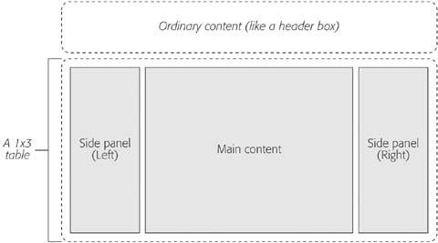
So far, the tables you've seen have been fairly typical grids of information. But on many Web sites, tables play another rolethey organize the page into separate regions .
One of the most common Web site designs is to divide the page into two or three columns. The column on the left typically has navigation buttons or links. The column in the middle takes the most space, and has the main content for the page. The column on the right, if present, has additional information, an advertisement, or another set of links. Figure 9-7 shows how it all breaks down.
|
In order to make this design work, you need to consider several details:
-
Vertical text alignment . Ordinarily, row content is centered between the top and bottom edge of the row. This effect isn't what you want in an extremely large row. Instead, you want to make sure each cell is aligned with the top of the table, so the content in the side panels remains at the top of your page, and is immediately visible.
-
Borders . If you decide to use borders, you'll want them only on some edges to emphasize the separation of content. You won't want them around every cell and the entire table. In many cases, you'll do away with borders altogether and just use different background colors or images to separate the sections of your page.
-
Sizing . Typically, the sidebars will be fixed in size. The middle panel needs to command the most space.
Figure 9-8 gives you a taste of what a finished page that uses a table for layout might look like. You can see this example with the downloadable content for this chapter.
|
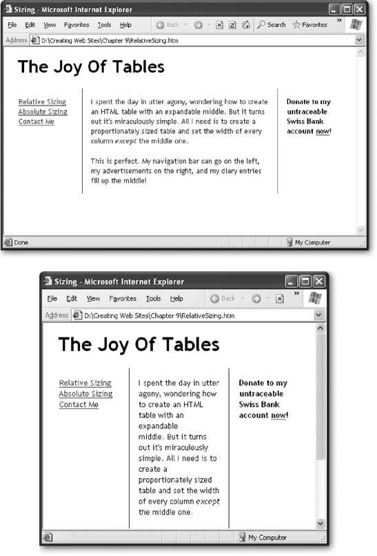
The table in this example is relatively simple, because all the formatting and sizing details are maintained separately, in the style rules. Therefore, all you need to do is create an ordinary table with one row and three columns. Each column is then mapped to a different style using a class name.
<table> <tr> <td class="Left"> <a href="RelativeSizing.htm">Relative Sizing</a><br> <a href="AbsoluteSizing.htm">Absolute Sizing</a><br> <a href="mailto:no-one">Contact Me</a><br> </td> <td class="Middle"> I spent the day in utter agony, wondering how to create an HTML table with an expandable middle </td> <td class="Right"> Donate to my untraceable Swiss Bank account <a href="http://www.paypal.org">now</a>! </td> </tr> </table>
The style sheet rules start by choosing a font for the whole document:
body { font-family: Trebuchet MS, serif; } Next, the table is sized to fill the window:
table { width: 100%; } Every cell is given some standard settings for text alignment, font size, and padding (to give a little extra space between the column border and the text):
td { font-size: x-small; padding: 15px; vertical-align: top; } Finally, the column-specific rules set the widths and the borders. The side panels are given fixed, 100-pixel widths:
td.Left { width: 100px; } td.Right { width: 100px; font-weight: bold; } The middle panel isn't given an explicit width. Instead, it's sized to fit whatever space remains. It's also given left and right borders to separate the side panels:
td.Middle { border-left-width: 1px; border-right-width: 1px; border-top-width: 0px; border-bottom-width: 0px; border-style: solid; border-color: blue; } There's one last detail you might want to consider changing. This example uses proportional sizing for the table, which allows the middle panel to grow and shrink as the browser window is resized. Although this is the most flexible option, in dense, graphics-rich Web sites, absolute sizing is a must, because it gives you tighter control over how the page looks. Absolute sizing prevents the table from being resized and mangling your layout.
You can convert this example to use absolute sizing by changing the table style rule, as shown here:
table { width: 600px; } Now the table is 600 pixels wide. The left and right panels are still 100 pixels each, and the middle column gets whatever's left in the table after the left and right panels are sized. That means it's always exactly 400 pixels wide (based on a total width of 600 pixels, minus 100 pixels for each panel). Figure 9-9 shows the difference.
If you use relative sizing, you need to think quite carefully about the size of monitor your visitors are using to surf your site. Choose a column width that's narrow enough for the average visitor. (As discussed on Section 5.1.2, a typical monitor resolution is 800 x 600 pixels, which gives a maximum width of 800 pixels if the browser window is maximized. Many Web designers use a width of 760 pixels, to make sure there's room left over for a vertical scroll bar, if needed.) If the content is too wide for the browser window, visitors will need to scroll from side to side to read each line.
EAN: N/A
Pages: 135