Other Good Habits and Hints
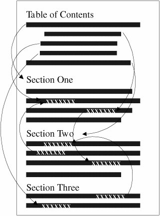
| In this section, I've gathered several other miscellaneous hints and advice about working with groups of web pages. This includes notes on how big to make each page and how to sign your pages. Link Back to HomeConsider linking back to the top level or home page on every page of your site. This link will give visitors a quick escape from the depths of your site. Using a home link is much easier than trying to navigate backward through a hierarchy or repeatedly clicking the Back button. This is especially important since the visitors to most sites are directed there by search engines. If a search engine leads users to an internal page on your site, you'll want to give them a way to find their way to the top. Don't Split Topics Across PagesEach web page works best if it covers a single topic in its entirety. Don't split topics across pages; even if you link between them, the transition can be confusing. It will be even more confusing if someone jumps in on the second or third page and wonders what's going on. If you think that one topic is becoming too large for a single page, consider reorganizing the page so that you can break up the topic into subtopics. This tip works especially well in hierarchical organizations. It enables you to determine the exact level of detail that each level of the hierarchy should go and exactly how big and complete each page should be. Don't Create Too Many or Too Few PagesThere are no rules for how many pages your website must have, nor for how large each page should be. You can have one page or several thousand, depending on the amount of content you have and how you've organized it. With this point in mind, you might decide to go to one extreme or another. Each one has advantages and disadvantages. For example, let's say that you put all your content on one big page and create links to sections within that page, as illustrated in Figure 16.24. Figure 16.24. One big page. Advantages:
Disadvantages:
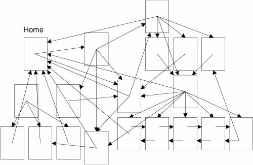
At the other extreme, you could create a whole bunch of little pages with links between them, as illustrated in Figure 16.25. Figure 16.25. Many little pages. Advantages:
Disadvantages:
What's the solution? The content you're describing will often determine the size and number of pages you need, especially if you follow the one-topic-per-page suggestion. Testing your web pages on a variety of platforms at different network speeds will tell you whether a single page is too large. If you spend a lot of time scrolling around in your page, or if it takes more time to load than you expected, it may be too large. Sign Your PagesEach page should contain some sort of information at the bottom to act as the signature. I mentioned this tip briefly in Lesson 6, "Formatting Text with HTML and CSS," as part of the description of the <address> tag. That particular tag was intended for just this purpose. Consider putting the following useful information in the <address> tag on each page:
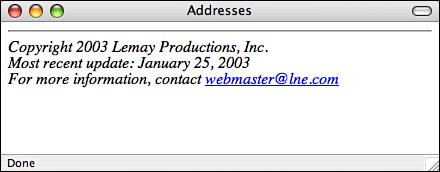
Figure 16.26 shows a nice example of an address block. Figure 16.26. A sample address. Another nice touch is to link a Mailto URL to the text containing the email address of the Webmaster, as in the following: <address> Laura Lemay <a href="mailto:lemay@lne.com">lemay@lne.com</a> </address> This way, the visitors who have browsers that support the Mailto URL can simply select the link and send mail to the person responsible for the page without having to retype the address into their mail programs. Note One downside of putting your email address on your web page is that there are programs that search websites for email addresses and add them to lists that are sold to spammers. You'll want to consider that risk before posting your email address on a public web page. Finally, if you don't want to clutter each page with a lot of personal contact information or boilerplate copyright info, a simple solution is to create a separate page for the extra information and then link the signature to that page. Here's an example: <address> <a href="copyright.html">Copyright</a> and <a href="webmaster.html">contact</a> information is available. </address> Provide Nonhypertext Versions of Hypertext PagesAlthough the Web provides a way to publish information in new and exciting ways, some visitors still like to print things off to read on the bus or at the breakfast table. These kinds of visitors have real problems with web pages because it's difficult to tell your browser to print the whole thing. The browser knows only the boundaries of individual pages. If you're using the Web to publish anything that might be readable and usable offline, consider creating a text or PDF version that's available as an external document for downloading, or even just publishing your information on one page without navigational elements or excessive layout. This way, your visitors can both browse the document online, print it out for reading offline, or even just save it to their local drive so that they can read it on their computer when it's not connected to the network. You can link the location of the hard-copy document to the start of the hypertext version, like the following: A <a href="ftp://myhome.com/pub/mydir/myfile.pdf">PDF version</a> of this document is available via ftp at myhome.com in the directory /pub/mydir/ myfile.pdf. Of course, a handy cross-reference for the hard-copy version would be to provide the URL for the hypertext version, as follows: This document is also available on hypertext form on the World Wide Web at the URL: http://myhome.com/pub/mydir/myfile.index.html. |
EAN: 2147483647
Pages: 305


