Making Color, Font, and Font Size Work for You

One often-overlooked element of successful presentations is the use of colors and fonts. If you're just starting out, it's likely that you've been using PowerPoint's predefined designs and color schemes. That's actually a good idea because the creators of PowerPoint have built their designs with good color and font combinations in mind.

You'll soon discover that you can control nearly every aspect of a PowerPoint slide show, including color schemes, fonts, and font sizes. However, because these visual elements can be nearly as important as text and graphic content in conveying your message, you should be aware of some of the guidelines that can help you use these effectively. You at least need to know the rules before you can break them!

Anyone can show you color charts and explain theories about primary and secondary colors, complementary and analogous colors, and so on. But the real test as to whether colors work well together is how the audience sees them and reacts to them. In particular, can the audience see and read the text, and do the colors add to the mood or feeling you're trying to create? I can't give this subject a comprehensive treatment, but here are a few suggestions:

  • Try using PowerPoint's color schemes before branching off on your own. If you like the effect one of these schemes provides, it's quite probable that your audience will too. Ask an office colleague or a friend what they think to get someone else's take.

  • White and very light colored backgrounds often give the best contrast for text or graphic images. However, such backgrounds are awfully bright, especially in darkened rooms, making it hard for the audience to look at them for a long period of time.

  • Darker colors can be used to set a mood. Blue is soft and soothing, while red and orange suggest passion or action. Green is life-giving and positive. Of course, color can't do all the work. You can use a bright yellow background and still put people to sleep with a lifeless presentation.

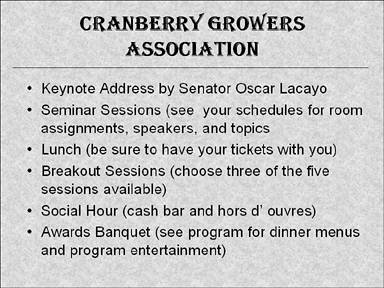
  • Gradient shades and textured backgrounds can add a touch of professionalism to a slide and can be more pleasing to the eye than a solid-color background (see Figure 16.2).

    Figure 16.2. Gradient or textured backgrounds provide a soft backdrop for text and other content.

    graphics/16fig02.jpg

  • Be particularly careful with solid-color backgrounds and colored text to make sure it's readable. For example, red on dark blue or green is very difficult to read.

  • graphics/color_grayscale.gif Be aware that many people have some form of color-blindness, red/green being the most common. Avoid color combinations that depend on these colors for contrast. In fact, avoid anything that depends totally on color contrasts. Use the Color/Grayscale button to preview a slide in gray tones to see if there's enough contrast without color.

Many rules exist regarding fonts and font sizes. When it comes right down to it, however, all you need to do is find a font and font size that's easily readable, not only by someone in the front row, but also by those in the back row.

As for fonts, consider the following:

  • Try to limit the number of fonts used in a slide show. Select one or two basic fonts and stick with them. Try to be consistent in terms of style, color, and size.

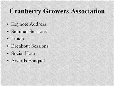
  • Serif fonts, those that have little feet on them, like the type in this book, are easier on the eyes than sans-serif fonts when used in printed text. However, they tend to be harder to read than sans-serif fonts when used on a PowerPoint slide. If you use a serif font, such as Times Roman, make sure the text is large and that there's not much of it (see Figure 16.3).

    Figure 16.3. Serif fonts are harder to read than sans-serif fonts on a PowerPoint slide.

    graphics/16fig03.jpg

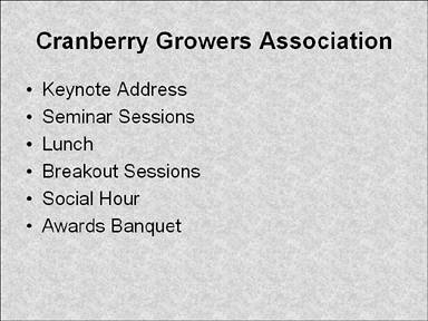
  • Sans-serif fonts, such as Arial and Tahoma, are usually easier to read than serif fonts on a PowerPoint slide, especially for the small text sizes typically used in lists, bullets, and quotes (see Figure 16.4).

    Figure 16.4. Sans-serif fonts are easier to read than serif fonts on a PowerPoint slide.

    graphics/16fig04.jpg

  • Traditional fonts, such as Arial and Times Roman, are considered neutral fonts in that they're common enough that they don't attract undue attention.

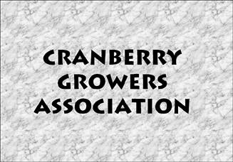
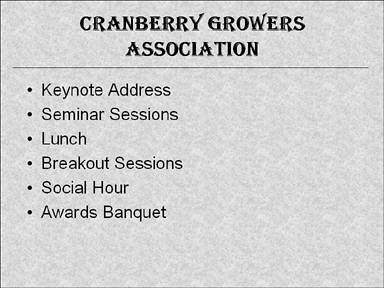
  • Fancy fonts, such as cursive or theme fonts, should be limited to very specific situations, where the font lends to or supports the meaning of the slide. Otherwise, the font is merely distracting (see Figure 16.5).

    Figure 16.5. Fancy fonts are hard to read and should be reserved for slide titles or other large font text.

    graphics/16fig05.jpg

Choosing the right size of text involves using something that's large enough to be read easily. Fonts are measured in such a way that I can't just give you specific point sizes. A 44-point font in Arial might be perfect, but in a script font it might be too small (see Figure 16.6).

Figure 16.6. Point size doesn't mean much on a PowerPoint slide; both of these fonts are the same point size (44 points).

graphics/16fig06.gif

If you're not sure if your text can be read by those in the back row, try it out yourself. If you can read it comfortably from a back-row distance, the text is large enough.

One problem we all face some time or another is that we try to cram too much text onto a single slide. In the case of text and PowerPoint, less is more. Make your bullet points succinct, and keep them to only a few per slide (refer to Figure 16.4). If you find yourself needing more space, create a new slide instead of cluttering one slide with too much information (see for example, Figure 16.7).

Figure 16.7. Too much text forces text to be smaller and less readable.

graphics/16fig07.jpg

Another problem that often occurs when you're experimenting with color schemes is that text is very readable on one part of the screen, but if it crosses a graphic image or a different color on the background, it becomes hard to see. An easy solution is to add a shadow style to the text that contrasts with the text color. For example, light text with a dark gray or black shadow is legible on nearly any kind of background (see Figure 16.8).

Figure 16.8. You can add shading to text to contrast with all backgrounds.

graphics/16fig08.gif


Absolute Beginner's Guide to Microsoft Office PowerPoint 2003
Absolute Beginners Guide to Microsoft Office PowerPoint 2003
ISBN: 0789729695
EAN: 2147483647
Year: 2003
Pages: 154
Authors: Read Gilgen

flylib.com © 2008-2017.
If you may any questions please contact us: flylib@qtcs.net