Text and Typography
| Photoshop gained typographic prowess late in its career; in fact, for a long time it was downright painful to get good-looking type out of it. But that's all changed now. It's like the folks on the Photoshop team took a look at the typography in InDesign and suddenly said, "Hey, we can do that!" Photoshop lets you tweak kerning, leading, color, hyphenation, and more to your heart's content. You can set beautiful type in Photoshop... but that doesn't mean you should. People who want to overlay text on top of pictures often ask us, "Should we use the Type tool in Photoshop, or the features in our page-layout or illustration program?" The answer, as always, is "it depends."
So, if you're setting more than a few words, you should probably set them in QuarkXPress, InDesign, PageMaker, Illustrator, FreeHand, or some other program. But if you're hell-bent on using Photoshop to lay out text, here are some tips and tricks to help you do so more efficiently. Tip: Making Text Blocks Most people who have used Photoshop for years use the Text tool by simply clicking on their image. That works, but if you're going to type more than one line's worth of text, the click-and-type procedure is a pain because you have to manually break lines by hitting Return. Instead, drag out a text frame with the Text tool before typing. Photoshop automatically wraps the text to fit that frame, and you can always reshape the frame by dragging its corner or edge handles, or rotate the text block by dragging outside of the frame. By the way, keep your eye on the lower-right corner handle; when there's too much text to fit the frame, Photoshop places a little + sign there. It's subtle, so you have to look carefully. If you want to create a new text block near or on top of another bit of text, you might have trouble because Photoshop will think you're trying to select the existing text. No problem: Shift-click or Shift-drag with the Text tool to force Photoshop to create a new text layer. When you're done creating or editing text, press Enter on the keypad, or Ctl-Enter (Windows) or Command-Return (Macintosh). Tip: Setting the Column Width Do you need a text block exactly 144 points wide? No problem: Just Option-click with the Text tool, and Photoshop offers you a way to type in an exact size. Tip: Editing Type Layers Once you have created some text on a type layer, there are several ways to edit it:
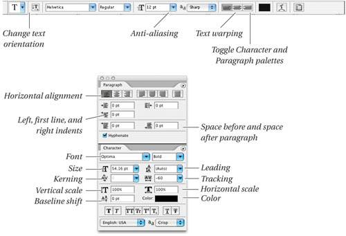
You can also format various aspects of a layer by selecting the layer in the Layers palette and changing values in the Options bar (when the Text tool is selected), Character palette, or Paragraph palette (see "Text Formatting," later in this chapter, for more on this). This changes the formatting (or color, or whatever) for all the text on the layer. Tip: Rendering Type Layers Type layers are special; you can't paint or run filters on them, or do anything else that relies on pixel editing. If you need to do something like that, you have to render them (turn them into pixels) by selecting Type from the Rasterize submenu (under the Layers menu) or from the context-sensitive menu you get with the Type tool (Control-click on Mac, right-click in Windows). But it's generally best to do all your transformations (rotating, scaling, positioning, skewing), and layer effects (drop shadows, and so on) that you need before rendering the type layer. That way, you can be assured of the highest-quality type. Tip: Making Text Masks There are two tools in the Tool palette that create text masks rather than text (that is, as you type, Photoshop makes a selection in the shape of text rather than text itself). However, when it comes to making selections in the shape of text, we would rather create a normal type layer and then Command-click on it in the Layers palette. By actually creating a type layer, we can preview it in the image before clicking OK, we can edit the text later, or use the type someplace else (even in another image). If we had simply used a Type Selection tool, we'd have nothing but an ephemeral group of marching ants. Tip: Check Your Spells No, the Check Spelling feature won't help you with your spells if you end up at Hogwarts School of Magic, but it might help if your Photoshop document has a lot of text in it. To check the spelling of a single word, select the word with the Text tool and choose Check Spelling from the Edit menu or the context-sensitive menu. If no word is selected, Photoshop checks the spelling of every text layer in your file. We find this feature especially helpful with foreign words, which we often have no idea how to spell correctly. Photoshop ships with a number of different language dictionaries, such as Spanish and Swedish. However, in order for the Check Spelling feature to work correctly with foreign words, you must first select the words and choose the appropriate language from the Language popup menu in the Character palette. Tip: Find and Replace Text For those of you who use Photoshop to create advertisements or other materials more appropriate for page-layout applications, note that Photoshop has a Find and Replace Text feature that lets you search for simple text strings. This feature isn't nearly as powerful as those in other programs (for instance, there's no way to search for text formatting or special characters such as tabs). But if you're trying to find a word or phrase that has gone missing, it does the trick. Tip: Text on a Path Need to run text along a path? No problem. Simply draw a path with the Pen tools (see "Paths," earlier in this chapter) and then click on it with the Text tool. Note that the Text tool's cursor icon changes when it's on top of a path, and when you click and then start typing, the text begins from the point you clicked. To adjust the starting and ending points for the text on the path, switch to the Path Selection tool (press A); as you hover the cursor over the start or end point, the cursor changes to a vertical line with a thick black arrow. If you click and drag with this cursor, you adjust where the text begins or ends on the line. The direction you draw your path determines how Photoshop draws the text. If you draw a path from left to right, the text flows on the top of the line; if you draw from right to left, the text flows from right to leftupside down. To flip the text over, use the Path Selection tool and drag the beginning or ending endpoint to the other side of the line. Photoshop doesn't offer a lot of control over how the text flows along the line, but you can rotate the text so that it flows "vertically" along the line by clicking the "Change the text orientation" button on the far left of the Options bar. Text FormattingPlacing text in your image is all very well and good, but you won't win design awards until you've figured out how to format your text. (Well, there might be a few other steps before you win awards, too. We make no guarantees.) There are two types of formatting: Character (which can apply to one or more characters) and Paragraph (which always applies to one or more paragraphs). You can find these settings in the Options bar (when the Text tool is selected in the Tool palette) or in the Character and Paragraph palettes (see Figure 12-55). Figure 12-55. Formatting text Tip: Hide the Selection Formatting text is difficult when you have text selected, especially when you're trying to change the text's color. Don't forget you can press Command-H to hide the text selection; the text remains selected, but you can see the changes more easily as you make them. LeadingLeading ("ledding") determines the amount of space between lines in a paragraph. Bruce, who is accustomed to PageMaker and InDesign, finds Photoshop's leading feature intuitive because in all three programs, leading is considered a character attribute. In QuarkXPress, however, leading is a paragraph attribute. If you're used to XPress (like David), you need to be extra careful when changing leading. If you want the leading to be consistent throughout a paragraph, you should either select every character in the paragraph before you set the leading in the Character palette, or you should apply the leading while the text layer is selected in the Layers palette (but no text on the layer is selected). Kerning and trackingKerning determines the amount of space between each character. Tracking is the same thing, but over a range of text (which is why some folks call it "range kerning"). Photoshop lets you do both in the Character paletteif your cursor is placed between two characters, you can kern them; if you've selected more than one character, then you can track them. (Or, if the type layer is selected in the Layers palette but no text is selected, then tracking applies to every character on that layer.) Note that the kerning and tracking values in Photoshop are based on The default kerning value for text is Metricsthese are the kerning pairs built into the font. But we almost always select the type layer (with no text selected on it) and change the kerning to Optical in the Character palette, which tells Photoshop to use its very cool method of analyzing the shape of each character and adjusting the kerning accordingly. If it's small text, this sometimes makes it look really ugly, so we change it back to Metrics, or even possibly change it to 0 (zero). Anti-alias settingsWhile some people recommend turning off anti-aliasing for very small text, we find that anti-aliasing almost always helps on-screen readability, so we generally leave it on. The problem is that in small text sizes, anti-aliasing sometimes leaves fonts looking a bit anemic. Fortunately, Photoshop lets you change the anti-aliasing style. We usually set the Anti-alias popup menu (in the Options bar or the context-sensitive menu when the Text tool is selected) to Crisp or Smooth (there's too little difference between the two to notice most of the time). However, when working with small text, we sometimes use the Strong option. It's entirely a judgment callif Strong is too bold, then we'll switch back to Smooth. Fractional WidthsText characters rarely fit perfectly on a 72-dpi gridfor instance, a letter "A" might be 18.1 pixels wide. Photoshop offers you the choice of how to deal with these "fractional widths." When the Fractional Widths feature is turned on in the Character palette menu, Photoshop rounds the character widths to the nearest pixel, which usually results in some characters moving slightly closer together. In large point sizes, this is usually a good thing, but in small text sizes, the characters often run into each other and it looks dorky. Note that Fractional Widths affects the entire text block, not just selected characters. Tip: Changing Text Color The fastest way to change the color of one or more characters in a text block is by selecting them with the Text tool and then simply picking a color in the Options bar, or the Tool, Character, Swatches, or Color palette. Or, if you already have the color chosen as your foreground or background color, you can select the text and press Option-Delete (to apply the foreground color) or Command-Delete (for the background color). If you want to apply the same color to every character on a type layer, then select the layer in the Layers palette and press these same keystrokes. (Photoshop acts as though Preserve Transparencywhat's now called Lock Transparent Pixelsis always turned on for text layers.) Tip: Linking Text Layers Do you want to change the font and size of six different text layers in your document? No problem: Just select all the layers in the Layers palette. (See Chapter 2, Essential Image Techniques, for more on selecting layers.) Tip: Keyboard Type Shortcuts There are a number of keyboard shortcuts that can help you speed up your text formatting (see Table 12-1). Remember that the extra time you take to learn these now will come back as time saved later.
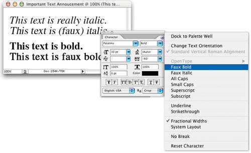
Other character stylesPhotoshop offers a number of other character styles to help make your award-winning text. Here are a few others you should know about:
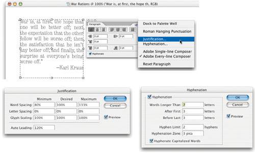
Hyphenation and justificationHyphenation and justification (usually just called "H&J") are two methods of making text fit into a given space by controlling the amount of space between letters and words, and by breaking certain words at line endings with hyphens. Photoshop can also stretch text in order to help it fit a particular column width. If any one of these methods is used in excess, the results are awful. So it's important to find a good balance among them. The H&J settings are only relevant when you have a paragraph or more of textthat is, when you've dragged out a text frame, rather than just clicked and typed (see "Tip: Converting Point Type to Paragraph Type," later in this chapter). And the H&Js are always paragraph-wide formats; you can't apply them to a single character or line within a paragraph. Let's look at the several features in Photoshop that relate to H&Js:
Ultimately, while it's cool that Adobe included all these typography features in Photoshop, we do find it a little absurd because it's so rare that you would ever want to set more than a few lines of text in Photoshop. The one exception is creating images for a PDF workflow. In fact, unless you save your files in the PDF format, the text will either be rasterized (anti-aliased into the background pixels) or it'll take forever to print and create enormous EPS files. Tip: Converting Point Type to Paragraph Type As we said earlier, you can create text in Photoshop by either clicking or dragging with the Text tool. If you drag, you get "Paragraph Type," which is a text block with text handles, that can reflow. If you click, you get "Point Type" which is text that starts at a point; all line breaks have to be made by hand, and you can't apply justification or hyphenation. You can change Paragraph Type to Point Type (and vice versa) by making sure no text or text blocks are selected (clicking on the text layer in the Layers palette will do this), then choosing Convert to Point Text or Convert to Paragraph Text from the Type submenu (under the Layer menu). You can also select this from the context-sensitive menu you get when Control- or right-button-clicking with the Type tool. |
EAN: N/A
Pages: 220

