Section 5.2. Creating Charts
Tables offer a way of displaying a large amount of information in a very readable format. Charts, also known as graphs, let you depict large amounts of data that would otherwise be tedious to read about in straight prose : "In 1998, sales of wombat gloves were $807 a year; in 1999 they rose to $874, before dipping to $751 in 2000."
Charts are graphical representations of lots of little bits of datadata that must first be organized in a spreadsheet. Once those numbers are in place, the stage is set for a modern miracle : from the stultifying columns of numbers, Pages helps you create a gorgeous chart, dramatically revealing the hidden pattern behind the numbers . True, not all charts are gorgeous, but they all reveal patterns and trends in the data that can be impossible to see in other ways.
Pages doesn't contain a spreadsheet programbut it does contain the Chart Data Editor, a pseudo-spreadsheet for your data. It's really just a table for numbers; it lacks the ability to perform any kind of mathematical functions. If you're making a simple chart with a small amount of data, this approach works fine. However, if you're working with large amounts of data, you undoubtedly already have them stored in a spreadsheetprobably Excel or AppleWorks. The Chart Data Editor acts as a conduit between your spreadsheet program and Pages. If you've prepared a spreadsheet properly in Excel or AppleWorks, you can quickly and easily import the data into Pages and create a chart.
Pages provides eight basic chart types from which you can create a multitude of different looks. The key to creating great charts is picking the right type for the kind of information you're presenting. Good charts can tell a complicated story at a glanceand poorly designed charts can confuse and mislead. (Perhaps you want to intentionally misleadthat takes a carefully designed chart, as well!)
5.2.1. Chart Parts
Most charts share some basic features that they use to display your data:
-
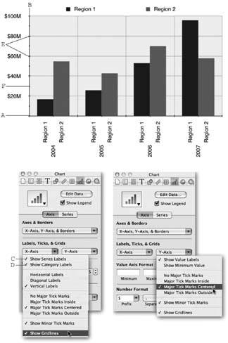
Axes . The x-axis and the y-axis are the horizontal and vertical rulers that provide some kind of scale against which to plot or measure your data. One axis corresponds to either your spreadsheet's row or column headingsin Figure 5-6's example, the column headings for years are charted along the x-axis. The other axis is the value scale determined by the data series , in this case, unspecified numbers that could be dollars.
-
Series . Each set of datasales from Region 1 and Region 2, for exampleis a data series . Each datum (or data point) in the series is plotted against the x and y axes of the chart. On a line chart, each data point is connected to the next with a line. In a bar chart, each data point is represented by a bar. In Figure 5-6, the first row of the spreadsheet contains the data series for Region 1, and the second row contains the series for Region 2. The chart data series can be drawn from either columns or rows of the Chart Data Editorits Plot Row vs. Column buttons determine which is which.
-
Legend . Just like the legend on a map, this legend shows what the lines or symbols on your chart represent. The legend displays the headings of the rows or columns containing the data series and can also display the color or symbol used for the data points on the chart. The legend is a separate object on your pageyou can reposition it or remove it without affecting the chart itself.
Tip: The x-axis is the horizontal axis; the y axis is the vertical. (Only pie charts don't have axes.) Having trouble remembering which is which? Remember that the letter y has to stand upright, or vertically. The letter x looks like an x even if it's lying on its side.
|
5.2.2. Choosing a Chart Type
When you insert a chart in your document, Pages chooses the column chart style from its eight chart types. You may want a different kind of chart, or you might want to change an existing chart to a different style. Click the chart once to select it, and use the Chart Inspector's chart type pop-up menu to choose one of the seven other styles, all of which are illustrated in the menu (or choose Format  Chart
Chart  Chart Type, and then choose the type by name from the submenu).
5.2.2.1. Column charts
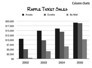
Column charts are a good choice for showing values or rankings for comparisonespecially over time. One data series produces one column, while two or more series allow you to compare those series over time. In this example, you can compare ticket sales at three locations over four years.
5.2.2.2. Stacked column charts
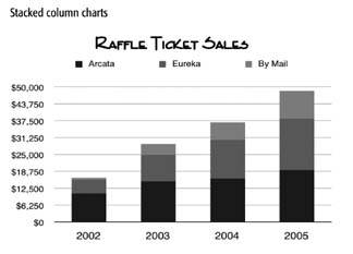
Stacked column charts displays the cumulative result of multiple data series. This example uses the same data as the column chart, but displays the ticket sales for all 3 locations.
5.2.2.3. Bar charts
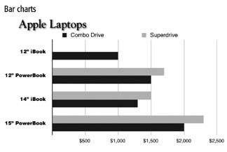
Bar charts are just like column charts turned sideways . They're also good for comparing, but people don't usually use them when the data changes over time. This example compares laptop prices, with one data series for the Combo drive model, and the second series for the SuperDrive model.
5.2.2.4. Stacked bar charts
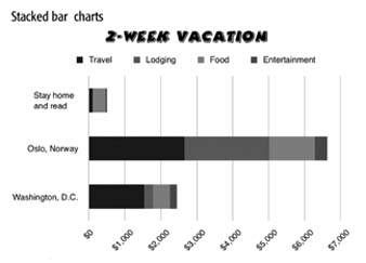
Stacked bar charts, like stacked column charts, compare the cumulative effect of multiple data series; but you wouldn't usually use stacked bar charts to display these data over time. This example compares total costs for three very different vacations .
5.2.2.5. Line charts
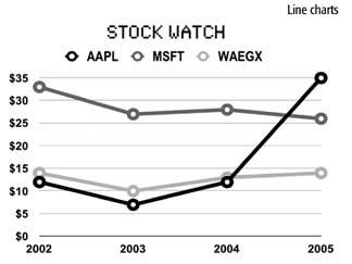
Line charts are the best choice for viewing trends over time, for example, stock prices or global warming. This example displays three data seriesthree stock pricesover time.
5.2.2.6. Area charts
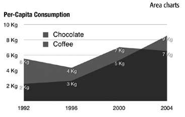
Area charts can emphasize the relative size of your data over time, for example, charting the amount of the snowpack in the mountains or the amount of coffee consumed. Use the stacked version to compare the snowpack at two ski resorts or the consumption of two dark, delicious , caffeine -containing treats.
5.2.2.7. Pie charts
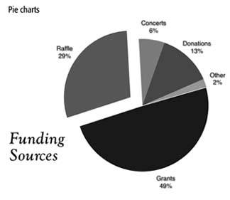
Pie charts display percentages of a wholefor example, the amount of sugar, protein, and fat in a candy bar. They work best when there aren't too many parts to the whole. Pie charts use only a single data set: the first data point from each series listed in the Chart Data Editor. This example shows an organization's funding sources, with one section of the pie "exploded" to call attention to it.
5.2.2.8. Scatter charts
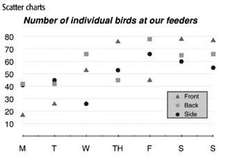
Scatter charts are line charts without the linesjust the data points. You can use them to display the same kinds of data, but they emphasize the individual data points more than overall trends. A favorite in scientific circles, scatter charts can reveal relationships among points from several data sets. Pages doesn't provide a scatter chart in its library of chart styles, but you can easily create one using the line chart styleand then delete the lines (see Section 5.2.4). This example plots bird activity at three different, carefully watched feeders.
5.2.3. Inserting Charts
When you add a chart to a Pages document, you determine whether it's fixed or in-line, just like with tables or other objects. To add an in-line chart, place the insertion point in the text where you want the chart to appear, click the Objects button in the toolbar, and then choose Chart from its pop-up menu (or choose Insert  Chart). A standard column chart (or bar graph) displaying sample data appears in your document, and Pages simultaneously opens the Chart Inspector and the Chart Data Editor. You can insert an in-line chart in any text column or text box. Resize it with one of the three active selection handles.
An in-line chart's legend appears as a separate in-line object above the chart. Resize it separately with its one active selection handle.
To add a fixed chart, click the document's margin so the insertion point disappears, click the Objects button in the toolbar, and choose Chart from its pop-up menu (or choose Insert  Chart). Drag any of a fixed charts eight selection handles to resize it.
A fixed chart's legend appears as a separate fixed object you can resize or reposition anywhere .
You can also draw a fixed chart of just the right size in your document. Hold down the Option key, click Objects in the toolbar, and choose Table. Then release the Option key, position the crosshair cursor where you want one corner of your chart to be, and drag to the opposite corner. Pages displays the chart dimensions as you drag. Pages creates a standard column chart, and then opens the Chart Inspector and the Chart Data Editor.
5.2.3.1. Entering data in the Chart Data Editor
Pages helpfully opens the Chart Data Editor when you insert a new chart. You use this pseudo-spreadsheet to add and arrange the data for your charts. To edit an existing chart, select the chart and click the Chart Inspector's Edit Data button (or choose Format  Chart
Chart  Show Data Editor). The Chart Data Editor window appears, revealing the numbers the chart represents (see Figure 5-6).
Colored squares in each row indicate the colors Pages uses to represent each data series. Each data point in the series is represented by a colored column in the chart. If you'd rather chart each column as a data series, click the Plot Row vs. Column button to swap data series and data sets (Figure 5-6, circled).
Enter your data directly into the Chart Data Editor. Click a data cell and type to replace its contents; press Tab to move to the cell to the right, and press Shift-Tab to move to the left. Double-click row and column labels to rename them; double-click blank row or column labels and type a name to create a new row or columnor press the Add row or Add Column buttons.
You can reorganize the Chart Data Editor's rows and columns by dragging the row or column label to a new position. To add new rows or columns between the existing ones, select a cell, and then click Add Row or Add Column. The new row appears above and the new column appears to the left of the selected cell. You can also Control-click an unselected cell and choose the Add Row Above or Add Column Before commands from the pop-up menu.
| POWER USERS' CLINIC The Most Favored Chart |
| Pages uses a column chart whenever you insert a new chart, but you can change this behavior to match your needsif you almost always make pie charts, for example. To do so, insert a chart and use the Chart Inspector to change it to a pie chart. With the chart selected, choose Format Beware of the related command in the same menu: Define Default Style for (Pie, or the selected chart type) Chart. It's designed to let you choose how many unique series colors Pages displays. Despite the command's name, this selection applies to all chart types, not just the selected one. The dangerous part is that changing this setting causes Pages to modify the formatting of all charts already in your document , sometimes changing label font style and value suffix, as well! Experiment with this command only before you insert any chartsor be prepared for some unpleasant surprises . |
To delete a Chart Data Editor row or column, click its label and press Delete; Shift-click to select several rows or columns, and then press Delete to obliterate them all.
Use the contextual pop-up menu to access all the commands for adding and deleting rows and columns. Control-click any unselected cell in the table to delete rows or columns; add a row above or a column to the left of the selected cell; or add a new row at the bottom or a new column at the right.
5.2.3.2. Copying spreadsheet data
If you already have your data in a spreadsheetin AppleWorks or Excel, for exampleyou can copy it right into the Chart Data Editor.
-
Open the spreadsheet in AppleWorks or Excel .
-
Select all the cells in the spreadsheet that you wish to chart, including the cells containing the column and row labels, and then choose Edit
 Copy .
 The first row heading and the first column heading of your spreadsheet must contain an alphabetical character, otherwise Pages assumes this row or column is filled with data and enters your header column (or row) into the data cells. In other words, you can label your first row Jan 04 but not 1/04.
If necessary, delete the occupied cells in Pages' Chart Data Editor. If the block of cells you're copying is smaller than the occupied cells in the Chart Data Editor, you have to delete those occupied rows and columns. Select all the occupied cells in one of three ways: click the upper left data cell, press the Shift key, and click the last occupied cell in the last row of the last column; drag diagonally from the upper left data cell down to the last occupied cell in the last row of the last column; or drag through one or more cells to select them with dark blue, and choose Edit
 Select All. (You cant use Select All when you have one cell selected in the light blue, data entry mode.)
 Pages highlights all the selected cells in the Chart Data Editor with dark blue.
-
Pressing Delete at this point clears the contents of all the cells, but not the row and column labels. Control-click one of the selected cells and, from the pop-up menu, choose Delete Rows. Then Control-click one of the remaining selected cells and choose Delete Columns from the pop-up menu .
The first row and first column labels remain along with one lonesome, selected, first cell. This one cell acts as the beginning point for the range of cells you're about to paste in.
-
Choose Edit
 Paste and Pages inserts your spreadsheet data and the row and column labels. Like magic, the chart instantly changes to reflect this new data .
5.2.4. Formatting Charts
Like any other object in a Pages document, you can resize, reposition, or rotate charts, adjust their opacity, wrap text around them, and so on. The chart Pages adds to your document is just a starting pointyou can alter the appearance of almost any chart element. The Chart Inspector and the Graphic Inspector have most of the controls for formatting charts. Open more than one Inspector by first opening one Inspector, and then Option-clicking one of the Inspector buttons at the top of its window to display another.
5.2.4.1. The chart legend
The chart's legend is a separate object that you can manipulate independently of the chart. Change its font using the Font Panel, adjust its fill, stroke, or opacity with the Graphic Inspector, or rotate it with the Metrics Inspectorjust like any object. If you don't want to display the legend, click to select it and press Delete (or turn off the Show Legend checkbox in the Chart Inspector). If you change your mind later, open the Chart Inspector and turn on the checkbox for Show Legend.
Tip: Adjusting the legend's font size also changes the size of the color key , the colored square that shows which of the chart elements represent this data series. Create your own customized color keys by inserting a shape and using the Color Picker's magnifying glass to match its color to the appropriate chart element.
5.2.4.2. Changing colors
Every chart is made up of a group of objects that you can select and format in different waysyou can change stroke, fill, or font color, for example.
Select a chart and use the Graphic Inspector's Fill section to add a color, gradient, or image fill to the chart background. Pages fills the rectangular area between the chart's axes.
Quickly change the fill color of a column, bar, area, or pie wedge by dragging a color from the Color Picker's swatch or palette, or from any Inspector's color well. Or, with a chart selected, click once on a column, bar, area, or pie segment to select that element. Pages displays round selection indicators to highlight the selected item. When you click a bar or column, Pages selects all the bars or columns of that data series. Use the Graphic Inspector to change the fill, or add a stroke to outline the column or segment.
The Graphic Inspector's Opacity slider affects a selected chart's columns, bars, areas, or pie segments. Turn on the Shadow checkbox to add a drop shadow to the same elements.
You can adjust the opacity of a single pie wedge or chart area; or the bars or columns of a data series (you can't select or change a single bar or column of a data seriesthe bars or columns of a data series always match). Click to select one of those chart elements; hold down  as you click to select more than one pie wedge or other chart element. Click the Graphic Inspectors Fill color well. The Color Picker appears, from which you can pick a new color or adjust the opacity for that chart element.
5.2.4.3. Changing fonts
You can change the fonts for the entire chart at once by selecting the chart and choosing or changing a font in the Font Panel. Call it forth by pressing ![]() -T (or choose Format
-T (or choose Format  Font
Font  Show Fonts to display it).
Change the fonts separately for axis labels or the data point labels by clicking one of those items to select it. A selection square and two round selection indicators highlight the group of labels. Use the Font Panel to make your adjustments. You can change each set of axis labels only as a group; likewise, you can change data point labels only as a group for each data series. Press ![]() as you click to select multiple labels or groups of labels.
as you click to select multiple labels or groups of labels.
5.2.4.4. Controlling chart elements
The Chart Inspector controls a host of display options for the various chart elements as shown in Figure 5-7.
5.2.4.5. Chart axes formatting
Pages lets you show or hide each of the chart axes; show, hide, or format their labels and tick marks; and add or remove chart grid lines. The Chart Inspector's Axis tab is headquarters for these adjustments. The options listed in the two Axis pop-up menus in the Labels, Ticks, & Grids section change depending on the kind of chart you're working with. The y-axis is the value axis in column charts, line charts, and area chartsbecause it contains the range of data point values. The x-axis is the value axis for bar charts. (Pie charts have no axes, therefore all the items in the Axis tab of the Chart Inspector are unavailable for pie charts.) Choose from the following axis formatting options:
-
Axes . Use the Axes & Borders pop-up menu to independently show or hide the y-axis and the x-axis. You can also choose Show Chart Borders from this menu to display the y and x axes and continue the borderline all the way around the chart. Adding or removing axis or border lines is a purely aesthetic choicethe axes on which the chart is built are there whether you display them or not.
-
X-Axis Labels . The x-axis pop-up menu lets you control the label display beneath the horizontal axis. Choose Show Series Labels to add the data series labels; choose Show Category Labels to add the data set labels to the chart. Adding series labels may ease confusion for the reader in column charts containing many series or in charts that might be printed in black and white. By adding the series to the chart itself, you can even do away with the legend. The x-axis pop-up menu also lets you choose to display those labels horizontally, vertically, or diagonally at a 45 angle. The diagonal setting is a good choice to display longer labels in a way that's easier to read than the vertical setting.
-
Y-Axis Labels . The y-Axis pop-up menu contains two choices for the vertical chart axis labels. Show Value Labels shows or hides these labels. Choose Show Minimum Value to show or hide the lowest value on its axis. For a cleaner looking chart, you may wish not to show this value when it's zero. If the minimum value isn't zero, however, you owe it to your readers to include this value label so they can discern the chart's baseline value.
-
Tick marks . Both Axis pop-up menus contain several choices for tick marks , the scale markings placed along the axis line that can make it easier to interpret the values of the data points. Major tick marks appear at each grid line or label location along the y-axis, and between each data set along the x-axis. Minor tick marks appear halfway between the major ones.
Choose No Major Tick Marks to delete all tick marksmajor and minor.
Choose one of the three Major Tick Marks menu items to display the marks inside the axis line, centered on the line, or outside the axis line. No matter how you display your major tick marks, the minor tick marks follow suit if you turn them on using the Show Minor Tick Marks menu item. Pages doesn't let you display minor tick marks without their major cohorts.
-
Grid lines . Choose Show Grid Lines in either Axis pop-up menu to show or hide the chart grid lines for that axis. Grid lines run perpendicular to the axis to make it easier to gauge the value of a data point (for the value axis) or to help separate the datasets (for the series axis).
-
Value Axis Format . When Pages creates a chart, it automatically sets the value axis range to run from zero up to a round number that can include all the data points. Enter minimum and maximum numbers of your own in the Value Axis Format boxes in order to, for example, begin the chart at a higher value when all your data points are much higher than zero; or to display a much higher range than your largest data pointto perhaps show how much fund-raising is yet to be done to reach your goal. The minimum setting can't be higher than your minimum data point, and the maximum setting can't be less than your maximum data point.
|
Enter a number in the Steps box or use its up and down arrow button to determine how many labelsand therefore how many grid linesPages displays along the y-axis.
Tip: Make sure the maximum value is evenly divisible by the number of steps or else you end up with a display of inappropriate precision with labels reading, for example, 33.333 and 66.667.
Use the Number Format section to determine how to display those labels. You can add a prefix, such as a dollar sign, choose whether or not to use a comma separator for thousands, and choose to add a suffix, such as B for billions. Use the pop-up menus or type directly into the Prefix or Suffix boxes.
5.2.4.6. Charts series formatting
Click the Chart Inspector's Series tab to access settings that control the display of the data series within the chart. The options you have change, depending on the kind of chart you're working with, but the following choices represent all the settings you' find for all the charts. (Pie charts get formatted a bit differently from most other chartssee Pie Charts below for details on their unique formatting options.)
-
Data Point Label . Choose Show Value in the Data Point Settings pop-up menu to display the actual data point value in the chart. Pages displays the number inside or next to the bar or column line, area, or pie segment. The lower section of this menu lets you choose the position within or next to the chart element where Pages displays the number.
Use the Decimals field to determine how many decimal places Pages displays in the data point labels. Use its up and down arrow buttons or type in a number to choose from zero to 10 decimal places.
Click a data point label to select all the labels for one data series, and then use the Font Panel to change their font; you can change data point label formatting only as a group for each data series.
-
Bar Format . You can adjust the bar spacing for column and bar charts and their stacked cousins. The "Gap between bars" setting determines the spacingif anybetween the bars within each data set. Zero percent means no gap, and 100 percent results in a gap equal in width to the bars.
Adjust the "Gap between sets" box to control the size of the gap between data sets. Again, a setting of 100 percent creates a gap as wide as one of the bars. It usually makes most sense to have little or no gap between bars, and a larger gap between sets. Use the up and down arrow buttons next to each box, or type in a number and press Return, to change the settings.
-
Shadow . Apply a shadow to all the columns or bars in column and bar charts by selecting either Group or Individual from the Shadow pop-up menuboth commands do the same thing. Fine-tune the shadows by adjusting them in the Graphic Inspector (see Section 4.4.7).
The Shadow pop-up menu's missing from the Chart Inspector when you choose a line or area chart style. But don't despair, just open the Graphic Inspector and turn on the Shadow checkbox to apply shadows to these types of charts as well.
-
Data Point Symbol . When you work with line or area charts, the Data Point Symbol pop-up menus appear. Use the upper menu to choose what kind of a symbola circle, triangle, diamond, and so onto display at each data point along the line or area. Or choose None for an unembellished line.
If you choose to display data point symbols, use the Symbol Fill pop-up menu to give those symbols either hollow or filled centers. The filling can match the line's stroke color, or you can choose any other color or gradient using the Color Picker. You can even fill the symbols with a tiny image or tinted image, and choose its scaling style (see Section 4.4.4).
5.2.4.7. Formatting pie charts
Pie charts are different than all the other Pages charts in that they can display only one data setthe one in the first row or column of the Chart Data Editor. If the data series are in rows, with the colored data series indicators next to the row labels, then Pages turns the first column into the pie chart. If the data series are in columns, with the colored data series indicators next to the column labels, then Pages turns the first row into the pie chart. Each slice of the pie represents one of the data points in that set, as a percentage of the total of that data set (Figure 5-8). Pages charts only the first column or row from the Chart Data Editor, ignoring any other rows or columns present. Summon any of those idle rows or columns to the charting position by dragging them to the number one slot. Pages instantly changes the chart to reflect this new data set.
Click the Chart Inspector's Series tab to fine-tune the appearance of your pie chart in the following ways:
-
Data Point Label . The Data Point Settings pop-up menu features a couple of pie-chart-specific options. Choose Show Value from the menu to show or hide the data point values for the whole chart or an individual selected wedge. When you elect to show the value, you can choose to show it as a percentage of the whole, or as the absolute value from the Chart Data Editor by choosing Show Pie Values as Percentages from the pop-up menu. Use the Decimals box to determine the decimal precision of these value labels.
From the Data Point Settings pop-up menu, choose Show Series Name to show or hide the data series name for each wedge. Finally, instruct Pages to place the value and series labels either inside or outside of the pie by using the menu's final two commands.
Whether it displays the value, the series name, or both, the data point label is a single entityformatting the font applies to the whole label.
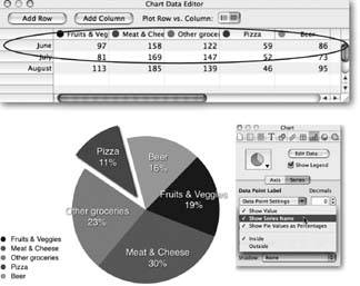
Figure 5-8. Top: In the Chart Inspector's Series tab, the Data Point Settings pop-up menu lets you choose how to display data point labels. If you turn off Show Pie Values as Percentages, Pages inserts the actual data point value in the chart.
Bottom: Pie charts can display only one data set. No matter how many data sets the Chart Data Editor contains to, only the first one contributes to a pie chartthe others have absolutely no bearing on it. Drag a different data set to the number one position to chart it. Or click the Plot Row vs. Column button to switch the data sets from rows to columnsin order to chart the Fruit & Vegetable expenses for three months in this chart.
-
Pie Wedge Format . With the pie chart selected, click a wedge once to select that wedge; if the chart's not selected, double-click a wedge to select it. Pages displays four round selection indicators around the wedge. Use the Explode slider to move the selected wedge away from the pie (or use the up and down arrow buttons, or type the number in the field and press Return). People often use this technique to emphasize a certain segment or group of segments of a pie chart to show, for example, what percentage of your nonprofit 's income is from grants. Press
 while you click to select two or more segments in order to explode them at the same timeperhaps to highlight the amount of both fund-raising and direct donations.
Note: The expanding universe theorywhere everything is moving away from everything elsealso applies to exploding pie chart wedges. Exploded wedges always separate themselves not only from the pie, but also from other exploded wedges. In other words, you can't group the fund-raising and direct donations wedges together so they appear as a single entity apart from the pie of your nonprofit's income.
-
Rotate . You can rotate a pie chart using the Chart Inspector's Rotation Angle knob. Click the knob to rotate it, use the up and down arrow buttons, or enter a rotation angle in the box and press Return. As you rotate the chart, Pages keeps the labels right side up. If you'd rather rotate the chart and the labels, open the Metrics Inspector and use its Rotate knob.
-
Shadow . To apply a shadow to a pie chart segment, select one or more wedges and, from the Shadow pop-up menu, choose Individual. Pages applies shadows to the selected segments. From the Shadow menu, choose Group to apply a shadow to the entire chart. Change a shadow's color or adjust its offset, blur, and so on, in the Graphic Inspector's Shadow section (see Section 4.4.7).
EAN: 2147483647
Pages: 134

