Working with Charts
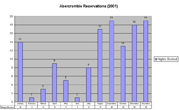
Charts are a great way to organize, simplify, categorize, and present data. Most of us can comprehend facts better if they are presented visually or in a graphical way. You might scratch your head when you try to analyze a worksheet full of numbers, but looking at a well-designed chart makes you say “A-ha” because the data is logically grouped or summarized. Although you might have worked with charts of all types, it’s helpful to understand the terminology that Excel uses to identify the items that a chart comprises. Figure 3-12 shows a sample Excel chart. An explanation of the different parts of the chart follows.

Figure 3-12: The Abercrombie Reservations (2001) chart.
The chart title is Abercrombie Reservations (2001).
-
The category axis contains the months January through December. A chart can have multiple category axes.
-
The value axis contains the numbers 0 through 20. Having multiple value axes in a chart is also possible.
-
The gridlines are the lines touching the numbers 0, 2, 4, and so on, extending across the chart. These are also known as major gridlines because they touch values on the axis. A chart can also have minor gridlines drawn between major gridlines for clarity. It is possible to have category axis gridlines as well as value axis gridlines.
-
The data labels are the numbers 14, 1, 3, 9, and so on directly above each column. To show multiple data labels in a single column, a chart can use legend keys to differentiate which data label matches which portion of the column.
-
The data table consists of the numbers 14, 1, 3, 9, and so on that appear at the very bottom of the chart.
-
The legend is the box containing the words Nights Booked.
The following table provides some suggestions about what types of charts you should use when you work with data that is presented in various formats.
| Chart Type | Type of Data to Analyze |
|---|---|
| Column or bar | Ideal for charting a relatively small number of data fields that you want to display as columns or bars. |
| Line | Also ideal for charting a relatively small number of data fields, but a line chart is used in cases in which you want to connect the values in an unbroken line. |
| Pie | Similar to a column or bar chart, but the chart displays the data as a pie instead of a column or a bar. |
| Scatter | Ideal for charting two fields’ worth of data values when the values do not necessarily follow a trend that can be connected in a reasonably unbroken line. |
| Area | Similar to line charts; use an Area chart when you want to fill in areas of the chart on one or both sides of the line. |
| Doughnut | Ideal for charting a relatively greater number of fields. Values are displayed in concentric rings, and the results look somewhat similar to a pie chart. |
| Radar | Ideal for displaying a relatively small number of fields; corresponding data values are displayed relative to a fixed data value. |
| Surface | Ideal for displaying more than two fields in cases in which you want to represent values along a multidimensional surface. |
| Bubble | Ideal for charting three fields of data; a bubble chart is similar to a scatter chart, but the size of the scatter point can vary. |
| Stock | Ideal for fields that follow an open-high-low-close-volume pattern or a similar stock valuation pattern. |
| Note | A pie chart and a doughnut chart can have a chart title, a legend, data labels, and legend keys, but the rest of the chart components do not apply. Pie charts can also contain leader lines that extend from data labels to pie pieces for visual clarity. Radar charts, surface charts, and bubble charts do not have options for data tables. Surface charts do not have options for data labels. |
Here are some examples of when you should use specific chart types:
-
If your fields consist of a customer name and a purchase amount, column, bar, line, pie, area, and radar charts are good choices.
-
If your fields consist of a customer name, cost of goods, and purchase amount, column, bar, line, area, doughnut, surface, and bubble charts are reasonable choices.
The more fields you add, the more you should lean toward doughnut and surface charts or use PivotChart reports with page fields. PivotChart reports are covered in detail in Chapter 4 and Chapter 6.
Inserting a chart into a spreadsheet is a relatively straightforward process. However, customizing and working with the various chart types may take a little getting used to. To insert a chart into a spreadsheet, select the cells containing the data values that you want to include in your chart, click the Chart Wizard button on the Standard toolbar, and then provide the chart settings as requested by the Chart Wizard.
Your Turn
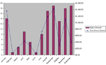
In this exercise, you want to see whether your data shows any month-to- month correlation between the number of nights that customer Abercrombie books and how much room service charges are for those nights. A chart is a good choice for visualizing this type of potential correlation.
-
Open
 Hotel.xls. If the file is open already, close it (do not save it) and open it again.
 -
Select cells B1 through D13, inclusive.
-
On the Insert menu, click Chart.
-
Click the Custom Types tab.
-
In the Chart Type list, select Line–Column On 2 Axes.
-
Click the Next button three times.
-
Click the As New Sheet option, and then click Finish. Compare your results to Figure 3-13.

Figure 3-13: Comparing number of nights booked to room service charges.
Is there a strong month-to-month correlation between the number of nights that customer Abercrombie books and how much room service charges are for those nights? Do a simple analysis:
-
Number of months in which the diamond is within one notch of the top of the bar: 7.
-
Number of months in which the diamond is more than one notch from the top of the bar: 5.
On the face of it, there may be a correlation. Is it a very strong one? Answering this question successfully depends on how well you understand your business.
EAN: 2147483647
Pages: 137
- Using SQL Data Definition Language (DDL) to Create Data Tables and Other Database Objects
- Working with Queries, Expressions, and Aggregate Functions
- Performing Multiple-table Queries and Creating SQL Data Views
- Working with SQL JOIN Statements and Other Multiple-table Queries
- Exploiting MS-SQL Server Built-in Stored Procedures