Problematic Menu Idioms
Over the years, programmers have seen fit to embellish simple menus with new behavioral idioms. Some of these have their (limited) uses, and others simply get in the way. This section discusses these menu idioms and their appropriate uses.
Cascading Menus
A variant of drop-down menus permits a secondary menu to appear alongside another active drop-down menu. This technique, called cascading menus, presents some serious issues for ease of use. At the same time, the temptation to make menus cascade is nearly unavoidable for most programmers, who seemingly have a fond attachment to them.
Where drop-down menus provide clear, easy-to-navigate monocline grouping, cascading menus move us into the nasty territory of nesting and hierarchies. Multiple levels of cascading menus not only make it much more difficult for users to remember where items are located, but they also require precision mouse movements to navigate them smoothly.
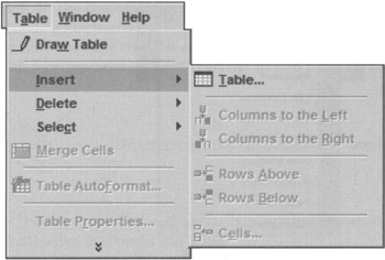
In the previous chapter, we talked about how the modern GUI allowed us to leave hierarchical menus behind. It seems tragic that programmers would want to revive an idiom that lies happily in its grave. Cascading menus do serve a purpose: They allow more functions to be crammed onto a single, top-level menu than would otherwise be legible on the screen. There are occasionally enough items on a menu to justify putting some of the more obscure ones onto a second level, but this should be an idiom of last resort (Figure 28-2 shows a properly-formed cascading menu with a single level). Cascading menus should never be employed for frequently used functions.

Figure 28-2: This is a cascading menu in Microsoft Word. Hierarchies make logical sense to the programmers, but rarely to users. Cascades also demand considerable skill with a mouse, which will frustrate infrequent users. Microsoft and most major software vendors keep to the standard of no more than one level of cascading menu. One other mitigating factor in this example: The cascaded items are also available from butcons, so there is an immediate alternative provided to cascading-menu access. This figure also shows examples of menu items in their disabled state.
In Windows, it is difficult to say categorically that an idiom should not be used because the range of possible application software is so huge. Cascading menus, however, are a weak idiom, one that can be used as needed, but that should not be chosen before first considering other ways to solve the problem.
Windows makes extensive use of cascading menus in the Taskbar. The Start button is so overloaded with hierarchical menus that it can be jerky and unresponsive, even for adept mousers. It seems that Microsoft went to an incredible extreme just to make double-clicks unnecessary.
Expanding Menus
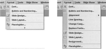
A new menu idiom arrived with Windows 2000 and is still in use in Windows XP: the expanding menu. This menu idiom is used ubiquitously throughout Microsoft's latest Office software, and although it's well-intended, it severely cripples the underlying pedagogic role of drop-down menus. With expanding menus, Microsoft designers tried to anticipate what the frequently used items on each menu would be and to initially display only those items to users. To see the rest of the menu items, users are forced to click (or hover the mouse) on an icon at the bottom of the menu. The previously hidden items may be interspersed with the items originally shown. Because the ordering of the menu changes significantly, in Windows 2000, Microsoft differentiates between normally displayed items and normally hidden items by visually indenting the normally hidden items. This is a terribly confusing visual idiom! It conflicts with the pliant response of buttons and adds confusing visual noise to menus; fortunately, this has been changed in Windows XP (see Figure 28-3). Nonetheless, the idiom is a massive train wreck—like cascading menus, only worse—its only slight saving grace is that if you actually choose one of the hidden items, it will then be available on the list of normally displayed items the next time you look.

Figure 28-3: An expanding menu from PowerPoint in Windows XP, before and after expansion. Expanding menus get just about everything wrong, interaction-wise; they are even more annoying than cascading menus. They hide information in menus, subverting the pedagogic vector; they change the ordering of menu items, disrupting motor memory of menu item location. In the expanded menu, the slightly darker shade of gray on the left indicates, rather subtly, those items that are not on the contracted version of the menu. Luckily, expanding menus can be turned off completely.
Microsoft was clearly trying to make its menu items more usable, but in doing so it has struck a terrible blow to the fundamental reason menus exist, to teach users what functions are available. Microsoft should realize that toolbars, not menus, are the place to send users for frequently used items. Luckily, the user can turn off this feature, but unfortunately it is on by default.
Bang Menus
In the early days of the Mac and Windows, some programs were shipped with a menu variant that has, for good reason, fallen out of favor: the immediate menu or bang menu. In programmer's jargon, an exclamation mark is a bang, and, by convention, top-level immediate menu items were always followed with a bang. Just as its name implies, it is a menu title—directly on the menu bar next to other menu titles—that instead, behaves like a menu item in a drop-down. Rather than displaying a drop-down menu for a subsequent selection, the bang menu causes a function to execute right away! For example, a bang menu title for compiling source code would be called Compile!
Its behavior is so unexpected that it generates instant anger. The bang menu title has virtually no instructional value. It is dislocating and disconcerting. The same immediacy on a toolbar butcon bothers nobody, though. The difference is that butcons on a toolbar advertise their immediacy because they are buttons, and toolbars are where immediate commands should stay.
|
|
EAN: N/A
Pages: 263