Creating an Option Group Another useful special control is the option group . An option group provides different types of buttons or input boxes that can be used to quickly input information into a form. An option group can use one of the following types of buttons : -
Option buttons A separate option button is provided for each choice you supply on the form. To make a particular choice, click the appropriate option button. -
Check boxes A separate check box is provided for each item you place in the option group. To select a particular item, click the appropriate check box. -
Toggle buttons A button is provided for the response required, which can be toggled on and off by clicking the button. Option groups work best when a fairly limited number of choices are available, and when you create your option group, you should select the type of button or box that best suits your need. If you have several responses where only one response is valid, use option buttons. If you have a situation in which more than one response is possible, use check boxes. Toggle buttons are used when only one response is possible, and a toggle button responds to a "yes or no" type question. The option button is then turned on or off with a click of the mouse.
To create an Option Group control (you will create a control that uses option buttons), follow these steps: -
Make sure that the Control Wizards button in the Toolbox is selected. -
 Click the Option Group button on the Toolbox. Your mouse pointer changes to show the Option Group icon. Click the Option Group button on the Toolbox. Your mouse pointer changes to show the Option Group icon. -
Drag your mouse pointer on your form to draw a box where you want the option group to appear. When you release the mouse button, the wizard starts. -
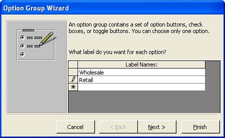
The wizard prompts you to enter the labels you want for each button (or check box or toggle button), as shown in Figure 12.6. You will need a label for each button that will appear in the group. These labels should be the same as the type of data you would normally insert into the field you are building the option group for (which you will specify in step 7). Enter the labels needed, pressing Tab after each one; then click Next . Figure 12.6. Enter the labels you want for each option here.  -
On the next screen, you can select one of the labels that you input in step 4 as the default choice for the option group. Specify the label, and then click Yes, the Default Choice Is . Or click No, I Don't Want a Default As the Other Possibility . Then click Next . -
On the next screen, the wizard asks what value you want to assign to each option (such as 1, 2, and so on). These values provide a numerical equivalent for each label you listed in step 4 and are used by Access to store the response provided by a particular option button or check box. You should use the default values that Access provides. Click Next to continue. -
On the next screen, you decide whether the value that you assigned to each of your option labels is stored in a particular field or saved by Access for later use. Because you are using the option group to input data into a particular field, be sure the Store the Value in This Field option button is selected. This stores the data that the option group provides in a particular field. Select the field from the drop-down list provided. Then, click Next to continue. -
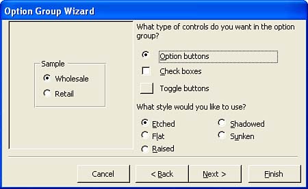
On the next screen, select the type of control (option button, check box, or toggle buttonsee Figure 12.7) you want to use and a style for the controls; then click Next . Figure 12.7. You can choose different input controls for your Option group.  -
On the last screen, type a label for the new control. Then click Finish . Your new option control appears on the grid area of the form. All the different option values that you entered appear in the control. When you switch to the Form view to enter data, you can use the various option buttons or check boxes to select an actual value for that particular field.  |

