Design for Mental Models
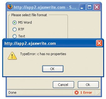
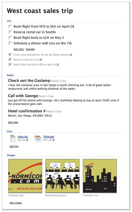
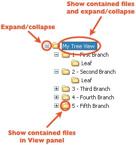
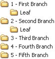
| When a Web application uses implementation models to represent its functionality, a few common trends emerge. First, error messages tend to read like bug reports written specifically for the developers who wrote them. Programmers often need to add code to applications during development that helps them debug issues as they arise, and the error messages are written in words that help the developers narrow down the issue. Before the application is released, this is fine, but these cryptic messages often live on into released applications and mystify users to no end. These messages reveal the system from the developer's perspective instead of revealing the system's benefits by improving a user's understanding. This error message is not only meaningless to users, it interferes with their ability to learn how the application works and their ability to be productive. Second, interfaces often become overly complicated. Because programmers enjoy exposing every option and setting a system could possibly contain, interfaces offer up buttons, configurations, settings, dialog boxes, panels, and menus that do everything but wash the dishes. Instead of focusing on focus, implementation-model designs focus on covering all the bases. They sacrifice ease of use in favor of the fine level of control a system is capable of allowing. Programmers, who are usually the first to admit they are more computer-savvy than the rest of the world, often want incredible amounts of control over the applications they work with, so they surface everything they can in the applications they build, regardless of how difficult it makes a tool to learn for someone who lacks the experience of a programmer. Their users typically don't want this fine level of control. They want to understand how to get their work done and go home to their kids and spouses and dogs.  Just yesterday, I was shown a design for a blog template that featured a small section in the sidebar used to show a list of keywords associated with the post currently being viewed. The list could be shown in two ways. One way was as a tag cloud, which uses larger fonts to display more relevant keywords and smaller fonts to represent less relevant keywords. The other way was as a plain list where each item used the same font and font size. Two buttons, labeled Cloud and List, were offered so users could switch between the tag-cloud view and the list view. When I asked why the buttons were there, the designer told me a developer had said something like, "It would be nice if users had a choice to display the list both ways." I understand where the developer was coming from. Developers like to cover their bases and offer everything they can. If it's possible to show the list in two ways, we think the choice should be offered. But most users viewing this particular page online will not know what a tag cloud is, and those who do will likely not want to switch between the two views. Providing them the choice is pointless. Users who see a tag cloud and understand it will benefit from being able to quickly discern between the relevancy of the various keywords, and those who don't get it will still see a simple list of keywords. No harm, no foul. But when presented with the option to switch between the two views, every user without preexisting knowledge of a tag cloud would have to try to figure out what was meant by the two buttons. Users would be forced to learn something they don't need to know in order to become comfortable with the page. The choice doesn't help anyone, and actually distracts users from achieving a basic understanding of the page's functionality. The implementation-model design would have impeded a user's chances of successfully using the page. Thankfully, the designer decided to scrap the two buttons and just show the tag cloud. A third trend that results from the use of implementation-model designs is that tasks often become cumbersome and frustrating because the system needs all sorts of particular bits of information to complete an operation, and it forces you to tweak and guide it at every step so it can complete the operation in the exact way you tell it. It doesn't help you form a simple understanding of how to make it work, it forces you to understand it so it can get what it needs. To this end, it pokes and prods at you until it gets everything out of you it can. This approach manifests itself as labels that mean nothing to someone who doesn't know how the system works, positioned next to pieces of functionality that should never have been surfaced in the first place. Like a button labeled Cloud. This behavior is, well, rude. It's about making users do everything they can to make the system happy and not doing what makes users happy. Applications like this try hard to be all things to all people, and end up failing to be anything great to anyone. Yes, these applications can still succeed, but it is often because of other factors, such as the lack of any other application in the market that fulfills a similar purpose. This sad fact doesn't make it OK for applications to be rude, but they end up that way far too often because the mighty implementation model rears its ugly head. When applications work well, however, and allow users to easily form their own, more comforting mental models, everybody wins. Making Metaphors that WorkBackpack (www.backpackit.com), created by 37signals (www.37signals.com), is a wonderful and very simple tool for managing small projects and chunks of information. Backpack allows you to create Web pages you can fill up with . . . stuff. You know, like you can fill up a backpack. This sample page from Backpack shows to-do list items, notes, files, and images all being managed in a single page. In Backpack, you simply click a button to create a page, name it, and then start filling it up with anything you need to get yourself organized. Notes, images, files, and to-do lists can all be kept in a single page. Prior to Backpack, whenever I sank my teeth into some new research or small project, I would invariably start compiling information. I'd create a folder on my desktop and start throwing files into it. I'd create a bookmarks folder in my browser and start adding bookmarks to it. I'd collect images. I'd write lists. I'd write more notes. I'd go crazy with disorganization. With Backpack, however, I can keep all that information in one place, just as if I were a student throwing books, homework, notes, and perhaps even my lunch into my backpack. Instead of the implementation model of the operating system, which says that bookmarks, files, to-do lists, and images are all different things that are stored in different software applications and folders, Backpack supports my mental model of how information like this is organized in real life. My real-world backpack lets me keep it all in one place. Now, my Web-based backpack does as well. At first, I understood Backpack's purpose and saw definite potential in it, but I wasn't sure it would be really useful for me. But I signed up for the free account and decided to give it a whirl to organize all the notes and such I needed to write an article I was working on that week. By the next day, I was completely sold, and upgraded to a paying account. Backpack let me get organized in a way that allowed me to maintain structure and relationships between formerly disparate bits of data and see it as a single collection that has meaning and context for me. Information and ideas tend to come in sporadic waves, and Backpack lets me work within this free-flowing state, without forcing me to use phrases like "maintain structure and relationships between formerly disparate bits of data." It lets me keep my own model of how all these bits of data go together, where I used to be stuck with the operating system's methods of organization. When I asked Jason Fried, the fearless leader of 37signals, about the inspiration for Backpack, he said:
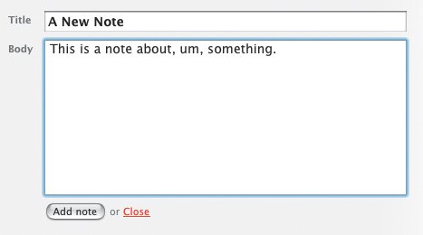
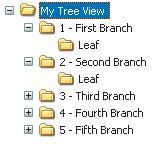
Rolling over the page title displays an Edit link. Clicking it converts the page title into an editable text field, in which you can simply type a new page title. Then you just click another button to save it. 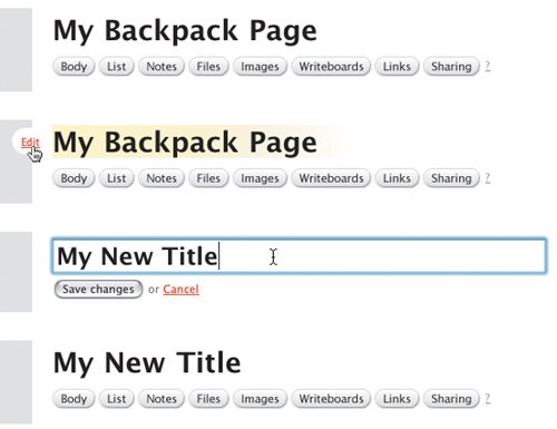 Another exciting part about Backpack is that everything on the page can be edited right in the page. Creating a new Note, for example, drops a text field into the page so you can just start typing. Creating a to-do list is as simple as clicking one button to create the list and typing the first item into another editable text field. Upon saving the to-do item, it converts to a check box so you can check off your to-do item later on. Adding files is a small matter of browsing to a file and uploading it. The fields you need to add a new note are dropped right into the page so you can create it without leaving the page. You never have to wait for a new page to reload, never have to remember which link takes you to which page, never have to remember how to perform a task. Backpack immediately became invaluable because it lets me get on with doing whatever I need to do and stays out of my way. I never see error messages while using the application, and it doesn't expect me to learn anything remarkable about its inner workings to understand how to use it. There are exactly zero hoops through which to jump. Are you sure?The only implementation-model piece of design I've seen while using Backpack is the JavaScript alert message that pops open when I attempt to delete something from a Backpack page. It asks, simply, "Are you sure?" While the message is a pretty standard confirmation messagewhich we're all used to seeingit's a sign of the underlying system. It's a big ol' banner that says "I don't have an undo feature and the only way I can deal with you deleting an object from your page is to interrupt your workflow with this message to make sure you know what you're doing." Yes, yes, I'm sure. Oh, wait. What did that message say? I clicked OK out of habit and didn't even bother looking at it. After all, in real life (which is where my mental model of deleting comes from) I can always take something out of the trash. And my trash can does not ask me if I'm sure I want to put something in it. If it were up to me, then, I'd design an undo function for the application and get rid of the confirmation message. There's no reason not to let the user throw stuff away without confirming his or her actions, so offer an undo function maybe a simple text link that appears in the page whenever the user performs an action that can't be undone some other way. This text link could remain available until the user performed a different action, at which point the link would change to enable an undo of the more recent action. The ability to undo the action would remain available for more time than the Java Script alert message, and it wouldn't get in the user's way when he was trying to work. Two benefits in one. It would not only hide the system from users, it would further support their mental models of how things are thrown away. Overall, however, Backpack does a fantastic job of helping me understand its purpose. In addition to letting me do exactly what I want with it, it's aptly named. Just like a backpack in my real life, Backpack is the place I throw all my stuff so I don't need to keep it in my head. I use Backpack at work to jot down interface ideas, and at home to organize articles I'm working on and plans for personal projects. And since it's Web based, I can bring it with me wherever I go. Just like a backpack. It's quite effective at supporting my mental model of the concept of organization. With the one exception of the JavaScript confirmation message, Backpack never reveals to me how it works or bothers me to confirm every little decision. It just works. For that, I thank 37signals. Every day. When was the last time someone thanked you for creating such a great application? Interface Surgery: Converting an Implementation-Model Design into a Mental-Model DesignOne of the peskiest implementation-model widgets on the Web is the tree view interaction. Tree views are a shining example of a graphical user interface element that reflects the system's underlying structure without regard to users. In this second installment of Interface Surgery, we'll take a look at converting this implementation-model widget into a mental-model widget. The tree view is used to display the hierarchical structure of a set of folders in a way that clearly represents the hierarchy used to create the set. And it does a great job of this. It's very easy to see from the figure below that the tree illustrates an outline view, like an outline you might create for a term paper. You see the root folder, folders nested within it, a small plus-minus icon next to each folder used to expand or collapse the folders, and you may even understand that each folder is clickable. But people don't understand tree views as much as we'd like to believe. Behold the tree view interface, in all its glory. I know, I knowright now you're saying, "Anyone who uses Windows knows about the tree view, because it's used in Windows Explorer." But most people don't use it because it's not the default view in Windows Explorer. The default view is a list of files and/or folders with a panel on the left that lets you perform certain actions on those files, like burn them to CD. And most people don't change the defaults because they either don't know they can, don't know how, or don't know why it would matter. The bigger problem, however, is that the only people who really understand deep, hierarchical structures like those represented by tree views are IT people. People like us. People who use Windows Explorer all the time and understand that a Web site is often comprised of a set of nested folders, each targeted individually within the code so everything on the site displays correctly. People who understand how the file system is organized. Regardless, developers often try to move this paradigm online, believing users will understand it. In most cases, however, they won't. Even Microsoft concurs with this view. In its own MSDN Library (msdn.microsoft.com/library/) it says, "Advanced users are more proficient at using trees. If your application is aimed at novice users, avoid using tree views." Many people outside of our world just dump everything into the My Documents folder and struggle to find files later on. And this, remarkably, works pretty well, because Windows defaults to the My Documents folder in File Open and Save As dialog boxes when it hasn't been told to point elsewhere. In addition to the difficulty of understanding the design of tree views, these painful little widgets also tend to include a ridiculous amount of functionality. When you click on the small plus-minus icon, the nested folders either display or are hidden, respectively. When you click on a folder name, the contents of the folder are revealed in a separate panel. But the plus-minus icon doesn't do the same thing. All that does is expand or collapse the view of nested folders. It doesn't show you files. So you can expand a folder and not see its contained files, or you can click on a folder label to see its contained files without expanding the view to see its nested folders. What you can't do, however, in some tree view implementations, is click once to expand the view and see contained files at the same time. Each part of a tree does something different, and many implementations of tree view interfaces behave differently than the others. This is an example of a typical implementation. So, in addition to the rather bizarre rules you must follow to work with a tree view, you also have to keep track of all the different versions of tree views you come across, because many of them operate differently from the others. And if that's not enoughand maybe I'm nitpicking herethe plus-minus icon is usually very small, making it fairly difficult to roll over with a mouse so it can be clicked. It doesn't exactly scream, "Hey! I'm a button!" All in all, it's a confusing piece of wizardry that only a geek could love. (Though I'm a geek, and I don't love it one bit.) The myriad ways you can interact with a tree view control are all made possible by a system that does way more than it should. Developers who build these controls see all the possible ways a user can interact with the tree view, and insist on making each one an option. More options are not what's needed here. What's needed is a simpler control that provides the same functionality in a way that's easier to understand. To get a new perspective, consider this: Tree-view controls are used as menus. Nothing more. Nothing less. People use them to make selections until they find the files or data objects they're looking for. A tree view is a selection control. With this in mind, we could just redesign tree views as menus with nested submenus, right? Well, sure, if we wanted to cause different problems instead of cure them. Deep, nested menus are equally, if not more, complicated than tree views, because hardly anyone is precise enough with a mouse to keep it in line well enough to move through three or four submenus without error. So how do we get rid of tree views? And in addressing the need for the deep, nested menu options, how do we Know the Best Ways to Implement It? The first thing to realize is that we can ditch the root level of the tree entirely. It's not necessary at all. Here's the tree view interface without the root node, which doesn't help users in any way. In the tree view, all it tells us is there's some sort of root container that contains everything else. This is pointless when you look at it as a way to choose simple options. If we get rid of the root level, we are left with a list of options. We can display this in a simple list box. This list box replaces the first layer in the tree view. The second thing to understand is that the final solution still must offer a way to go on endlessly. You must be able to provide an infinite number of nested options. So we need a solution that just shows an initial set of options, and upon clicking one of them, shows us more options, and on and on until we've located the object we need. To do this, we can line up several list-boxes in a horizontal row. This cascading list-view, with a more obvious menu-style design interface, replaces the tree view. In case you don't recognize it, this new control is a cascading list. Apple uses this paradigm in Mac OS X operating systems, in the Finder application used to navigate the file system on a Mac. It's simply a set of list-box components lined up side by side and bound together with code to display the progression of levels within a hierarchy in a much friendlier way than a tree can offer. Instead of seeing the branches and leaf nodes of a tree, you see options. Instead of asking users to learn about the deep, hierarchical nature of the file system, we show options. Clicking an option in one column displays another set of options in the next column. Simple as that. There's exactly one way to make a selection using a cascading list. You just click on a label. When you run out of columns, the set of list-boxes scrolls (animates) to the left to hide the first column and simultaneously reveal a fourth. Amazingly, this style of component has not yet made its way to the Web except in a few rare cases. So here's your call to action: kill the trees. Use cascading lists. |
EAN: 2147483647
Pages: 81
