Writing Your Own Controls
|
|
| This section discusses how you can create your own controls in wxWidgets. wxWidgets does not have the concept of a "custom control" in the sense of a binary, drop-in component to which Windows programmers might be accustomed. Third-party controls are usually supplied as source code and follow the same pattern as generic controls within wxWidgets, such as wxCalendarCtrl and wxGrid. We're using the term "control" loosely here because controls do not have to be derived from wxControl; you might want to use wxScrolledWindow as a base class, for example. Ten major tasks are involved in writing a new control:
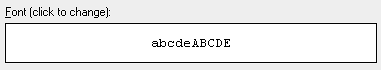
Let's take the simple example we used in Chapter 3, "Event Handling," when discussing custom events: wxFontSelectorCtrl, which you can find in examples/chap03 on the CD-ROM. This class shows a font preview on which the user can click to change the font using the standard font selector dialog. Changing the font causes a wxFontSelectorCtrlEvent to be sent, which can be caught by providing an event handler for EVT_FONT_SELECTION_CHANGED(id, func). The control is illustrated in Figure 12-9 and is shown with a static text control above it. Figure 12-9. wxFontSelectorCtrl
The Custom Control DeclarationThe following code is the class declaration for wxFontSelectorCtrl. DoGetBestSize returns a fairly arbitrary size, 200 x 40 pixels, which will be used if no minimum size is passed to the constructor. /*! * A control for displaying a font preview. */ class wxFontSelectorCtrl: public wxControl { DECLARE_DYNAMIC_CLASS(wxFontSelectorCtrl) DECLARE_EVENT_TABLE() public: // Constructors wxFontSelectorCtrl() { Init(); } wxFontSelectorCtrl(wxWindow* parent, wxWindowID id, const wxPoint& pos = wxDefaultPosition, const wxSize& size = wxDefaultSize, long style = wxSUNKEN_BORDER, const wxValidator& validator = wxDefaultValidator) { Init(); Create(parent, id, pos, size, style, validator); } // Creation bool Create(wxWindow* parent, wxWindowID id, const wxPoint& pos = wxDefaultPosition, const wxSize& size = wxDefaultSize, long style = wxSUNKEN_BORDER, const wxValidator& validator = wxDefaultValidator); // Common initialization void Init() { m_sampleText = wxT("abcdeABCDE"); } // Overrides wxSize DoGetBestSize() const { return wxSize(200, 40); } // Event handlers void OnPaint(wxPaintEvent& event); void OnMouseEvent(wxMouseEvent& event); // Accessors void SetFontData(const wxFontData& fontData) { m_fontData = fontData; }; const wxFontData& GetFontData() const { return m_fontData; }; wxFontData& GetFontData() { return m_fontData; }; void SetSampleText(const wxString& sample); const wxString& GetSampleText() const { return m_sampleText; }; protected: wxFontData m_fontData; wxString m_sampleText; }; To store the font information associated with the control, we are using a wxFontData object, as used by wxFontDialog, so that we can store a color selection along with the font. The control's RTTI event table macros and creation code look like this: BEGIN_EVENT_TABLE(wxFontSelectorCtrl, wxControl) EVT_PAINT(wxFontSelectorCtrl::OnPaint) EVT_MOUSE_EVENTS(wxFontSelectorCtrl::OnMouseEvent) END_EVENT_TABLE() IMPLEMENT_DYNAMIC_CLASS(wxFontSelectorCtrl, wxControl) bool wxFontSelectorCtrl::Create(wxWindow* parent, wxWindowID id, const wxPoint& pos, const wxSize& size, long style, const wxValidator& validator) { if (!wxControl::Create(parent, id, pos, size, style, validator)) return false; SetBackgroundColour(wxSystemSettings::GetColour( wxSYS_COLOUR_WINDOW)); m_fontData.SetInitialFont(GetFont()); m_fontData.SetChosenFont(GetFont()); m_fontData.SetColour(GetForegroundColour()); // Tell the sizers to use the given or best size SetBestFittingSize(size); return true; } The call to SetBestFittingSize tells the sizer layout algorithm to use either the initial size or the "best" size returned from DoGetBestSize as the minimal control size. The control can stretch to be bigger than this size, according to the flags passed when the control is added to a sizer. Adding DoGetBestSizeImplementing DoGetBestSize lets wxWidgets know the optimal minimal size of the control. Providing this information means that a control can be created with default size (wxDefaultSize) and it will size itself sensibly. We've chosen a somewhat arbitrary but reasonable size of 200 x 40 pixels, which will normally be overridden by application code. A control such as a label or button has a natural default size, but other controls don't, such as a scrolled window with no child windows. If your control falls into this category, your DoGetBestSize can call wxWindow::DoGetBestSize, or you can omit the function altogether. You will need to rely on the application passing a non-default size to the control's constructor or the control being sized appropriately by a parent sizer. If your control can have child windows of arbitrary size, and you want your control to size itself according to these child windows, you can find each child's size using GetAdjustedBestSize, and you can return a size that fits around these. For example, say we're implementing a window that contains two child windows, arranged horizontally. We might have this implementation: wxSize ContainerCtrl::DoGetBestSize() const { // Get best sizes of subwindows wxSize size1, size2; if ( m_windowOne ) size1 = m_windowOne->GetAdjustedBestSize(); if ( m_windowTwo ) size2 = m_windowTwo->GetAdjustedBestSize(); // The windows are laid out horizontally. Find // the total window size. wxSize bestSize; bestSize.x = size1.x + size2.x; bestSize.y = wxMax(size1.y, size2.y); return bestSize; } Defining a New Event ClassWe covered the topic of creating a new event class (wxFontSelectorCtrlEvent) and event table macro (EVT_FONT_SELECTION_CHANGED) in Chapter 3. An application that uses the font selector control doesn't have to catch this event at all because data transfer is handled separately. In a more complex control, the event class would have specific functions; we could have provided information about the font in the event class, for example, so that handlers could retrieve the selected font with wxFontSelectorCtrlEvent::GetFont. Displaying Information on the ControlOur control has a very simple paint event handler, centering the sample text on the control as follows: void wxFontSelectorCtrl::OnPaint(wxPaintEvent& event) { wxPaintDC dc(this); wxRect rect = GetClientRect(); int topMargin = 2; int leftMargin = 2; dc.SetFont(m_fontData.GetChosenFont()); wxCoord width, height; dc.GetTextExtent(m_sampleText, & width, & height); int x = wxMax(leftMargin, ((rect.GetWidth() - width) / 2)) ; int y = wxMax(topMargin, ((rect.GetHeight() - height) / 2)) ; dc.SetBackgroundMode(wxTRANSPARENT); dc.SetTextForeground(m_fontData.GetColour()); dc.DrawText(m_sampleText, x, y); dc.SetFont(wxNullFont); } For drawing standard elements, such as a splitter sash or a border, consider using wxNativeRenderer (please see the reference manual for more details). Handling InputOur control detects a left-click and shows a font dialog. If the user confirmed the choice, the font data is retrieved from the font dialog, and an event is sent to the control using ProcessEvent. This event can be processed by a function in a class derived from wxFontSelectorCtrl or a function in the dialog (or other window) containing the control. void wxFontSelectorCtrl::OnMouseEvent(wxMouseEvent& event) { if (event.LeftDown()) { // Get a parent for the font dialog wxWindow* parent = GetParent(); while (parent != NULL && !parent->IsKindOf(CLASSINFO(wxDialog)) && !parent->IsKindOf(CLASSINFO(wxFrame))) parent = parent->GetParent(); wxFontDialog dialog(parent, m_fontData); dialog.SetTitle(_("Please choose a font")); if (dialog.ShowModal() == wxID_OK) { m_fontData = dialog.GetFontData(); m_fontData.SetInitialFont( dialog.GetFontData().GetChosenFont()); Refresh(); wxFontSelectorCtrlEvent event( wxEVT_COMMAND_FONT_SELECTION_CHANGED, GetId()); event.SetEventObject(this); GetEventHandler()->ProcessEvent(event); } } } This class has no keyboard handling, but you could interpret an Enter key press to do the same as left-click. You could also draw a focus rectangle to indicate that the control has the focus, using wxWindow::FindFocus to determine whether this is the focused window. You would need to intercept focus events with EVT_SET_FOCUS and EVT_KILL_FOCUS to refresh the control so that the correct focus graphic is drawn. Defining Default Event HandlersIf you look at implementations of wxTextCtrl, for example src/msw/textctrl.cpp, you will find that standard identifiers such as wxID_COPY, wxID_PASTE, wxID_UNDO, and wxID_REDO have default command event and UI update event handlers. This means that if your application is set up to direct events to the focused control (see Chapter 20, "Perfecting Your Application"), your standard menu items and toolbar buttons will respond correctly according to the state of the control. Our example control is not complex enough to warrant these handlers, but if you implement undo/redo or clipboard operations, you should provide them. For example: BEGIN_EVENT_TABLE(wxTextCtrl, wxControl) ... EVT_MENU(wxID_COPY, wxTextCtrl::OnCopy) EVT_MENU(wxID_PASTE, wxTextCtrl::OnPaste) EVT_MENU(wxID_SELECTALL, wxTextCtrl::OnSelectAll) EVT_UPDATE_UI(wxID_COPY, wxTextCtrl::OnUpdateCopy) EVT_UPDATE_UI(wxID_PASTE, wxTextCtrl::OnUpdatePaste) EVT_UPDATE_UI(wxID_SELECTALL, wxTextCtrl::OnUpdateSelectAll) ... END_EVENT_TABLE() void wxTextCtrl::OnCopy(wxCommandEvent& event) { Copy(); } void wxTextCtrl::OnPaste(wxCommandEvent& event) { Paste(); } void wxTextCtrl::OnSelectAll(wxCommandEvent& event) { SetSelection(-1, -1); } void wxTextCtrl::OnUpdateCopy(wxUpdateUIEvent& event) { event.Enable( CanCopy() ); } void wxTextCtrl::OnUpdatePaste(wxUpdateUIEvent& event) { event.Enable( CanPaste() ); } void wxTextCtrl::OnUpdateSelectAll(wxUpdateUIEvent& event) { event.Enable( GetLastPosition() > 0 ); } Implementing ValidatorsAs we saw in Chapter 9, "Creating Custom Dialogs," validators are a very convenient way to specify how data is validated and transferred between variables and associated controls. When you write a new control class, you can provide a special validator class to use with it. wxFontSelectorValidator is a validator you can use with wxFontSelector Ctrl. You can pass font and color pointers or a pointer to a wxFontData object. These variables are usually declared in the dialog class so that they persist and can be retrieved when the dialog has been dismissed. Note that the validator is passed as an object, not using the new operator, and the object is copied by SetValidator before it goes out of scope and is deleted. For example: wxFontSelectorCtrl* fontCtrl = new wxFontSelectorCtrl( this, ID_FONTCTRL, wxDefaultPosition, wxSize(100, 40), wxSIMPLE_BORDER ); // Either a pointer to a wxFont and optional wxColour... fontCtrl->SetValidator( wxFontSelectorValidator(& m_font, & m_fontColor) ); // ...or a pointer to a wxFontData fontCtrl->SetValidator( wxFontSelectorValidator(& m_fontData) ); The m_font and m_fontColor variables (or m_fontData variable) will reflect any changes to the font preview made by the user. This transfer of data happens when the dialog's transferDataFromWindow function is called (which it is by default, from wxWidgets' standard wxID_OK handler). You must implement a default constructor, further constructors that take pointers to variables, and a Clone function to duplicate the object. The Validate function should be implemented to check that the data in the control is valid, showing a message and returning false if not. transferToWindow and transferFromWindow must be implemented to copy the data to and from the control, respectively. Here's the declaration of wxFontSelectorValidator: /*! * Validator for wxFontSelectorCtrl */ class wxFontSelectorValidator: public wxValidator { DECLARE_DYNAMIC_CLASS(wxFontSelectorValidator) public: // Constructors wxFontSelectorValidator(wxFontData *val = NULL); wxFontSelectorValidator(wxFont *fontVal, wxColour* colourVal = NULL); wxFontSelectorValidator(const wxFontSelectorValidator& val); // Destructor ~wxFontSelectorValidator(); // Make a clone of this validator virtual wxObject *Clone() const { return new wxFontSelectorValidator(*this); } // Copies val to this object bool Copy(const wxFontSelectorValidator& val); // Called when the value in the window must be validated. // This function can pop up an error message. virtual bool Validate(wxWindow *parent); // Called to transfer data to the window virtual bool TransferToWindow(); // Called to transfer data to the window virtual bool TransferFromWindow(); wxFontData* GetFontData() { return m_fontDataValue; } DECLARE_EVENT_TABLE() protected: wxFontData* m_fontDataValue; wxFont* m_fontValue; wxColour* m_colourValue; // Checks that the validator is set up correctly bool CheckValidator() const; }; We will leave you to peruse the source in fontctrl.cpp to find out how the class is implemented. Implementing Resource HandlersIf your class is to be used with XRC files, it is convenient to provide a suitable resource handler to use with the control. This is not illustrated in our example, but refer to the discussion of the XRC system in Chapter 9, and refer also to the existing handlers in the directories include/wx/xrc and src/xrc in your wxWidgets distribution. After the handler is registered by an application, XRC files containing objects with your control's properties will be loaded just like any file containing standard wxWidgets controls. Writing the XRC file is another matter, though, because design tools cannot currently be made aware of new resource handlers. However, with DialogBlocks' simple "custom control definition" facility, you can set up the name and properties for a custom control, and the correct XRC definition will be written, even if it can only display an approximation of the control while editing. Determining Control AppearanceWhen writing your own control, you need to give wxWidgets a few hints about the control's appearance. Bear in mind that wxWidgets tries to use the system colors and fonts wherever possible, but also enables an application to customize these attributes where permitted by the native platform. wxWidgets also lets the application and the control choose whether or not child windows inherit their attributes from parents. The system for controlling these attributes is a little involved, but developers won't have to know about these unless they heavily customize control colors (which is not recommended) or implement their own controls. If explicitly provided by an application, foreground colors and fonts for a parent window are normally inherited by its children (which may include your custom control). However, this may be overriddenif the application has called SetOwnFont for the parent, the child controls will not inherit the font, and similarly for SetOwnForegroundColour. Also, your control can specify whether it can inherit its parent's foreground color by returning true from ShouldInheritColours (the default for wxControl, but not for wxWindow). Background colors are not explicitly inherited; preferably, your control should use the same background as the parent by not painting outside the visible part of the control. In order to implement attribute inheritance, your control should call InheritAttributes from its constructor after window creation. Depending on platform, you can do this when you call wxControl::Create from within your constructor. Some classes implement the static function GetClassDefaultAttributes, returning a wxVisualAttributes object with background color, foreground color, and font members. It takes a wxWindowVariant argument used only on Mac OS X. This function specifies the default attributes for objects of that class and will be used by functions such as GetBackgroundColour in the absence of specific settings provided by the application. If you don't want the default values to be returned, you can implement it in your class. You will also need to override the virtual function GeTDefaultAttributes, calling GetClassDefaultAttributes, to allow the correct attributes to be returned for a given object. If your control has similar attributes to a standard control, you could use its attributes, for example: // The static function, for global access static wxVisualAttributes GetClassDefaultAttributes( wxWindowVariant variant = wxWINDOW_VARIANT_NORMAL) { return wxListBox::GetClassDefaultAttributes(variant); } // The virtual function, for object access virtual wxVisualAttributes GetDefaultAttributes() const { return GetClassDefaultAttributes(GetWindowVariant()); } The wxVisualAttributes structure is defined as follows: // struct containing all the visual attributes of a control struct wxVisualAttributes { // the font used for the control's label or text inside it wxFont font; // the foreground color wxColour colFg; // the background color; may be wxNullColour if the // control's background color is not solid wxColour colBg; }; If your control should have a transparent backgroundfor example, if it's a static control such as a labelthen provide the function HasTransparent Background as a hint to wxWidgets (currently on Windows only). Finally, sometimes your control may need to delay certain operations until the final size or some other property is known. You can use idle time processing for this, as described in "Alternatives to Multithreading" in Chapter 17, "Writing Multithreaded Aplications." A More Complex Example: wxThumbnailCtrlThe example we looked at previously, wxFontSelectorCtrl, was simple enough that we could briefly demonstrate the basics of creating new control, event, and validator classes. However, it's a bit thin on interesting display and input code. For a more complex example, take a look at wxThumbnailCtrl in examples/chap12/thumbnail on the CD-ROM. This control displays a scrolling page of thumbnails (little images) and can be used in any application that deals with images. (In fact, it's not limited to images; you can define your own classes derived from wxThumbnailItem to display thumbnails for other file types, or for images within archives, for example.) Figure 12-10 shows the control being used with a wxGenericDirCtrl inside an image selection dialog (wxThumbnailBrowserDialog). The supplied sample comes with a selection of images in the images subdirectory for demonstration purposes. Figure 12-10. wxThumbnailCtrl used in an image selection dialog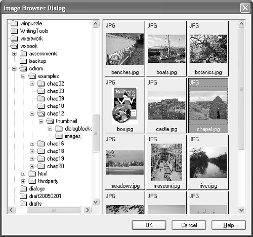 The class illustrates the following topics, among others:
wxThumbnailCtrl doesn't load a directory full of images itself; for flexibility, wxThumbnailItem objects are explicitly added, as the following code shows: // Create a multiple-selection thumbnail control wxThumbnailCtrl* imageBrowser = new wxThumbnailCtrl(parent, wxID_ANY, wxDefaultPosition, wxSize(300, 400), wxSUNKEN_BORDER|wxHSCROLL|wxVSCROLL|wxTH_TEXT_LABEL| wxTH_IMAGE_LABEL|wxTH_EXTENSION_LABEL|wxTH_MULTIPLE_SELECT); // Set a nice big thumbnail size imageBrowser->SetThumbnailImageSize(wxSize(200, 200)); // Don't paint while filling the control imageBrowser->Freeze(); // Set some bright colors imageBrowser->SetUnselectedThumbnailBackgroundColour(*wxRED); imageBrowser->SetSelectedThumbnailBackgroundColour(*wxGREEN); // Add images from directory 'path' wxDir dir; if (dir.Open(path)) { wxString filename; bool cont = dir.GetFirst(&filename, wxT("*.*"), wxDIR_FILES); while ( cont ) { wxString file = path + wxFILE_SEP_PATH + filename; if (wxFileExists(file) && DetermineImageType(file) != -1) { imageBrowser->Append(new wxImageThumbnailItem(file)); } cont = dir.GetNext(&filename); } } // Sort by name imageBrowser->Sort(wxTHUMBNAIL_SORT_NAME_DOWN); // Tag and select the first thumbnail imageBrowser->Tag(0); imageBrowser->Select(0); // Delete the second thumbnail imageBrowser->Delete(1); // Now display the images imageBrowser->Thaw(); If you look through the source code in thumbnailctrl.h and thumbnail.cpp, you should get plenty of ideas for implementing your own controls. Feel free to use wxThumbnailCtrl in your own applications, too. |
|
|
EAN: 2147483647
Pages: 262