Hack 51. Make a Fullscreen Map the Right Way


Map too big? Map too small? Flex those pixels into shape!
Imagine you're the proud new owner of a big, shiny 21-inch flat-panel display, and you surf to your favorite Google Maps web siteonly to find it still confines you to a tiny little 3-inch-square map. It's an embarrassment, to say the least. Likewise, think about those poor fellows with small monitors who are scrolling until their fingers fall off to get around your gigantic 1600 x 1200pixel map. Such sites ought to come with warning labels about claustrophobia.
A good Google Map stretches itself to fit comfortably on your screen. In this hack we'll investigate a simple two-step approach to make your map always take up the whole window, then build on the technique to include a fixed right-side panel, similar to the maps.google.com web site. We'll also point out some tricks to help you avoid common pitfalls that unsuspecting web developers stumble into when trying to make auto-sizing maps.
6.2.1. Making a Map Take Up the Full Screen
The first step is to include the following style declaration in the head section of your page. If your map div is named something other than map, you'll need to replace #map with the appropriate name (e.g., #mymap).
The width and height declarations cause the map container to fill the entire document body, and the body to take up all the available window space. Make sure you don't have any inline width or height attributes on your map element that could override these. The overflow:hidden line hides any scrollbars the browser would otherwise display, and the margin and padding lines get rid of the white border that is shown by default around a document. This leaves us with a map container that stretches to fit all the available window space in the browser (minus that reserved for the toolbars, status bar, etc.).
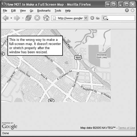
The Google map automatically takes up this whole container when you instantiate it, and most web developers stop here, thinking all is well. However, somewhat less obvious is the fact that the map doesn't detect when its container has been resizedat least, not as of version 1 of the API. Resizing a map that isn't aware when its container size changes can produce some misleading effects, which you can see by going to http://www.googlemappers.com/articles/fullscreenmap/bad.htm.
When you enlarge the browser window, you'll see more of the map revealed and might be tempted to think it is stretching to fit your window. But what you are actually seeing is the "off-screen" portion of the mapsurrounding tiles that have been preloaded, but aren't supposed to be showing on your screen.
If you open the web page in a very small browser window and then enlarge it enough, you'll run out of off-screen tiles and will start to see the gray background shown in Figure 6-1. Additionally, double-clicking the map will make it pan the point you clicked to the old center of the window, based on its dimensions at the time it was created.
Figure 6-1. A full-screen map done the wrong way
To make your map resize and re-center properly, you need to let it know when its container has resized. To do this, we make use of an undocumented Google Maps API method called map.onResize(), calling it whenever the window dimensions change. Include the following JavaScript code, after you create your map object:
	if (window.attachEvent) {
	 window.attachEvent("onresize", function( ) {this.map.onResize( )} );
	 window.attachEvent("onload", function( ) {this.map.onResize( )} );
	} else if (window.addEventListener) {
	 window.addEventListener("resize",
	 function( ) {this.map.onResize( )} , false);
	 window.addEventListener("load", function( ) {this.map.onResize( )} ,
	false);
	}
This is the final step needed to obtain a properly working fullscreen map. You can see the complete implementation of these two code snippets at http://www.googlemappers.com/articles/fullscreenmap/default.htm. You may want to check there for the most up-to-date example of the fullscreen map.
6.2.2. Adding a Side Panel to the Map
It's easy to add a fixed-width panel alongside an auto-sizing map. Here we show the code needed for a fullscreen map with a panel 300 pixels wide docked to the right side of the screen.
Replace the style declaration used in the head section with the following one:
The map's right margin is set to the width of the panel, plus another 2 pixels to account for its left border. The overflow:auto attribute in the right panel causes it to show scrollbars if the content is too big to fit in the panel. The border and padding are added just to make things look cleaner.
It's important that the padding-top and padding-bottom attributes for the right panel be 0px, or the panel's scrollbar will extend underneath the window's status bar, as shown in Figure 6-2. This has to do with a bottom margin the Google Map API internals add below the map, which unintentionally makes the browser think the window content extends slightly below the screen.
Finally, in the body section declare your side panel right after your map div.
Figure 6-2. The unfortunate effects of including top and bottom side panel padding

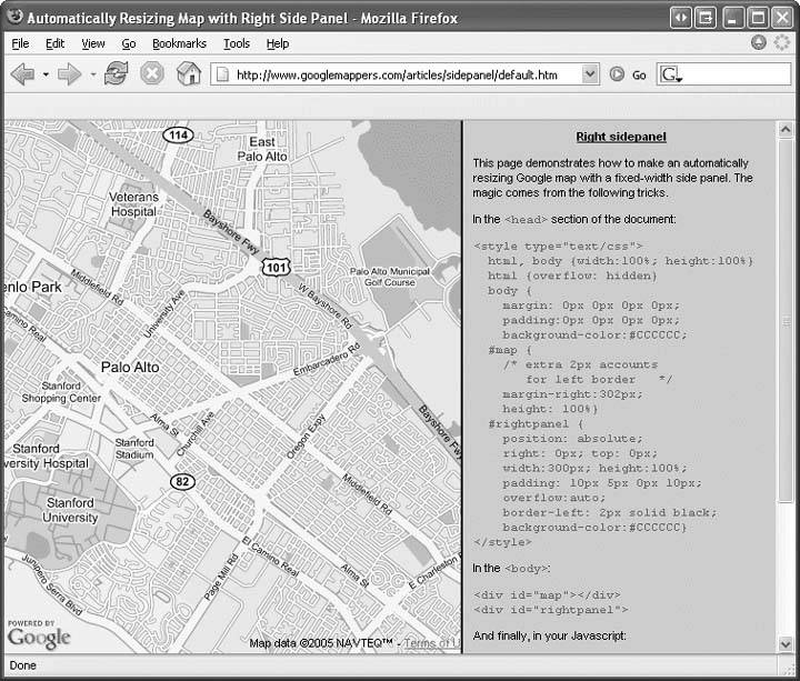
That's all there is to it! You can fill the side panel with any information you'd like. You can see an up-to-date example at http://www.googlemappers.com/articles/sidepanel/default.htm, which is depicted in Figure 6-3.
Figure 6-3. A properly configured side panel
Richard Kagerer
You Are Here: Introducing Google Maps
- Hacks 19: Introduction
- Hack 1. Get Around http://maps.google.com
- Hack 2. Find Yourself (and Others) on Google Maps
- Hack 3. Navigate the World in Your Web Browser
- Hack 4. Get the Birds-Eye View
- Hack 5. Driven to a Better User Interface
- Hack 6. Share Google Maps
- Hack 7. Inside Google Maps URLs
- Hack 8. Generate Links to Google Maps in a Spreadsheet
- Hack 9. Use del.icio.us to Keep Up with Google Maps
Introducing the Google Maps API
- Hacks 1016: Introduction
- Hack 10. Add a Google Map to Your Web Site
- Hack 11. Where Did the User Click?
- Hack 12. How Far Is That? Go Beyond Driving Directions
- Hack 13. Create a Route with a Click (or Two)
- Hack 14. Create Custom Map Markers
- Hack 15. Map a Slideshow of Your Travels
- Hack 16. How Big Is the World?
Mashing Up Google Maps
- Hacks 1728: Introduction
- Hack 17. Map the News
- Hack 18. Examine Patterns of Criminal Activity
- Hack 19. Map Local Weather Conditions
- Hack 20. Track Official Storm Reporting
- Hack 21. Track the International Space Station
- Hack 22. Witness the Effects of a Nuclear Explosion
- Hack 23. Find a Place to Live
- Hack 24. Search for Events by Location
- Hack 25. Track Your UPS Packages
- Hack 26. Follow Your Packets Across the Internet
- Hack 27. Add Google Maps to Any Web Site
- Hack 28. How Big Is That, Exactly?
On the Road with Google Maps
- Hacks 2941: Introduction
- Hack 29. Find the Best Gasoline Prices
- Hack 30. Stay Out of Traffic Jams
- Hack 31. Navigate Public Transportation
- Hack 32. Locate a Phone Number
- Hack 33. Why Your Cell Phone Doesnt Work There
- Hack 34. Publish Your Own Hiking Trail Maps
- Hack 35. Load Driving Directions into Your GPS
- Hack 36. Get Driving Directions for More Than Two Locations
- Hack 37. View Your GPS Tracklogs in Google Maps
- Hack 38. Map Your Wardriving Expeditions
- Hack 39. Track Your Every Move with Google Earth
- Hack 40. The Ghost in Google Ride Finder
- Hack 41. How Google Maps Got Me Out of a Traffic Ticket
Google Maps in Words and Pictures
- Hacks 4250: Introduction
- Hack 42. Get More out of What You Read
- Hack 43. Dont Believe Everything You Read on a Map
- Hack 44. You Got Your A9 Local in My Google Maps!
- Hack 45. Share Pictures with Your Community
- Hack 46. Browse Photography by Shooting Location
- Hack 47. Geotag Your Own Photos on Flickr
- Hack 48. Tell Your Communitys Story
- Hack 49. Generate Geocoded RSS from Any Google Map
- Hack 50. Geoblog with Google Maps in Thingster
API Tips and Tricks
- Hacks 5161: Introduction
- Hack 51. Make a Fullscreen Map the Right Way
- Hack 52. Put a Map and HTML into Your Info Windows
- Hack 53. Add Flash Applets to Your Google Maps
- Hack 54. Add a Nicer Info Window to Your Map with TLabel
- Hack 55. Put Photographs on Your Google Maps
- Hack 56. Pin Your Own Maps to Google Maps with TPhoto
- Hack 57. Do a Local Zoom with GxMagnifier
- Hack 58. Find the Right Zoom Level
- Hack 59. Show Lots of StuffQuickly
- Hack 60. Make Things Happen When the Map Moves
- Hack 61. Use the Right Developers Key Automatically
Extreme Google Maps Hacks
- Hacks 6270: Introduction
- Hack 62. Find the Latitude and Longitude of a Street Address
- Hack 63. Read and Write Markers from a MySQL Database
- Hack 64. Build Custom Icons on the Fly
- Hack 65. Add More Imagery with a WMS Interface
- Hack 66. Add Your Own Custom Map
- Hack 67. Serve Custom Map Imagery
- Hack 68. Automatically Cut and Name Custom Map Tiles
- Hack 69. Cluster Markers at High Zoom Levels
- Hack 70. Will the Kids Barf? (and Other Cool Ways to Use Google Maps)
EAN: 2147483647
Pages: 131
- Chapter I e-Search: A Conceptual Framework of Online Consumer Behavior
- Chapter II Information Search on the Internet: A Causal Model
- Chapter VII Objective and Perceived Complexity and Their Impacts on Internet Communication
- Chapter XIV Product Catalog and Shopping Cart Effective Design
- Chapter XVII Internet Markets and E-Loyalty
