Section 6.2. Varieties of Labels
6.2. Varieties of LabelsOn the Web, we regularly encounter labels in two formats: textual and iconic. In this chapter, we'll spend most of our time addressing textual labels (as they remain the most common despite the Web's highly visual nature), including:
These categories are by no means perfect or mutually exclusive. A single label can do double duty; for example, the contextual link "Naked Bungee Jumping" could lead to a page that uses the heading label "Naked Bungee Jumping" and has been indexed as being about (you guessed it) "Naked Bungee Jumping." And some of these labels could be iconic rather than textual, although we'd rather not imagine a visual representation of naked bungee jumping. In the following section, we'll explore the varieties of labeling in greater detail and provide you with some examples. 6.2.1. Labels As Contextual LinksLabels describe the hypertext links within the body of a document or chunk of information, and naturally occur within the descriptive context of their surrounding text. Contextual links are easy to create and are the basis for the exciting interconnectedness that drives much of the Web's success. However, just because contextual links are relatively easy to create doesn't mean they necessarily work well. In fact, ease of creation introduces problems. Contextual links are generally not developed systematically; instead, they are developed in an ad hoc manner when the author makes a connection between his text and something else, and encodes that association in his document. These hypertext connections are therefore more heterogeneous and personal than, say, the connections between items in a hierarchy, where links are understood to be connecting parent items and child items. The result is that contextual link labels mean different things to different people. You see the link "Shakespeare" and, upon clicking it, expect to be taken to the Bard's biography. I, on the other hand, expect to be taken to his Wikipedia entry. In fact, the link actually takes us to a page for the village of Shakespeare, New Mexico, USA. Go figure.... To be more representational of the content they connect to, contextual links rely instead upon, naturally, context. If the content's author succeeds at establishing that context in his writing, then the label draws meaning from its surrounding text. If he doesn't, the label loses its representational value, and users are more likely to experience occasionally rude surprises. Because Fidelity (Figure 6-2) is a site dedicated to providing information to investors, contextual links need to be straightforward and meaningful. Fidelity's contextual link labels, such as "stocks," "mutual funds," and "Learn how to invest," are representational, and draw on surrounding text and headings to make it clear what type of help you'll receive if you click through. These highly representational labels are made even clearer by their context: explanatory text, clear headings, and a site that itself has a few straightforward uses. Figure 6-2. The contextual links on this page from Fidelity are straightforward and meaningful On the other hand, contextual links on a personal web log ("blog") aren't necessarily so clear. The author is among friends and can assume that his regular readers possess a certain level of background, or really, contextual knowledge. Or he knows that keeping his link labels less representational creates some mystery around what they'll lead to. So the author may choose to design contextual link labels that aren't so representational. In Figure 6-3, the author expects us to know who "Eric Sinclair" isperhaps he's been mentioned in this blog before. Or the author knows that we'll recognize the label "Eric Sinclair" as a person, and provides some minimal contextthe fact that Eric wrote some commentsto entice the user to click through. "They Rule" is equally mysterious; we have no idea what this label represents, but the blog author contextualizes it as "fascinating" and "scary." Nonrepresentational labels have their place; as it's likely that we already trust the author's opinion, we'll probably want to click through and learn more. But without that degree of trust already in place, nonrepresentational links can be damaging. Figure 6-3. These contextual links aren't very representational, but that's acceptable when there is a high degree of trust for the author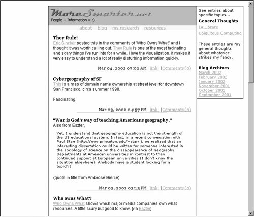 As we'll see, other varieties of labels derive context, and therefore meaning, from being part of larger sets of labels or labeling systems. But systematic consistency isn't quite so possible with link labels. These labels are instead glued together by the copy and context rather than membership in a peer group. However, consistency among these labels and the chunks of information to which they link remains an issue to keep in mind. An information architect can ensure that contextual link labels are representational by asking herself, "What kind of information will the user expect to be taken to?" before creating and labeling a contextual link. Contextual links are created in such an ad hoc manner that simply asking this question will improve the quality of representation. (An easy way to study users' interpretations of labels is to provide a printout of a page with the labels clearly identified, and have subjects jot down what they'd expect each to link to.) On the other hand, it's important to acknowledge that contextual links are often not within the information architect's control. Usually, content authors are responsible for contextual links. They are the ones who know the meaning of their content and how to best link it to other content. So while you may want to enforce rules for contextual link labels (such as what an employee's name should always link to), you may be better off suggesting guidelines to content authors (such as suggesting that employees' names link to a corresponding directory listing when possible). 6.2.2. Labels As HeadingsLabels are often used as headings that describe the chunk of information that follows. Headings, as shown in Figure 6-4, are often used to establish a hierarchy within a text. Just as in a book, where headings help us distinguish chapters from sections, they also help us determine a site's subsites, or differentiate categories from subcategories. Figure 6-4. Numbering, bullets, bolding, and vertical whitespace help the reader distinguish heading labels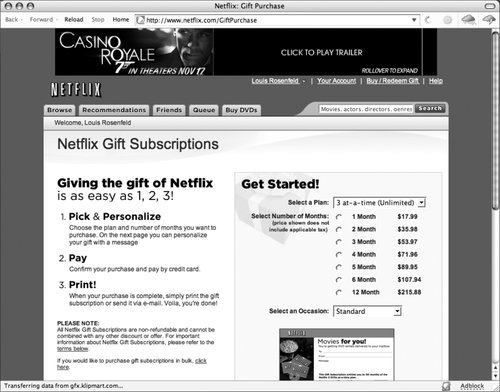 The hierarchical relationships between headingswhether parent, child, or siblingare usually established visually through consistent use of numbering, font sizes, colors and styles, whitespace and indentation, or combinations thereof. A visually clear hierarchy, often the work of information or graphic designers, can take some pressure off information architects by reducing the need to create labels that convey that hierarchy. So a set of labels that don't mean much can suddenly take on meaning when presented in a hierarchy. For example, this set of inconsistent headings may be quite confusing:
However, they are much more meaningful when presented in a hierarchy: Our Furniture Selection Office Chairs Our buyer's picks Chairs from Steelcase Hon products Herman Miller Aerons Lateral Files It's also important not to be too rigidly bound to showcasing hierarchical relationships. In Figure 6-5, heading labels such as "Background" and "Scouting report" represent the text that follows them. Yet the statistics closer to the top of the page don't merit the same treatment because most readers could visually distinguish these without actually reading them. In other words, inserting the heading "Statistics" before the numbers and applying to it the same typographic style as "Background" and "Scouting report" wouldn't greatly benefit users, who, as baseball fans, would likely recognize them already. Figure 6-5. This hierarchy of heading labels is inconsistent, but that's OK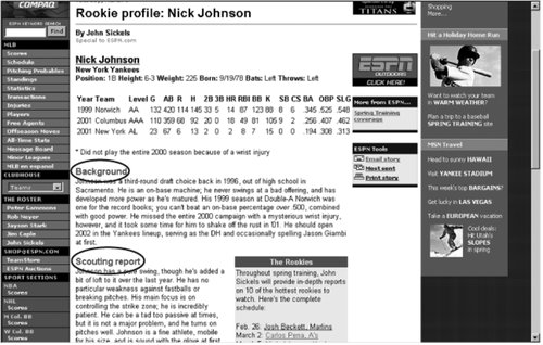 It is interesting to note, however, that it's difficult to distinguish one column of statistics from another, so each utilizes its own heading label. We can be a bit more flexible when designing hierarchical headings, but it's especially important to maintain consistency when labeling steps in a process. To successfully navigate a process, it's typically necessary for users to complete each step along the way, so heading labels have to be obvious and must also convey sequence. Using numbers is an obvious way to communicate progression, and consistently framing the labels as actionsutilizing verbsalso helps tie together the sequence of steps. In effect, the labels should tell users where to start, where to go next, and what action will be involved in each step along the way. Figure 6-6 shows a page from Northwest Airlines in which the heading labels are clearly numbered, are consistently laid out, and utilize a consistent syntax that describes the question addressed in each step of the process. Figure 6-6. Sequential numbering and consistent syntax keep these labels clear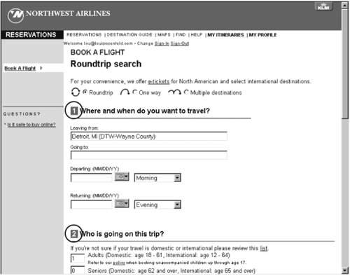 Heading labels, whether hierarchical or sequenced, come in multiples, and should be more systematically designed than contextual link labels. 6.2.3. Labels Within Navigation SystemsBecause navigation systems typically have a small number of options, their labels demand consistent application more than any other type of label. A single inconsistent option can introduce an "apples and oranges" effect more quickly to a navigation system, which usually has fewer than ten choices, than to a set of index terms, which might have thousands. Additionally, a navigation system typically occurs again and again throughout a site, so navigation labeling problems are magnified through repeated exposure. Users rely on a navigation system to behave "rationally" through consistent page location and look; labels should be no different. Effectively applied labels are integral to building a sense of familiarity, so they'd better not change from page to page. That's why using the label "Main" on one page, "Main Page" on another, and "Home" elsewhere could destroy the familiarity that the user needs when navigating a site. In Figure 6-7, the horizontal navigation system's four labels"Getting Started," "Our Funds," "Planning," and "My Account"are applied consistently throughout the site, and would be even more effective if colors and locations were also consistent. Figure 6-7. Janus' navigation system labels remain consistent throughout the site There are no standards, but some common variants exist for many navigation system labels. You should consider selecting one from each of these categories and applying it consistently, as these labels are already familiar to most web users. Here is a nonexhaustive list:
Of course, the same label can often represent different kinds of information. For example, in one site, "News" may link to an area that includes announcements of new additions to the site. In another site, "News" may link to an area of news stories describing national and world events. Obviously, if you use the same labels in different ways within your own site, your users will be very confused. To address both problems, navigational labels can be augmented by brief descriptions (also known as scope notes) when initially introduced on the main page. In Figure 6-8, the navigation system labels appear in brief on the lefthand side, and are described with scope notes in the body of the main page. Figure 6-8. Scope notes are provided for each of the navigation system labels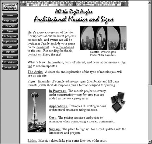 In this case, if more representational navigation system labels had been used in the first place, they may have diminished the need to devote so much valuable main page real estate to scope notes. There are alternatives to scope notes that don't monopolize real estate, such as using JavaScript rollovers and other scripted mouseover effects to display the scope note, but these aren't an established convention. If you feel that your site will be regularly used by a loyal set of users who are willing to learn your site's conventions, then it's worth considering these alternatives; otherwise, we suggest keeping things simple by making your navigation labels representational. 6.2.4. Labels As Index TermsOften referred to as keywords, tags, descriptive metadata, taxonomies, controlled vocabularies, and thesauri, sets of index term labels can be used to describe any type of content: sites, subsites, pages, content chunks, and so on. By representing the meaning of a piece of content, index terms support more precise searching than simply searching the full text of contentsomeone has assessed the content's meaning and described it using index terms, and searching those terms ought to be more effective than having a search engine match a query against the content's full text. Index terms are also used to make browsing easier: the metadata from a collection of documents can serve as the source of browsable lists or menus. This can be highly beneficial to users, as index terms provide an alternative to a site's primary organization system, such as an information architecture organized by business unit. Index terms in the form of site indexes and other lists provide a valuable alternative view by "cutting across the grain" of organizational silos. In Figure 6-9, this index of the BBC's site is generated from index term labels, which, in turn, are used to identify content from many different Sun business units. Much of the content already accessible through the BBC site's primary organization system is also accessible by browsing these index terms (e.g., keywords). Figure 6-9. The BBC's site index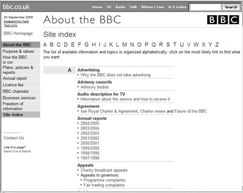 Frequently, index terms are completely invisible to users. The records we use to represent documents in content management systems and other databases typically include fields for index terms, which are often heard but not seen: they come into play only when you search. Similarly, index terms may be hidden as embedded metadata in an HTML document's <META...> or <TITLE> tags. For example, a furniture manufacturer's site might list the following index terms in the <META...> tags of records for its upholstered items: <META NAME="keywords" CONTENT="upholstery, upholstered, sofa, couch, loveseat, love seat, sectional, armchair, arm chair, easy chair, chaise lounge"> So a search on "sofa" would retrieve the page with these index terms even if the term "sofa" doesn't appear anywhere in the page's text. Figure 6-10 shows a similar, more delectable example from Epicurious.com. A search for "snack" retrieves this recipe, though there is no mention of the term in the recipe itself. "Snack" is likely stored separately as an index term in a database record for this recipe. Figure 6-10. A search for "snack" retrieves this recipe, even though the term doesn't appear within the text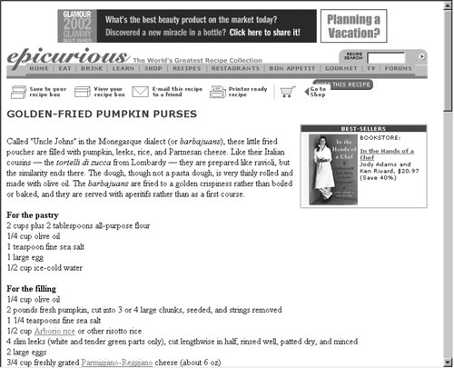 It's interesting how many sites' main pages don't feature index terms. Organizations do crazy, expensive things to get their sites noticed, including advertising their URL on banners flown over football stadiums. But using index terms to describe a main page is a much cheaper way for getting that page, and the site as a whole, indexed and "known" so that users who search the Web are more likely to find it.[
Getting your pages to stand out from one another is a different and much more daunting challenge. That's where a more systematic approach to labelingusing index terms from controlled vocabularies or thesaurihas more value. These sets of labels are designed to describe a delineated domainsuch as products and services, or oncologyand to do so in a consistent, predictable manner. We'll describe these vocabularies in great detail in Chapter 9. 6.2.5. Iconic LabelsIt's true that a picture is worth a thousand words. But which thousand? Icons can represent information in much the same way as text can. We see them most frequently used as navigation system labels. Additionally, icons occasionally serve as heading labels and have even been known to show up as link labels, although this is rare. The problem with iconic labels is that they constitute a much more limited language than text. That's why they're more typically used for navigation system or small organization system labels, where the list of options is small, than for larger sets of labels such as index terms, where iconic "vocabularies" are quickly outstripped. (They also can work well for less text-oriented audiences, like children.) Even so, iconic labels are still a risky proposition in terms of whether or not they can represent meaning. Figure 6-11 is a navigation aid from jetBlue's web site. But what do the icons mean to you? Figure 6-11. Icons from jetBlue's navigation system Even given the fairly specific context of an airline's site, most users probably won't understand this language immediately, although they might correctly guess the meaning of one or two of these labels. Since the iconic labels are presented with textual labels, our test wasn't really fair. But it is interesting to note that even the site's designers acknowledge that the iconic labels don't stand well on their own and hence need textual explanations. Iconic labels like these add aesthetic quality to a site, and as long as they don't compromise the site's usability, there's no reason not to use them. In fact, if your site's users visit regularly, the iconic "language" might get established in their minds through repeated exposure. In such situations, icons are an especially useful shorthand, both representational and easy to visually recognizea double bonus. But it's interesting to note that jetBlue's subsidiary pages don't use iconic labels alone; they've chosen to maintain the icon/text pairing throughout their site. Unless your site has a patient, loyal audience of users who are willing to learn your visual language, we suggest using iconic labels only for systems with a limited set of options, being careful not to place form ahead of function. |
EAN: 2147483647
Pages: 194
- ERP System Acquisition: A Process Model and Results From an Austrian Survey
- Enterprise Application Integration: New Solutions for a Solved Problem or a Challenging Research Field?
- Context Management of ERP Processes in Virtual Communities
- Data Mining for Business Process Reengineering
- Intrinsic and Contextual Data Quality: The Effect of Media and Personal Involvement
 ]
]  ] Search Engine Watch (http://www.searchenginewatch.com) is the most useful resource for learning how web-wide search engines and directories work, and how you can index your sites main and other major pages to "rise to the top" of retrieval results.