Showing the Entire Site Structure
| As Figure 19.7 shows, the SiteMapPath control displays only the current section based on the page where the user is visiting and those immediate ancestor sections. Although the breadcrumb interface provided by the SiteMapPath makes it easy for a visitor to pinpoint his location in the site's navigational hierarchy and navigate further up the hierarchy quickly, it does not enable him to easily jump to any section of the site. For example, imagine that a visitor comes to our online bookstore's home page. While there's only text right now, imagine that the page has links to the various genre pages titled Business Books, Fiction Books, and Technology Books. Our imaginary visitor might click on Technology Books, which would take her to Technology/Default.aspx, where there might be some technology books listed as well as links to drill down into the subcategories, Computer Books and Electronics Books. Say that our user clicks on the Computer Books link. On this page the SiteMapPath shows Home > Technology > Computers and would list the computer books for sale. However, at this point if the user decides that she wants to look at books on electronics instead, or if she realizes technology books aren't her thing and she'd rather browse the fiction titles, the user has to click her browser's Back button or go back via the breadcrumb to the appropriate parent level, and then drill down into whatever category she's interested in. The point is, the user can't jump directly from the computer books page to the electronics books or fiction books pages. To allow a visitor to quickly hop to any section from any page, we need to use a navigation user interface element that lists the entire site structure. The final two ASP.NET navigation Web controlsthe TreeView control and the Menu controlprovide this functionality. The Menu and TreeView controls are similar to the GridView and DetailsView controls examined in Hour 15 in that they require a data source control that contains the data to display. ASP.NET provides a SiteMapDataSource control that automatically retrieves the data from the site map and provides it in a manner that the TreeView and Menu controls can work with. Unlike the SqlDataSource control we used when working with the GridView and DetailsView, the SiteMapDataSource control doesn't have any wizard or require any configuration on our part. Displaying the Site's Structure in a TreeViewThe TreeView control lists the sections of the website as defined in the site map in a collapsible tree. A visitor can quickly see all of the sections of the site and his position in the site structure hierarchy. Each node in the tree is rendered as a hyperlink that whisks the user to the appropriate section when clicked. Let's add a TreeView to the Home section (Default.aspx in the root directory). To do so, we must first add a SiteMapDataSource control to the page; this control can be found in the Data section of the Toolbox. Next, add the TreeView control to the page and, from its smart tag, specify the data source as the SiteMapDataSource we just added to the page. After we specify the TreeView's data source, the TreeView's appearance in the Design view will be updated, mirroring the hierarchy expressed in site map. Take a moment to visit this page through a browser (see Figure 19.8). When trying out this control, notice that you can jump to any section in the site by clicking the appropriate section title in the TreeView. Furthermore, you can expand or collapse the TreeView's nodes by clicking on the + or icons on the left of those nodes that have children nodes. Also, note that the SiteMapDataSource control does not cause any visual effect in the browser. The SiteMapDataSource, just like the SqlDataSourceControl examined in previous hours, simply retrieves data from a sourcein particular, the site mapand does not render into HTML markup. Figure 19.8. The TreeView's structure mirrors the site map. Customizing the TreeView's AppearanceLike the SiteMapPath control, the TreeView contains a number of appearance-related properties, as well as an Auto Format option, that we can use to highly customize the look and feel of the TreeView. The TreeView is made up of a number of nodes, with each node representing a section defined in the site map. Each node has zero or one parent nodes and zero to many children nodes. For example, in the TreeView shown in Figure 19.8, the Home node has no parent and five childrenAbout, On Sale, Business, Fiction, and Technology. The About node has one parentHomeand two childrenLegal and Privacy. The Business node has one parentHomeand no children. The four types of nodes in a TreeView are
Each of these types of nodes has style properties, which can be found in the Styles section of the Properties window. These style properties, which have subproperties like BackColor, BorderColor, BorderWidth, BorderStyle, Font, and so on, affect the appearance of these classes of nodes. For example, setting the LeafNodeStyle property's BackColor subproperty to Red will cause all Leaf Nodes to have a red background color. In addition to the RootNodeStyle, ParentNodeStyle, LeafNodeStyle, and SelectedNodeStyle style properties, there are two additional node-related style properties: NodeStyle and HoverNodeStyle. NodeStyle specifies the default style applied to all nodes in the TreeView. HoverNodeStyle indicates the style settings to be applied when the user hovers his mouse pointer over a particular node.
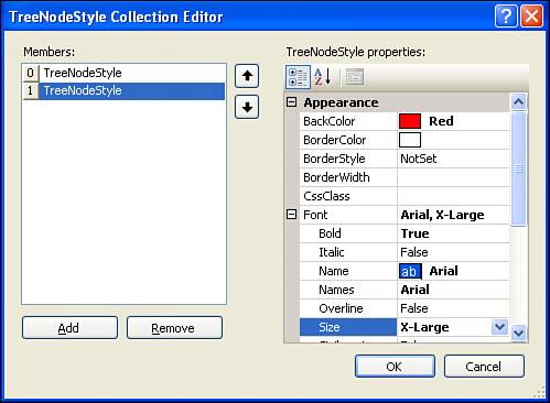
The Styles section in the Properties window also includes a LevelStyles property. This property allows you to specify style information for particular levels of the TreeView, with the first level being the set of Root Nodes, the second level being those nodes that are children of the first-level nodes, the third level being the children of the second-level nodes, and so on. To specify a unique style for each level, go to the LevelStyles property in the Properties window and click the ellipses icon to the right of the property name. This will bring up the TreeNodeStyle Collection Editor dialog box, from which you can define the style for each level. Click the Add button to add a new level to the list of levels on the left. For each level, you can specify its appearance-related properties from the list on the right. Note that the topmost level in the list on the left corresponds to the first level (the set of Root Nodes), while the second level from the top corresponds to the second level (the children of the Root Nodes), and so on. Figure 19.9 shows the TreeNodeStyle Collection Editor dialog box for a TreeView control that has the style settings made for the first two levels. Figure 19.9. The styles for the TreeView's first two levels have been specified. In addition to the properties in the Styles section of the Properties window, the TreeView contains a number of styles in the Appearances section worth noting. Of course, there are the usual propertiesBackColor, CssClass, Font, and so onbut there are also a number of TreeView-specific properties. These appearance-related TreeView-specific properties are listed in Table 19.2.
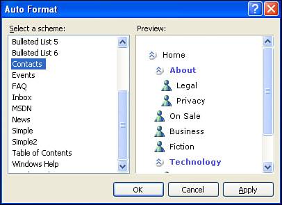
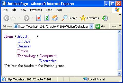
The ImageSet property provides a list of packaged images to display next to each icon. This list includes choices like WindowsHelp, BulletedList, Events, and Contacts, each providing a different set of images for expand and collapse icons for non-Leaf Nodes, as well as images for the nonexpandable, noncollapsible Leaf Nodes. (Figure 19.10 shows the icons used when the ImageSet property is set to Contacts.) If you want to provide your own images, set ImageSet to Custom and then provide the URLs to your custom images in the CollapseImageUrl, ExpandImageUrl, and NoExpandImageUrl properties. Figure 19.10. Let the Auto Format dialog box help you improve the appearance of the TreeView. If you would rather let Visual Web Developer choose the appearance-related property settings, you can always use the Auto Format option, which is available through the TreeView's smart tag. Figure 19.10 shows the TreeView's Auto Format dialog box when choosing the Contacts Auto Format option. Using Menus to Show the Site's StructureLike the TreeView control, the Menu control displays the entire contents of the site map. Rather than displaying the contents of the site map as a tree, however, the Menu control displays the items using a menu interface. By default, each section defined in the site map is rendered as an item in the menu with submenus used to reflect the hierarchy. To display navigation using a Menu control, we must first add a SiteMapDataSource control to the page that will contain the menu. Let's add a Menu control to the Default.aspx page in the Fiction folder. Open this page in Visual Web Developer and start by adding a SiteMapDataSource control; next, add the Menu control, setting its data source to the SiteMapDataSource control just added. After you specify the Menu control's data source, the Menu will be updated in the Design view to reflect the structure of the site map. By default, the menu will show all top-level elements in the site structure hierarchyHome, for our site map. After setting the data source, take a minute to view this page in a browser. On the page the menu contains just a single displayed menu item, Home. If you move your mouse pointer over the Home item, though, a submenu appears, listing About, On Sale, Business, Fiction, and Technology. If you move your mouse pointer over About or Technology, another submenu appears, listing the appropriate items (see Figure 19.11). Clicking on a menu item will whisk you to the corresponding section in the site. Figure 19.11. The menu's Home and Technology options have been selected. Configuring the Menu's Static and Dynamic PortionsA Menu control is composed of both a static and dynamic portion. The static portion of the menu is always shown when viewing the page, whereas the dynamic portion is shown only when the user interacts with the menu. By default, only the top-level sections in the site map are static; all other site map sections are placed in the dynamic portion. In Figure 19.11, only the Home menu item is shown when the page loads; the other sections are displayed only when the user interacts with the menu, hovering the mouse pointer over the Home menu item. The number of levels in the site map hierarchy that make up the static portion of the menu can be specified by the menu control's StaticDisplayLevels property. The default value for this property is 1. If we change this to 2, however, all of the sections in the first or second levels of the site map hierarchyHome, About, On Sale, Business, Fiction, and Technologywill be shown as static menu items. Figure 19.12 shows the Menu control in the Visual Web Developer Design view after the StaticDisplayLevels property has been set to 2. Figure 19.12. The menu shows the first two levels of the site map hierarchy statically.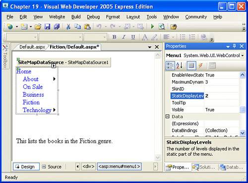 Now instead of just the Home menu item showing when the page loads, Home, About, On Sale, Business, Fiction, and Technology will be displayed. The third level, which includes Legal, Privacy, Computers, and Electronics, will still be displayed in the dynamic portion. That is, the user will have to hover her mouse pointer over the About menu item to be able to see the Privacy or Legal menu items.
Customizing the Menu's AppearanceThe Menu control contains a wide array of appearance-related properties, far too many to cover them all in this hour. Rather than enumerate all of these properties, we'll instead look at the more germane ones and focus on the concepts as opposed to the specifics.
You should not be surprised that the Menu control has the base set of appearance-related properties: BackColor, ForeColor, Font, and the like. In addition to these properties, it has appearance-related properties for the dynamic and static portions of the Menu. The names of these properties start with either Static or Dynamic, such as StaticItemFormatString and DynamicItemFormatString. The prefix indicates whether the property value applies to the dynamic or static portion of the Menu control. Table 19.3 lists a number of the Menu control's appearance-related properties. Figure 19.13 shows a Menu control after a number of these properties have been set.
Figure 19.13. This menu has a Horizontal Orientation and was further customized with Auto Format.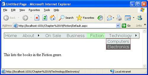
|
EAN: 2147483647
Pages: 233
- The Second Wave ERP Market: An Australian Viewpoint
- Enterprise Application Integration: New Solutions for a Solved Problem or a Challenging Research Field?
- The Effects of an Enterprise Resource Planning System (ERP) Implementation on Job Characteristics – A Study using the Hackman and Oldham Job Characteristics Model
- Data Mining for Business Process Reengineering
- Development of Interactive Web Sites to Enhance Police/Community Relations

