Tool 171: Run Chart
| AKA | N/A |
| Classification | Analyzing/Trending (AT) |
Tool description
A run chart is a simple monitoring tool that indicates a trend of change or process over a specified time. Observed data is plotted in sequence and connected by a line to show runs. Run charts can be used for monitoring any variation from an average, the increasing/decreasing trends in performance or defects, or any other change in normal data patterns.
Typical application
-
To observe process variation over time.
-
To plot data for the purpose of identifying any changes or trends in the average.
-
To receive an early warning of a potential problem due to an observed pattern of plotted data that shows an undesirable trend or variation.
Problem-solving phase
| → | Select and define problem or opportunity |
| → | Identify and analyze causes or potential change |
| Develop and plan possible solutions or change | |
| Implement and evaluate solution or change | |
| → | Measure and report solution or change results |
| Recognize and reward team efforts |
Typically used by
| 1 | Research/statistics |
| Creativity/innovation | |
| Engineering | |
| 3 | Project management |
| 4 | Manufacturing |
| Marketing/sales | |
| Administration/documentation | |
| Servicing/support | |
| Customer/quality metrics | |
| 2 | Change management |
before
-
Checksheet
-
Observation
-
Data Collection Strategy
-
Polygon
-
Surveying
after
-
Problem Specification
-
Process Analysis
-
Problem Analysis
-
Potential Problem Analysis (PPA)
-
Monthly Assessment Schedule
Notes and key points
-
A run chart is simply a chart showing runs and trends. It is not as powerful as a control chart that determines if a process is in or out of control on the basis of calculated upper and lower control limits.
-
A rough indication of a potential problem may be the consecutive increase or decrease of six or more points in row (a run).
-
Another indication of a process change may be the consecutive run of nine or more points on one side of a plotted average (
 ) center line of the run chart.
 -
Plot at least twelve data points to increase the probability of observing a meaningful pattern.
Step-by-step procedure
-
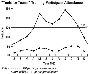
STEP 1 If possible, collect historical data of the process to be observed. This will provide a baseline, or an average, for the run chart to be constructed. See example "Tools for Teams" Training Participant Attendance.
-
STEP 2 Develop a run chart showing time horizontally and a discrete or continuous interval scale vertically.
-
STEP 3 Plot the observations (measurements) in sequential order as they are collected. Connect data points with straight lines.
-
STEP 4 As the run chart is developed, check for trends, variations, or indications of potential problems.
-
STEP 5 Date and save run charts for formulating a problem specification.
Example of tool application

EAN: 2147483647
Pages: 326