Design and Page Layout
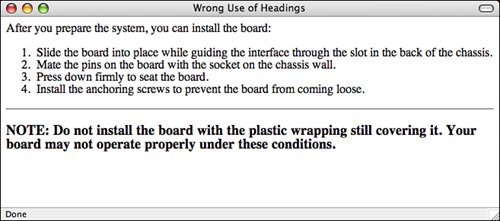
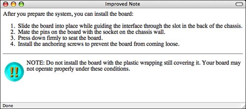
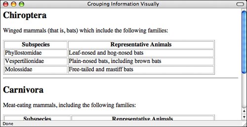
| With the introduction of technologies such as style sheets and Dynamic HTML, people without a sense of design have even more opportunities to create a site that looks simply awful. Probably the best rule of web design to follow at all times is this: Keep the design of each page as simple as possible. Reduce the number of elements (images, headings, and rule lines) and make sure that visitors' eyes are drawn to the most important parts of the page first. Keep this cardinal rule in mind as you read the next sections, which offer some other suggestions for basic design and layout of web pages. Use Headings As HeadingsHeadings tend to be rendered in larger or bolder fonts in graphical browsers. Therefore, using a heading tag to provide some sort of warning, note, or emphasis in regular text can be tempting (see Figure 16.8). Figure 16.8. DON'T: The wrong way to use headings. Headings stand out from the text and signal the start of new topics, so they should be used only as headings. If you really want to emphasize a particular section of text, consider using a small image, a rule line, or some other method of emphasis instead. Remember that you can use CSS to change the color, background color, font size, font face, and border for a block of text. Figure 16.9 shows an example of the text from Figure 16.8 with a different kind of visual emphasis. Figure 16.9. DO: The right way to use headings. Group Related Information VisuallyGrouping related information within a page is a task for both writing and design. As I suggested in the "Writing for Online Publication" section, grouping related information under headings improves the scannability of that information. Visually separating each section from the others helps to make it distinct and emphasizes the relatedness of the information. If a web page contains several sections, find a way to separate those sections visuallyfor example, with a heading, a rule line, or tables, as shown in Figure 16.10. Figure 16.10. DO: Separate sections visually. Use a Consistent LayoutWhen you're reading a book, each page or section usually has the same layout. The page numbers are placed where you expect them, and the first word on each page starts in the same place. The same sort of consistent layout works equally well on web pages. Having a single look and feel for each page on your website is comforting to your visitors. After two or three pages, they'll know what the elements of each page are and where to find them. If you create a consistent design, your visitors can find the information they need and navigate through your pages without having to stop at every page and try to find where certain elements are located. Consistent layout can include the following:
|
EAN: 2147483647
Pages: 305
- Using SQL Data Manipulation Language (DML) to Insert and Manipulate Data Within SQL Tables
- Using Keys and Constraints to Maintain Database Integrity
- Working with Comparison Predicates and Grouped Queries
- Working with Ms-sql Server Information Schema View
- Repairing and Maintaining MS-SQL Server Database Files